A Fresh Look at News Consumption: The New York Times App UX Redesign
 Adara Omotomileye Helen
Maintaining user loyalty can be quite a challenge in a world overflowing with various news app. The New York Times faced this issue, and in this case study, I would share the three major things I learnt.
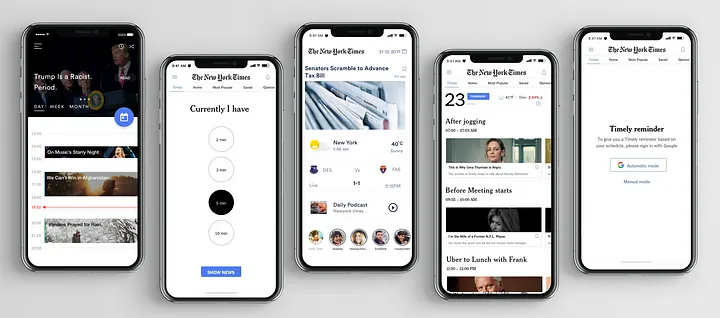
1. Timeliness is Key: One of the primary issues I identified was user's dissatisfaction with the relevance and timing of news articles. To address this, the team proposed the introduction of "Timely," (which would be embedded in the landing page of the app) a feature that sends notifications at strategic moments throughout the day. These notifications are carefully timed to coincide with users' daily routines, such as during breakfast, commutes, or coffee breaks etc. This simple addition ensures that users access articles that fit seamlessly into their schedules, making news consumption a habitual and relevant part of their lives.
2. Understanding User Habits: This redesign hinged on understanding the habits and preferences of the target audience: tech-savvy individuals aged 20-40 in New York. Research revealed that young Americans are increasingly willing to pay for quality news content, but time management and relevancy remained critical challenges. By integrating the Google Calendar, the redesigned app will align itself with user's schedules, offering a personalized news experience that respects their time and interests.
3. Design Principles that Matter: The team established crucial design principles to guide the process. The goal was to maintain a direct link between user insights and UI design. "Seamless integration" ensured the app effortlessly slotted into users' daily routines. "Simple" was essential to ensure that using the app required no learning curve. Lastly, "polite" design aimed to be beneficial and unobtrusive, avoiding unnecessary notifications and disturbances.
The team dived deep into empathy mapping, putting themselves in the shoes of their audience. Ideation sessions led to the creation of 15 diverse concepts, each scrutinized for its potential. Through rigorous validation processes involving VP design and user testing, the team narrowed down their options, ensuring that the chosen solution resonated deeply with the users' needs.
Conclusion
Users, particularly young and busy individuals, will embrace a news app that aligns with their lifestyles. In a world where news apps compete for attention, this case study serves as a guide of how user-centric design can lead to lasting loyalty and engagement.
Thanks for reading!🤗☺️
Subscribe to my newsletter
Read articles from Adara Omotomileye Helen directly inside your inbox. Subscribe to the newsletter, and don't miss out.
Written by

Adara Omotomileye Helen
Adara Omotomileye Helen
Hi there, welcome to my space About me? oh yes, #smiles in a loving manner yet welcoming. Curious minds fascinate me; what people think, how they act, and why they do what they do. It’s like a puzzle I love piecing together. I love my personal space, serene and peaceful I’m a product designer passionate about crafting meaningful experiences that truly meet users’ needs. Every design I create is a little love letter to my users, carefully thought out to make their journey effortless and enjoyable. Here, you’ll find glimpses of my daily adventures, design projects, and some fun, out-loud thinking moments. Loads of love.