Create Custom Accordion in React
 Jatin Hazrati
Hello guys. If you have landed here, you are probably looking to create a custom accordion in react which is a popular frontend machine coding problem.
Now, let's cover step by step to develop an accordion in React from scratch.
Step 1: Analyzing the accordion component

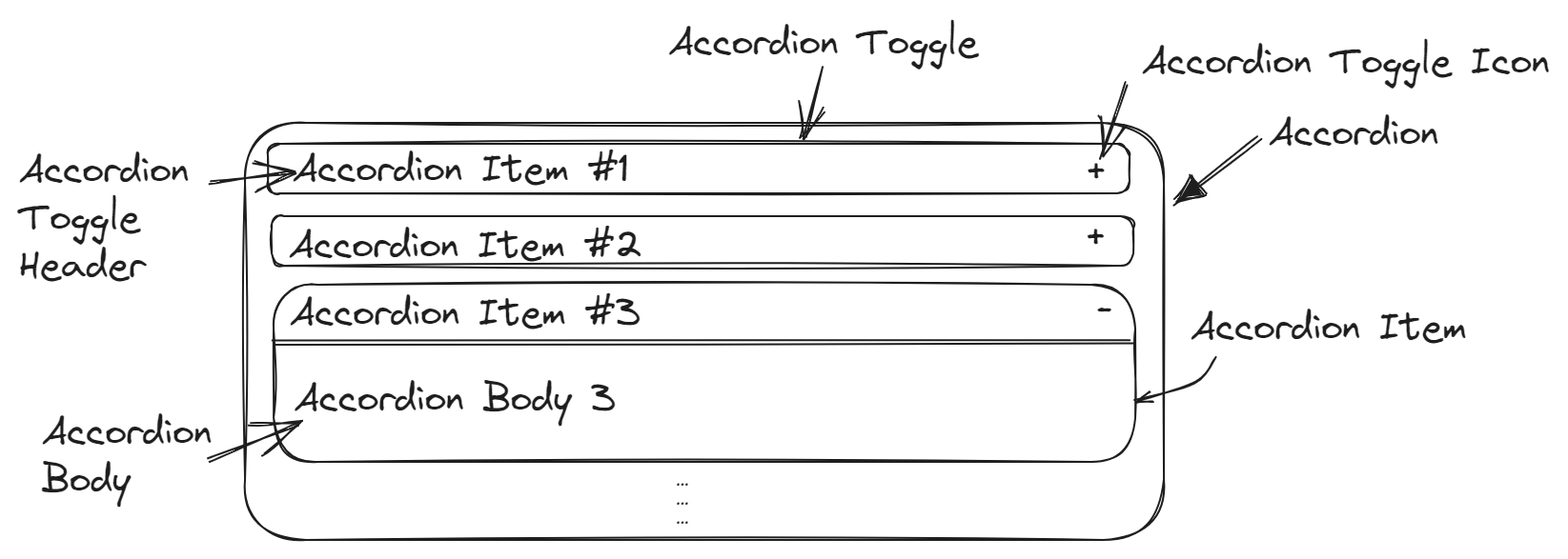
We must analyze & design our accordion UI before jumping into the coding parts so that we can structure our elements better. Let's take a brief look at the mockup -
Accordion - It serves as a container or wrapper for the entire accordion UI element.
Accordion Item - It represents an individual accordion item. It contains both the header and body of the accordion item.
Accordion Toggle - It is responsible for displaying the header of each accordion item with toggle functionality.
Accordion Toggle Header - It is responsible for styling and displaying the header of the accordion item.
Accordion Toggle Icon - It is responsible for displaying an icon (usually a "-" or "+") that indicates whether the accordion item is currently expanded or collapsed.
Accordion Body - It represents the content of the accordion item.
Step 2: Atomic vs Compound Components
Well, before moving ahead and jumping into the code let's explore two different approaches to achieve the result i.e. Atomic vs Compound Components.
Atomic Components
Atomic Components are individual and self-contained components that handle specific pieces of UI or functionality. They are the simplest and most self-contained components that can't be broken down any further. They often accept props to configure their behavior. Examples of atomic components include buttons, input, labels, and other similar UI elements.
Compound Components
Compound components are a pattern where multiple components work together to achieve common functionality. They are composed of multiple child components that are closely related to each other. They work together, sharing state and props among themselves to create unified functionality. Examples of compound components include accordions, modals, tabs, forms and other similar UI elements.
Hopefully, now we are clear about what atomic and compound components are all about let's deep dive into code right away.
Let's create our first accordionData.js, accordion.css file with the following code which will be common in both approaches :
/*
accordionData.js

It is an array of objects representing accordion items.
Each object has three properties: eventKey, header, and body.
These properties store the unique key for the item, the header text,
and the body content.
*/

export const accordionData = [
  {
    eventKey: "0",
    header: "Accordion Item 1",
    body: "Accordion Body 1",
  },
  {
    eventKey: "1",
    header: "Accordion Item 2",
    body: "Accordion Body 2",
  },
  {
    eventKey: "2",
    header: "Accordion Item 3",
    body: "Accordion Body 3",
  },
];
/* accordion.css */
.accordion-container {
  text-align: center;
  width: 500px;
  border: 2px solid black;
  background: lightgray;
  padding: 10px;
}

.accordion-toggle {
  padding: 10px;
  border: 1px solid black;
  margin: 0px 10px 0px 10px;
  display: flex;
  justify-content: space-between;
}

.accordion-toggle-icon {
  cursor: pointer;
  font-size: 20px;
}

.accordion-body {
  margin: 0px 10px;
  padding: 10px;
  border: 1px solid black;
}
Step 3: Atomic Component Approach
In the Atomic Component approach, we created the Accordion component, which can be used in the following way:
function App() {
  return (
    <div className="app">
      <Accordion />
    </div>
  );
}

export default App;
import React, { useState } from "react";
import { accordionData } from "../../accordionData";
import "../../accordion.css";

// defaultActiveKey - determines which accordion item is initially open
// collapsible - determines whether all accordion item can be closed
const Accordion = ({ defaultActiveKey, collapsible = true }) => {
  //keeps track of currently active accordion item's index
  const [activeAccordionItem, setActiveAccordionItem] =
    useState(defaultActiveKey);

  return (
    <div className="accordion-container">
      {accordionData.map((item, index) => (
        <>
          <div className="accordion-item" key={index}>
            {/* serves as clickable header of accordion item */}
            <div
              className="accordion-toggle"
              onClick={() =>
                collapsible && activeAccordionItem === index
                  ? setActiveAccordionItem(null)
                  : setActiveAccordionItem(index)
              }
            >
              <div className="accordion-toggle-header">{item.header}</div>
              <div className="accordion-toggle-icon">
                {activeAccordionItem === index ? "-" : "+"}
              </div>
            </div>
            {/* displaying accordion body based on current active accordion item */}
            {activeAccordionItem === index && (
              <div className="accordion-body">
                {accordionData[activeAccordionItem].body}
              </div>
            )}
          </div>
        </>
      ))}
    </div>
  );
};

export default Accordion;
Step 4: Compound Component Approach
In the Compound Component approach, we created separate components for different parts of the accordion: AccordionItem, AccordionToggle, and AccordionBody. The Accordion component serves as the container for these compound components.
Here's how you can use the Compound Component approach:
function App() {
  return (
    <div className="app">
      <Accordion collapsible={true}>
        {accordionData.map((item, index) => {
          return (
            <AccordionItem id={index}>
              <AccordionToggle>{item.header}</AccordionToggle>
              <AccordionBody>{item.body}</AccordionBody>
            </AccordionItem>
          );
        })}
      </Accordion>
    </div>
  );
}

export default App;
Accordion is the main accordion component that wraps everything together. It takes props like defaultActiveKey, collapsible, and children. It uses the useState hook to manage the activeAccordionItem state variable. It maps over its children (which are AccordionItem components) and clones them with the necessary props.
import React, { useState } from "react";
import "../../accordion.css";

const Accordion = ({ defaultActiveKey, children, collapsible }) => {
  const [activeAccordionItem, setActiveAccordionItem] =
    useState(defaultActiveKey);

  return (
    <div className="accordion-container">
      {/* clone each child and pass down the required props, such as id and event handlers */}
      {React.Children.map(children, (child) => {
        return React.cloneElement(child, {
          collapsible,
          activeAccordionItem,
          handleAccordionItemClick: setActiveAccordionItem,
        });
      })}
    </div>
  );
};

export default Accordion;
AccordionItem.jsx component represents an individual accordion item. It takes props like id, collapsible, activeAccordionItem, and handleAccordionItemClick. It is designed to contain AccordionToggle and AccordionBody components as its children.
export const AccordionItem = ({
  id,
  children,
  collapsible,
  activeAccordionItem,
  handleAccordionItemClick,
}) => {
  return (
    <div className="accordion-item">
      {/* clone each child and pass down the required props, such as id and event handlers */}
      {React.Children.map(children, (child) => {
        return React.cloneElement(child, {
          id,
          collapsible,
          activeAccordionItem,
          handleAccordionItemClick,
        });
      })}
    </div>
  );
};
AccordionToggle.jsx component represents the clickable header of an accordion item. When clicked, it toggles the open/close state of the accordion item based on the collapsible and activeAccordionItem props.
const AccordionToggle = ({
  id,
  children,
  collapsible,
  activeAccordionItem,
  handleAccordionItemClick,
}) => {
  return (
    <div
      className="accordion-toggle"
      onClick={() =>
        collapsible && activeAccordionItem === id
          ? handleAccordionItemClick(null)
          : handleAccordionItemClick(id)
      }
    >
      {children}
    </div>
  );
};
AccordionBody.jsx takes id and activeAccordionItem props and only renders children if the item's id matches the activeAccordionItem, making sure it displays content when the accordion item is open.
//AccordionBody.jsx
export const AccordionBody = ({ id, activeAccordionItem, children }) => {
  return (
    <>
      {activeAccordionItem === id && (
        <div className="accordion-body">{children}</div>
      )}
    </>
  );
};

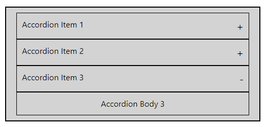
That's it! This is what it looks like. You now have a good understanding of how to create a custom accordion in React using both Atomic and Compound Component approaches. Feel free to choose the approach that best suits your interviewer's requirements.
For the complete source code, please visit the GitHub repository here: GitHub
Happy coding! Cheers 🥂
Subscribe to my newsletter
Read articles from Jatin Hazrati directly inside your inbox. Subscribe to the newsletter, and don't miss out.
Written by
