Understanding CSS Position: A Comprehensive Guide
 Victor Joey
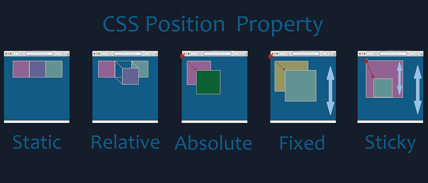
Cascading Style Sheets (CSS) is a fundamental technology in web development that enables designers to control the layout and presentation of web pages. One critical aspect of CSS is understanding how elements are positioned on a webpage. This involves a concept called the "CSS Box Model" and various positioning properties. In this article, we'll delve into the intricacies of CSS positioning, covering static, relative, absolute, fixed, and sticky positions.
The CSS Box Model
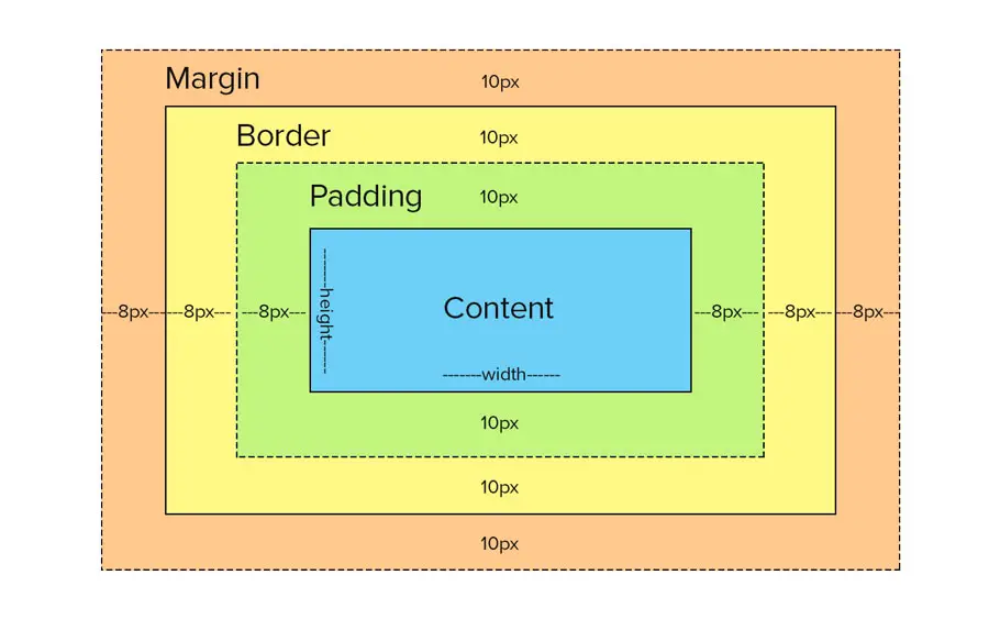
Before diving into positioning, it's crucial to grasp the CSS Box Model. This model conceptualizes every HTML element as a rectangular box. Each box has content, padding, border, and margin areas.

Content: This is where the actual content, like text or images, resides.
Padding: It's the space between the content and the border.
Border: It surrounds the padding and content.
Margin: This is the space outside the border, which separates the element from other elements.
Static Positioning
By default, all elements are positioned statically. This means they are displayed in the normal flow of the page. Properties like top, bottom, left, and right have no effect in static positioning.
.example {
  position: static;
}
Relative Positioning
Setting an element's position to relative allows you to move it relative to its normal position. This means you can use properties like top, bottom, left, and right to adjust its position.
.example {
  position: relative;
  top: 10px;
  left: 20px;
}
In this example, the .example element will be moved 10 pixels down and 20 pixels to the right from its normal position.
Absolute Positioning
When an element is set to position: absolute, it's positioned relative to its nearest positioned ancestor (an ancestor with a position other than static). If there is no positioned ancestor, it's positioned relative to the initial containing block (usually the body).
.example {
  position: absolute;
  top: 50px;
  left: 100px;
}
Here, the .example element is positioned 50 pixels from the top and 100 pixels from the left relative to its closest positioned ancestor.
Fixed Positioning
Fixed positioning is similar to absolute positioning, but the element is positioned relative to the viewport, meaning it won't move even if the page is scrolled.
.example {
  position: fixed;
  top: 10px;
  right: 10px;
}
In this example, the .example element will always be 10 pixels from the top and 10 pixels from the right of the viewport.
Sticky Positioning
Sticky positioning is a hybrid of relative and fixed positioning. An element with position: sticky is positioned based on the user's scroll position. Once it reaches a specified threshold, it acts like a fixed element.
.example {
  position: sticky;
  top: 10px;
}
Here, the .example element will behave like a normal relative positioned element until the user scrolls it 10 pixels from the top of the viewport, at which point it will stick there.
Subscribe to my newsletter
Read articles from Victor Joey directly inside your inbox. Subscribe to the newsletter, and don't miss out.
Written by

Victor Joey
Victor Joey
Software Engineer passionate about creating technologies that embody the qualities of a likable human: being respectful, gorgeous, and helpful. My primary focus is on crafting products that not only meet functional requirements but also resonate with users on an emotional level.