Tiny Awards Finalists
 Alvaro Montoro
A few weeks ago, I learned about the Tiny Awards through social media. It is a recently created prize for small websites within the huge vastness of the nowadays Internet. For websites that embraced the heartfelt and playful feeling from the past Internet. When things were simpler and smaller.
The rules to participate were:
- Have a "tiny" website
- That has its own URL
- That was published between June 2022 and June 2023
- Non-commercial, no agencies, not just for publicity
- Responsive (work both on desktop and mobile)
- No apps/download required
I had released many small projects that could fit those requirements —comiCSS or CSS Drawings came to mind—, but comiCSS didn't fulfill those requirements (it was released on February 2022), so I nominated CSS Drawings... which didn't make the cut into the final :-P
According to one of the selection committee members, there were 270 submissions, of which 16 were picked as finalists. And voting is open to select the winner! There is still time to vote for your favorite finalist until July 20th.
Here is my review of the 16 finalist, with some comments.
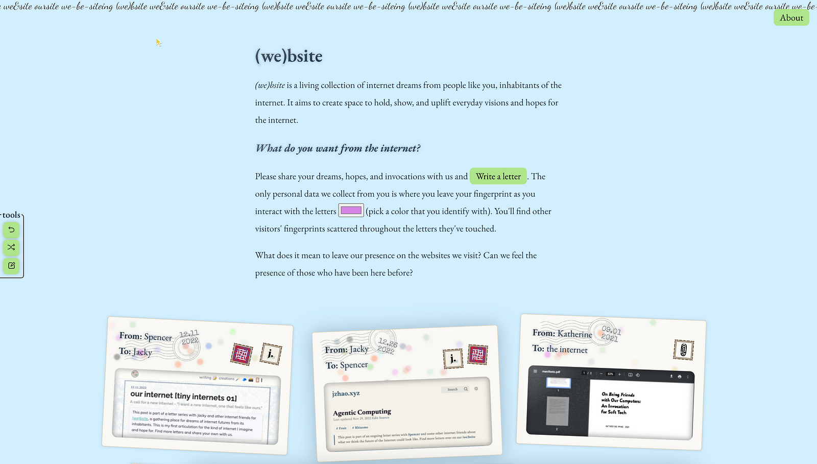
(we)bsite
A "a living collection of internet dreams." From love letters to poems to hopes and dreams of what they want the online future to bring, this site assembles blog posts and messages from users to the Internet. The messages can be read directly on the web, and the posts are linked using a curious drag-and-drop system (with an accessible alternative.)
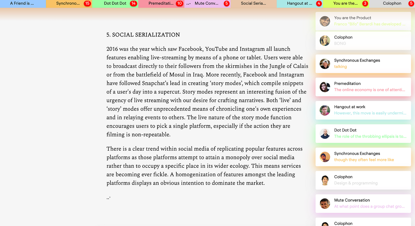
A Friend is Writing
This project presents different documents in a different way: as a text message or chat in which different people (friends) are writing. The idea is original and unconventional, but the site can be overwhelming at times, with animations, sounds, and alerts popping continuously from the different tabs fighting for attention.
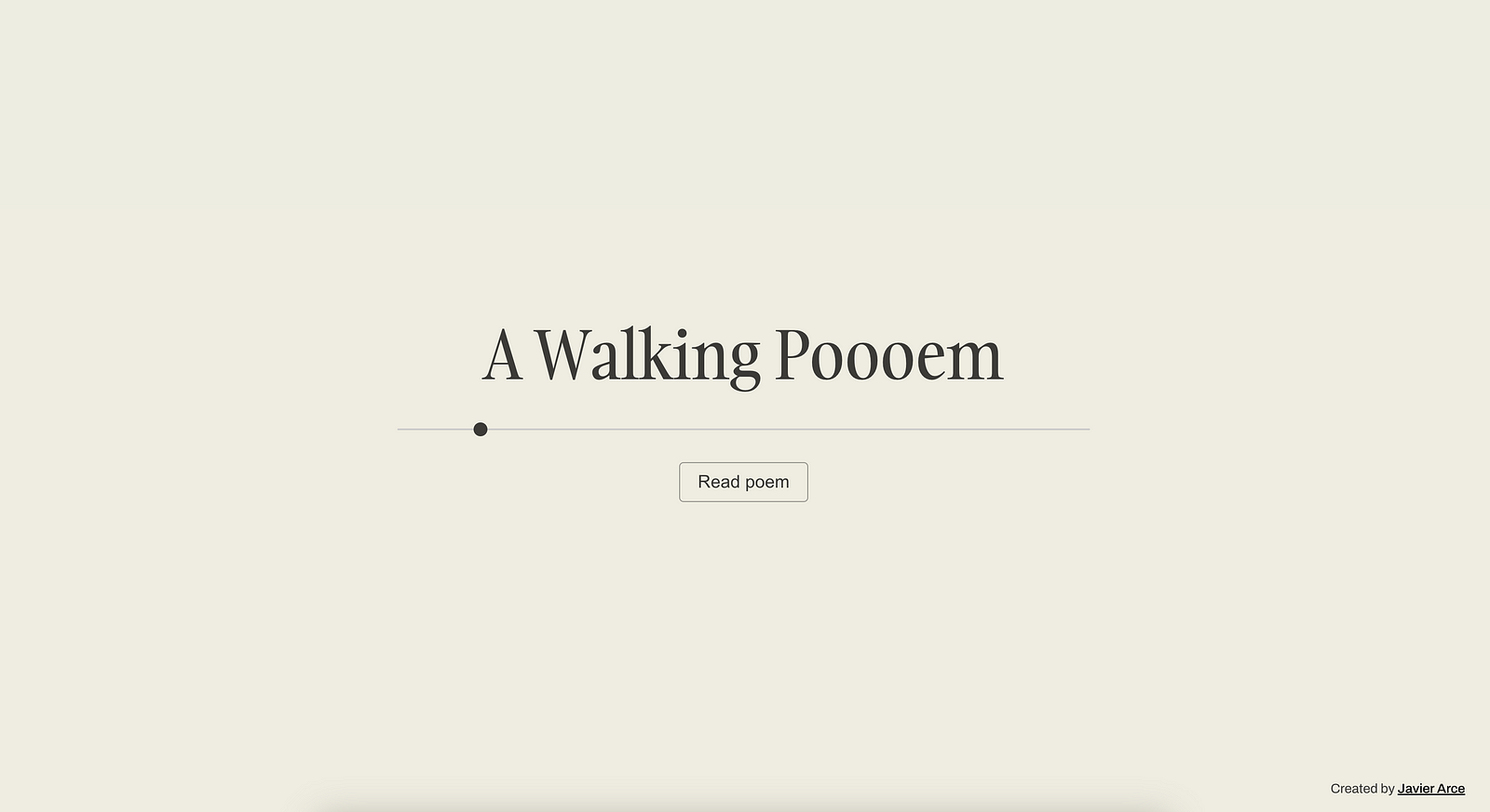
A Walking Poem
Do you want a poem based on your current location? A Walking Poem generates a poem with directions and walking instructions to follow from your starting point. The poem is basically Google Map steps presented in a nice-looking way, but something different and original. I have to admit that having to turn location services to use the site is a bit strange and a downer.
Acronymy
Turn any word into an acronym... and if none exists, suggest on of your own. The concept of Acronymy is simple, fun, and it has a cool Urban Dictionary vibe to it. The implementation is simple too (maybe a bit too basic) and really easy to use.

Bird Game
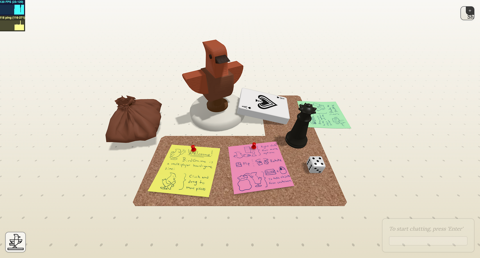
Bird Game provides a board game area that can be easily shared with other players, who will see changes live (and they may make changes themselves, but probably there's a setting to avoid that; I haven't played —no pun intended— enough with the site.) The controls may take a little bit of time to get used to, but the idea is interesting, and the live updates are smooth.
brr
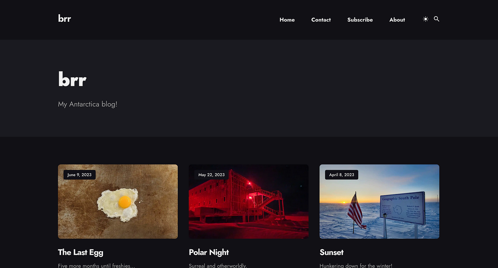
What would you do if you were an IT worker located in Antarctica? Blog about it! An anonymous San Francisco resident tells us about his experience deployed as an IT employee at the McMurdo Station. This is a classic blog with comments, photos, and curiosities about Antartica.
Himmel über Karlsruhe
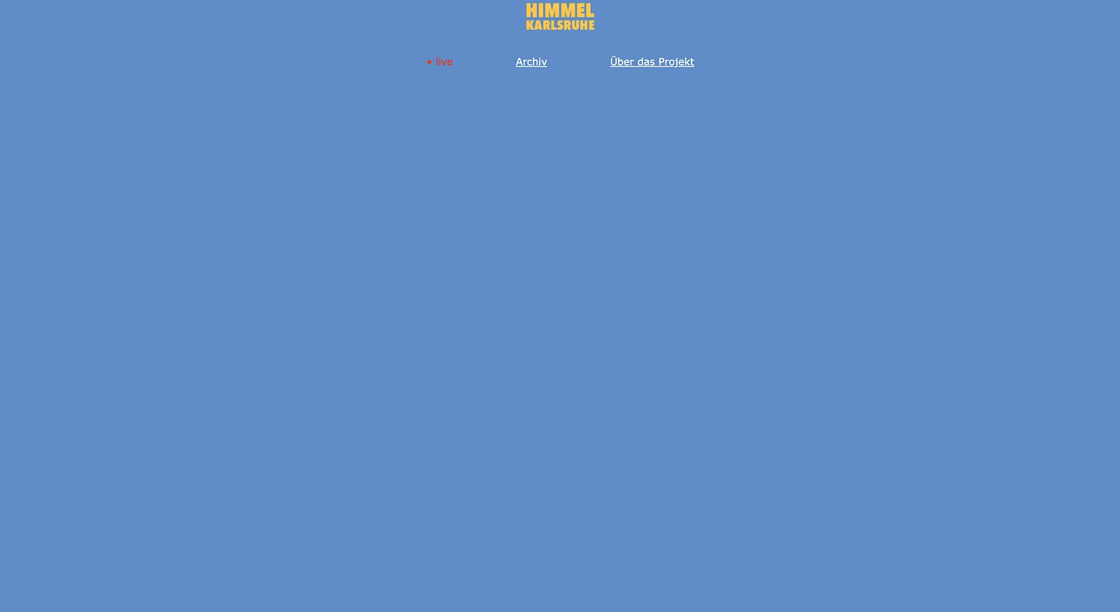
This website will show you the color of the sky over the German city of Karlsruhe at any given moment. It uses a camera, reduces the colors to a single pixel, and saves it. The site has a history (archive) page that shows graphically every day of the year. This could be a really helpful tool for tourism as it helps identify sunny days, sunrise and sunset, etc.
Interdependence Online
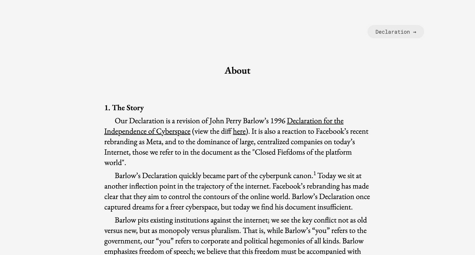
A revised version of John Perry Barlow's "Declaration for the Independence of Cyberspace", asking for an Internet that is independent and free from the dominance of large corporations. It uses blockchain to track support and signatures. This finalist selection is a bit weird considering that it is a 2021 fork.
MeatGPT
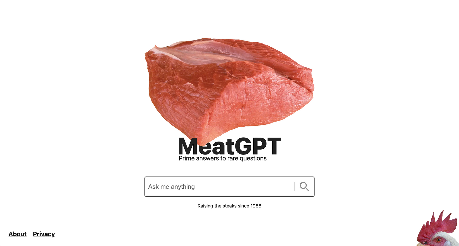
The latest IT hype is ChatGPT. Here's a humorous parody of the other LLMs: MeatGPT. Just ask anything and wait for the soon-to-be-meat chicken to give you an answer... It may not be exactly what you are expecting. Oh! And remember to put the volume up (although there are subtitles).
Ooh! directory
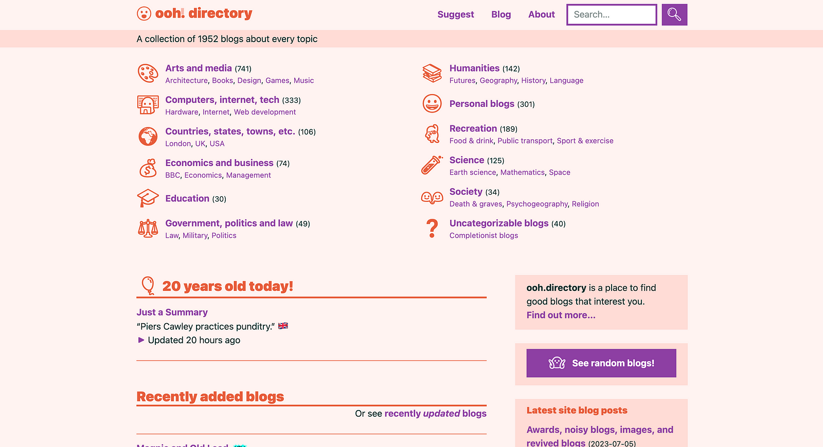
A collection of blogs categorized in 12 different topics. Anyone can contribute and it offers tools to discover new posts (sorting by "Recently Updated Blogs" which uses the RSS from the blogs to generate the feed). A nice tool to find new blogs from people all over the world. The site and its design could remind of an early Yahoo!.
Prose Play
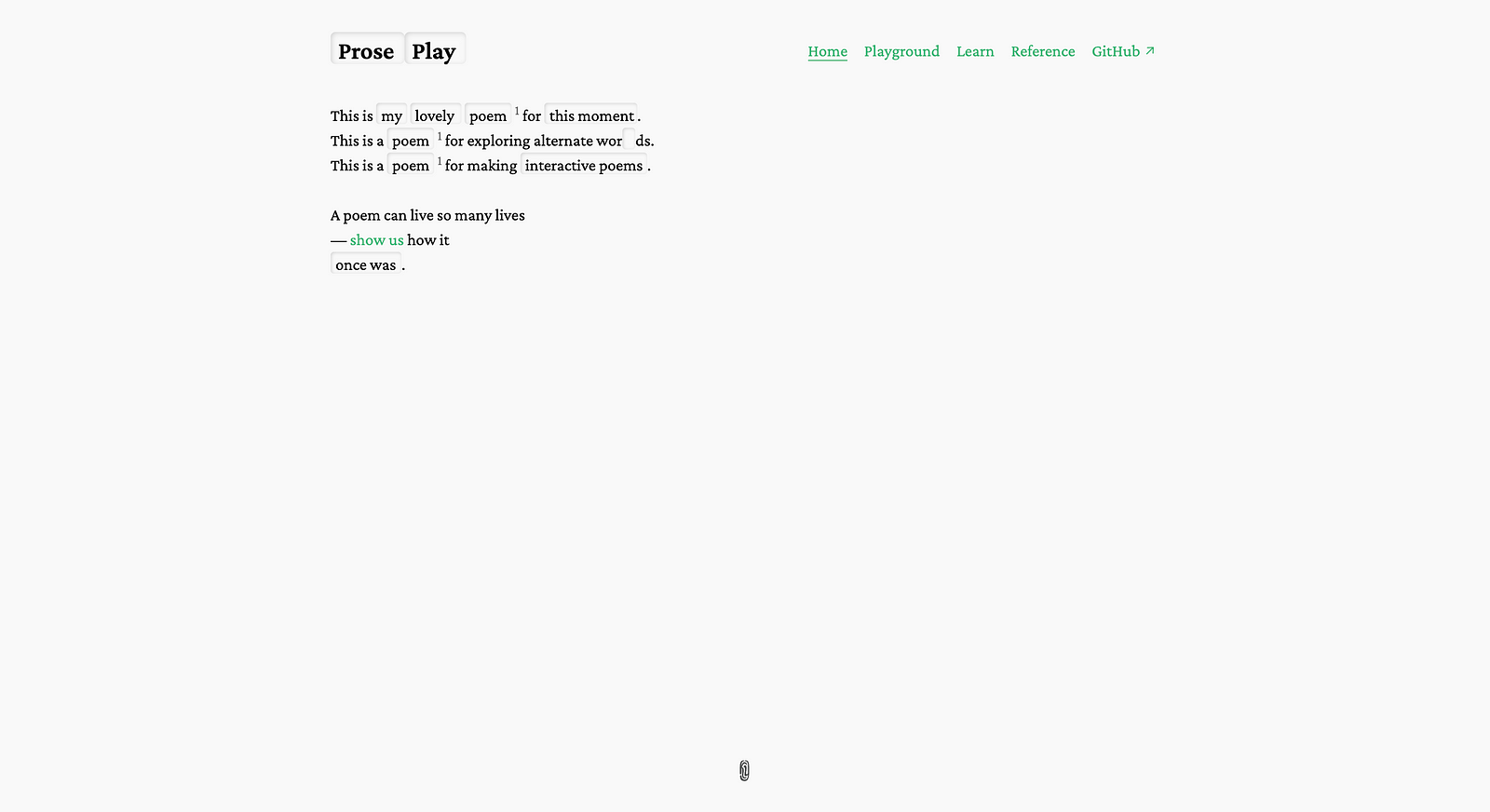
The idea is interesting: an interactive poem where you can slide up or down some words and generate a completely different poem. It even has a playground where you could upload and generate your own interactive poem. Pretty cool idea... although it may not be as accessible as it could be (drag-and-dropping/sliding is always tricky.)
Rotating Sandwiches
This site is exactly what it advertise: a collection of animated GIFs of rotating sandwiches. That's it. No words, no complications. Just rotating sandwiches. It could look like a section from one of those early websites that offered free animated GIFs. It uses decoding="async", and yet, I pity the fool who opens this website using a data connection instead of being on wifi.

Solar Protocol Exhibition
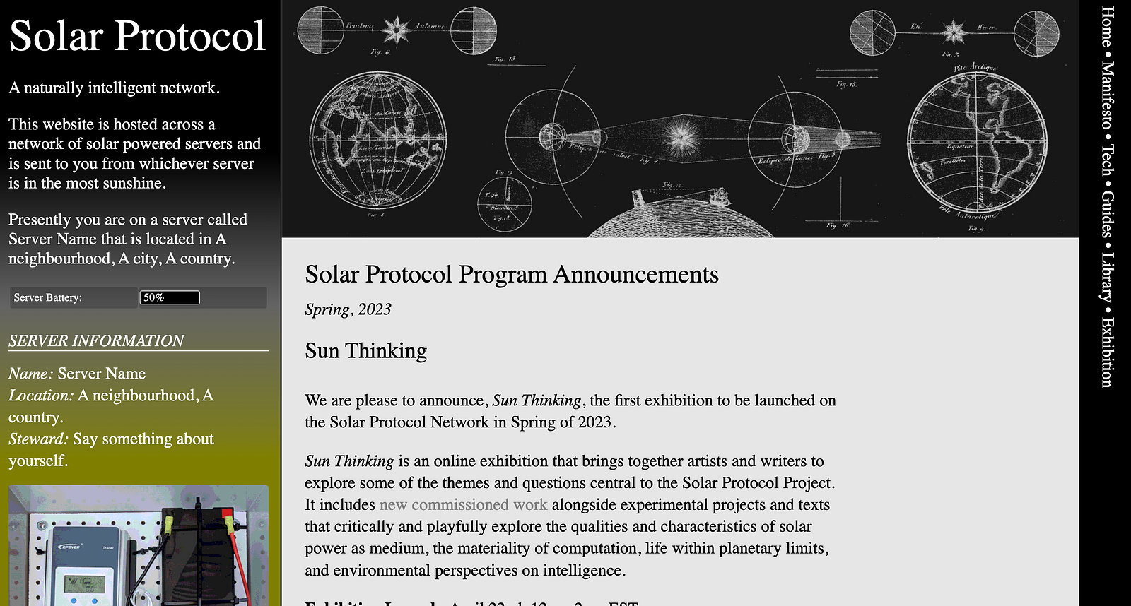
Imagine a server that is powered by solar power (using a photovoltaic panel and a Raspberry Pi). And now imagine that you create a network of solar servers that runs traffic through the most convenient ones (e.g. the ones enjoying more sunshine). That is the idea behind Solar Protocol —a naturally (instead of artificially) intelligent network... and a pretty cool project.
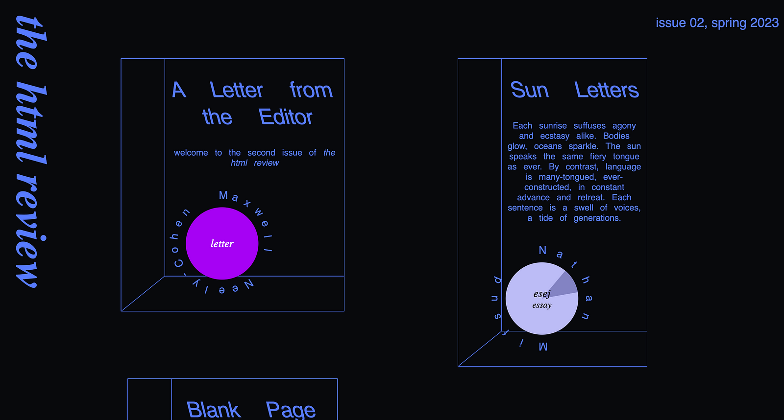
the html review #2
An online magazine that mixes art and technology in creative ways (for example, there's a poem that will be revealed only as we scroll over the page). I like the simple yet original presentation of the different sections, and how the shadow moves depending on the mouse/scroll position.
User Sentimental Experience
I was able to load this project once... then I wasn't able to load it again (not to try it again or when I started writing this article)... so the only way to describe it is from that first quick pass I did (which I must admit was not the best). It seemed like an experiment/mixture between a 90s design portfolio and a escape room.
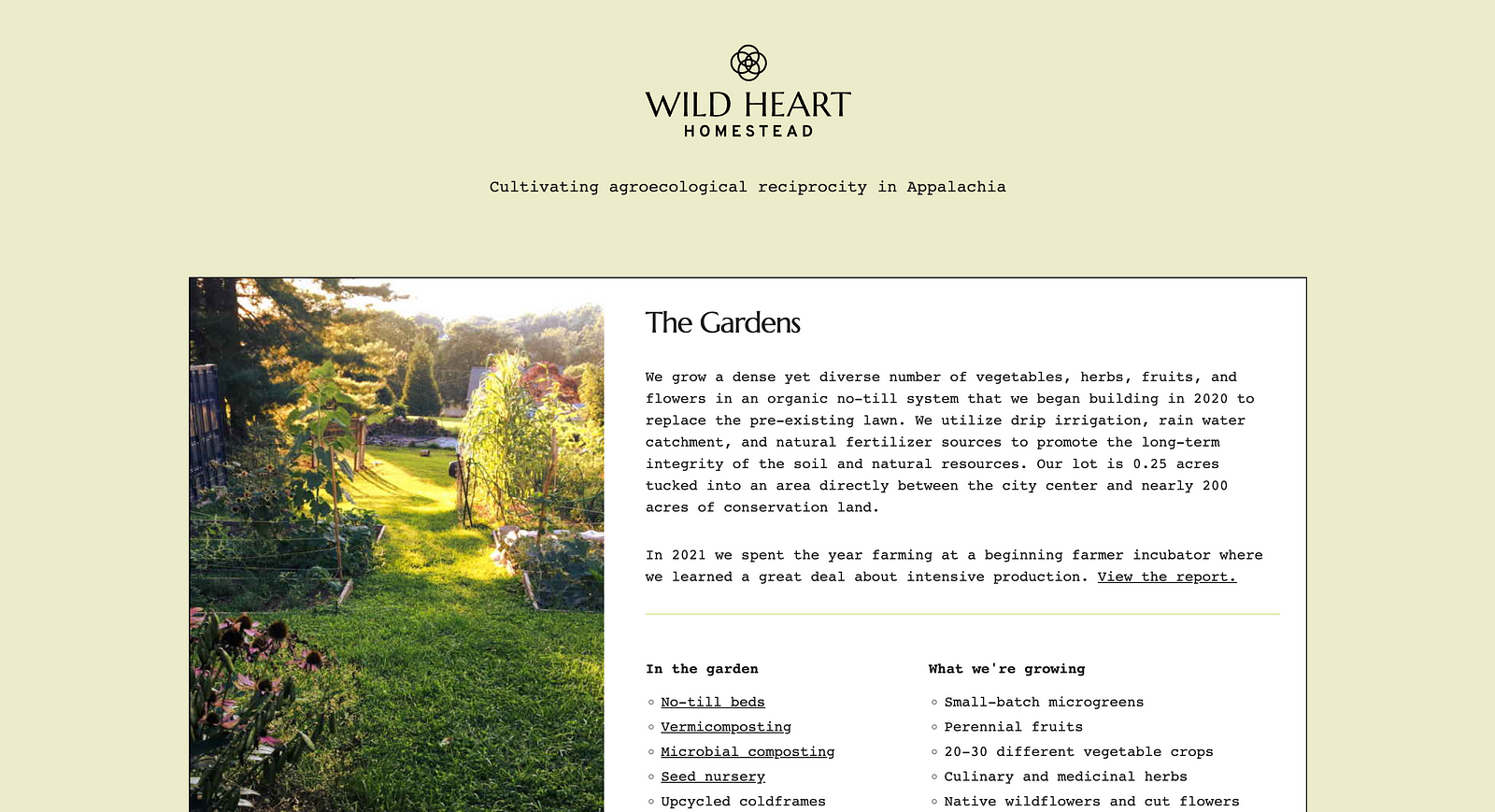
Wild Heart Homestead
This is a blog/website of an urban homestead in Virginia. It includes descriptions of the different things that they do, alongside with descriptions, learnings, and tips for others to learn. The website indicates that it is a low consumption website with no trackers (confirmed). Talking the talk, and walking the walk.
And those are all! Remember: if you are reading this before July 21st, you are still in time to vote for your favorite!
Subscribe to my newsletter
Read articles from Alvaro Montoro directly inside your inbox. Subscribe to the newsletter, and don't miss out.
Written by
