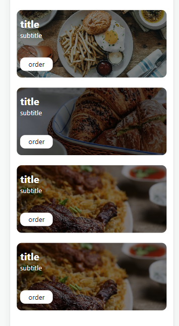
How to build a card grid with background image and text using React and Tailwindcss
 ryad
ryad

Introduction:
In the world of web development, creating visually appealing user interfaces is key to attracting and retaining users. One way to achieve this is by incorporating eye-catching components like headline cards. In this article, we’ll walk you through a React component that generates stunning headline cards, showcasing captivating images with dynamic content and overlay effects.
Getting Started:
Before we dive into the code, make sure you have a React project set up. If you haven’t already, you can create a new React app using Create React App or your preferred method. Once your project is ready, we can start creating our HeadlineCards component.
HeadlineCards Component:
The HeadlineCards component is designed to display a set of cards, each containing an image, a title, a subtitle, and an order button. The code structure is simple yet effective, making it easy to customize and use in your own projects.
import React from "react";

const HeadlineCards = () => {
  const menuItem = [
    {
      text: "title",
      subtitle: "subtitle",
      image:
        "https://images.pexels.com/photos/4393021/pexels-photo-4393021.jpeg?auto=compress&cs=tinysrgb&w=1260&h=750&dpr=1",
    },
    {
      text: "title",
      subtitle: "subtitle",
      image:
        "https://images.pexels.com/photos/17216084/pexels-photo-17216084/free-photo-of-nourriture-tasse-fruit-panier.jpeg?auto=compress&cs=tinysrgb&w=1260&h=750&dpr=1",
    },
    {
      text: "title",
      subtitle: "subtitle",
      image:
        "https://images.pexels.com/photos/1624487/pexels-photo-1624487.jpeg?auto=compress&cs=tinysrgb&w=1260&h=750&dpr=1",
    },
    {
      text: "title",
      subtitle: "subtitle",
      image:
        "https://images.pexels.com/photos/1624487/pexels-photo-1624487.jpeg?auto=compress&cs=tinysrgb&w=1260&h=750&dpr=1",
    },
  ];

  return (
    <div className="max-w-[1640px] mx-auto p-4 py-12 grid md:grid-cols-3 gap-6">
      {/* Card */}

      {menuItem.map(({ text, subtitle, image }, index) => {
        return (
          <div key={index} className="rounded-xl relative">
            {/* Overlay */}
            <div className="absolute w-full h-full bg-black/50 rounded-xl text-white">
              <p className="font-bold text-2xl px-2 pt-4">{text} </p>
              <p className="px-2">{subtitle}</p>
              <button className="border rounded-xl px-5 py-1 border-white bg-white text-black hover:bg-black/50 hover:text-white border-none mx-2 absolute bottom-4">
                order
              </button>
            </div>
            <img
              className="max-h-[160px]  md:max-h-[200px] w-full object-cover rounded-xl"
              src={image}
              alt="/"
            />
          </div>
        );
      })}
    </div>
  );
};

export default HeadlineCards;
Explanation:
We start by importing React and defining a functional component named
HeadlineCards.Inside the component, we create an array called
menuItem, which holds the data for our cards, including the title, subtitle, and image URL.We use the
.map()function to iterate through themenuItemarray, creating a card for each item. The card's content is dynamically populated with the data from the array.Each card consists of an image with a transparent overlay that displays the title, subtitle, and an “order” button when hovered over. The CSS classes are used to style and position the elements.
The
max-w-[1640px],mx-auto, and other classes are used for responsive layout and styling.
Using the Component: To use the HeadlineCards component in your app, simply import it and render it within your main component, as shown in the App.js file:
import React from "react";
import HeadlineCards from "./components/HeadlineCards";
function App() {
  return (
    <div>
      <HeadlineCards />
    </div>
  );
}
export default App;
Conclusion:
Creating visually appealing components like headline cards can greatly enhance the user experience of your web application. With React, building such components becomes more manageable, allowing you to focus on the design and functionality. Feel free to customize the HeadlineCards component further to suit your project's specific needs and make your website's front end truly captivating. Happy coding!
Subscribe to my newsletter
Read articles from ryad directly inside your inbox. Subscribe to the newsletter, and don't miss out.
Written by
