Design a User Experience for Social Good & Prepare for Jobs Course Journey Week 1
 Dev Rayda
Hey Readers! This is the first article in a series of articles on the last course of Google's UX design certificate on Coursera. I will talk about my journey of taking this course and applying what I learned to finish the course's project.
I am currently in my first week, it is taking more time than I thought. Cause I am doing everything I did in the first 5 courses just in this first week.
This course's project is to design for social good, a mobile app and a responsive website. Designing for social good is different from any other product in that social good is for "collective social good that drives positive change in the society" as the course says.
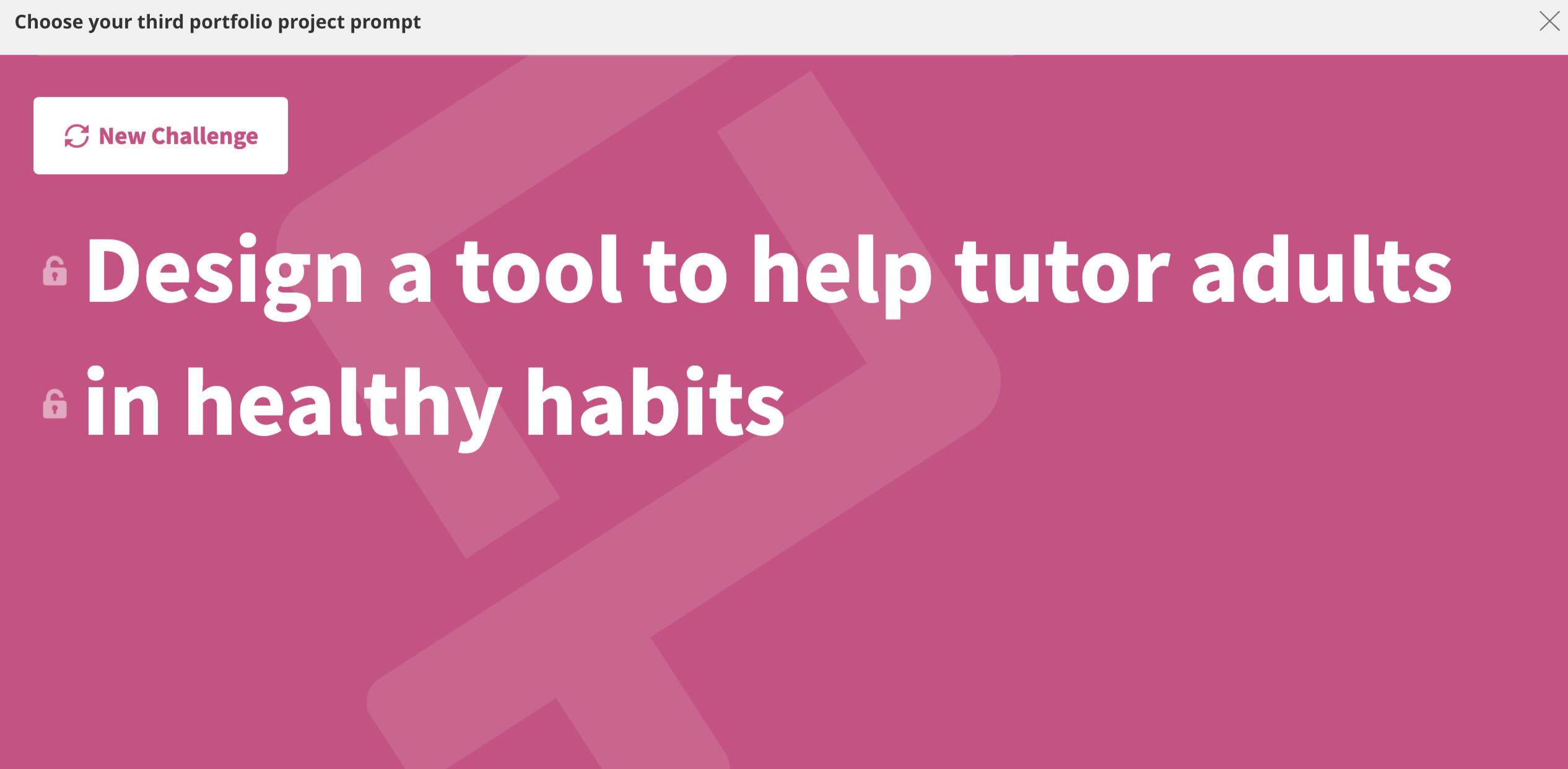
I used Sharpen to generate a prompt for the project, I chose a healthy habits app as shown in the image. I won't do exactly as the prompt says but it is a habit-tracking app with a learning feature.
The empathize phase
Persona
First I needed to do user research by conducting interviews to understand the users and their problems more. So, I made a questionnaire using Google form and sent it to a few of my online friends but asked them if they were suitable participants first for example, if they are interested in health and wellness. I got 4 responses back which of course isn't enough for two personas. But I managed to make 2 personas, I would say that these personas are not representative of the whole user group. But this is a course project, not a real app so I will ignore this problem.
I used AI a lot in this project, I asked Edge AI to suggest some interview questions for a habits-tracking app, and I chose what was suitable.
Here are the interview questions I used, they aren't in the same order I asked the questions plus there were some personal questions for example the age and their job:
What are some of the healthy habits that you currently have and what do you want to have?
How do you track your progress with your healthy habits?
What are some of the challenges or barriers that prevent you from maintaining your healthy habits?
How do you motivate yourself to stick to your healthy habits?
What are some of the tools, apps, or resources that you use to help you with your healthy habits?
How do you balance your healthy habits with other aspects of your life, such as work, family, or hobbies?
How do you cope with stress, boredom, or cravings that might interfere with your healthy habits?
How do you celebrate or reward yourself for achieving your healthy habit goals?
How do you learn new information or skills related to your healthy habits?
How do you deal with setbacks or failures with your healthy habits?
User Stories

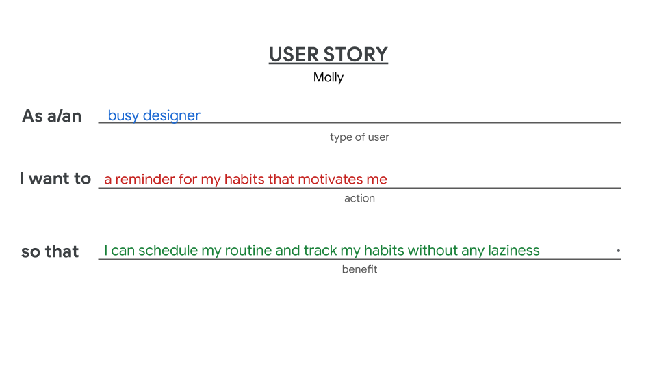
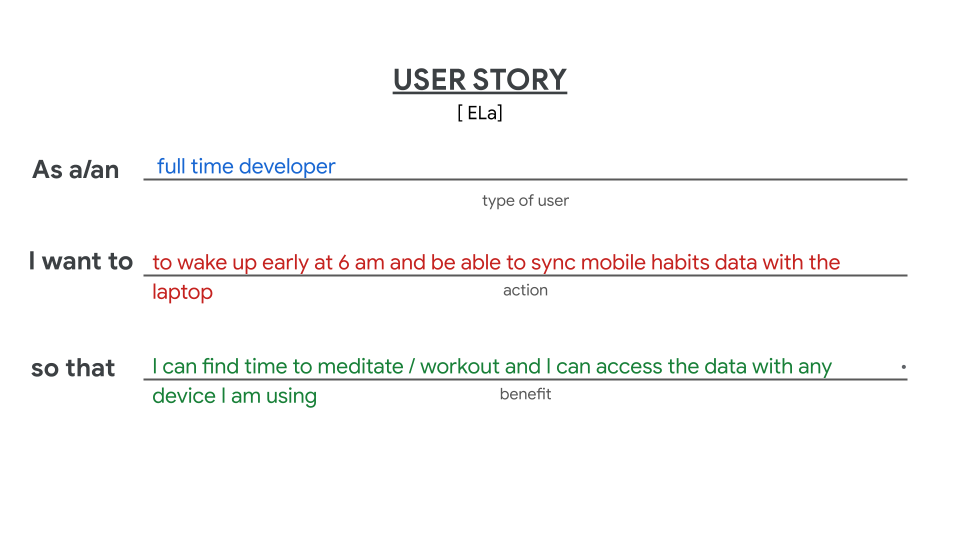
User Stories is a "fictional one-sentence story told from the persona’s point of view to inspire and inform design decisions." as Google explains it.
We follow the following formula to make a user story, According to the course,
"As a type of "user" (who), I want "action"(What). So that "benefit" (Why).".
I made the two user Stories as follows for my two personas.
User Journeys
I asked myself: Is that really necessary? 🤷♀️ Since we don't have an app or a website yet!
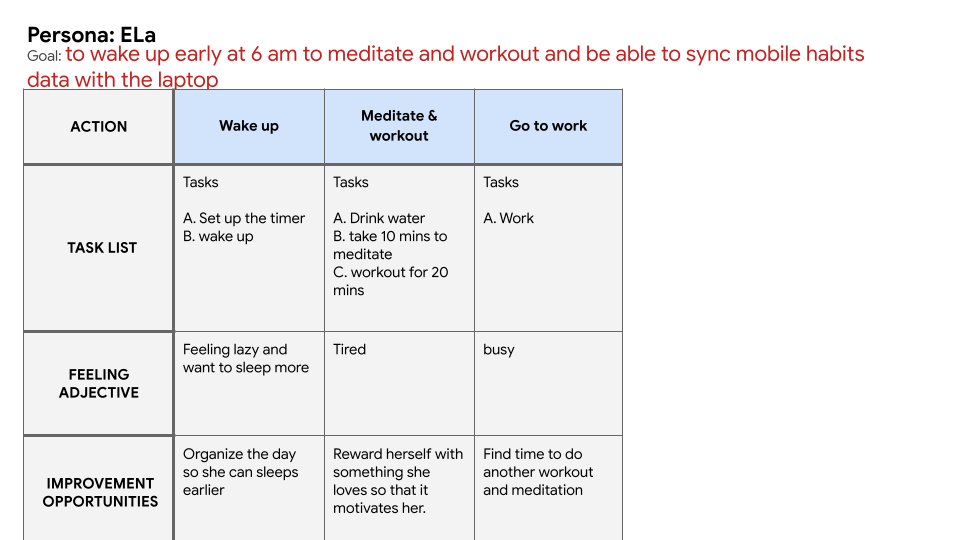
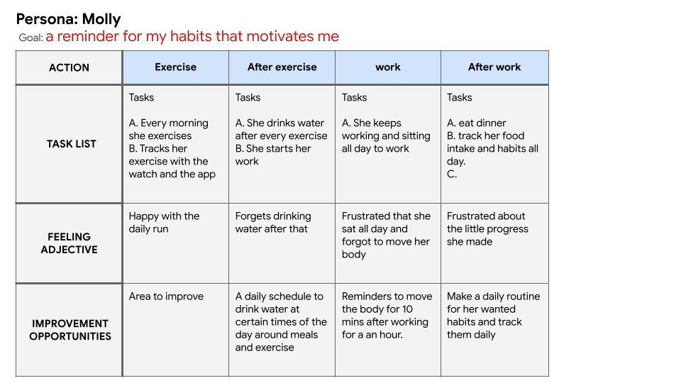
I approached this step by making assumptions about the day of the two personas, only focusing on the things I got from the questionnaire to reduce any designer bias.
I made them as follows:
Problem Statement
For the problem statement, I chose the Persona "Ela". Her pain points felt close to the first persona. They both have trouble following their routine whether the reason is laziness, forgetfulness or not being able to follow their routine.
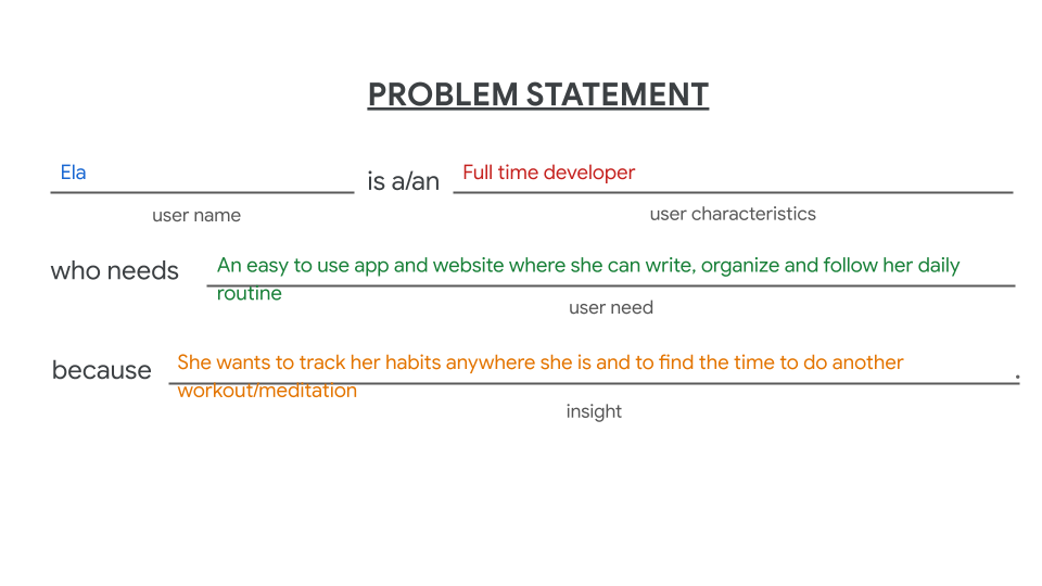
The user journey made the problem statement easier to write 😁. So I guess it was important 😅 .
The Ideate Phase

Competitive Audit
This is the last step in the first week. We first need to make a competitive audit where we check the competitors' strengths and weaknesses. I checked out the apps that came up in the interview "Questionnaire". There are three indirect competitors: Insumo: Habit Tracker, Remind, Mi Fitness (Xiaomi Wear) and finally DailyBean: Simplest Journal. Next, I searched for direct competitors, I found Fabulous Daily Routine Planner and HabitNow Daily Routine Planner. Here is the Audit report:
1. Competitive audit goal(s)**
Compare the user experience and the features of different habits tracking apps |
2. Who are your key competitors? (Description)
A lot but I checked three indirect and two direct ones. |
3. What are the type and quality of competitors’ products? (Description)
The two direct ones are pretty outstanding, especially Fabulous. HabitNow is a simple planner app with a simple UI design but it doesn't have ready-to-use habits like Fabulous. Fabulous has way more features, first, it uses behavioral science to change the habits of the users, Second, it has ready-to-use habits that are easy to use, Third, it has coaching options and mini videos that teach you about how to change your habits, Fourth; it has meditation sessions ready to use. And fifth, it has an online community for every interest inside the app where you can have a conversation. |
4. How do competitors position themselves in the market? (Description)
Fabulous is a coaching app for self-care that uses behavioral neuroscience. But Habit now is more of a planner and daily organizer with a reminder. |
5. How do competitors talk about themselves? (Description)
Fabulous is an award-winning self-care coaching app that harnesses the power and wisdom of behavioral science to help you develop lasting healthy habits. You’ll learn how to create meaningful daily rituals and stack habits to create routines that guide you toward achieving all your goals. |
6. Competitors’ strengths (List)
-Fabulous uses behavioral science |
7. Competitors’ weaknesses (List)
-the app is subscription-based so not free |
8. Gaps (List)
-No desktop app to sync with |
9. Opportunities (List)
-make a mobile app and desktop web app that is easily synced together to use with whatever device we are using |
Ideate with crazy eight

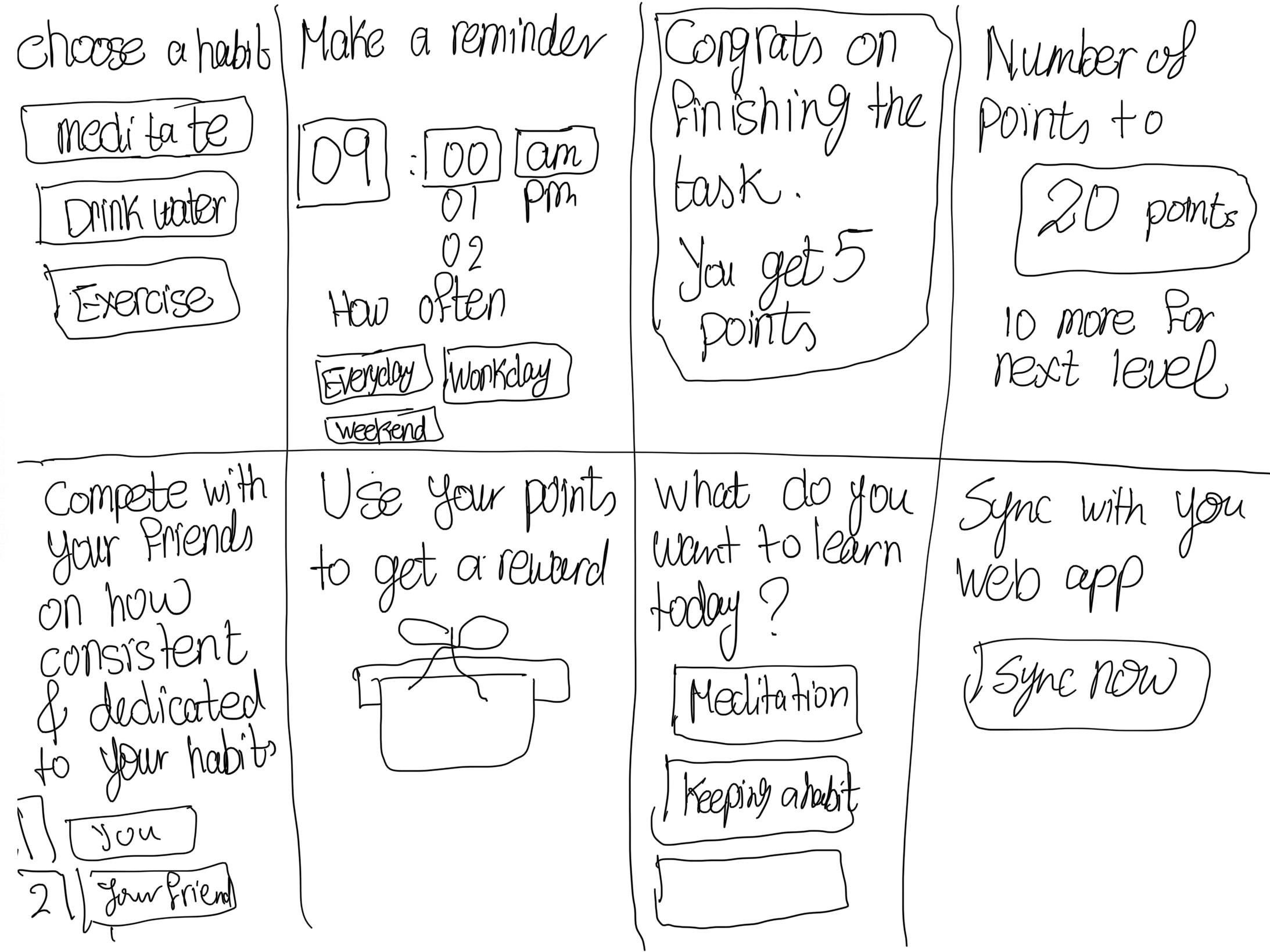
This method is for exploring tons of ideas with a limited amount of time. What sort of features would be in your app or website? You should make a timer for 8 minutes. Sketch 8 ideas on a piece of paper that is folded to make you small 8 pages. I just used the Notes app on my iPad. I sketched a few screens that would be in my app. The first things that came to my mind. It took a little over 8 minutes. Here are the sketches.
Conclusion
This was the end of week 1. I found out that the more work you do in one step, the easier the step after would be. Don't rush and be patient with each step and trust that each step has a purpose even if you don't believe it 😁.
Thanks for reading and stay tuned to week 2 of this course where I will be sketching the wireframes and building the low-fi prototype, i.e. the fun part 🙌.
Subscribe to my newsletter
Read articles from Dev Rayda directly inside your inbox. Subscribe to the newsletter, and don't miss out.
Written by

Dev Rayda
Dev Rayda
An indie app developer and blogger. I developed bubblenum app using Android studio and AddUp monster game using Unity. Learning about UX design.