How to do a Material 3 pull refresh
 bambooapps
Table of contents

Why we made it
Recently, in one of our projects, we were faced with the requirement to support the pull refresh gesture to update the local data from the server. For those unaware, pull refresh is the process of pulling down a screen to refresh a page on a mobile app. You can read more about the feature here.
The problem was, we were using Material 3 and Jetpack Compose, and there was only a Material 2 pull refresh available. And the downside of using the Material 2 library in a Material 3 app is that Android Studio will suggest imports for both Material 2 and Material 3 components, which is easy to miss.
If that happens, you’ll only notice that something looks off after building the app. It quickly becomes annoying.
But when we looked at the code of the Material 2 pull refresh component, it turned out it wasn’t all that complicated. So, we extracted it, adapted it for the Material 3 design language, and decided to publish it as a separate open-source library.
Thus, we are happy to introduce “compose-material3-pullrefresh” to the community.
In this article, we’ll show how to use our library and explain how it was created.
Usage
We recommend using the version catalog to define the dependency:
[versions]
# …
pullRefresh = "1.0.0"
[libraries]
pullrefresh = { module = "eu.bambooapps:compose-material3-pullrefresh", version.ref = "pullRefresh" }
And in your app's build.gradle.kts:
dependencies {
// ...
implementation(libs.pullrefresh)
}
Alternatively, you can define the dependency directly:
dependencies {
// ...
implementation("eu.bambooapps:compose-material3-pullrefresh:1.0.0")
}
The actual usage in code is the same as for the Material 2 pull refresh. First, you will need to initialize the state for pull-to-refresh:
val isRefreshing by remember {
mutableStateOf(false)
}
val state = rememberPullRefreshState(refreshing = isRefreshing, onRefresh = {})
Then, you'll need to add a modifier to your composable, e.g. LazyColumn:
LazyColumn(
modifier = Modifier.pullRefresh(state)
) {
// ...
}
The composable that will have the pullRefresh modifier should be scrollable, so that the modifier can receive scroll events and show the indicator. After that, you'll need to add an indicator somewhere near the composable that you've applied the pullRefresh Modifier to.
We recommend to wrap it into a Box together with the indicator, so you can neatly position the latter:
PullRefreshIndicator(
refreshing = isRefreshing,
state = state,
modifier = Modifier
.align(Alignment.TopCenter)
)
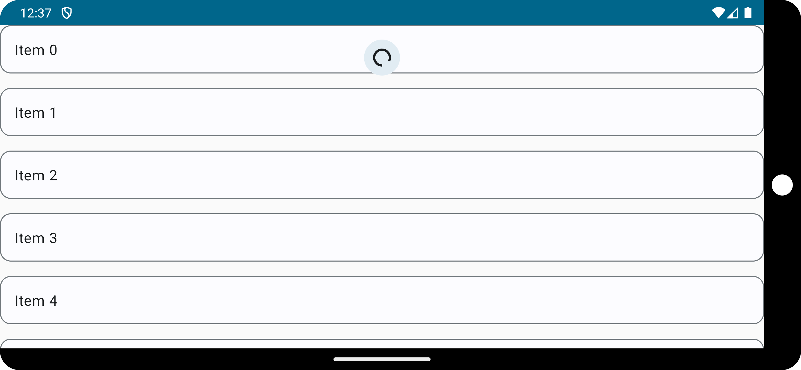
Here's a full example:
@OptIn(ExperimentalMaterial3Api::class)
@Composable
fun PullToRefresh(modifier: Modifier = Modifier) {
Box(modifier = modifier) {
val isRefreshing by remember {
mutableStateOf(false)
}
val state = rememberPullRefreshState(refreshing = isRefreshing, onRefresh = {})
LazyColumn(
modifier = Modifier.pullRefresh(state),
verticalArrangement = Arrangement.spacedBy(16.dp)
) {
items(listOf("test 1", "test 2")) {
OutlinedCard(modifier = Modifier.fillMaxWidth()) {
Text(text = "Item $it", modifier = Modifier.padding(16.dp))
}
}
}
PullRefreshIndicator(refreshing = isRefreshing, state = state,
modifier = Modifier
.align(Alignment.TopCenter)
)
}
}
How it works
The code in the compose-material was on the sophisticated side. For some reason, the component developers didn’t use Surface for the background of the indicator – instead, they just reimplemented Surface.
But that didn’t seem to be a limitation for Material 3, and there were no methods available to reimplement Surface. So we decided to use Surface directly as a background:
@Composable
@ExperimentalMaterial3Api
fun PullRefreshIndicator(
refreshing: Boolean,
state: PullRefreshState,
modifier: Modifier = Modifier,
colors: PullRefreshIndicatorColors = PullRefreshIndicatorDefaults.colors(),
tonalElevation: Dp = PullRefreshIndicatorDefaults.Elevation,
shadowElevation: Dp = 0.dp,
scale: Boolean = false,
) {
val showElevation by remember(refreshing, state) {
derivedStateOf {
refreshing || state.position > PullRefreshIndicatorDefaults.POSITION_THRESHOLD
}
}
Surface(
color = colors.containerColor().value,
contentColor = colors.contentColor().value,
tonalElevation = if (showElevation) {
tonalElevation
} else {
0.dp
},
shadowElevation = if (showElevation) {
shadowElevation
} else {
0.dp
},
shape = SpinnerShape,
modifier = modifier
.size(IndicatorSize)
.pullRefreshIndicatorTransform(state, scale),
) {
Crossfade(
targetState = refreshing,
animationSpec = tween(durationMillis = PullRefreshIndicatorDefaults.CrossfadeDurationMs),
label = "PullRefreshIndicator",
) { refreshing ->
Box(
modifier = Modifier.fillMaxSize(),
contentAlignment = Alignment.Center,
) {
val spinnerSize =
(ArcRadius + PullRefreshIndicatorDefaults.StrokeWidth).times(
2,
)
if (refreshing) {
CircularProgressIndicator(
color = colors.contentColor().value,
strokeWidth = PullRefreshIndicatorDefaults.StrokeWidth,
modifier = Modifier.size(spinnerSize),
)
} else {
CircularArrowIndicator(
state,
colors.contentColor().value,
Modifier.size(spinnerSize),
)
}
}
}
}
}
Other code is mostly the same stuff extracted from SwipeRefreshLayout as in the compose-material.
Conclusion
Overall, porting the library and publishing it to Github was a pretty straightforward experience. At the same time, we think the result of this port can be of great help for developers who use Material 3 design in their projects. We also want to thank Google for publishing our compose-material source code.
We’ll be grateful for your feedback on the library and reports on any issues found. Feel free to contribute to this further and reach out to us for any extra info!
Subscribe to my newsletter
Read articles from bambooapps directly inside your inbox. Subscribe to the newsletter, and don't miss out.
Written by

bambooapps
bambooapps
Bamboo Apps is a trusted outsourcing partner that delivers custom software and provides skilled design & development teams for companies working with connected, autonomous, shared, and electric vehicles.