Tellaprompt Early Access: A Glimpse into Our Approach
 Khoa Lam
At Tellaprompt, our commitment lies in the power of clarity, especially during vital moments like the Early Access phase. Our prime objective? Equipping users with a clear roadmap of expectations and guiding them seamlessly through our platform. In the spirit of transparency, and potentially as a model for those on parallel journeys, we're offering a window into our document and thought process.
Leveraging Notion
Our document was crafted using Notion. The choice was clear-cut for us: Notion epitomized convenience and efficiency. With our planning, research, and miscellaneous integrations already centralized on this platform, it seamlessly fits the bill for housing this document as well. Moreover, Notion's capability to generate and disseminate public links enhanced our communication with testers, enabling us to operate at an accelerated pace.
You're welcome to explore the full document here: Tellaprompt Early Access.

Setting the Stage with Introduction and Context
We kick-started with a welcoming note, ensuring participants could immerse themselves by referencing a previously shared demo. This provided a familiar ground for our users, showcasing the interface and features even before they dove in.
A Meticulous Walkthrough
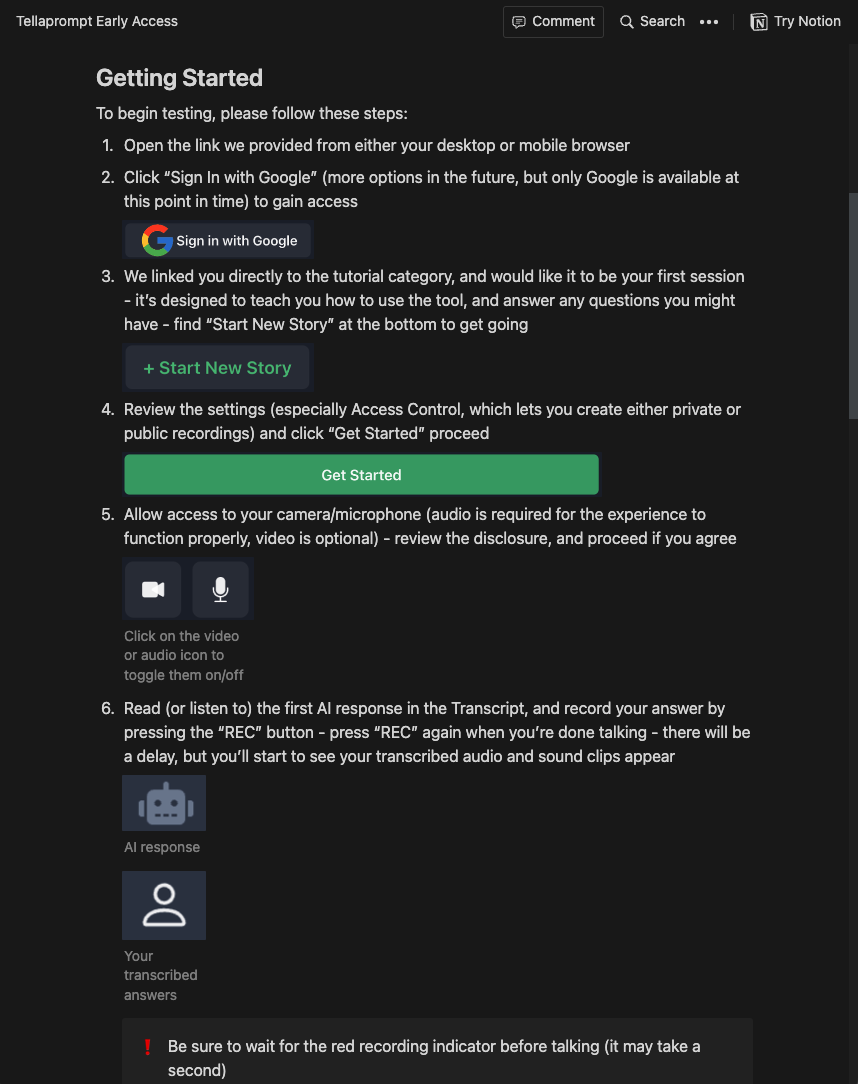
With any early version of a product, there are inherent challenges and potential shortcomings in user experience and functionality. We were acutely aware of this and recognized the significance of providing a seamless experience. Our guide, therefore, offered a detailed step-by-step walkthrough. From the initial login to exploring the platform's core features, we meticulously mapped out each phase to navigate the user through potential pitfalls and ambiguities. Every step was articulated with clarity, anticipating points of confusion and ensuring testers could fully engage with and harness the breadth of our platform.
Upholding Transparency with Known Limitations
This was a cornerstone of our approach. Being upfront about potential hiccups or areas of refinement ensured testers were well-informed. It not only set the right expectations but also fostered trust. From potential AI quirks to user experience challenges, no stone was left unturned in sharing where we were, and more importantly, where we aimed to be.
Tester Guidelines: Laying Down the Essentials
To optimize the feedback process, we presented our testers with a set of guidelines. This spectrum covered everything: from the discretion required while disseminating platform-centric content to the significance of feedback from diverse device ecosystems.
Signing Off with A Personal Touch
Rounding off our guide, we sprinkled in a touch of whimsy by concluding with a haiku. This poetic flourish wasn't just for kicks - it encapsulated our ethos and served as a rhythmic tip of the hat to our cherished testers.
Our methodology during the Early Access phase was defined by transparency, detail, and a genuine appreciation for our user community. By sharing this structure, we hope to offer insights and potentially guide others on a similar journey toward product validation.
Subscribe to my newsletter
Read articles from Khoa Lam directly inside your inbox. Subscribe to the newsletter, and don't miss out.
Written by

Khoa Lam
Khoa Lam
Inspiration chasing technologist. Craftsman of clarity. Advocate for style points.