Crafting Long-Lasting Frontend Designs: Key Considerations
 Hildor Júnior
Table of contents

If you are an application designer, you have probably seen implementations of your design that should have the same margins, paddings, text sizes, and colors but it seems like everywhere that the design should be consistent, it is a little bit different than it is on other places of the app.
The problem
As a frontend developer, I have often seen designers make wonderful designs but when the pages from Figma are transformed into code, in a team with more than one developer, after a few component implementations, there is usually a style/code duplication.
That happens because the designers tend to go straight to designing big components. And so do the developers. If we start like this, the styling will be hardly consistent throughout the application, the code will be duplicated and a lot of productive development time will be wasted.
The solution
To fix this problem, there will need to be an effort both from the design team and the developer team.
Think of every section of the application as a combination of smaller components.
Begin by designing small components first, which can be reused in both design and code. Usually, these are Texts, Headings, Inputs, Buttons and other small items that you plan to reuse in bigger sections.
You and the team should enforce that the frontend development should start with the smallest components first, then medium, and then bigger components.
Keep reusing components and maintain a consistent style.
If you, the designer, notice that a new page/section that you are designing needs a different small component that you have never used before, you NEED to point this out to the assigned frontend developer so that your new small component is implemented before the bigger section that uses it. This will ensure that the next time this same component is used, it will maintain a consistent look and behavior.
The outcome
Of course, this way of working tends to slow down the start of a big project but if your project is a long-term one, this solution will ensure that once a component is designed and implemented, there should be almost no rework needed both for the designer and the developers once that same component can be reused throughout the application.
There will be a time when the team will notice that when coding a brand new page or section, most of the work from the developer will go into just importing previously done components and getting the right data to it. Almost like a drag-n-drop code solution.
I'm currently on a project that is already benefitting from this approach and there were multiple cases in which the development work for building a new page was as easy as importing components, instantiating them in the right order, getting the page data from a CMS API and passing the data to each component. No styling work needed.
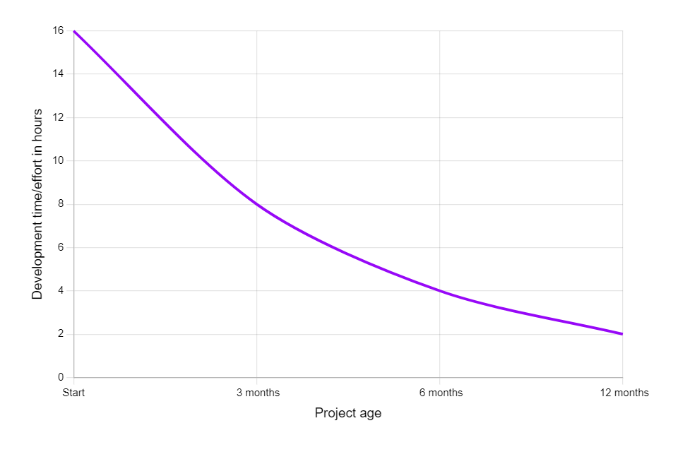
This solution speeds up the development time exponentially and the following chart exemplifies approximately how the development speed should grow as the project ages. This curve should happen because each new page will probably contain components that were already previously developed.

A known solution
There is a methodology called Atomic Design which takes all that into account and simplifies it into an easier way to understand the concept. You have multiple levels of component complexity, starting with very simple components, usually with only one goal, and then those smaller components are used in bigger ones until we get to the final level, which should be what is displayed to the user as a result.
Here is an example:
Atoms: input, label, button
Molecule: a component that combines one input and one label
Organism: a component that combines multiple molecules to create a form with multiple inputs, labels and one button
Template: a component that takes the form organism and puts it into a section that is meant to be used on pages
Page: a /contact page that uses the previously created section to display a nice cohesive form section

You can read more about the Atomic Design Methodology in this great article written by Brad Frost.
Final notes
As for my own experience, the solution explained above results in a great improvement in development speed, code quality, and reusability and I would recommend it for any long-term project.
If you like this article, subscribe to my newsletter and if you want to share your own experiences or thoughts on the topic, feel free to leave a comment.
You can also contact me through LinkedIn and if you want to know a little bit more about me, check out my website at hildor.dev.
Subscribe to my newsletter
Read articles from Hildor Júnior directly inside your inbox. Subscribe to the newsletter, and don't miss out.
Written by

Hildor Júnior
Hildor Júnior
I'm a front-end developer who alsos loves to learn about a lot of random things as games, tech, sports, woodworking, home design, gardening and anything I can get into.