Understanding Web Accessibility for All
 Kofo Cole
Introduction
The internet is a place where everyone can access information and services with ease. However, websites with poor designs can make it difficult for some people to use the web.
Cinemas in Nigeria have elevators and escalators for those with limited mobility, e.g., for people who are in wheelchairs, elderly, or tired. This is an example of accessibility put into consideration.
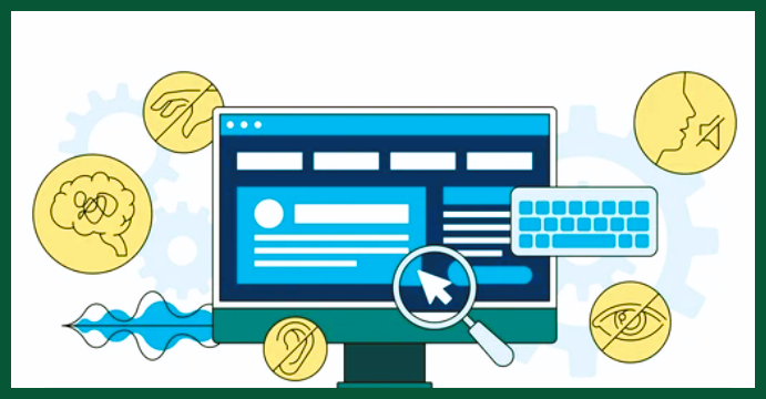
The goal of accessibility is to make the web accessible to diverse users. This includes a diverse range of hearing, movement, sight, and cognitive abilities.
Who benefits from accessibility?
Web accessibility is about making the internet usable for a variety of people.
People with disabilities: those who depend on screen readers to navigate the web
People with limitations, those using mobile devices, or those dealing with slow internet connections
People with difficulties, including the elderly
Understanding the Web Content Accessibility Guidelines (WCAG)
WCAG is like a set of rules to make the Internet fair and friendly for everyone. There are four important rules and principles of web accessibility. These state that content must be POUR (perceivable, operable, understandable, and robust).
Practical Accessibility Challenges and Solutions
My experience as a front-end developer:
My task was to improve a non-profit company website. Despite its valuable content, the site had several issues:
Lack of text alternatives for images and web elements: Sometimes, I experienced poor connection, and so images failed to load. Images that weren't rendered displayed the X sign. I addressed this by adding meaningful "alt text" to describe each image.
Keyboard Inaccessibility: Navigating the site using keyboard shortcuts and tab keys proved challenging. especially the contact and donation forms.
Disorganized HTML Content: The site's content had no clear headings or HTML elements. One solution I found was to use semantic HTML tags, e.g., <section> and <caption>, instead of <div>s. This makes the web more navigable for screen reader users and better organized for all users.
Color and Contrast: Poor color choices made the text hard to read. I improved this by selecting color palettes with better contrast and backgrounds. This ensured the text was more legible for all users.
Challenges as a Website User:
As a website user, I've encountered my share of accessibility issues:
Lack of captions, subtitles, and transcripts for media:
I couldn't understand what the characters were saying in my favorite Indian movies and anime (like cartoons). It was like trying to read a book in a language I didn't know.
No Audio/Text-to-Speech Functionality: Multitasking, like cooking while reading, presented challenges. But if the tablet could read the words to me like a storyteller, it would be much easier, and I could do two things at once.
Conclusion:
Accessibility should be a top priority for everyone. You should consider it from the very beginning of any project, so you don’t re-do work. An organization’s reach expands as more people access its resources and services. It's a win-win situation for all.
Subscribe to my newsletter
Read articles from Kofo Cole directly inside your inbox. Subscribe to the newsletter, and don't miss out.
Written by

Kofo Cole
Kofo Cole
Experienced Frontend Engineer, Social Media Manager, and Technical Writer with a passion for problem-solving and attention to detail. I offer comprehensive social media management, top-notch frontend development, and precise technical writing services to help your business achieve outstanding results.