CSS Layout Patterns #7
 nidhinkumar
If you don’t have time to read but want to know what’s there in this post. Find the quick read 👇

On this Series
We are going to look at the commonly used CSS layout patterns. Most of the patterns which we are going to see use CSS grid and flexbox to achieve the common UI patterns such as cards, dynamic grid areas, and full-page layouts supported on all modern browsers.
The patterns which we are going to see in this series are
Aspect ratio Image Card
Clamping Card
Deconstructed Pancake
Holy grail layout
Line up
Pancake Stack
RAM (Repeat, Auto, Minmax)
Sidebar says something
Super centered
12-span grid
Autobot
Container query card
Content center
Fluffy center
Gentle flex
Pop n’ Plop
If you are new to this series check out the Part 6👇
On this Post
In this post, we are going to see the following patterns that are
Content center
Fluffy center
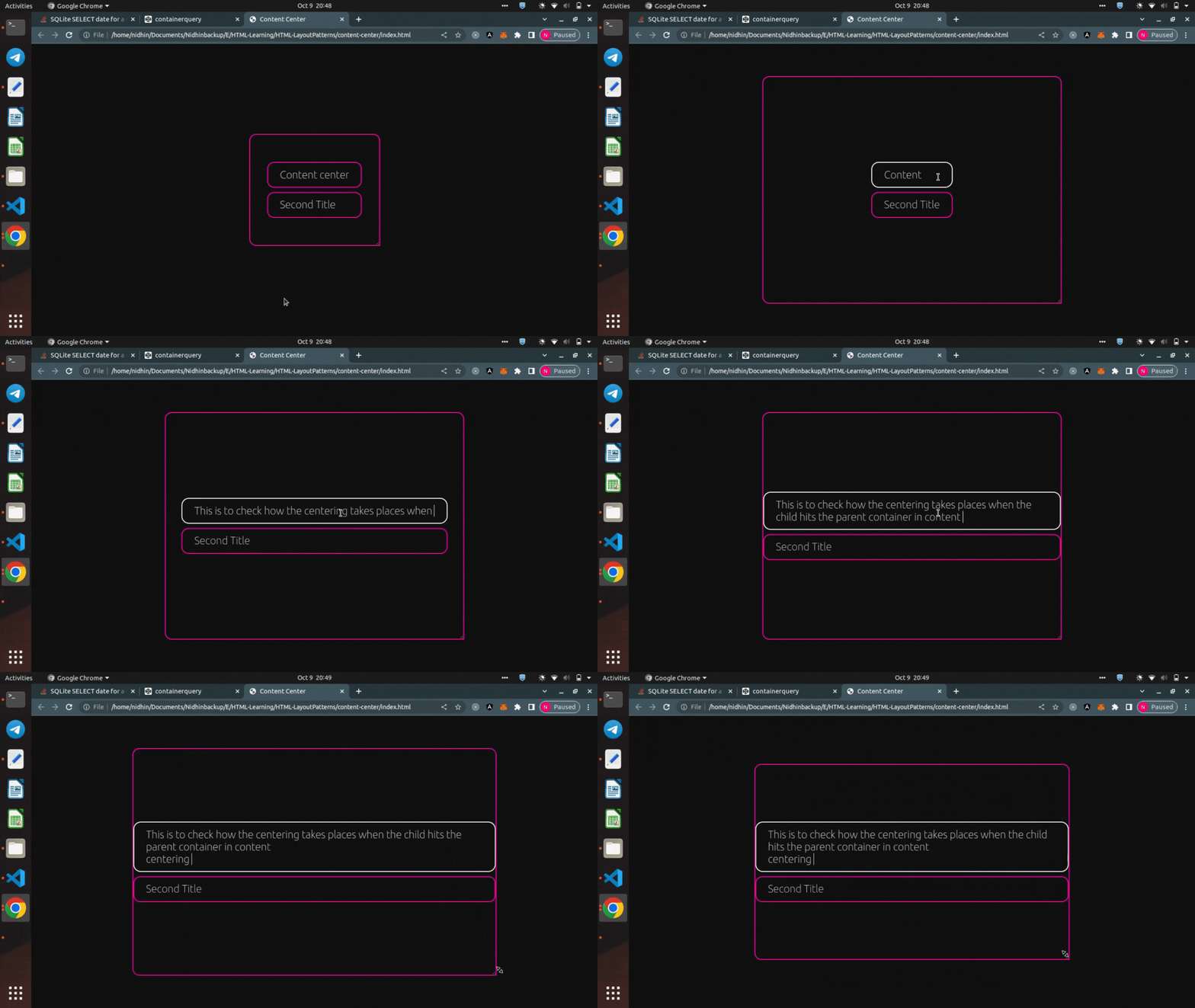
1. Content center
A centering technique that is only a few lines of CSS, works great for many elements but has the side effect of making children match the width of the widest element.
It can be used in the grid as well as in flex since it centers and justifies children collectively, it’s a solid centering technique for groups of elements meant to be read.
.content-center {
  display: grid;
  place-content: center;
  gap: 1ch;
}
Content is centred even under constrained space and overflow
Centering edits and maintenance are all in one spot
Gap guarantees equal spacing among n children
Grid creates rows by default

Content centers are great for macro layouts containing paragraphs and headlines, prototypes, or generally things that need legible centering.
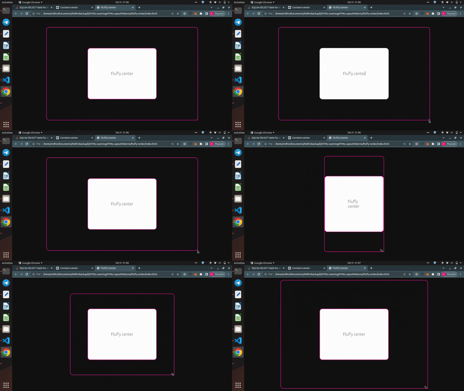
2. Fluffy Center
A centering technique that puts the content in the center via equal padding around all its sides.
It is the only centering technique that’s entirely element/child owned.

Protects content
Every test is secretly containing this centering strategy
Word space is gap
There’s a clash between the container and the items, naturally since each are being very firm about their sizing
Fluffy center are great for word or phrase-centric centering, tags, pills, buttons, chips, and more.
Congratulations!!!

Subscribe to my newsletter
Read articles from nidhinkumar directly inside your inbox. Subscribe to the newsletter, and don't miss out.
Written by

