Revamping A Fintech App
 Collins Kiarie
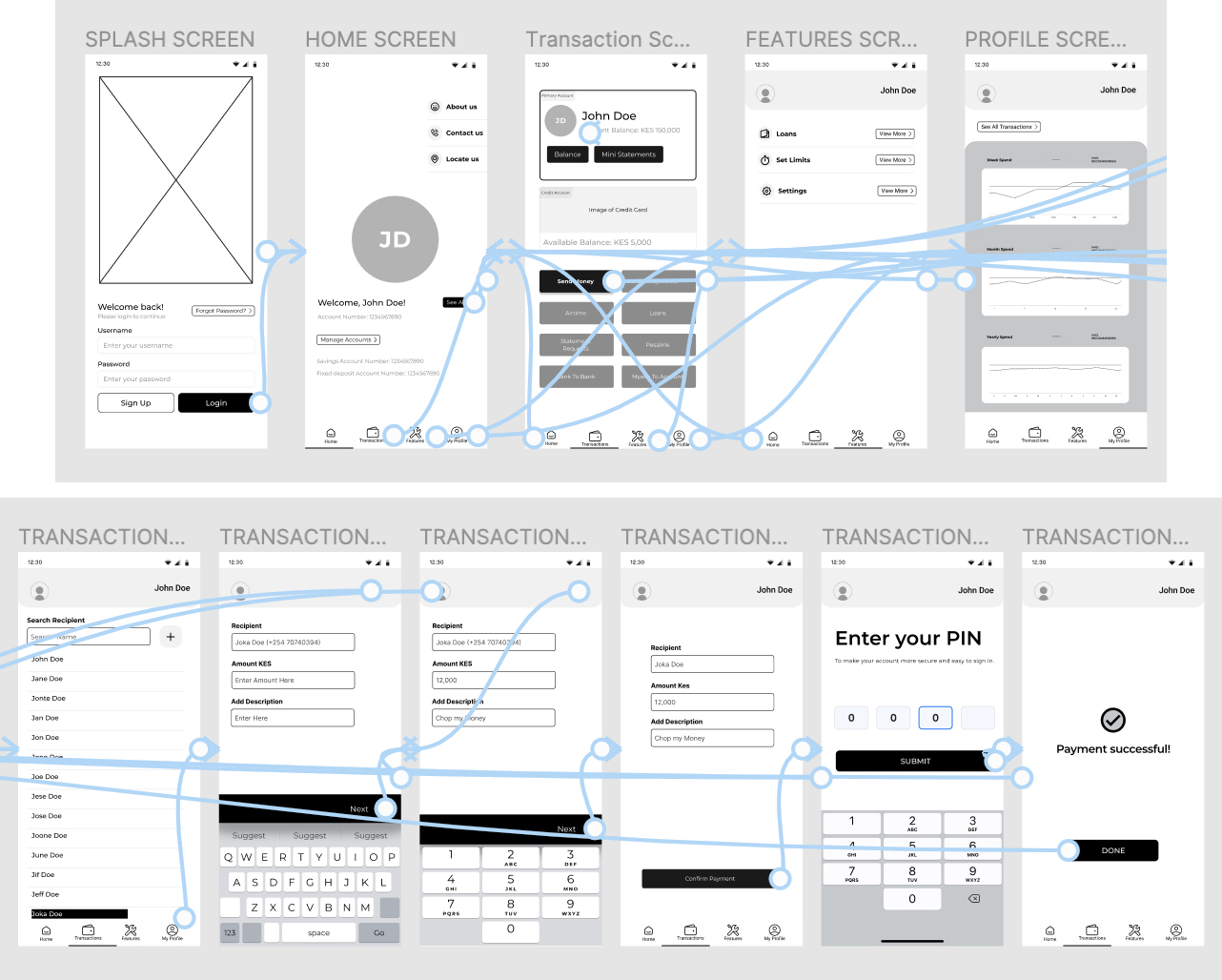
Welcome to the exciting Phase 1 of our fintech app redesign journey! We're about to embark on a thrilling adventure, crafting a fresh look and feel for our app. The objective? To make it more intuitive, user-friendly, and accessible for all. With wireframes and low-fi prototypes as our trusty tools, let's dive into this transformative phase of the project.
Wireframe Magic:
Phase 1 is all about laying the foundation for our fintech app's makeover. The wireframing stage is where the real magic happens. Imagine it as a blueprint for our app's new home - we're sketching out the rooms, deciding on the furniture, and ensuring everything is in the right place. In other words, we're creating the skeleton of our user interface, streamlining the layout, and making sure it's a breeze for users to navigate.
Low-Fi Prototypes: Bringing Ideas to Life:
As we move forward, we'll turn our wireframes into low-fi prototypes. These are like the first drafts of our fintech app's new look, where we get to see our ideas take shape. It's a bit like decorating the rooms we sketched in our wireframes; we add some color, place the furniture, and see how everything comes together. These low-fi prototypes may look simple, but they're the first steps to a user-friendly, accessible design.
Lessons from the First Phase:
This phase is a vital part of our journey. We've learned to keep things simple, make sure every element serves a purpose, and think about how different users might experience our app. It's a reminder that design is all about the people who use our app, their needs, and their preferences. Our app is for everyone, and inclusivity is at the heart of this phase.
Looking Ahead: More Adventures Await!
Our fintech app redesign adventure is far from over. In the coming phases, we'll refine and fine-tune our low-fi prototype, making it even more user-centric and accessible. There will be user testing, more insights, and exciting tweaks on the horizon.
Phase 1 - A Promising Start
Phase 1 has been a promising start to our fintech app's redesign journey. Wireframing and low-fi prototyping are where we shape the app's future. We're excited about the road ahead, and we can't wait to share more of this journey with you. It's all about making the app more intuitive, user-friendly, and accessible for everyone. Stay tuned for more updates as we transform our fintech app!
Subscribe to my newsletter
Read articles from Collins Kiarie directly inside your inbox. Subscribe to the newsletter, and don't miss out.
Written by

Collins Kiarie
Collins Kiarie
Meet the 'AD-man' in the midst of a fascinating transition! 🚀 I'm your friendly neighborhood Copywriter and Graphic Designer on a whirlwind adventure through the magical realm of UI/UX design. 🎨✍️ Buckle up, because I'm here to take you on a wild ride, complete with all the highs and lows, the Low-fi's that make you raise an eyebrow, and the High-fi's that make you say, "Wowza!" 🚀✨ Join me as I navigate this epic journey, sharing laughs, lessons, and a whole lot of design pizzazz along the way. 🎢💫 Stay tuned for an unforgettable creative ride! 🎉🤩