Why use CSS Media Queries?
 Yusuf Abdulmuizz
What are Media Queries?
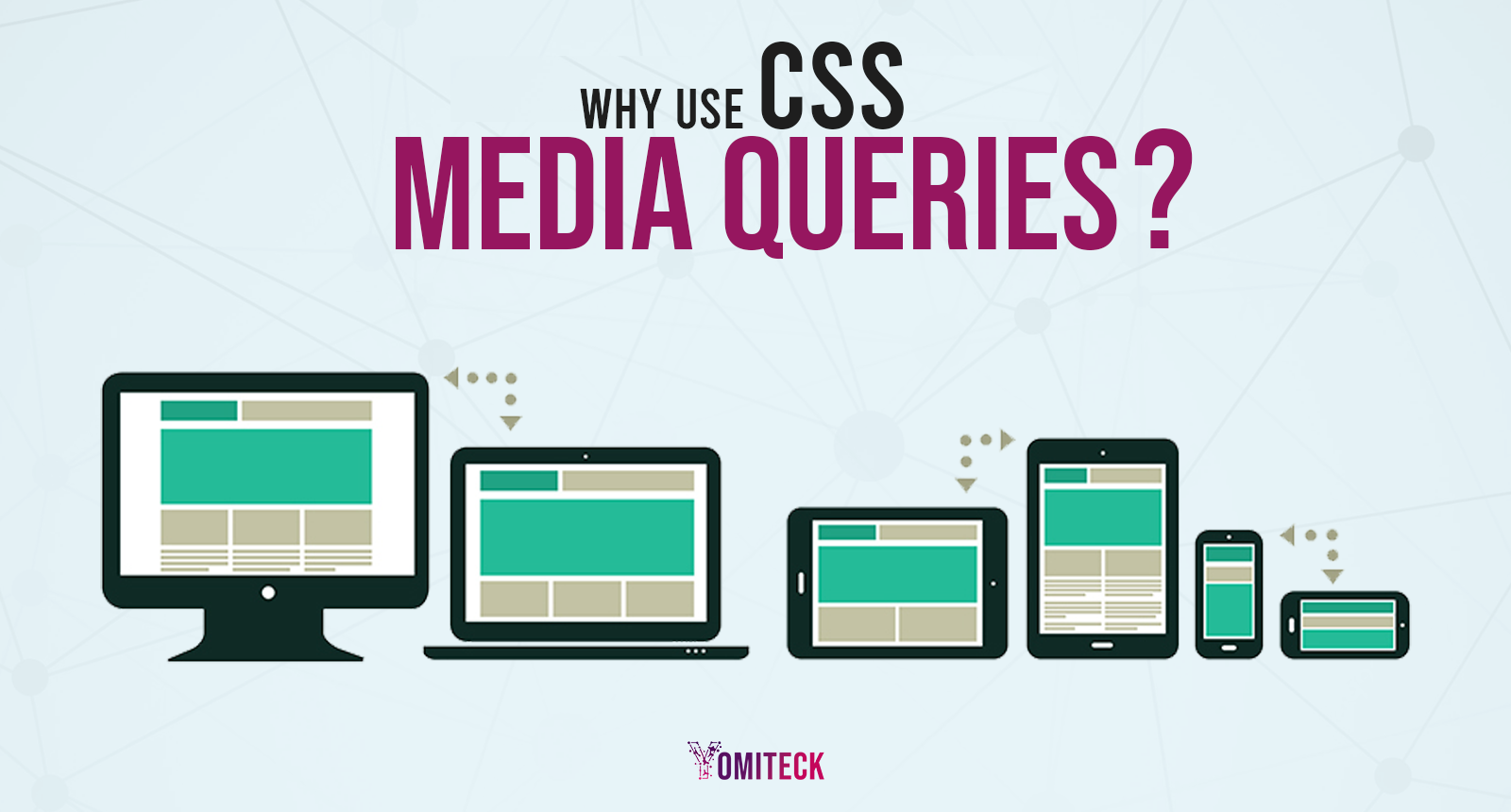
Media queries are used to adjust the appearance and functionality of a website based on a matched set of parameters regarding the user's device, browser, and system settings. The use of CSS media queries is to target browsers based on certain characteristics, features, and user preferences, followed by the use of codes to execute those styles. The most common media queries target specific viewport ranges and apply custom styles, i.e., if the viewport is within this range, then apply these custom styles. It is widely known as RESPONSIVE DESIGNS.
The most common use of media queries is in CSS but it can be used within HTML and Javascript as well.
USAGE IN HTML
- Using the media attribute in the < style > tag to target the new style. An example is displayed below.
<style>
p {
    background-color: yellow;
    color: red;
  }
</style>

<style media="all and (max-width: 500px)">
  p {
    background-color: blue;
    color: white;
  }
</style>
Using media queries within the < link > tag of an HTML file is the second method. This implies that instead of having a single huge stylesheet including the styling preferences for mobile devices, tablets, and personal computers, you could utilize three independent CSS files and create media queries within the < link > tag. The code below should be placed in the tag of your HTML file. Now all you need to do is create three separate CSS files with the file names main.css, tablet.css, and smartphone. css—then create the specific design that you would want for each device.
<head>
 <link rel="stylesheet" href="main.css">

 <link rel="stylesheet" media="(max-width:800px) and (min-width:451px)"
  href="tablet.css">

 <link rel="stylesheet" media="(max-width:450px)" href="smartphone.css">
</head>
Our focus is on CSS media queries, so we won't be diving deep into the JavaScript implementation. You can click the Link for more knowledge on media query implementation with JavaScript.
USAGE IN CSS
Media queries, a fundamental component of CSS (Cascading Style Sheets), allow you to specify different styles and layouts based on specific conditions, such as screen width, height, or orientation.
@media Rule
The @media can be used to apply part of a style sheet based on the result of one or more media queries. With it, you specify a media query and a block of CSS to apply to the document if and only if the media query matches the device on which the content is being used.
Syntax
The @media at-rule may be placed at the top level of your code or nested inside any other.
/* At the top level of your code */
@media screen and (min-width: 900px) {
  section {
    margin: 1rem 3rem;
  }
}

/* Nested within another conditional at-rule */
@supports (display: flex) {
  @media screen and (min-width: 900px) {
    section {
      background-color: green;
    }
  }
}
Check the Link for more Media Queries Rule.
Subscribe to my newsletter
Read articles from Yusuf Abdulmuizz directly inside your inbox. Subscribe to the newsletter, and don't miss out.
Written by

Yusuf Abdulmuizz
Yusuf Abdulmuizz
I am a software developer, UI/UX, and Graphics designer. I love sports, particularly Football, and enjoy writing as well.