Intro to UI Design
 Henna Singh
Contents
UI Design Fundamentals
Build a simple layout
Full project refactoring
Design Fundamentals
White Space
Color
Contrast
Scale
Alignment
Typography
Visual Hierarchy
White Space
White Space is the empty space b/w the elements in the user interface. The primary properties to define white space in CSS are padding and margin.

The only change applied is white space.
.secondary {
    padding: 1.9em;
}

.secondary h1 {
    margin-bottom: .5em;
}

.secondary p {
    line-height: 1.5em;
}
Alignment
Alignment in UI design is the process of ensuring that every element is positioned correctly in relation to other elements.
Before
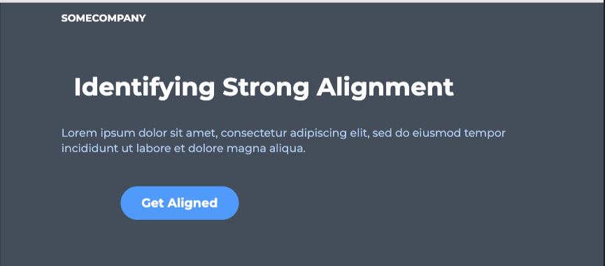
Each element in UI defines a series of rows and columns
After
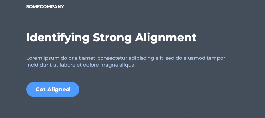
h1 { margin-left: 0; }
button { transform: none; }
a.logo { text-align: left; }
A codepen design challenge to practice (solution is js section)
https://codepen.io/hennasingh04/pen/JjxrBmE
Contrast
Contrast is defined as being in a 'strikingly' different state from something else.
WCAG 2.0 Contrast Guidelines
(minimum AA)
The visual presentation of text and images of text has a contrast ratio of at least 4.5:1, except for large text which should have a contrast ratio of at least 3:1.
(Enhanced AAA)
The visual presentation of text and images of text has a contrast ratio of at least 7:1, except for large text which should have a contrast ratio of at least 4.5:1.
Contrast Checking Tools
Browser Plugins
Websites
UI Designs Application Plugins (Sketch, Figma, Adobe Experience Design)
Before

After

p {
    color: #002A4E;
}

a {
    background: #006BC6;
    color: white;
}
Scale
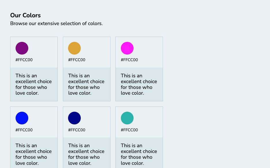
Just as with alignment, white space, contrast, and the other fundamentals, the size of every UI element must be carefully considered.
Before
After
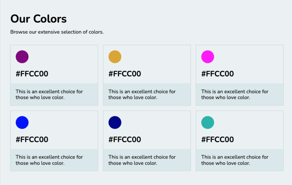
.color-container {
    grid-template-columns: repeat(3, auto);
}

h1 {
    font-size: 2.2em;
}

p.code {
    font-size: 1.5em;
    font-weight: bold;
}
Codepen for same - https://codepen.io/hennasingh04/pen/YzBrOWj
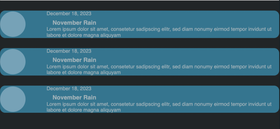
Design Challenge
Fixing below: https://codepen.io/hennasingh04/pen/NWoaLbK
Typography
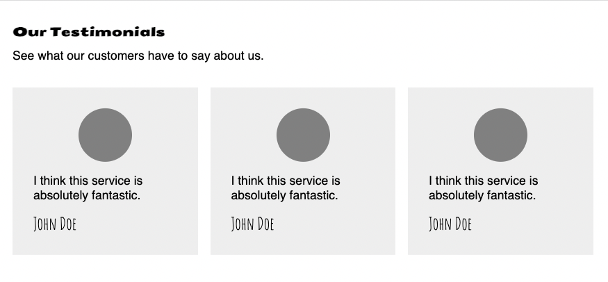
Font Choices (1-2 max)
Visual Hierarchy (order of importance taking into account other fundamentals)
Font size (scale)
Alignment
Letter spacing & line height
Font styles (weight, italics etc)
Color & Contrast
Before
After
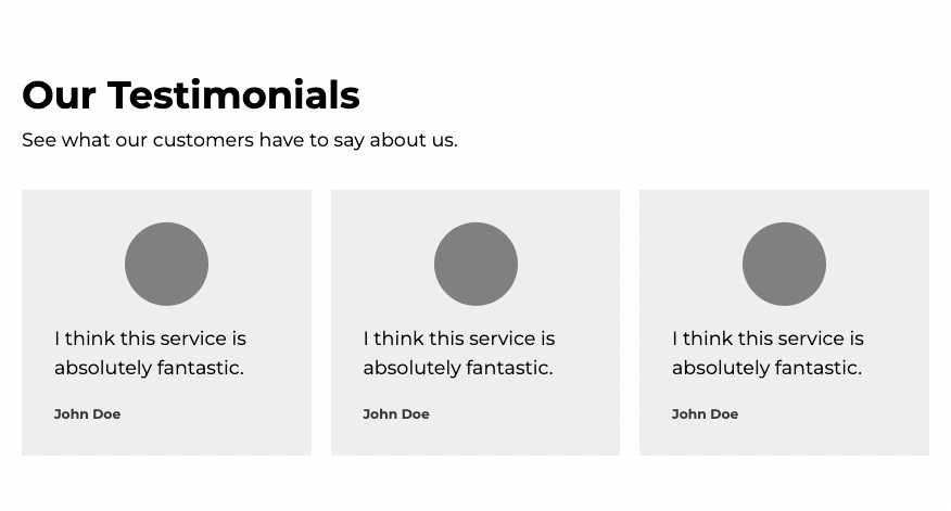
h1, p, blockquote p, cite {
    font-family: 'Montserrat';
}

h1 { /* Our Testimonials*/
    font-size: 2em;
}

blockquote p { /* The actual testimonial*/
    line-height: 1.5em;
}

cite { /*author*/
    font-size: .7em;
    font-weight: bold;
    color: #373737;
}
Color
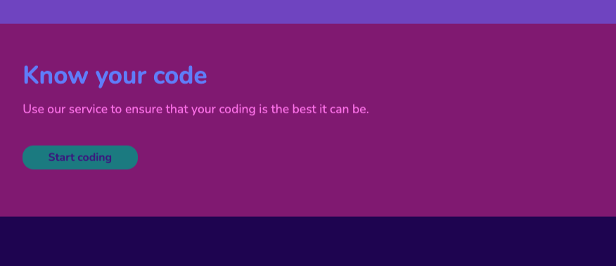
The first UI design fundamental that shapes a user's experience is color. Using too many colors is not a good thing. Color contrasts are important.
Before
After
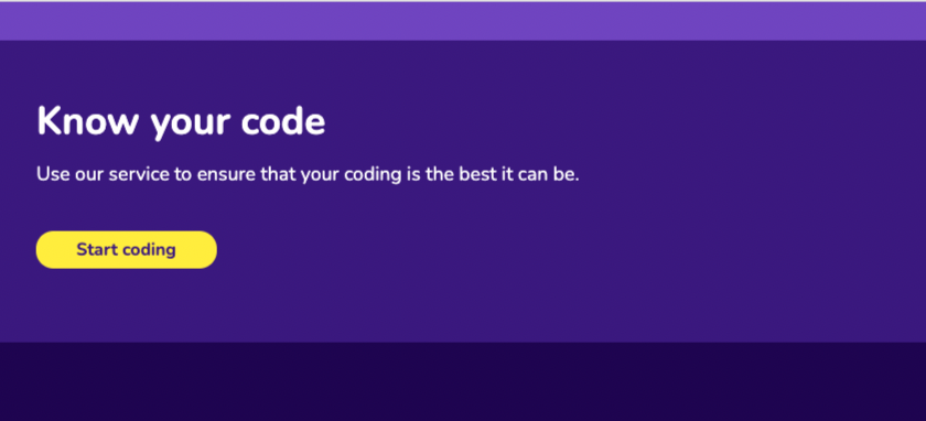
.container {
    background: #3C1581;
}

h1, p {
    color: white;
}

a {
    background: #FEED00;
}
Design Challenge - color
https://codepen.io/hennasingh04/pen/abXLQdz
Visual Hierarchy
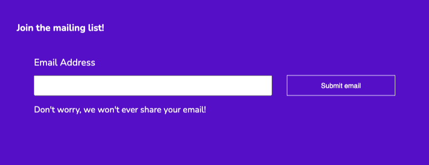
Every element on a user interface has a level of importance. Some elements are more important than others. Visual Hierarchy is how we establish this importance.
A combination of different UI fundamentals can be used to establish a visual hierarchy
After

Design Challenge- Visual Hierarchy
https://codepen.io/hennasingh04/pen/ExrwGYZ
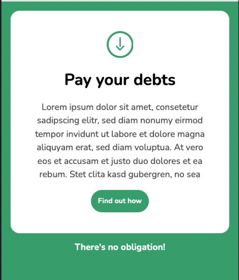
My Solution
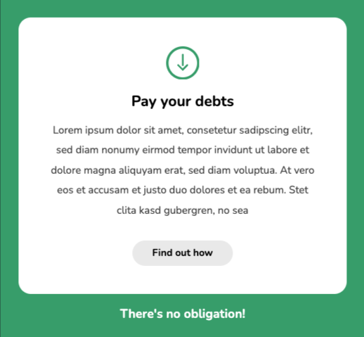
Instructor solution
body {
    padding: 1.5em;
}

svg {
    width: 2.7em;
}

h1 {
    font-size: 1.2em;
    font-weight: bold;
}

.card p {
    line-height: 1.9em;
    color: auto;
}

a {
    background: #e9e9e9;
    padding: .7em 2em;
    margin-top: 1em;
}
Final Challenge
https://codepen.io/hennasingh04/pen/YzBrdwv
My solution
body {
    grid-gap: 2em;    /* Improve the white space */
}

.content {
    background: #1C6EFD;  /* Improve the color/contrast */
    padding: 1.5em 1em;     /* Improve the white space */
}

h1 {
    margin-left:auto;  /* Improve the alignment */
    font-size: 1.2rem;   /* Improve the visual hierarchy */
}
Instructor Solution
body {
    grid-gap: 2em;    /* Improve the white space */
}

.content {
    background: #0044B9;  /* Improve the color/contrast */
    padding: 1.5em;     /* Improve the white space */
}

h1 {
    margin-left: 0;  /* Improve the alignment */
    font-size: 2.3em;   /* Improve the visual hierarchy */
}
Subscribe to my newsletter
Read articles from Henna Singh directly inside your inbox. Subscribe to the newsletter, and don't miss out.
Written by

Henna Singh
Henna Singh
Driven professional with expertise in problem-solving, relationship building, and event organization, complemented by a strong presence in blogging and public speaking. Currently studying Frontend Development Career Path from Scrimba and working as Program Manager at MongoDB. I am actively looking to switch to a more technical profile and build web solutions. I bring great leadership, program management and customer engineering background, that proves my strong interpersonal, team building and resourceful skills