Bottom Navigation Bar in jetpack Compose using Material3 (UI/UX)
 Vyom Singh
Hi Devs, in this article i am going to show you how you can design bottom navigation bar in jetpack compose using navigation component(nav controller and nav host).
Step 1: Set Up a Compose Project
Firstly, create an empty Android Studio project. Open your build.gradle (Module: app) file and add the following dependency for navigation-compose:
implementation ("androidx.navigation:navigation-compose:2.7.5")
Sync your project to ensure the dependency is downloaded.
Step 2: Define BottomNavScreen Class
In your project, create a Kotlin file (e.g., BottomNavScreen.kt). Define a sealed class BottomNavScreen that represents each screen in your app's bottom navigation bar:
sealed class BottomNavScreen (
    val name : String,
    val route : String,
    val selectedIcon: ImageVector,
    val unselectedIcon: ImageVector,
    val hasNews: Boolean,
    val badgeCount: Int? = null,
){

    object Home : BottomNavScreen(
        name = "Home",
        route= "home",
        selectedIcon = Icons.Filled.Home,
        unselectedIcon = Icons.Outlined.Home,
        hasNews =true,
        badgeCount = null
    )
    object Email : BottomNavScreen(
        name = "Email",
        route= "Email",
        selectedIcon = Icons.Filled.Email,
        unselectedIcon = Icons.Outlined.Email,
        hasNews = false,
        badgeCount = 9
    )
    object Settings : BottomNavScreen(
        name = "Settings",
        route= "Settings",
        selectedIcon = Icons.Filled.Settings,
        unselectedIcon = Icons.Outlined.Settings,
        hasNews = true,
        badgeCount = null
    )

}
Understanding the BottomNavScreen Class:
The BottomNavScreen class is a sealed class representing each screen in your app's bottom navigation bar. Here's a breakdown of its properties:
name: A string representing the name of the screen (e.g., "Home", "Email", "Settings").route: A string representing the route associated with the screen.selectedIconandunselectedIcon: ImageVectors representing the icons for the screen when it is selected and unselected, respectively.hasNews: A boolean indicating whether there is news or updates for this screen, if there is news or urgent message we will show bubble .badgeCount: An optional integer representing the count for a badge .
Step 3: Create Composable Screens
Create individual composable functions for each screen (Home, Email, Settings) in separate files (e.g., HomeScreen.kt, MessageScreen.kt, SettingsScreen.kt). Use the Box composable to display a centered text indicating the screen:
@Composable
fun HomeScreeen() {
    Box(modifier = Modifier.fillMaxSize(),
        contentAlignment = Alignment.Center){
        Text(
            text = "Home"
        )
    }
}

@Composable
fun MessageScreen() {
    Box(modifier = Modifier.fillMaxSize(),
        contentAlignment = Alignment.Center){
        Text(
            text = "Message"
        )
    }
}

@Composable
fun SettingsScreen() {
    Box(modifier = Modifier.fillMaxSize(),
        contentAlignment = Alignment.Center){
        Text(
            text = "Settings"
        )
    }
}
Step 4: Implement BottomNavgraph Composable
Create a composable function BottomNavgraph in a new Kotlin file (e.g., Navigation.kt). Use NavHost to set up the navigation graph:
@Composable
fun BottomNavgraph(navController : NavHostController) {
   NavHost(navController = navController, startDestination = BottomNavScreen.Home.route ){
      composable(route = BottomNavScreen.Home.route){
          HomeScreeen()
      }
       composable(route = BottomNavScreen.Email.route){
         MessageScreen()
       }
       composable(route = BottomNavScreen.Settings.route){
           SettingsScreen()
       }
   }
}
the BottomNavgraph composable function is responsible for defining the navigation structure for the bottom navigation bar. It sets up the navigation host and specifies the composable functions to be invoked for each screen based on their respective routes. Each screen's content is defined in its corresponding composable function (HomeScreen(), MessageScreen(), SettingsScreen()).
Step 5: Main Activity Implementation
In your MainActivity.kt, set up the main activity. Create a Scaffold with a NavigationBar at the bottom and your BottomNavgraph composable as the main content:
class MainActivity : ComponentActivity() {
    @SuppressLint("UnusedMaterial3ScaffoldPaddingParameter")
    @OptIn(ExperimentalMaterial3Api::class)
    override fun onCreate(savedInstanceState: Bundle?) {
        super.onCreate(savedInstanceState)
        setContent {
            BottomNavigationBarTheme {
                val screens = listOf(
                    BottomNavScreen.Home,
                    BottomNavScreen.Email,
                    BottomNavScreen.Settings
                )
                val navController = rememberNavController()
                var selectedItemIndex by rememberSaveable {
                    mutableStateOf(0)
                }
                Scaffold(
                    bottomBar = {
                        NavigationBar {
                            screens.forEachIndexed { index, item ->
                                NavigationBarItem(
                                    selected = selectedItemIndex == index,
                                    onClick = {
                                        selectedItemIndex = index
                                         navController.navigate(item.route)
                                    },
                                    label = {
                                        Text(text = item.name)
                                    },
                                    alwaysShowLabel = false,
                                    icon = {
                                        BadgedBox(
                                            badge = {
                                                if(item.badgeCount != null) {
                                                    Badge {
                                                        Text(text = item.badgeCount.toString())
                                                    }
                                                } else if(item.hasNews) {
                                                    Badge()
                                                }
                                            }
                                        ) {
                                            Icon(
                                                imageVector = if (index == selectedItemIndex) {
                                                    item.selectedIcon
                                                } else item.unselectedIcon,
                                                contentDescription = item.name
                                            )
                                        }
                                    }
                                )
                            }
                        }
                    }
                ) {
                      BottomNavgraph(navController = navController)
                }
            }

        }
    }
}
Now, let's break down each step
Step 1: Create a list of BottomNavScreen items
val screens = listOf(
    BottomNavScreen.Home,
    BottomNavScreen.Email,
    BottomNavScreen.Settings
)
This list represents the screens you want to display in the bottom navigation bar.
Step 2: Create a NavController to manage navigation
val navController = rememberNavController()
rememberNavController() is a composable function that creates a NavController instance to handle navigation within your app.
Step 3: Create a variable to track the selected item index and for recomposition
var selectedItemIndex by rememberSaveable {
    mutableStateOf(0)
}
rememberSaveableis a composable function provided by Jetpack Compose that allows you to preserve the state of a variable across configuration changes.Examples of configuration changes include screen rotations or changes in system language.
It saves and restores the state when the Compose hierarchy is recreated.
Step 4: Set up the Scaffold with BottomNavigationBar
Scaffold(
    bottomBar = {
  // Bottom navigation bar setup goes here
       }
) {
    // Content of the main screen goes here
}
Scaffold is a composable that provides the basic structure for your app. It includes a bottom bar (in this case, the bottom navigation bar) and the main content area.
 NavigationBarItem(
            selected = selectedItemIndex == index,
            onClick = {
                selectedItemIndex = index
                 navController.navigate(item.route)
            },
            label = {
                Text(text = item.name)
            },
            alwaysShowLabel = false,
            icon = {
                BadgedBox(
                    badge = {
                        if(item.badgeCount != null) {
                            Badge {
                                Text(text = item.badgeCount.toString())
                            }
                        } else if(item.hasNews) {
                            Badge()
                        }
                    }
                ) {
                    Icon(
                        imageVector = if (index == selectedItemIndex) {
                            item.selectedIcon
                        } else item.unselectedIcon,
                        contentDescription = item.name
                    )
                }
            }
        )
    }
}
NavigationBarItem Attributes:
selected:- This attribute determines whether the current item is selected. It compares
selectedItemIndexwith the current index in the loop.
- This attribute determines whether the current item is selected. It compares
onClick:- This is a callback that gets executed when the item is clicked. It updates the
selectedItemIndexand triggers navigation to the associated route usingnavController.navigate().
- This is a callback that gets executed when the item is clicked. It updates the
label:- This is where you can provide a label or text that appears below the icon. In this case, it's set to the name of the item.
alwaysShowLabel:- This attribute, when set to
false, means that the label (text) below the icon will be hidden when the item is unselected. If set totrue, the label will always be visible.
- This attribute, when set to
icon:- This is where the icon for the item is set up. The icon is wrapped in a
BadgedBoxto handle badge display.
- This is where the icon for the item is set up. The icon is wrapped in a
Badge:
What is a Badge?
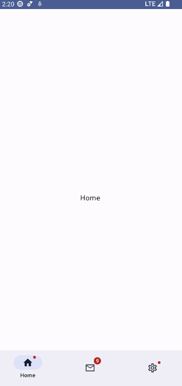
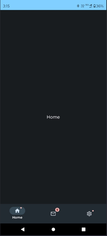
A badge is a small visual indicator, often a number or a dot, that appears on an icon to convey additional information or notifications. In this context, it may represent unread messages, updates, or any other relevant information.
Badge Setup:
BadgedBox:- This is a composable that wraps the icon and handles the display of the badge.
badge:- The
badgeattribute is where the badge content is specified. In this case, it checks if the item has abadgeCount. If it does, it displays a badge with the count; otherwise, it displays a simple badge (dot) ifhasNewsis true.
- The
Badge:- This is a composable that creates the actual badge. In this case, it contains a
Textcomposable displaying the badge count.
- This is a composable that creates the actual badge. In this case, it contains a
Putting it Together:
The NavigationBar iterates through each item in the screens list and creates a NavigationBarItem for each. The selected item is highlighted, and clicking on an item updates the selectedItemIndex and navigates to the associated route. The BadgedBox wraps the icon, and the Badge composable handles the display of the badge, providing a visual indicator for additional information or notifications related to each item.
Final Step: Integrating BottomNavgraph and Running the App
BottomNavgraph(navController = navController)
The main content of the app is set using the trailing lambda block with the BottomNavgraph composable, passing the navController to handle navigation.
ScreenShots


Thank you for reading! I hope you found this post helpful.If you want to clone the project, check out my GitHub repo: GitHub
Subscribe to my newsletter
Read articles from Vyom Singh directly inside your inbox. Subscribe to the newsletter, and don't miss out.
Written by

Vyom Singh
Vyom Singh
📱 Hey there! I'm Vyom Singh, a regular learner diving into Android development. Come with me as I figure out how to make apps and share what I learn. Let's explore Android together! 🌟📚 #AndroidDev #LearningAsWeGo