Gradients / transition in css (lt.19)
 himanshu
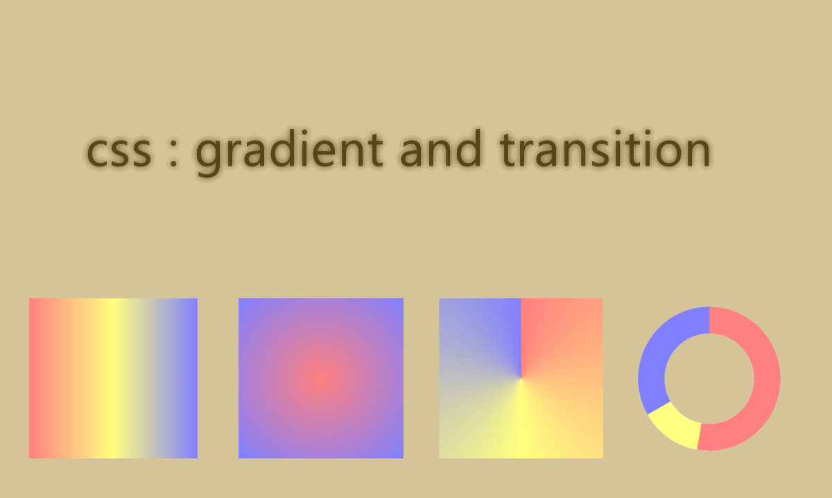
CSS gradients are a way to display smooth transitions between two or more specified colors. They are a powerful tool for applying dynamic effects on web pages. To apply gradient we have to use background image.
There are three primary types of gradients
Linear gradient : creates a smooth transition between colors along a straight line also we can give the direction i.e starting and ending point
Radial gradient: creates a circular transition of colors, emanating from a central point ,create a smooth transition of colors from the center of a circle to its perimeter.
Conic gradient :It provide a circular color transition similar to radial gradients, but instead of radiating from a central point, they rotate around a center point.
In all we can apply many combinations in these gradients.
code to demonstrate it:
<!DOCTYPE html>
<html lang="en">
  <head>
    <meta charset="UTF-8" />
    <meta name="viewport" content="width=device-width, initial-scale=1.0" />
    <title>gradient</title>
  </head>
  <body>
    <style>
      .grad {
        height: 450px;
        /* background-image: linear-gradient(red, yellow); */
        /* background-image: linear-gradient(to left,red, yellow); */
        /* background-image: radial-gradient(circle,blue,red, yellow); */
        /* background-image: repeating-radial-gradient(red 10%, yellow 20%,blue 25%); */
        background-image: conic-gradient(red 200deg, blue, green);
        /*background-image: radial-gradient(ellpise at top, red, transparent),
          radial-gradient(ellpise at bottom, rgb(215, 233, 11), transparent);*/
      }
    </style>
  </body>
  <div class="grad"></div>
</html>
Transitions:
This allows us to change the property values smoothly over a defined duration .This creates a more visually appealing and engaging experience for the user. We can do transitions in almost all properties of css.
Timing Function: Defines the acceleration curve of the transition.
Delay : Delays the start of the transition for the time specified.
code to demonstrate transition:
<!DOCTYPE html>
<html lang="en">
<head>
    <meta charset="UTF-8">
    <meta name="viewport" content="width=device-width, initial-scale=1.0">
    <title>transition</title>
    <style>
        div{
            height: 100px;
            width: 150px;
            background-color: aqua;
            transition: width 3s, height 4s;
            transition-timing-function: ease-out;
            transition-delay: 3s;
        }

        div:hover{
            width:200px;
            height:200px ;

        }
    </style>
</head>
<body>
    <div></div>
    <p title="helo">name</p>
</body>
</html>
Subscribe to my newsletter
Read articles from himanshu directly inside your inbox. Subscribe to the newsletter, and don't miss out.
Written by
