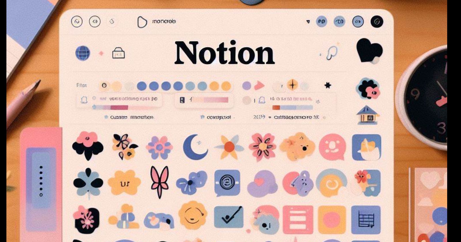
How to Make Notion Aesthetic
 Pratik M
The notion is a popular productivity and organization app that allows you to create databases, wikis, documents and more. With its flexibility and customization options, you can design Notion to not only be highly functional but also visually appealing.
Making your Notion setup look nice takes some work, but it’s worthwhile for an enjoyable user experience. Aesthetic Notion setups also tend to gain traction on social media among the app’s passionate user community.
Here are tips for making your Notion beautiful and aesthetically pleasing while remaining easy to use.
Use Custom Icons and Covers
Replace boring default icons and page covers in Notion with custom images. Icons visually identify different sections, so choose ones that represent each purpose from icon websites or create your own.
Page covers showcase your style throughout Notion. Set eye-catching cover photos for top-level pages first. Cohesive cover themes for nested subpages make databases orderly.
Uploading many quality custom images requires patience but elevates aesthetics meaningfully.
Select a Soothing Color Scheme
Notion’s interface defaults black text to white, which strains eyes over time. Set a custom soothing color scheme for a warmer feel.
First, pick 1-2 main accent colors that you enjoy. Softer muted shades usually complement most aesthetics. Then choose an off-white background color. Finally, make text shades slightly darker for adequate contrast.
Having too many colors looks chaotic. Stick to similar hues that naturally flow into each other. Use them consistently for icons, headers, backgrounds and more.
Style Text Elements Intentionally
Notion offers basic text customization like fonts, sizes, italics and more. Don’t go overboard mixing endless combinations.
Select 1-2 easy-to-read fonts for clean unity – one display-worthy for headers and a readable one for long-form text. Outline key details with styled elements like bold, highlight or a colored font to direct attention. Lists, divider lines and indentations also aid readability in paragraphs.
Text styling creates visual harmony when used cohesively. Make deliberate choices to manipulate what users notice first.
Structure Pages with Spacing
Carefully structure pages to prevent overly dense or text-heavy walls that are difficult to parse. Use spacing between sections, keeping related content in clean sections.
Add divider icons between distinct sections. Play with padding and margins around elements to further define relationships. Use nested pages, toggle lists and linked databases to reveal and hide additional details.
Thoughtful use of white space makes each page open and digestible. Regular spacing gives users’ eyes room to breathe.
Curate Clean Aesthetic Media
Displaying rich media is one of Notion’s best features. Share your interests by embedding aesthetic photos, videos, tweets, PDFs and more related to your content.
Aim for media that fits within your color palette for cohesion. Credit creators when possible. Minimize disruptive auto-play media that fights user attention. Display previews first before full images or attachments to maintain a clean page flow.
Curating on-theme media that engages without overwhelming enhances aesthetics. Bonus points if you create matching visuals yourself.
Personalize with Quotes and Details
Add personal touches like inspiring quotes, emoji reactions, page descriptions and comments. These optional details let your personality shine through your productive system.
Choose quotes resembling your motives and values. React frequently to your own content as if conversing. Use page descriptions for clarifying summaries or inside jokes. Comment gifts of encouragement to future self.
Subtle personalization makes Notion feel more human. But be wary of cluttering functionality with too many non-essential niceties.
Keep Improving Over Time
Building a polished elegant Notion requires gradual upgrades rather than all-at-once overhauls. Complex setups like color relations and nested systems are powerful but time-intensive.
Start simply with improved icons, colors and fonts to unify basic cross-pages. Then build up nested pages one by one. Refine organization systems like tables and toggle lists with filtered views to manage information. Record style inspiration from other users to regularly implement focused touch-ups.
Your ideal Notion aesthetic evolves continually. Embrace gradual progress through intentional upgrades over daily use.
Subscribe to my newsletter
Read articles from Pratik M directly inside your inbox. Subscribe to the newsletter, and don't miss out.
Written by

Pratik M
Pratik M
As an experienced Linux user and no-code app developer, I enjoy using the latest tools to create efficient and innovative small apps. Although coding is my hobby, I still love using AI tools and no-code platforms.