Design a User Experience for Social Good & Prepare for Jobs Course Journey Week 4
 Dev Rayda
This is the fourth article and final article in the series. If you haven't read them, Here are the First Article, Second Article and Third Article.
In this article, I will talk about the fourth week of the course. I will create a responsive website for the Lumi App.
Use Case
According to the course, I need to define the use case for the website. This means "how the users would experience the product", and what will they use the website for.
For the Lumi App, I know from the interviews that one user wanted to be able to sync the habits from the app with the desktop app. So, I plan to integrate all the features present in the app into the website, along with the capability to synchronize data seamlessly.
Information Architecture (IA)
When you create the IA for your website, You have to anticipate what the users need and make sure the design meets those needs.
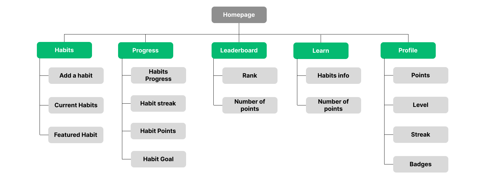
I had to create a sitemap for the website to show the main content: pages and its content as shown below.
Responsive Website Ideation
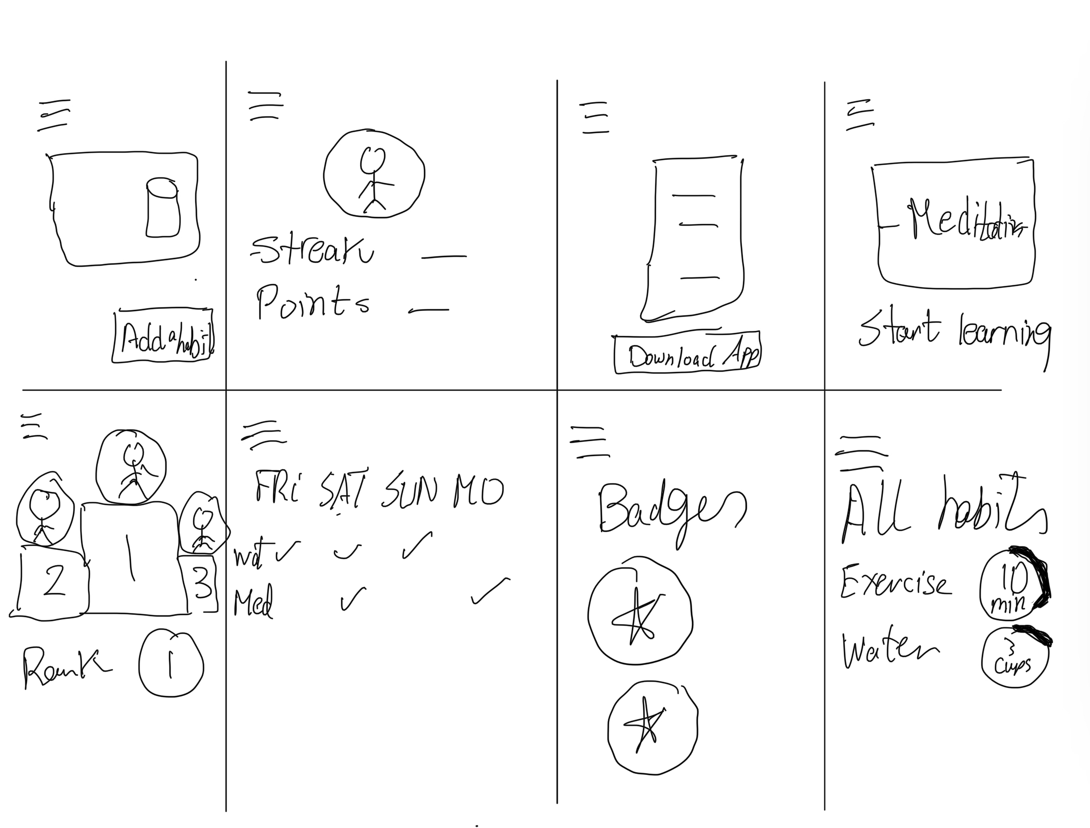
I did a quick crazy eight exercise to generate ideas for the websites. I just sketched features that should be included in the website. Here is the sketch:
Creating Wireframes
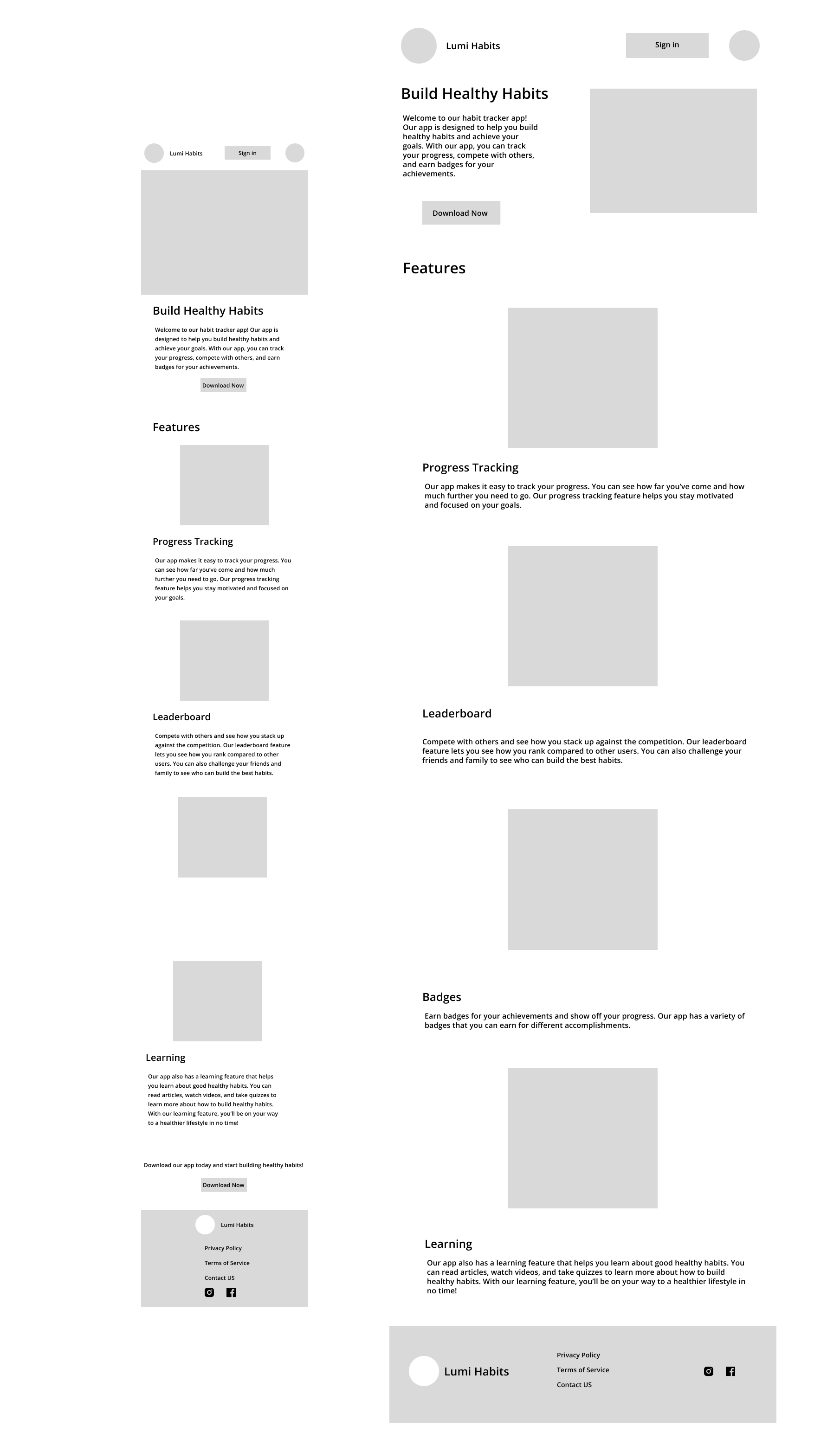
Now it is time to create the low-fidelity digital wireframes for the mobile website version for Lumi.
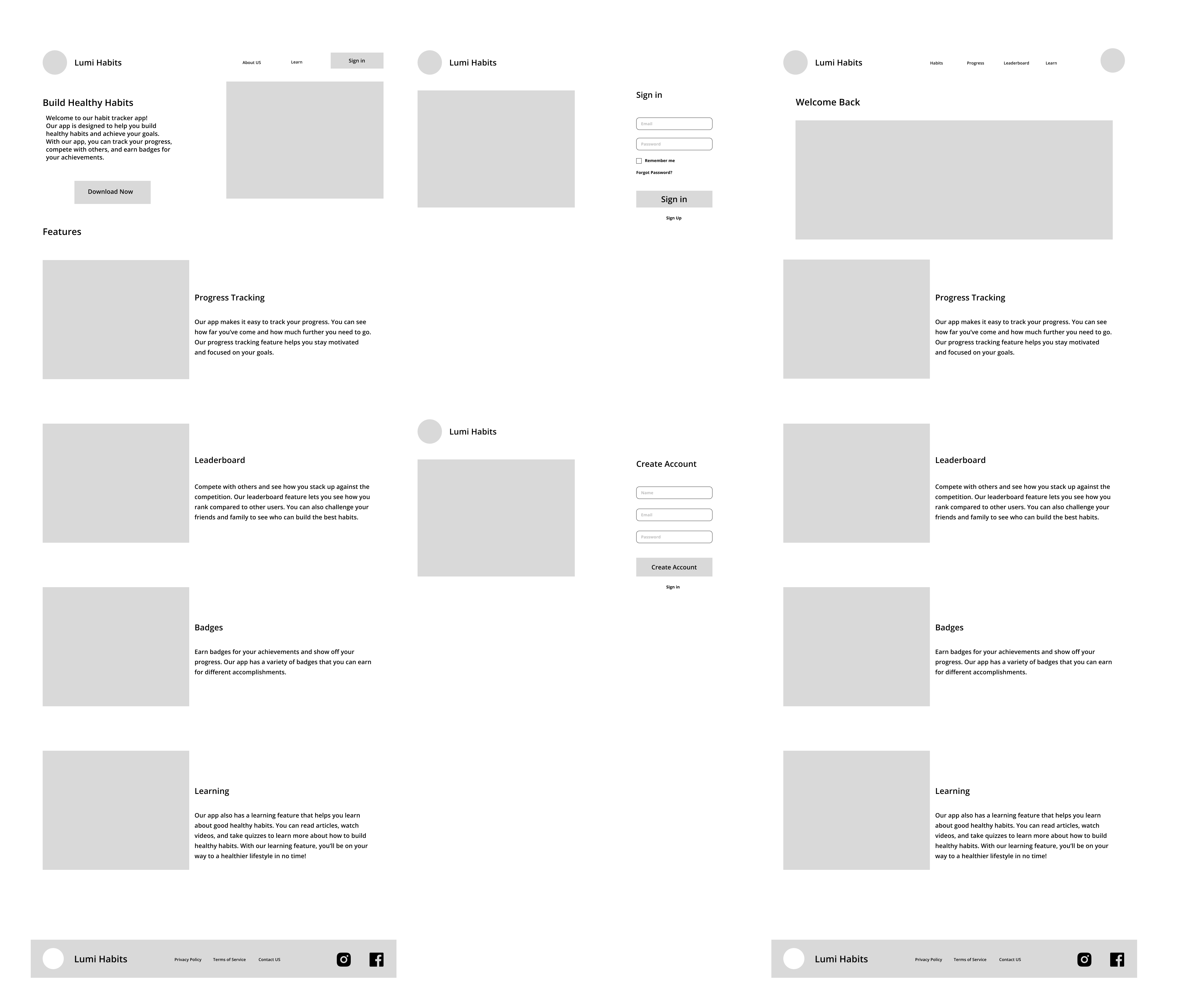
I was thinking since it is a website, not a smartphone App. I would make the homepage a landing page for the app and explain what it does, what its features are. When the user signs in, they will be able to use the web app version of Lumi.
Here are the lo-fi wireframes:
Mobile and Tablet Homepage
Desktop Website
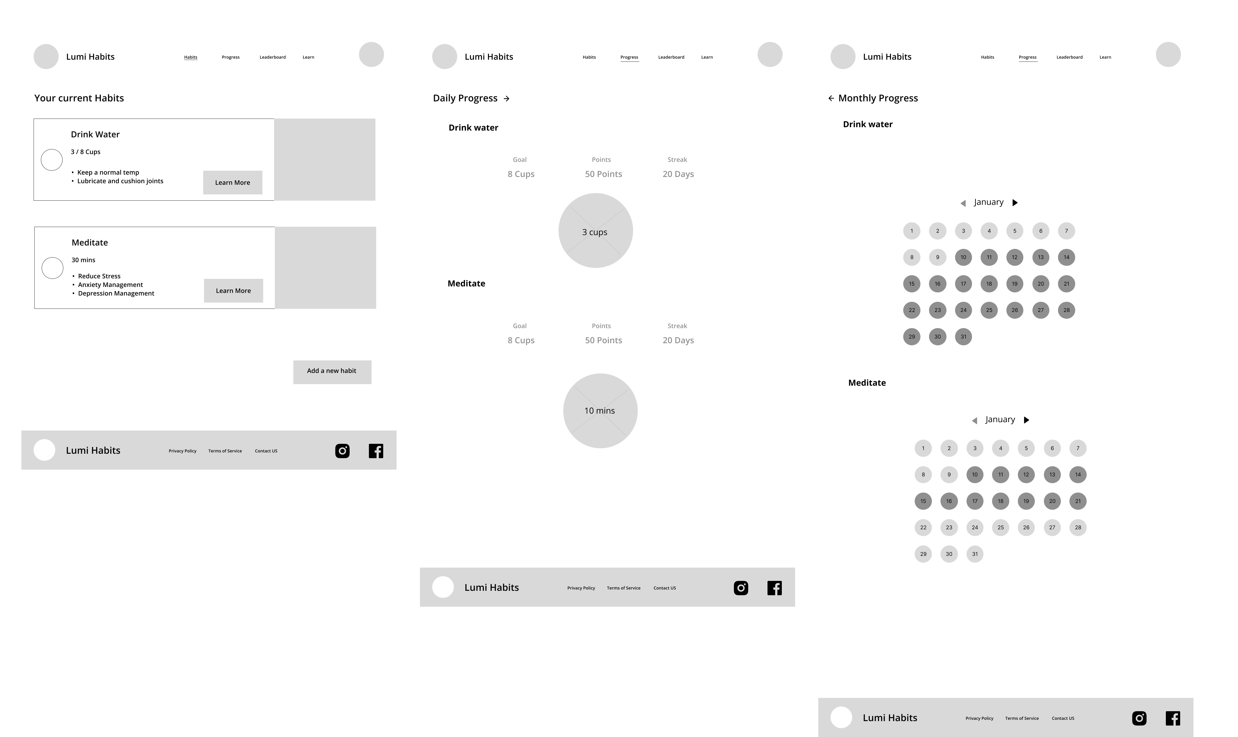
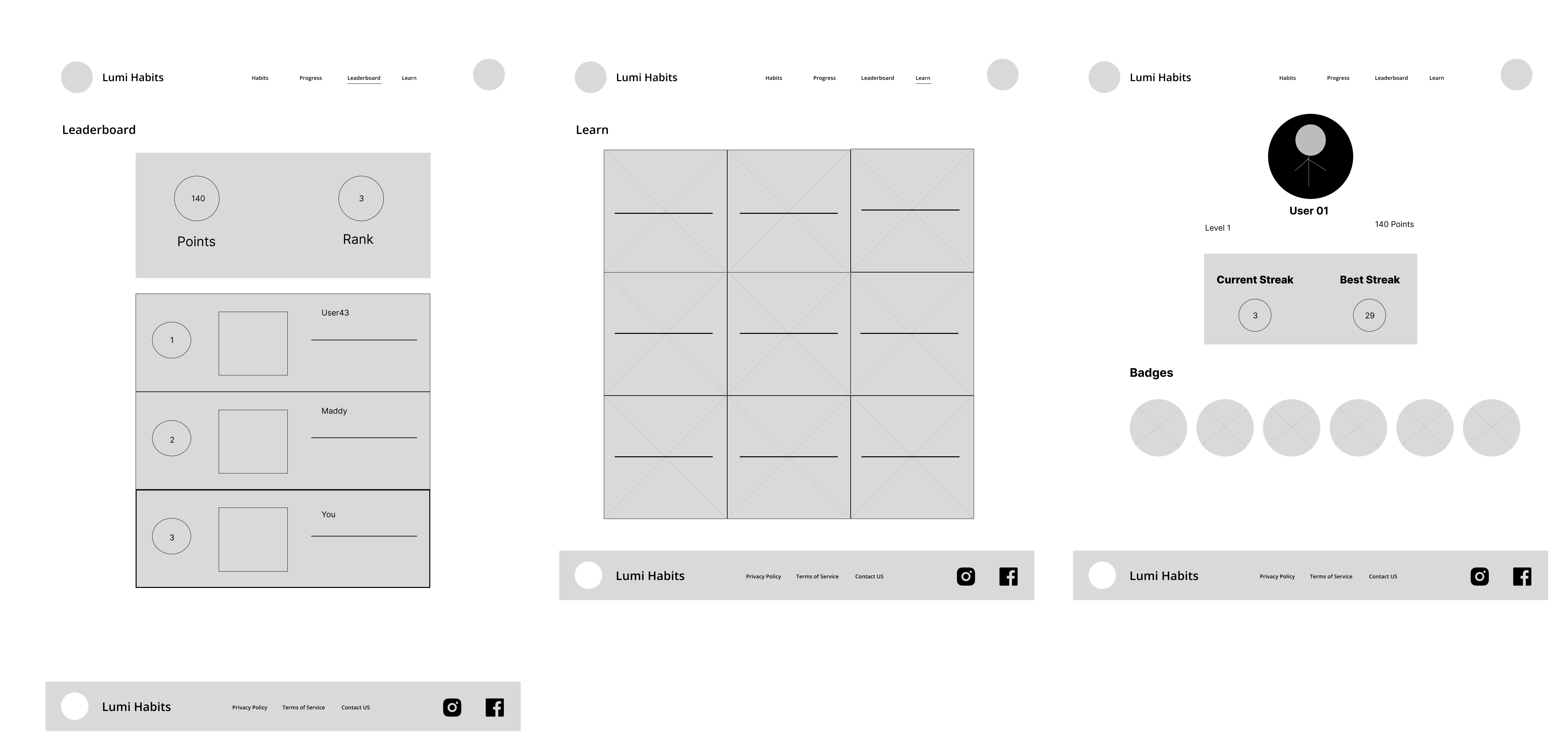
Here is the link for the prototype. I didn't design every single page on the website.
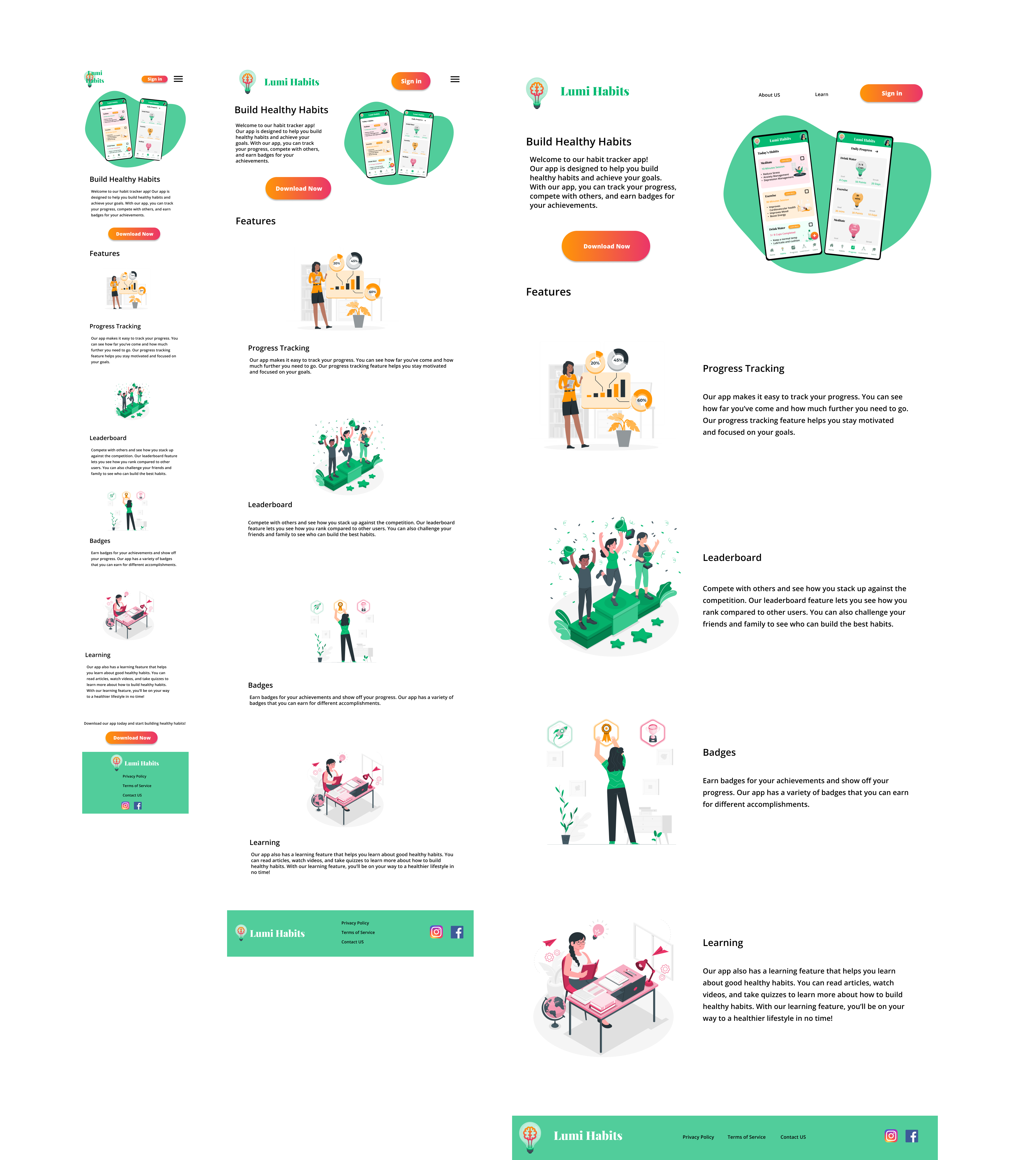
Home Screen Mockups
I made a quick UI design for the home screen for mobile, tablet and Desktop. I didn't make the whole flow for the website since this is just a concept, plus it would take a lot of time.
Conclusion
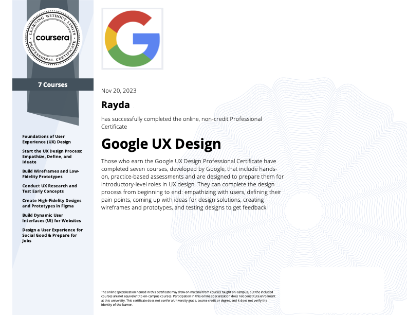
When I got to the portfolio submission part, I had to switch to a different session on Coursera as the due dates had passed, But when I updated the course's dates, I found out that the course's content had changed. The course became three weeks instead of six weeks and there were only quizzes instead of peer-graded assignments. I submitted the final assignment and finally finished the course and Got my Course certificate and Google UX Design certificate as shown below. This certificate took a long time to get as I studied the courses intermittently, fitting it in between work commitments.
Thanks for reading! Stay tuned to my next article! Talk to you soon!
Subscribe to my newsletter
Read articles from Dev Rayda directly inside your inbox. Subscribe to the newsletter, and don't miss out.
Written by

Dev Rayda
Dev Rayda
An indie app developer and blogger. I developed bubblenum app using Android studio and AddUp monster game using Unity. Learning about UX design.