For the Love of Food, People, and UX
 G Nosa Osas
Introduction
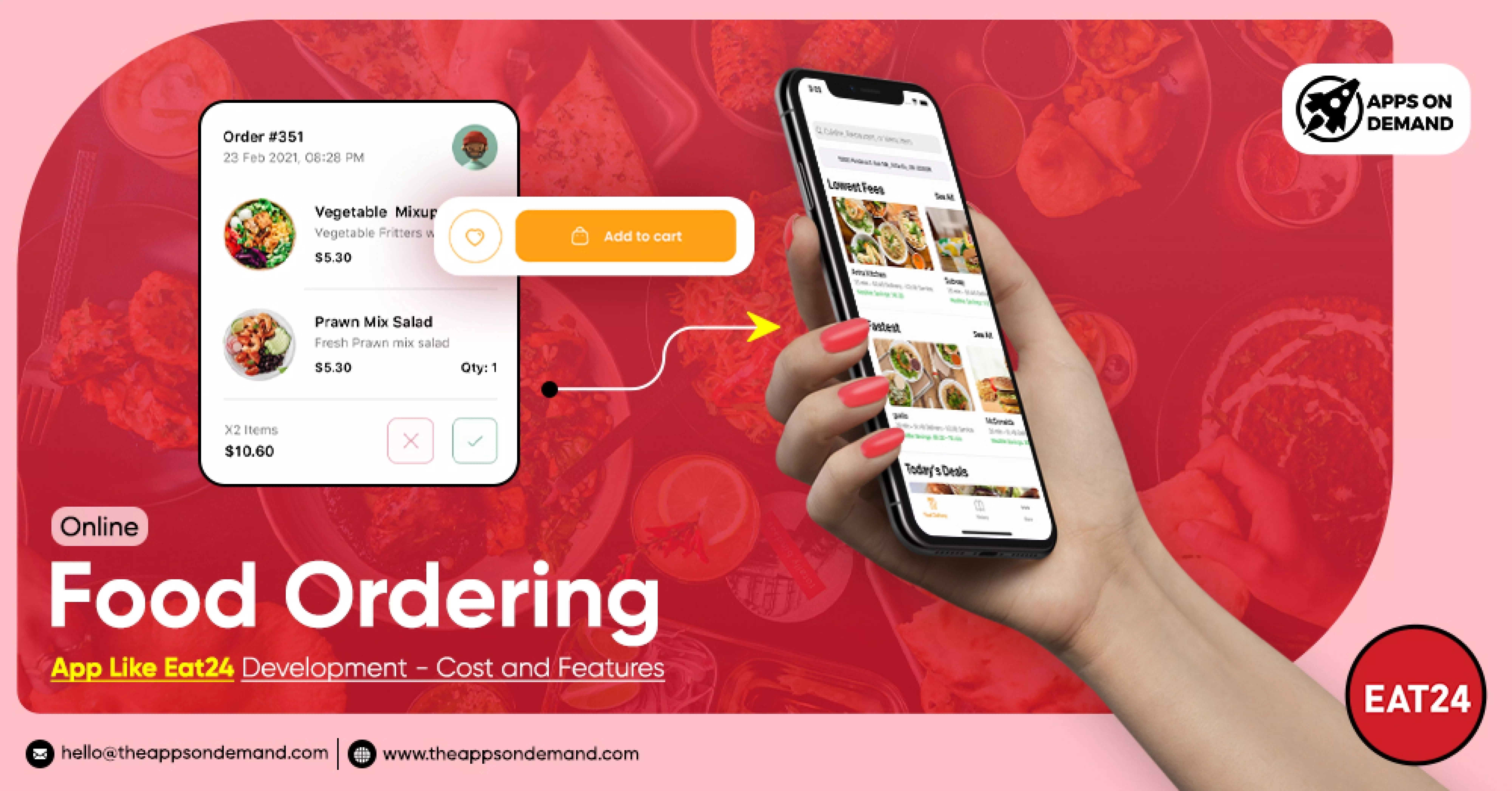
In the fast-paced digital age, the convergence of technology and Culinary food business has given rise to an array of food delivery apps, each vying for user attention and loyalty. Eat24, a prominent player in this domain, stands out not only for its extensive culinary offerings but also for its commitment to a seamless user experience (UX). This article delves into a usability case study of Eat24, exploring how the app navigates the complex intersection of food, people, and UX design to deliver a satisfying experience for users.
Understanding User Needs
The foundation of any successful food delivery app lies in its ability to understand and cater to the diverse needs of its users. Eat24 excels in this regard by offering a user-friendly interface that allows customers to easily browse through a variety of cuisines, filter options based on preferences, and navigate the ordering process with minimal friction. The app's intuitive design ensures that users of all technological proficiencies can enjoy a seamless and enjoyable experience.
Visual Appeal and Appetizing Design:
Much like a visually appealing dish whets the appetite, the visual design of the Eat24 app plays a crucial role in engaging users. A well-curated visual hierarchy, high-quality images of dishes, and a consistent color scheme contribute to an appetizing and visually pleasing interface. This not only enhances the overall user experience but also makes the process of selecting and ordering food a more enjoyable and immersive activity.
Efficient Navigation and Search:
Eat24 understands that users crave efficiency, especially when it comes to ordering food. The app employs a robust navigation system and a powerful search feature that allows users to quickly locate their favorite restaurants, explore new options, and filter results based on various criteria such as cuisine type, delivery time, and user ratings. This efficient navigation ensures that users can find what they want with ease, contributing to a positive overall experience.
Seamless Checkout Process:
The checkout process is a critical juncture in any food delivery app's UX journey. Eat24 excels in providing a seamless and secure checkout process, minimizing the steps required to place an order. Users can review their orders, select payment options, and track their deliveries effortlessly. This streamlined approach not only reduces friction but also enhances the overall satisfaction of users, fostering loyalty to the platform.
Personalization and User Engagement
Understanding that each user has unique preferences, Eat24 incorporates personalization features to enhance the user experience. Recommendations based on past orders, personalized promotions, and a user-friendly feedback system contribute to a sense of personal connection. By fostering user engagement and tailoring the experience to individual tastes, Eat24 establishes a more intimate relationship with its users.
Continuous Improvement and Feedback
A key aspect of UX design is the commitment to continuous improvement based on user feedback. Eat24 actively solicits and responds to user reviews, incorporating valuable insights to refine its app continually. This iterative process demonstrates a dedication to enhancing the user experience, ensuring that Eat24 remains at the forefront of the competitive food delivery app landscape.
Conclusion
Eat24's success in the realm of food delivery is a testament to its meticulous attention to the intersection of food, people, and UX design. By prioritizing user needs, employing a visually appealing design, ensuring efficient navigation, streamlining the checkout process, and embracing personalization, Eat24 creates an experience that resonates with its users. This usability case study serves as a valuable exploration of how technology and gastronomy can harmonize to provide a delightful and satisfying user experience in the ever-evolving landscape of digital food delivery.
Subscribe to my newsletter
Read articles from G Nosa Osas directly inside your inbox. Subscribe to the newsletter, and don't miss out.
Written by
