Create DropDown List in Flutter: DropdownButton Widget
 Manav Sarkar
Dropdown is a list of choices given to a user to choose among one of them. Flutter uses the DropdownButton widget to create a list of items and then display the list of items. In this tutorial, we are going to create a list of options and then selecting one of them will be displayed in a Text widget.
Contents
Create a Dropdown widget - DropdownButton
Selecting an item - onChanged function
Styling the Dropdown widget
Create a Dropdown widget - DropdownButton
We are going to display a list of Strings in the Dropdown. We can display any widget to the items, but in this example, the string is used.
Now initialize a list of string items as follows:
List<String> items = ["Car", "Bus", "Train", "Aeroplane"];
Now create a value holder item variable that will store the currently selected value. Here it is named as currentItem.
String currentItem = "";
@override
void initState() {
  currentItem = items[0];
  super.initState();
}
Now we have initialized the first item of the items list to be as the initial value in the initState function. initState function is called before the widget build function.
initState function is available only to the Stateful classes.
Now create a DropdownButton widget that will display the items. The items and the onChanged functions are the required parameters.
items (List<DropdownMenuItem<Object>>): It takes a list of DropdownMenuItem of type Object.
onChanged(value): This callback function which contains the selected value. The selected value can also be null so we should keep that in mind.
DropdownButton(
  items: items
  onChanged: (value){}
),
Let's map the items list of ours to the DropdownMenuItem list as follows.
items.map<DropdownMenuItem<String>>
(
  (e) => DropdownMenuItem(
    value: e,
    child: Text(e),
  ),
).toList(),
We have successfully mapped the items as a DropdownMenuItem list and in the next step, we will select the options.
Selecting an item - onChanged function
The DropdownButton has a parameter called value which takes a parameter of type String. We will set it as the currentItem we created above.
value: currentItem,
Now change the onChanged function as follows so that we can select different options. If the value will be null, we won't change the currentItem.
onChanged: (String? value) => setState(
  () {
    if (value != null) currentItem = value;
  },
),
Finally, we will put the DropdownButton with a Text widget inside the Column widget.
Center(
  child: Column(
    mainAxisAlignment: MainAxisAlignment.spaceEvenly,
    children: [
      DropdownButton(
        value: currentItem,
        items: items
            .map<DropdownMenuItem<String>>(
              (e) => DropdownMenuItem(
                value: e,
                child: Text(e),
              ),
            )
            .toList(),
        onChanged: (String? value) => setState(
          () {
            if (value != null) currentItem = value;
          },
        ),
      ),
      Text(currentItem),
    ],
  ),
)
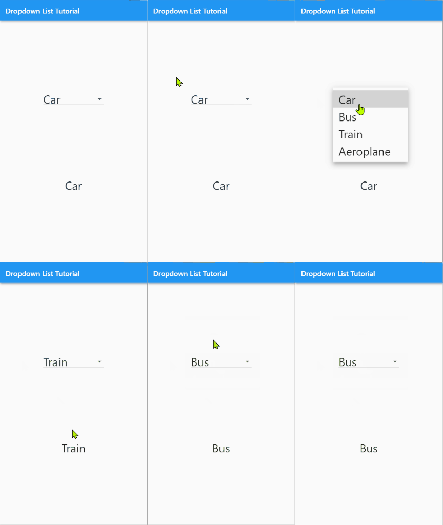
Put the code in the respective Scaffold and see the result.

Styling the Dropdown widget
It's time to style the DropdownButton widget. Here are some styling parameters that we are going to use.
DropdownButton
alignment: The alignment that we want for our items. Here we are going to use Alignment.center or Alignment.topCenter as alignment.
borderRadius: When the list pops up, the list shown has sharp corners. We can modify the corners by applying a BorderRadius.
dropdownColor: The colour of the dropdown.
There are many more parameters that can suit different needs and are worth trying on our own. For this tutorial, these parameters are sufficient to explain the styling of the DropdownButton.
Here we have applied the different above parameters. Also, we wrapped the DroddownButton with the Container widget having a Color and a borderRadius.
Container(
  decoration: BoxDecoration(
    color: Colors.amber,
    borderRadius: BorderRadius.circular(10),
  ),
  child: DropdownButton(
    alignment: Alignment.topCenter,
    borderRadius: BorderRadius.circular(8),
    dropdownColor: Colors.blueAccent,
    value: currentItem,
    items: items
        .map<DropdownMenuItem<String>>(
          (e) => DropdownMenuItem(
            value: e,
            child: Text(e),
            alignment: Alignment.center,
          ),
        )
        .toList(),
    onChanged: (String? value) => setState(
      () {
        if (value != null) currentItem = value;
      },
    ),
  ),
)
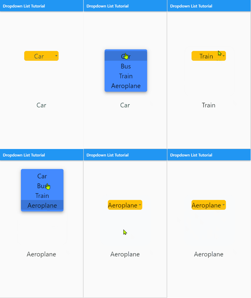
Here is the result.

Here is the full code if you want to try and paste the full code.
import 'package:flutter/material.dart';

void main() {
  runApp(const MyApp());
}

class MyApp extends StatelessWidget {
  const MyApp({Key? key}) : super(key: key);
  @override
  Widget build(BuildContext context) {
    return MaterialApp(
      title: 'AllAboutFlutter',
      theme: ThemeData(
        primarySwatch: Colors.blue,
        textTheme: const TextTheme(
          bodyText1: TextStyle(fontSize: 32),
          bodyText2: TextStyle(fontSize: 32),
          subtitle1: TextStyle(fontSize: 32),
        ),
      ),
      debugShowCheckedModeBanner: false,
      home: const DropdownListTutorial(),
    );
  }
}

class DropdownListTutorial extends StatefulWidget {
  const DropdownListTutorial({Key? key}) : super(key: key);

  @override
  _DropdownListTutorialState createState() => _DropdownListTutorialState();
}

class _DropdownListTutorialState extends State<DropdownListTutorial> {
  List<String> items = ["Car", "Bus", "Train", "Aeroplane"];
  String currentItem = "";
  @override
  void initState() {
    currentItem = items[0];
    super.initState();
  }

  @override
  Widget build(BuildContext context) {
    return Scaffold(
      appBar: AppBar(
        title: const Text("Dropdown List Tutorial"),
      ),
      body: Center(
        child: Column(
          mainAxisAlignment: MainAxisAlignment.spaceEvenly,
          children: [
            Container(
              decoration: BoxDecoration(
                color: Colors.amber,
                borderRadius: BorderRadius.circular(10),
              ),
              child: DropdownButton(
                alignment: Alignment.topCenter,
                borderRadius: BorderRadius.circular(8),
                dropdownColor: Colors.blueAccent,
                value: currentItem,
                items: items
                    .map<DropdownMenuItem<String>>(
                      (e) => DropdownMenuItem(
                        value: e,
                        child: Text(e),
                        alignment: Alignment.center,
                      ),
                    )
                    .toList(),
                onChanged: (String? value) => setState(
                  () {
                    if (value != null) currentItem = value;
                  },
                ),
              ),
            ),
            Text(currentItem),
          ],
        ),
      ),
    );
  }
}
Subscribe to my newsletter
Read articles from Manav Sarkar directly inside your inbox. Subscribe to the newsletter, and don't miss out.
Written by
