My First Web Development Milestone: Creating My Debut Web Layout
 Deerendra Saravanan
What's up, everyone? I am thrilled to sit down finally and share the excitement of creating my first web layout. This post shares all the things I had to learn, the challenges I had to overcome, and the lessons I learned along the way.
The Beginning
I always thought of having my portfolio website where I can share my achievements, write blog posts, and connect with like-minded people. So, why not create my own? I surfed through the internet for free courses and YouTube tutorials on web development. Finally, I found this amazing YouTube channel that catered to all my needs. My web development journey started five days ago, and I have learned the basics of HTML and CSS and have been experimenting with their functionalities. I decided to put my skills to the test by creating a simple and responsive web layout using HTML and CSS. I knew this was going to take a lot of time since this is my first time creating a webpage. I then decided to tackle it head-on.
Designing the layout
The inspiration that guided my website was from this tutorial. The website belongs to a fictional web design company called "Acme Web Designs". It consists of three pages: Home, About, and Services.
All three pages contain a header with the name of the company floating on the left and a navigation bar floating on the right with links to the three pages of the website. The newsletter subscription area has a form with a submit button. The footer contains the copyrights of the website.
The Home page contains a showcase area with a heading and a paragraph, a background image that acts like an introduction to the website, and a section that displays the features with three images namely "HTML5", "CSS3" and "Graphic Design" and descriptions that float side by side.
The About page contains a main section and a side section. The main section/article namely "About Us" contains a title and two paragraphs, where the second paragraph is in a box with the background color. The side section namely "What We Do" with a title and a paragraph is contained in a box with a background color that floats to the right.
The Services page has a main section with the title "Services". This is an unordered list with each list item consisting of a title and a paragraph. Each list item describes the services provided by the company with pricing for the same. Each list item has a border. The side section named "Get A Quote" has a form with three credentials: name, email, and a message with a submit button. It is contained in a box floating to the right with a background color.
The HTML/CSS Journey
HTML and CSS are the first two technologies any web developer learns at the beginning of his/her journey. HTML defines the structure and content of a webpage, while CSS focuses on aesthetics and styling, allowing developers to create visually appealing and user-friendly web pages.
I completed two crash courses on HTML and CSS within a day or two which is enough to create a basic webpage. I then experimented with HTML and CSS functionalities. I had doubts regarding classes and IDs on their usage, applying margin and padding to the right divisions, various ways to position the containers, etcetera.
I decided that doing a project may help me understand these concepts better. Of course, what is a better way to learn than by doing?!
Challenges
I knew the design of the website I was going to build (inspired by the website shown in the tutorial). As soon as I saw the website design in the video, I paused and started building it on my own. I started with the Home page.
Writing the markup was a piece of cake. I got the desired output. CSS was the challenging part. The markup seems alright before you start working on CSS. I did not exactly know where to create classes and IDs. I created unnecessary divisions which was a big headache during the styling part.
I was stuck at the header part of the Home page for almost half a day. I got the title right but the navigation bar was not placed right. It had to float on the right side of the title. But its container was clashing with the container of the title. This demonstrates my weakness in concepts like divisions i.e.<div> tag and classes, IDs, and positioning. I also had to clear my concepts on margin and padding and when/where to use them.
How did I overcome them?
After being stuck for almost half a day, I decided to watch the tutorial (referring only to the header area). I learned the changes I had to make in the markup. This time, I had a far better understanding of the concepts than before. I got a better understanding of when and where to create divisions, use classes/IDs, use margin/padding, and position sections.
After this, designing the remaining part of the page was easier. I still had doubts regarding certain HTML and CSS attributes, which I later resolved from w3schools and GeeksForGeeks. I also had to watch the tutorial from time to time. I also had to resize images to fit in the container using Adobe Express Image Resizer.
After completing about three-fourths of the project, I watched the tutorial and continued along with it. The markup for the About and Services page was similar to the Home page with few changes. My understanding of CSS was better this time, but still needed the help of the tutorial.
Making It Responsive
The website I built was not responsive. It was suitable only for desktops. To make it responsive, I had to learn media queries. Media queries are instructions that change how your webpage looks on different devices. They let you adjust the size based on screen size, ensuring your site looks good on any device from phones to desktops.
I had to disable the float for some sections when the width of the screen was reduced beyond a certain limit. For instance, the three images that were floating side-by-side in the desktop view had to go on top of each other in the tablet view. This works when the float is disabled for the image section. I also had to resize forms and buttons when the width was reduced. A minimum height has to be set for containers for the content to adjust in the given space.
Lessons Learned and Key Takeaways
Create a class if the item is going to be used often. As a simple analogy, you can relate a class in CSS to a function in a programming language. They can be used often. Easy to edit in the future. Create an ID if the item is unique and you are not going to use it anywhere else.
When styling, use the top-down approach. Style the bigger/outer elements first, then go deeper. For instance, if there is a class called container, which contains an ordered list with various list items, each list item contains a link. Then start from the container, style the ordered list, then the list item, and then finally the link. This prevents any confusion in the sizing and positioning of the element.
Use the box model to understand margins and padding better. You can directly see the box model on the browser. Right-click on the webpage > click "Inspect" > go to "Elements" to view the markup > in "Styles" below the elements, you can view the box model for the selected element.
Use the "Try first, Learn later" approach. It involves hands-on experimentation, trial, and error methods before seeking solutions. It deepens your understanding of your weak concepts through practical experience. The solution for the challenges you face in this process will be more resourceful, leading to more effective learning.
Do not aim for perfection. You are never too perfect to start a project. You learn along the way. Learn by doing.
The Final Result
After a day and a half of coding, the website is here!
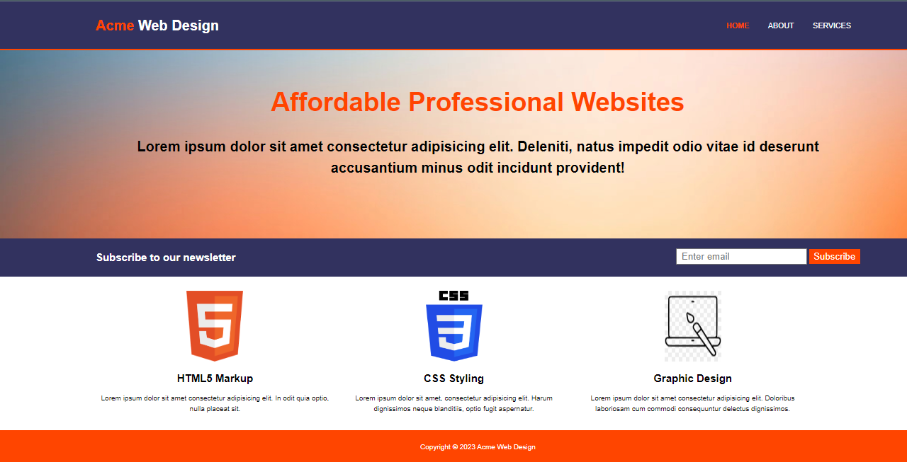
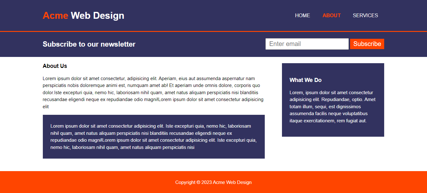
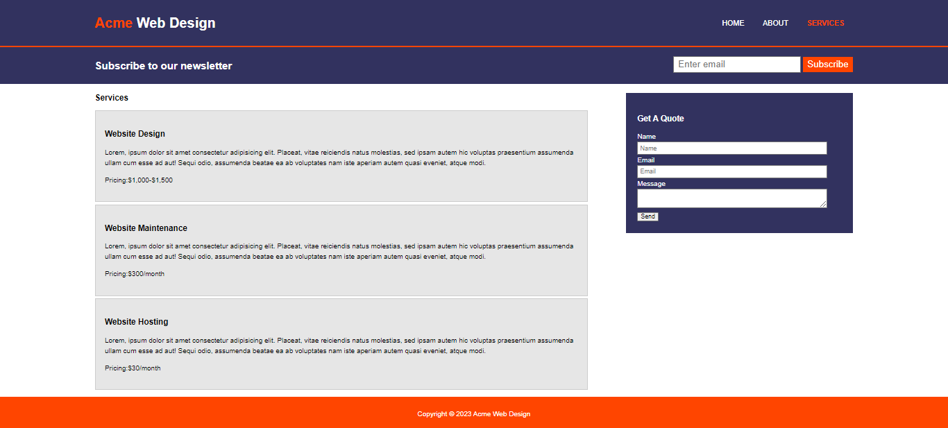
This is only the design of the website and is not fully functional. The website cannot collect any data from the user. My next step in my journey is learning JavaScript and making this website functional.
The Conclusion
My first project of making a responsive web layout has taught me a lot and helped me deepen my understanding of the concepts. This is a major milestone in my journey. I was introduced to various learning methods in this project.
Readers, kindly share your personal experiences, tips, and questions in the comments section.
Feel free to connect with me on these platforms.
Subscribe to my newsletter
Read articles from Deerendra Saravanan directly inside your inbox. Subscribe to the newsletter, and don't miss out.
Written by

Deerendra Saravanan
Deerendra Saravanan
Student and an aspiring developer.