How to Close Modal by Clicking Outside The Modal
 Segun Ajibola
Adding interaction in a web application is very essential for modern development, but tiny effects can super change user experience in a positive way.
In this article, you will learn how to close a modal by clicking outside of it.
We will create a button to show a modal, then implement a close icon to close the modal and also make the modal close by clicking outside the modal.
We will be using Next.js for development and Tailwind CSS for styling.
Prerequisite
Basic knowledge of HTML, CSS, JavaScript, React and Tailwind CSS
Experience with Next.js
Believing you have your Next app and Tailwind CSS setup, if you don't know how to do that, click here.
It's a simple application, so I'm putting the whole logic in the page.js.
Step 1: Create a Button Element
export default function Home() {
  return (
    <div></div>
  );
}
Let's add the button element.
export default function Home() {
  return (
    <div className="flex flex-col m-10 justify-center h-screen">
      <button className="bg-gray-200 rounded-md p-3 mx-auto">
        Show Modal
      </button>
    </div>
  );
}
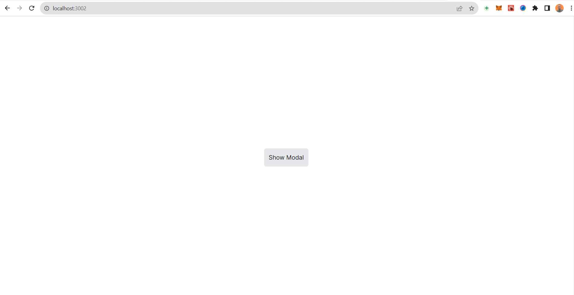
I made the button and styled it, note that I also made the whole page a flex element so the button will be in the middle.

Step 2: Adding Function and State
You need to create a function to be called when you click the button, I imported the useState() hook to create and maintain state.
Note that I also added "use client" at the top. This is because all Next.js components are on the server side, so they do not have access to client side event handlers or React hooks like useState(). The "use client" turns the component to a client-side component. Read more about how that works here.
const [isModalOpen, setIsModalOpen] = useState(false);
I created a state called isModalOpen and set it to false.
openModal function sets the isModalOpen state to true. You will use this logic to open the modal if isModalOpen is true and later close the modal when isModalOpen is false.
Here is the openModal function.
  const openModal = () => {
    setIsModalOpen(true);
  };
Here is the whole code now.
"use client";

import { useState } from "react";

export default function Home() {
  const [isModalOpen, setIsModalOpen] = useState(false);

  const openModal = () => {
    setIsModalOpen(true);
  };

  return (
    <div className="flex flex-col m-10 justify-center h-screen">
      <button
        onClick={openModal}
        className="bg-gray-200 rounded-md p-3 mx-auto"
      >
        Show Modal
      </button>
    </div>
  );
}
Clicking the button now will set isModalOpen to true.
Let's add some logic to open the modal.
Step 3: Creating the Modal
{isModalOpen && (
    <div
       className="fixed top-0 p-10 left-0 w-full h-full bg-gray-400 flex justify-center align-center"
       onClick={handleOverlayClick}>
       <div className="flex flex-col bg-white p-20 rounded-xl">
          <button
            className="flex justify-end text-[30px]"
            onClick={closeModal}
          >
            X
          </button>
            <h2>Modal Content</h2>
            <p>This is a simple modal.</p>
        </div>
    </div>
)}
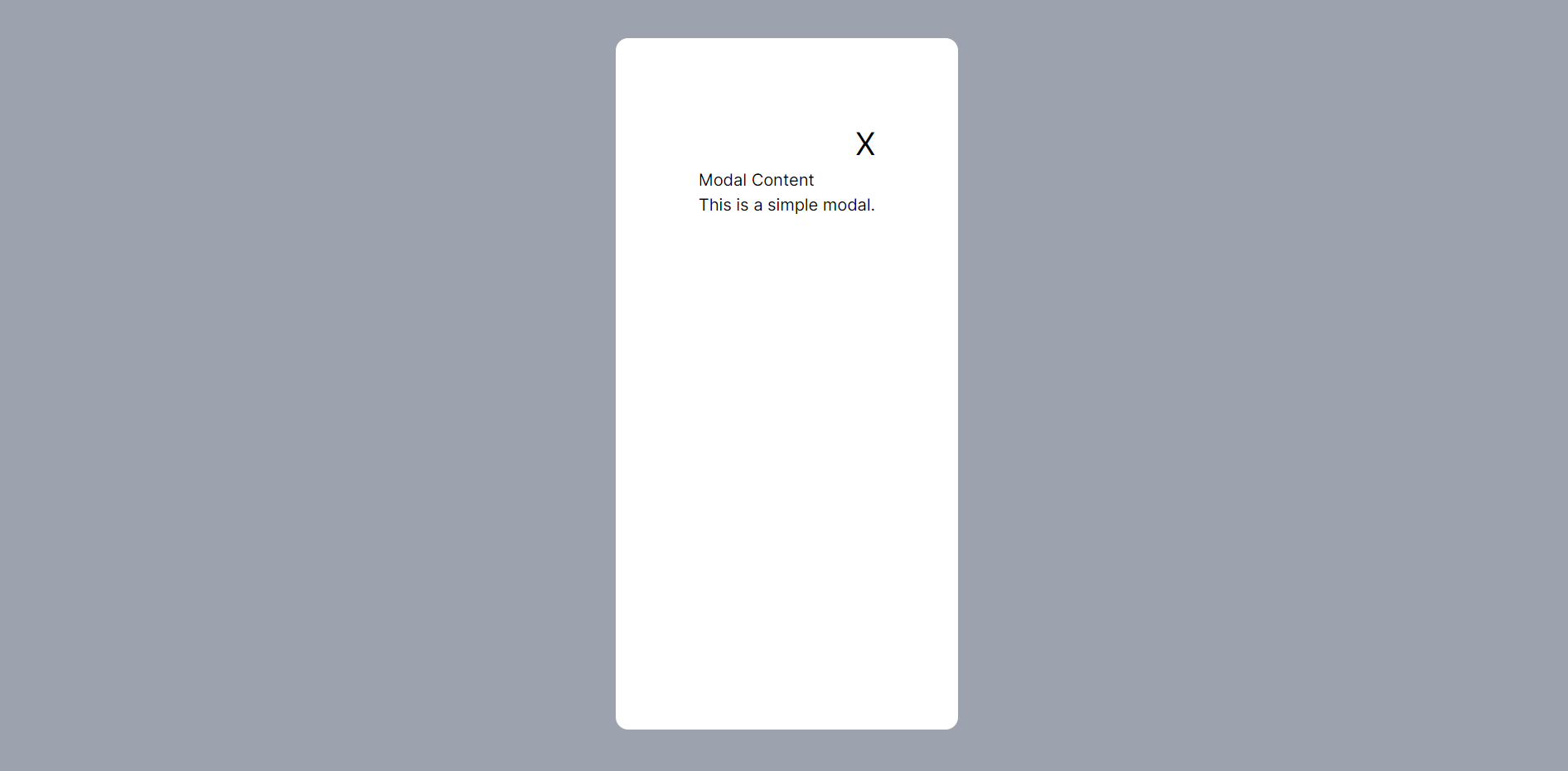
The above code will run when isModalOpen is set to true. {isModalOpen && ()} means if isModalOpen is true, the code in the () will work.
The parenthesis() contains a div that acts as overlay, it takes the whole height and has background color of bg-gray-400.
The main modal is in the overlay div, it has a "X" button to close the button.
Step 4: Closing the Modal
The "X" button runs closeModal function onclick.
Here is the closeModal function.
const closeModal = () => {
    setIsModalOpen(false);
};
The "X" button sets isModalOpen to false.
The whole code looks like this now.
"use client";

import { useState } from "react";

export default function Home() {
  const [isModalOpen, setIsModalOpen] = useState(false);

  const openModal = () => {
    setIsModalOpen(true);
  };

  const closeModal = () => {
    setIsModalOpen(false);
  };

  return (
    <div className="flex flex-col m-10 justify-center h-screen">
      <button
        onClick={openModal}
        className="bg-gray-200 rounded-md p-3 mx-auto"
      >
        Show Modal
      </button>

      {/* code to run when Show Modal button is clicked thus setting isModalOpen to true */}
      {isModalOpen && (
        <div
          className="fixed top-0 p-10 left-0 w-full h-full bg-gray-400 flex justify-center align-center">
          <div className="flex flex-col bg-white p-20 rounded-xl">
            <button
              className="flex justify-end text-[30px]"
              onClick={closeModal}
            >
              X
            </button>
            <h2>Modal Content</h2>
            <p>This is a simple modal.</p>
          </div>
        </div>
      )}
    </div>
  );
}
Clicking the "Show Modal" button will set isModalOpen to true, thereby showing the modal. The "X" button will run the closeModal function, sets isModalOpen to false thus, removing the modal.

Step 5: Close Modal by Clicking Outside Modal
To create the logic that close the modal when you click outside of the modal is quite easy. You just need to set a function that runs when you click outside the modal.
Since the overlay div takes the whole space surrounding the modal, you need to attach the function to close the modal to the overlay div.
Here's the function.
const handleOverlayClick = () => {
    isModalOpen ? closeModal() : null
};
The handleOverlayClick function is attached to the overlay div here.
{isModalOpen && (
    <div
      className="fixed top-0 p-10 left-0 w-full h-full bg-gray-400 flex justify-center align-center"
      onClick={handleOverlayClick}
    >
 {/* the rest of the code */}
)}
The whole code looks like this now.
"use client";

import { useState } from "react";

export default function Home() {
  const [isModalOpen, setIsModalOpen] = useState(false);

  const openModal = () => {
    setIsModalOpen(true);
  };

  const closeModal = () => {
    setIsModalOpen(false);
  };

  const handleOverlayClick = () => {
    isModalOpen ? closeModal() : null
  };

  return (
    <div className="flex flex-col m-10 justify-center h-screen">
      <button
        onClick={openModal}
        className="bg-gray-200 rounded-md p-3 mx-auto"
      >
        Show Modal
      </button>

      {isModalOpen && (
        <div
          className="fixed top-0 p-10 left-0 w-full h-full bg-gray-400 flex justify-center align-center"
          onClick={handleOverlayClick}
        >
          <div className="flex flex-col bg-white p-20 rounded-xl">
            <button
              className="flex justify-end text-[30px]"
              onClick={closeModal}
            >
              X
            </button>
            <h2>Modal Content</h2>
            <p>This is a simple modal.</p>
          </div>
        </div>
      )}
    </div>
  );
}
Conclusion
The idea behind adding the overlay is to block out the whole space around the modal so that you can attach the function to close the modal to the overlay div.
This is a simple way to achieve closing the modal by outside of it, you can also use useEffect to achieve this without attaching any function to the overlay div but this will involve extra lines of code.
Here is the GitHub repo to copy this code. Click here to clone it.
That will be all. Hope you found any value here as you learn to build more projects effectively.
Before you leave,
If you enjoyed this article and want to see more content related to JavaScript and Web development, then follow me here, Twitter (X) or connect on LinkedIn.
I'd be happy to count you as one of my ever-growing group of awesome friends on the internet.
If you also want to support me, you can buy a cup of coffee for me here.
Thanks && Bye. 👋
Subscribe to my newsletter
Read articles from Segun Ajibola directly inside your inbox. Subscribe to the newsletter, and don't miss out.
Written by

Segun Ajibola
Segun Ajibola
I'm a front-end web developer, enjoys working with TailwindCSS and React. Love to contribute to Open Source and meet new people on Twitter.