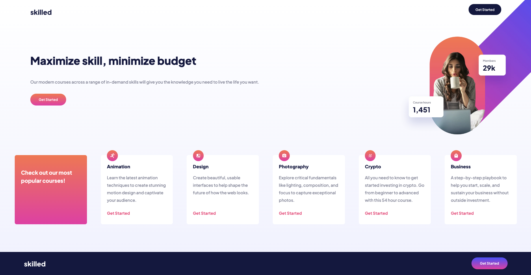
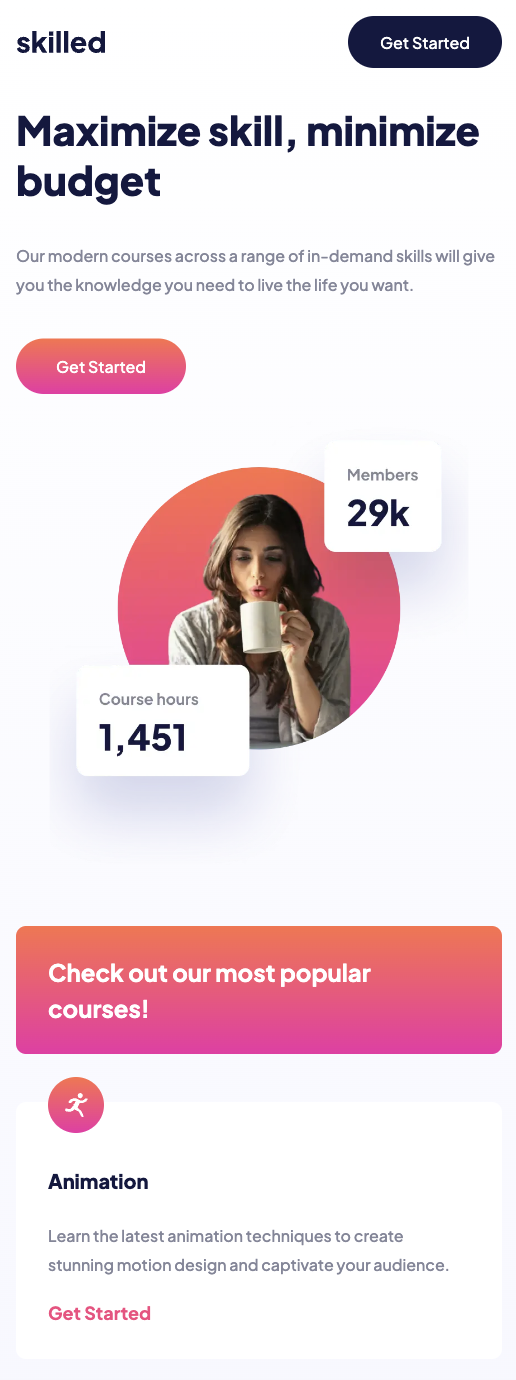
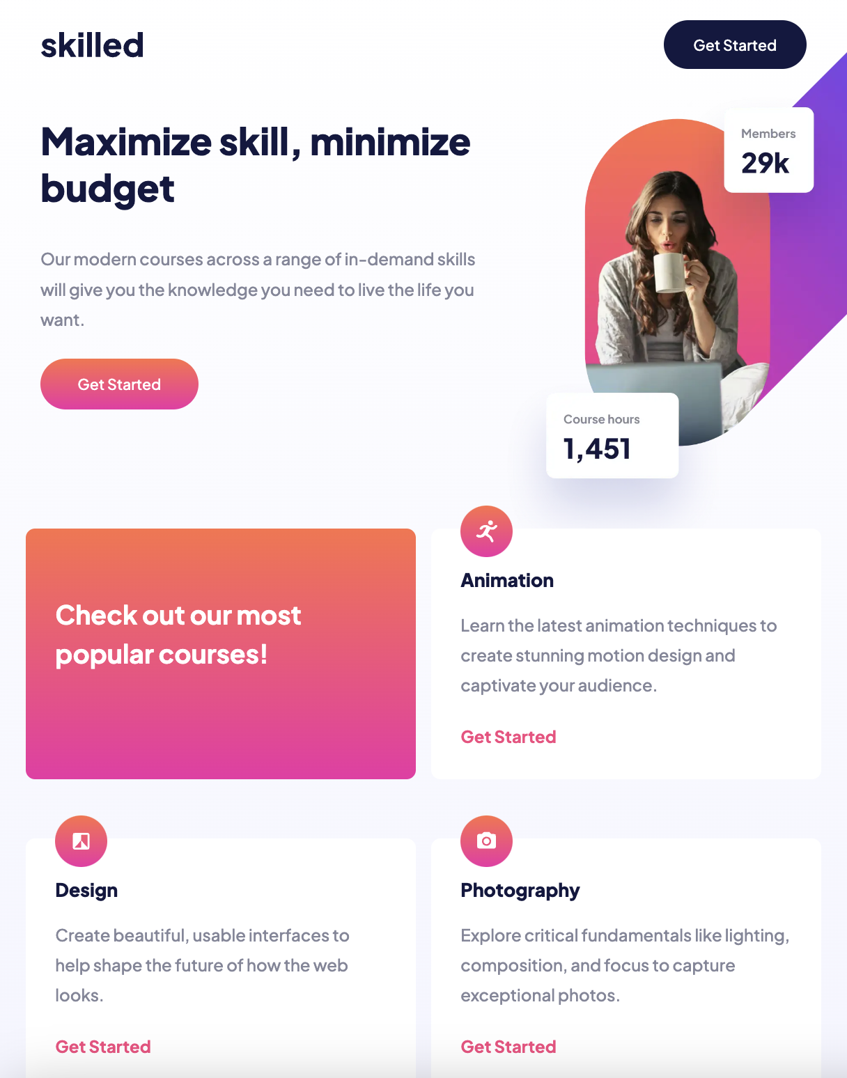
Project Launch: Frontend Mentor E-Learning Landing Page
 Lucie Yarish
Scrimba and Their Solo Projects
For a little over three months now, I've been hard at work teaching myself frontend development with Scrimba Frontend Career Path. Their courses are full of interactive challenges that help you learn frontend development and most modules are concluded with a solo project that students build from scratch to practice all concepts taught in that module. For each solo projects, there's a bunch of requirements that you should meet, stretch goals in case the project isn't challenging enough for your current capabilities, and a Figma mockup. Students who sign up for Scrimba's self-paced bootcamp have the option to submit their project for a code review.
Frontend Mentor Challenges
Building Scrimba's solo projects has proven to be the most effective way to learn for me, so naturally, I had started to seek ways to get even more practice in, and recently purchased Frontend Mentor subscription. Developing an eye pleasing user interface is one thing, but designing one is not an easy task for developers who are not trained in UI/UX best practices (i.e. me). Frontend Mentor offers a little over a hundred projects accompanied by Figma mockups that you can build and add to your portfolio. It is possible to access all of them without the Pro subscription, but you won't be able to view the mockups.
Picking a Challenge
When I was choosing my first challenge, the goal I had in mind was to practice HTML & CSS only. I've always found CSS rather intimidating, and it took me quite a lot of time to get to the point of being able to build a layout from scratch with the help of Flexbox, so tackling one of the Frontend Mentor's many landing page challenges seemed like a good place to start.
The Process
Task Breakdown
Starting is always the hardest part of any work or project, which is why I like to break any task at hand into smaller, achievable chunks. Putting build e-learning landing page on my todo list feels as if I had a tall, steep mountain to climb, while jotting down tasks like create GitHub repo, build nav bar, or add active states makes the "mountain" ahead of me look like a group of little hills.
Mobile-First And Responsive Design
One of the mistakes I used to make was applying desktop-first principles instead of mobile-first approach, which had inevitably led to excessive amount of code and hardly recognizable bugs. Learning to build mobile-first and making my websites fully responsive with the help of relative units, therefore, was one of the main goals of the challenge and I really enjoyed the process.

Debugging Adventure
Naturally, I came across quite a few CSS bugs along the way, but the one I found the most interesting was a non-working active state of one of my buttons. In total, there are three buttons on the landing page, but only one of them wasn't working the way it was supposed to, and it took me a good hour to find out that the problem was caused by an absolutely positioned image covering the top-most button on the page. Setting the button's position to relative and giving it z-index: 1 had helped solve the issue!
Deployment
I use Netlify to deploy all my website as I found it very straightforward and easy to use. As a nice bonus, it's free to use for personal projects! The live version is available here!
Time Commitment
Other responsibilities prevented me from working on the challenge on daily basis, so it felt as if it took me three weeks to complete it. However, based on my time log, it actually only took me 7 hours to build, including final touch ups, and polishing the project's README on GitHub.
Key Takeaways And Next Steps
Having a mockup with all design specs created by a professional at hand was an amazing experience and completing the project had given me a little confidence boost when it comes to building fully responsive layouts.
I'm excited to learn to use CSS preprocessors and experiment with Tailwind CSS framework in the next Frontend Mentor challenges. Before that, I'll be building a few solo projects on Scrimba in order to get more feedback on my code. The upcoming projects in my pipeline is a learning journal website layout with CSS grid, and two JavaScript-focused projects: a restaurant ordering app and an invoice creator. I'm really looking forward to elevating my CSS grid and JavaScript skills!
Conclusion
If you're currently learning to code, you've probably came across this piece of advice: Don't get trapped in tutorial hell. Learn by building projects instead! And if you asked me how to learn to code, I'd tell you exactly that because I've been there. I did get trapped in tutorial hell and coming across resources like Scrimba and Frontend Mentor was what have helped me break free from it. Go give it a go if you want to work on your skills and/or learn new technologies!

Subscribe to my newsletter
Read articles from Lucie Yarish directly inside your inbox. Subscribe to the newsletter, and don't miss out.
Written by

Lucie Yarish
Lucie Yarish
Lucie is a fullstack developer with passion for true mastery of her craft and lifelong learning. As a motivated career switcher, she is always figuring out ways of improving both her soft and hard skills, and connecting with like-minded people.