Data Analytics Project with Excel
 Mugendi Mung'athia

INTRODUCTION
In the realm of data-driven decision-making, our ability to gain valuable insights is often dependent on the quality and richness of the datasets at our disposal.
I’m to extract meaningful insight from the spreadsheet that will be used for analysis. This project covers the data cleaning, data analysis, and data visualisation processes using Microsoft Excel, and this is the project’s documentation.
The major aim of this project is to communicate insights via an interactive Microsoft Excel dashboard.
Data collection
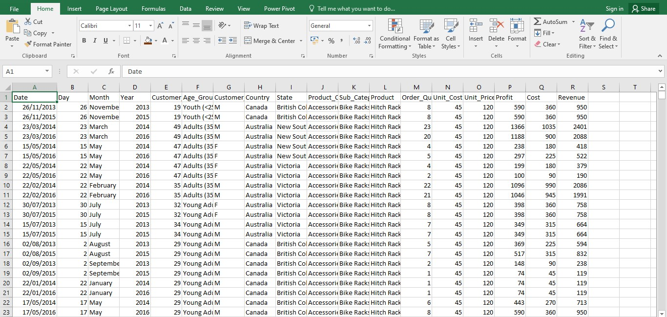
I got this dataset from my SQL Tribe mentor, Wakio. This dataset is about bike sales in different parts of Europe. The dataset has 18 columns. The columns include customer age, date, gender, revenue, profit, cost, products, etc. The data set had duplicates and incorrect values. I cleaned the data by filling in missing values, removing duplicates, and correcting the incorrect values. This image shows incorrect values in the Revenue, Cost, and Profit columns.
Data Cleaning
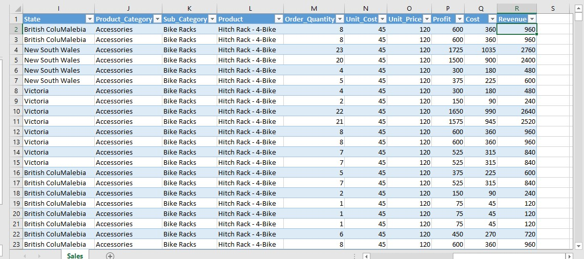
Data cleaning is the process of fixing or removing incorrect, corrupted, incorrectly formatted, duplicate, or incomplete data within a dataset. I corrected the revenue, profit, and cost columns. The three columns had incorrect values.
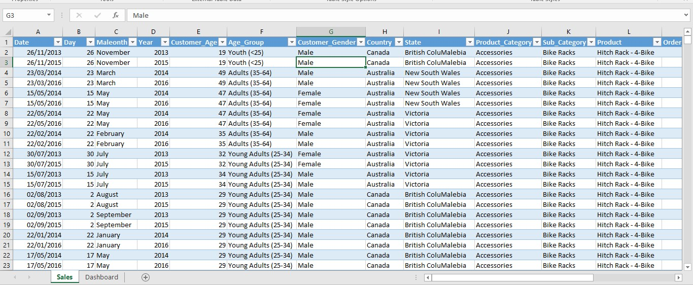
I replace F with Female and M with Male.
Data Analysis
I analysed the data using charts and pivot tables. Pivot charts offer a visual representation of complex data sets, making it easier to identify trends, patterns, and outliers. Visualising data helps users understand the information more quickly than examining raw numbers alone. Here are the questions I was finding out:
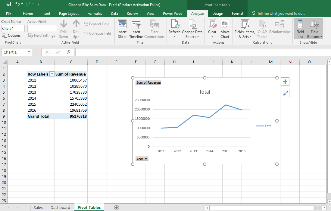
Revenue over the years
This chart represents the revenue that was generated by bike sales over the years. At the beginning, bike sales generated low revenue, but over the years, revenue increased steadily.
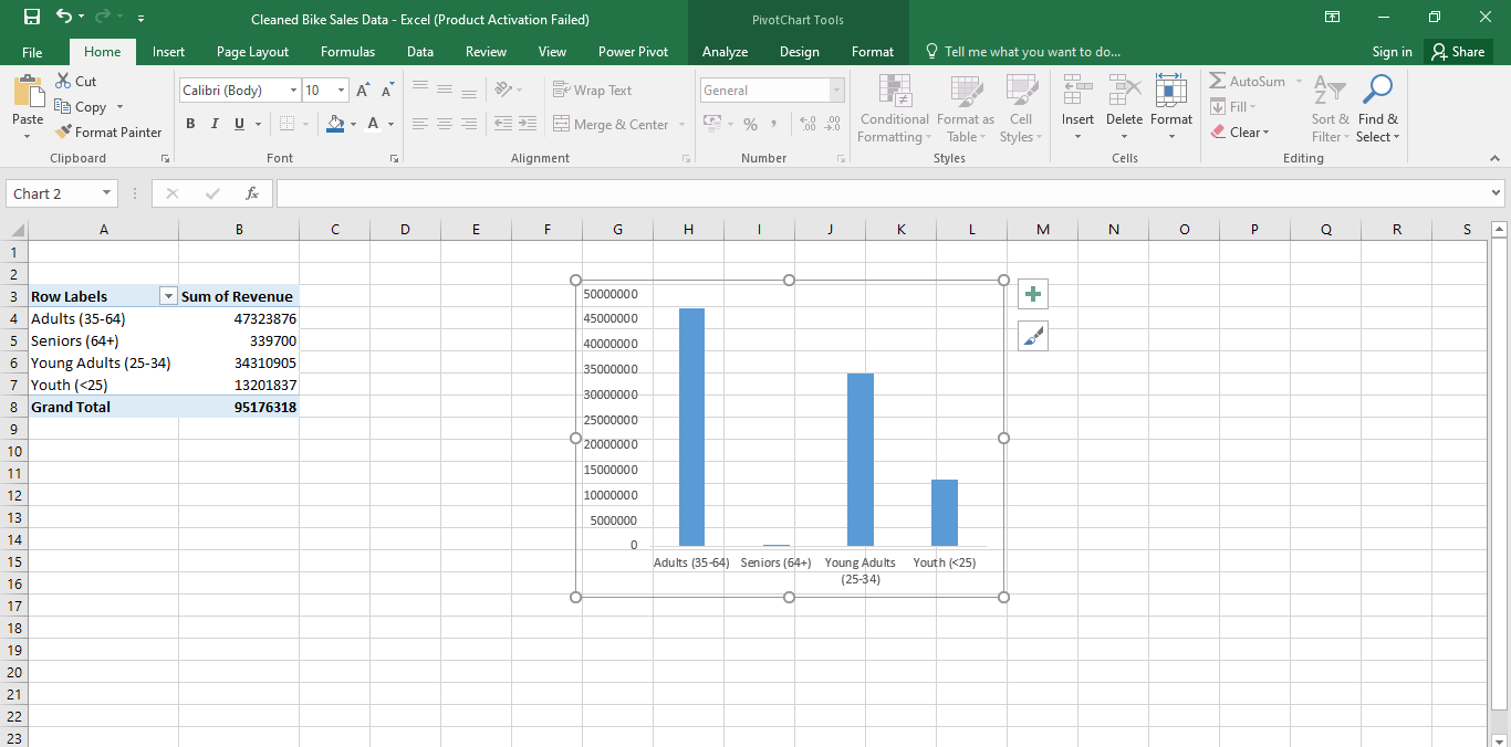
Revenue generated by Age groups
This chart represents revenue generated by different age groups. The age groups include youth (<25), young adults (25–34), adults (35–64), and seniors (64+). Seniors (64+) brought in the least revenue to the company.
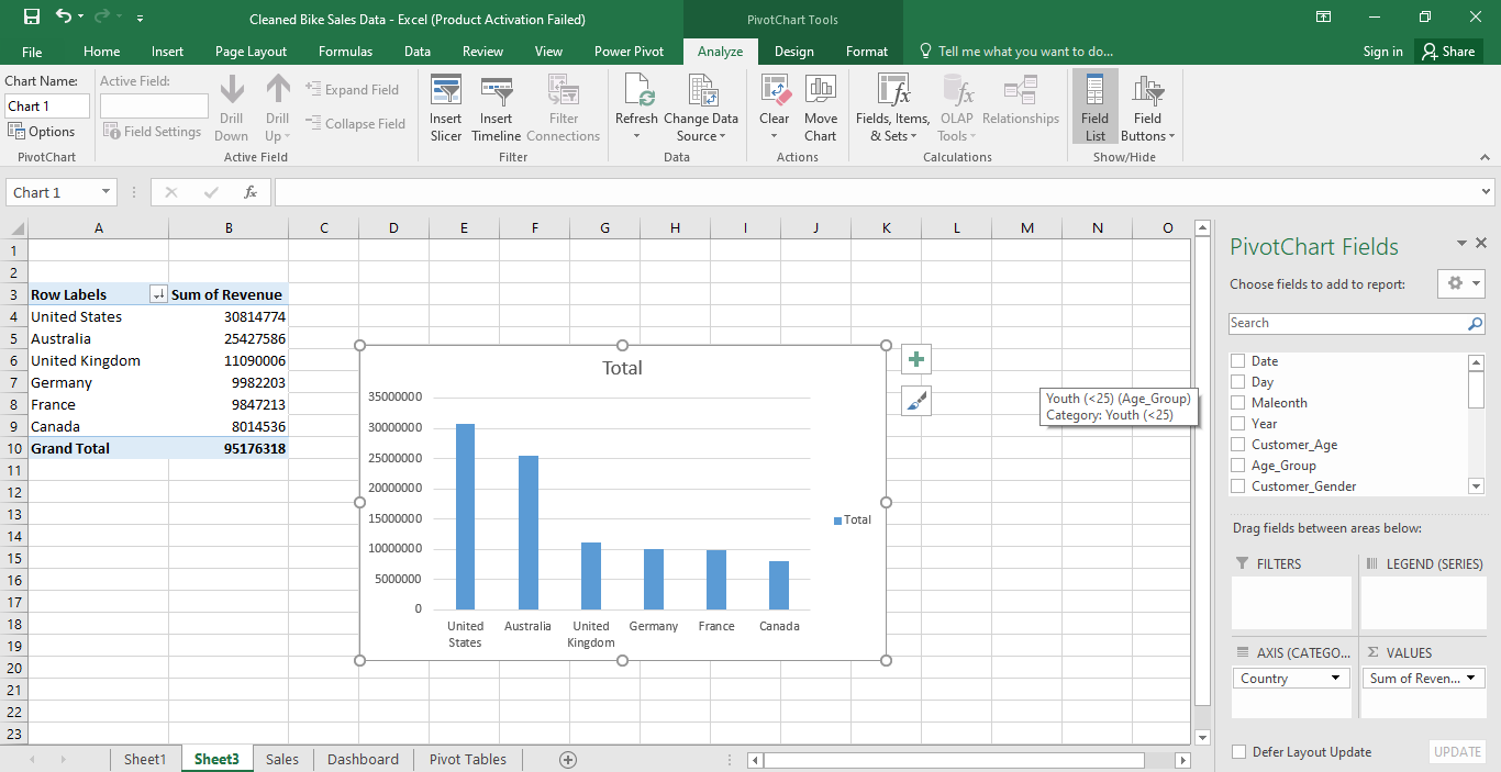
Revenue by different countries
This chart represents the revenue brought in by different countries. The countries were the United States, the United Kingdom, Australia, Canada, Germany, and France. The United States generated the highest revenue, while Canada generated the least revenue.
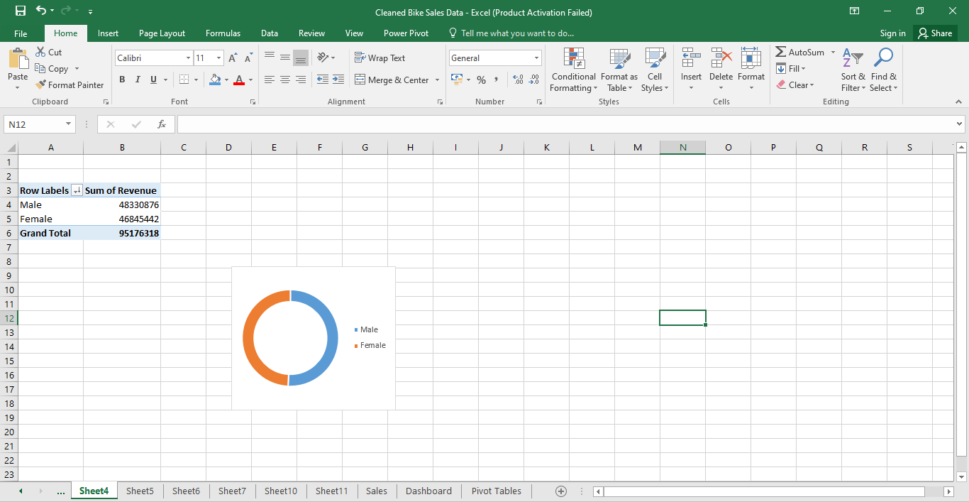
Revenue generated by male and female
This chart represents the revenue generated by the males and females of each country. Males generated the highest revenue.
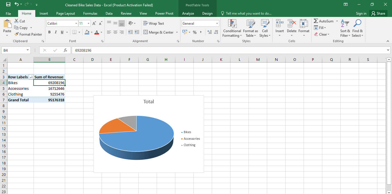
Revenue generated by accessories, bikes and clothing
This chart represents the sales of different products. The products were accessories, bikes, and clothing. Bikes generated the highest revenue, followed by accessories, while clothing generated the least revenue.
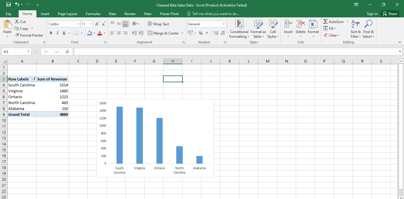
The least performing states in terms of revenue generated
This chart represents the five least-performing states in terms of revenue generation. The states were from all the countries. Alabama was the least performing state. It brought in the least revenue.
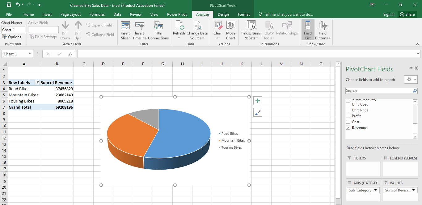
The most popular bike
This chart represents the most popular bike among the three types that were available. Road bikes were the most popular, followed by mountain bikes, while touring bikes were the least popular.
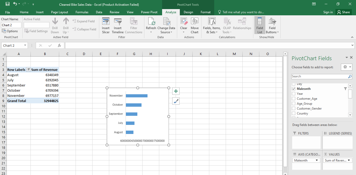
The least performing months in terms of revenue generation
This chart represents the bottom 5 months in terms of revenue generation. In the month of August, the least revenue was generated.
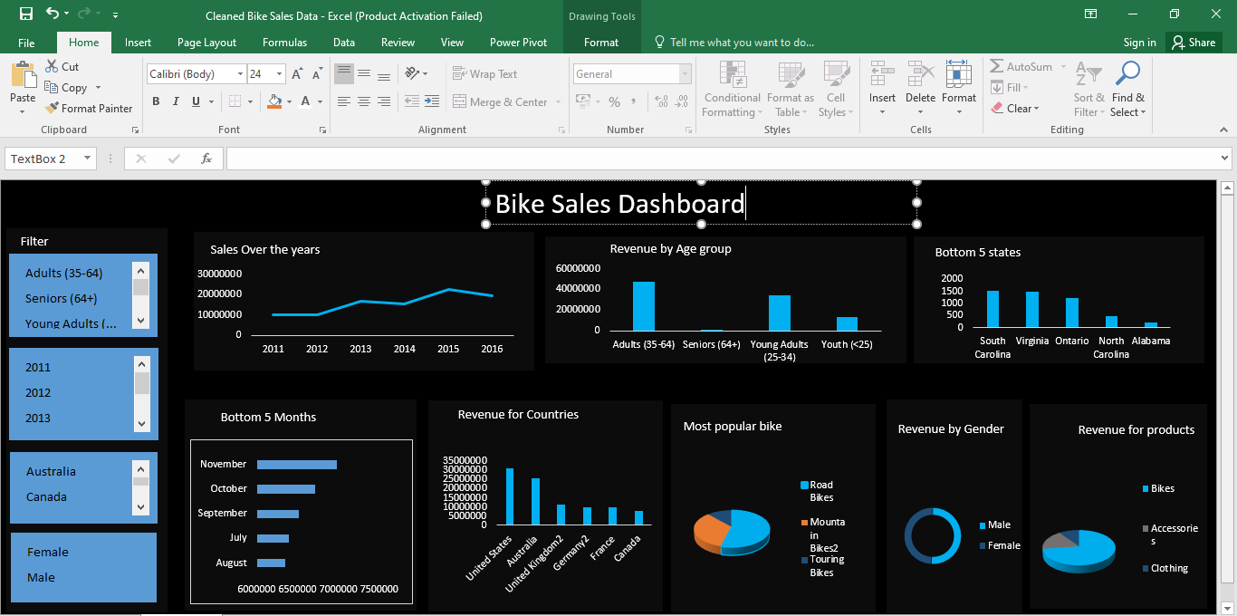
Dashboard
I finalised my analysis by creating a dashboard with all of the above charts. I also added four slicers that will be used to filter information.
Recommendation
The data that I extracted will be useful for proper analysis, and I recommend advertising goods, particularly tourist bikes, among the bike categories. Also, goods that serve the needs of seniors (64+) should be added because they bring in the least revenue. A lot of marketing should be done during the month of August. Also, more marketing should be done in the following states: Alabama, North Carolina, Ontario, South Carolina, and Virginia.
Subscribe to my newsletter
Read articles from Mugendi Mung'athia directly inside your inbox. Subscribe to the newsletter, and don't miss out.
Written by

Mugendi Mung'athia
Mugendi Mung'athia
I am a skilled Data Analyst with expertise in Excel, SQL, Python, Power BI, and ETL processes. I specialize in transforming raw data into actionable insights, enabling informed business decisions through effective data analysis and visualization.