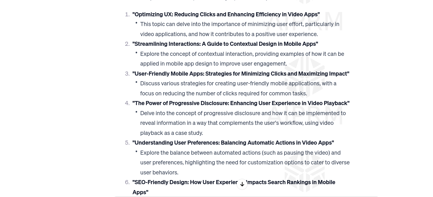
The Power of Progressive Disclosure: Strategies for Minimizing Clicks and Maximizing Impact in Mobile Applications
 Kamran Mansoor
I have a question in my mind about User Experience(UX), or creating user-friendly mobile applications, with a focus on reducing the number of clicks required for common tasks, with more efficient and user-friendly apps
I asked ChatGPT and it gave me the answer. Below is my question and the answer from ChatGPT
My Question from ChatGPT about User Experience in Mobile Applications
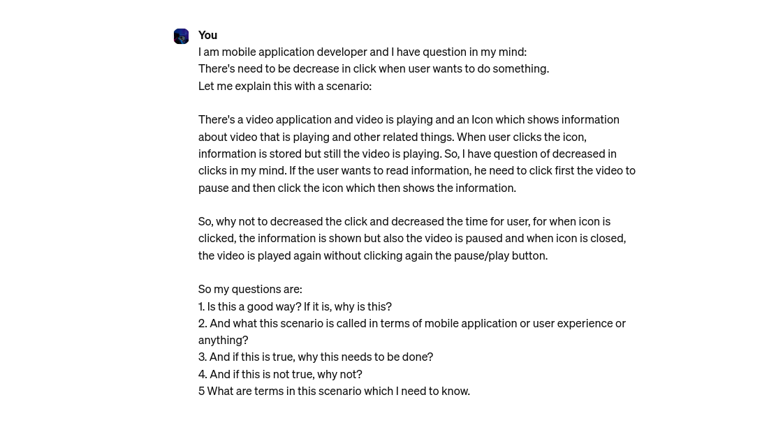
I am mobile application developer and I have question in my mind: There's need to be decrease in click when user wants to do something. Let me explain this with a scenario: There's a video application and video is playing and an Icon which shows information about video that is playing and other related things. When user clicks the icon, information is stored but still the video is playing. So, I have question of decreased in clicks in my mind. If the user wants to read information, he need to click first the video to pause and then click the icon which then shows the information. So, why not to decreased the click and decreased the time for user, for when icon is clicked, the information is shown but also the video is paused and when icon is closed, the video is played again without clicking again the pause/play button. So my questions are: 1. Is this a good way? If it is, why is this? 2. And what this scenario is called in terms of mobile application or user experience or anything? 3. And if this is true, why this needs to be done? 4. And if this is not true, why not? 5 What are terms in this scenario which I need to know.
Image of Question

Image of My Question from ChatGPT about User Experience in Mobile Applications
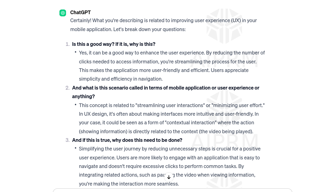
Answer from ChatGPT about User-Friendly and Minimizing Clicks in Mobile Phones
Certainly! What you're describing is related to improving user experience (UX) in your mobile application. Let's break down your questions:
Is this a good way? If it is, why is this?
- Yes, it can be a good way to enhance the user experience. By reducing the number of clicks needed to access information, you're streamlining the process for the user. This makes the application more user-friendly and efficient. Users appreciate simplicity and efficiency in navigation.
And what is this scenario called in terms of mobile application or user experience or anything?
- This concept is related to "streamlining user interactions" or "minimizing user effort." In UX design, it's often about making interfaces more intuitive and user-friendly. In your case, it could be seen as a form of "contextual interaction" where the action (showing information) is directly related to the context (the video being played).
And if this is true, why does this need to be done?
- Simplifying the user journey by reducing unnecessary steps is crucial for a positive user experience. Users are more likely to engage with an application that is easy to navigate and doesn't require excessive clicks to perform common tasks. By integrating related actions, such as pausing the video when viewing information, you're making the interaction more seamless.
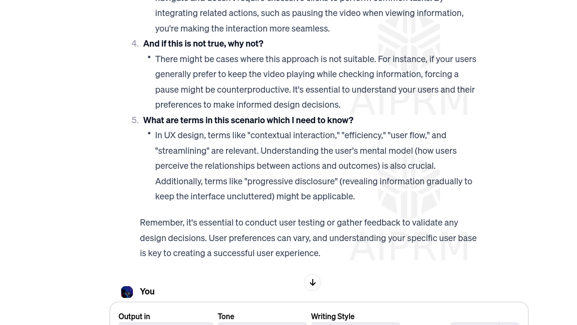
And if this is not true, why not?
- There might be cases where this approach is not suitable. For instance, if your users generally prefer to keep the video playing while checking information, forcing a pause might be counterproductive. It's essential to understand your users and their preferences to make informed design decisions.
What are terms in this scenario which I need to know?
- In UX design, terms like "contextual interaction," "efficiency," "user flow," and "streamlining" are relevant. Understanding the user's mental model (how users perceive the relationships between actions and outcomes) is also crucial. Additionally, terms like "progressive disclosure" (revealing information gradually to keep the interface uncluttered) might be applicable.
Remember, it's essential to conduct user testing or gather feedback to validate any design decisions. User preferences can vary, and understanding your specific user base is key to creating a successful user experience.
Image Answer from ChatGPT

Image 1 of Answer from ChatGPT about User-Friendly and Minimizing Clicks in Mobile Phones

Image 2 of Answer from ChatGPT about User-Friendly and Minimizing Clicks in Mobile Phones
Subscribe to my newsletter
Read articles from Kamran Mansoor directly inside your inbox. Subscribe to the newsletter, and don't miss out.
Written by

Kamran Mansoor
Kamran Mansoor
Student: Software Engineer. Junior Flutter Developer Data Scientist == Entrepreneur 🤞. COMSATS' 24. @kamran_hccp