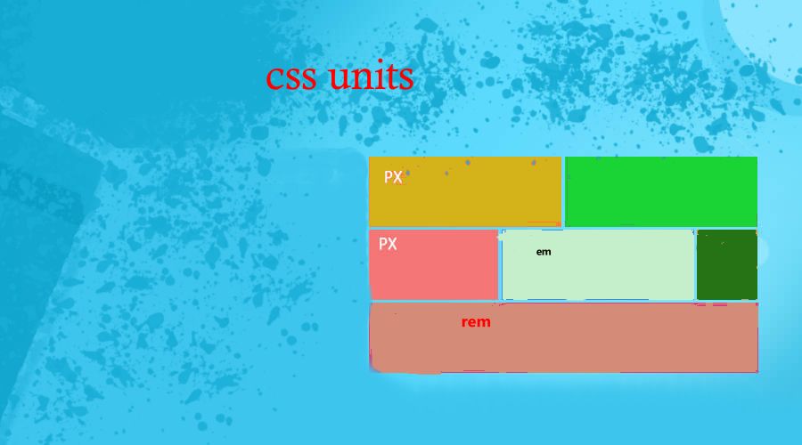
Units in css(lt.28)
 himanshu
Introduction:
CSS unit is a measurement of length, which is used to specify the size of element on the website.
Types of CSS Unit
Absolute: They represent a fixed size and remain the same regardless of screen size and are not responsive to changes in font size or viewport size.
Relative: They represent a size that is relative to another reference value. They change according to the various screen sizes.
Most Commonly used CSS units:
px: The most commonly used absolute unit, representing a single pixel on the screen.
em: Depend upon the parent.
rem: Depend upon root. Value of 1rem will be 16 px by default.
percentage: Represents a percentage of a reference value, such as the parent element's width or height
vw: This is a relative unit.Represents a percentage of the viewport's width
vh: This is also a relative unit.Represents a percentage of the viewport's height.
When to choose what to choose:
Use absolute units:
For specifying precise sizes that should remain constant.
When working with fixed layouts.
Use relative units:
For creating a responsive layouts that are flexible too.
When size of one depend upon the size of another element.
code to demonstrate:
<!DOCTYPE html>
<html lang="en">
<head>
    <meta charset="UTF-8">
    <meta name="viewport" content="width=device-width, initial-scale=1.0">
    <title>units</title>
    <style>
        section
        {
            border: 2px solid red;
            width: 50vw;
            height: 50vh;
            font-size: 20px;
        }
        main
        {
            border: 2px solid black;
            width: 50vh;
            /* 2 em ka mtlb h ki parent k font size * child ka size given .i.e 2*20,agr 4em hota to 4*20px */
            font-size: 1rem;
        }
    </style>
</head>
<body>
    <section>
        <main>hi how r u</main>
        </section>
</body>
</html>
Subscribe to my newsletter
Read articles from himanshu directly inside your inbox. Subscribe to the newsletter, and don't miss out.
Written by
