FlexBox 101 For Web Developer
 Anup Kumar Maurya
Hi there,
Gear up people, We'll learn about one of the most important concepts of CSS and how it can help us to style our website!
Let's flex:

What is Flexbox
Flex Box is a Layout Module, which makes easier to design flexible responsive layout structure without using float or positioning.
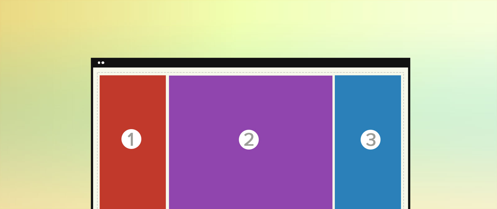
To start with flex ,you need a container with some items
<div class="flex-container">
  <div>1</div>
  <div>2</div>
  <div>3</div>
</div>
What is flex-direction, main-axis, cross-axis?
flex-direction is a property which defines the direction the container wants to stack the flex items.
The main axis is defined by flex-direction, which has four possible values:
row
row-reverse
column
column-reverse
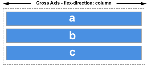
The main axis is defined by the flex-direction property, and the cross axis runs perpendicular to it.
By default
flex-direction:row
This means the main axis is left to right(Horizontal) and cross axis is top to bottom(Vertical)


when you change
flex-direction:column
This means the main axis is top to bottom(Vertical) and cross axis is left to right(Horizontal)


Note: understanding which is main axis and cross axis is important.
Flex container properties
Now, Let's Explore more about Flex container properties
flex-direction
justify-content
align-items
align-content
flex-wrap
flex-flow
1.The flex-direction Property
We already learn about flex direction row and column property ,now we learn about row-reverse and column-reverse.
a) row-reverse
When flex-direction : row-reverse , all the items of the container aligned horizontally (but from right to left)
b) column-reverse
When flex-direction : column-reverse , all the items of the container aligned vertically (but from bottom to top)
2. The justify-content Properties
justify-content property is used to align the flex items.
1. Positional alignment
a) center
justify-content: center; // Pack items around the center
b) start
justify-content: start; // Pack items from the start
c) end
justify-content: end; //Pack items from the end
Note:
flex-startandflex-endare somewhat similar tostartandend. One value (end) is defined in the CSS Box Alignment specification, and is intended to apply to multiple box layout models (block, table, grid, flex, etc.) .The other value (flex-end) is defined in the CSS flexbox specification, and is intended to apply only to flex layout.
justify-content: flex-start; //Pack flex items from the start justify-content: flex-end; //Pack flex items from the end
Note : 'left' and 'right' is same as 'start' and 'end'
justify-content: left; //Pack items from the left justify-content: right; //Pack items from the right
2. Distributed alignment
a) space-between
justify-content: space-between; /* Distribute items evenly The first item is flush with the start, the last is flush with the end */
b) space-around
justify-content: space-around; /* Distribute items evenly Items have a half-size space on either end */
c) space-evenly
justify-content: space-evenly; /* Distribute items evenly Items have equal space around them */
d) stretch
justify-content: stretch; /* Distribute items evenly Stretch 'auto'-sized items to fit the container */
3.The align-items Property
The align-items property is used to align the flex items.
We are using 200 pixels height for container, to understand the align-items property better
1. Positional alignment
Note: align-items does not take left and right values
a) center
align-items: center; // Pack items around the center
b) start
align-items: start; //Pack items from the start
c) end
align-items: end; //Pack items from the end
d) flex-start
align-items: flex-start; /* Pack flex items from the start */
e) flex-end
align-items: flex-end; /* Pack flex items from the end */
That's all for this article and with that, it's a wrap! I hope you found the article useful. Thank you for reading, If you have reached so far, please like the article, It will encourage me to write more such articles. Do share your valuable suggestions, I appreciate your honest feedback!
I create content about Programming, Design, and Technology, If this is something that interests you, please share the article with your friends and connections. You can also subscribe to my newsletter to get updates every time I write something!
Ta da! Until we meet again Happy Coding! ❤️
Subscribe to my newsletter
Read articles from Anup Kumar Maurya directly inside your inbox. Subscribe to the newsletter, and don't miss out.
Written by

Anup Kumar Maurya
Anup Kumar Maurya
Hey there, My name is Anup Maurya. I was born with love with programming and worked with Tata Consultancy Services as System Administrator in past & Founder of Techarge. I also love graphics designing. It's my pleasure to have you here.