How to Set Up a Modal in React: A Step-by-Step Guide
 Fronted Brief
Introduction
Modals are essential to modern, interactive React user interfaces. Modals, often called dialog boxes or overlays, display content or collect user input without leaving the website. Alerts, forms, notifications, and other information are often shown on them.
This step-by-step article will teach you how to create a React modal component, covering major concepts and approaches. Learn how to manage state, organize the modal component, handle opening and closing behaviours, and style to create a beautiful and functional modal interface in React apps.
Setting up the Project
Make sure you have Node.js installed on your PC before setting up our project.
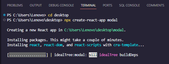
Create a new React project and navigate into the project directory by running the following commands in your terminal:
npx create-react-app modal
cd modal

Creating a modal component
To create our Modal component, we create a new file inside src and name it Modal.js
Insert the following code in the Modal.js file:
// src/Modal.js
import React, { useState } from 'react';
const Modal = () => {
const [isOpen, setIsOpen] = useState(true);
return (
<div className="modal">
<button onClick={() => setIsOpen(!isOpen)}>×</button>
{isOpen ? (
<div>Modal is open</div>
) : (
<div>Modal is Closed. Toggle to open the Modal again</div>
)}
</div>
);
};
export default Modal;
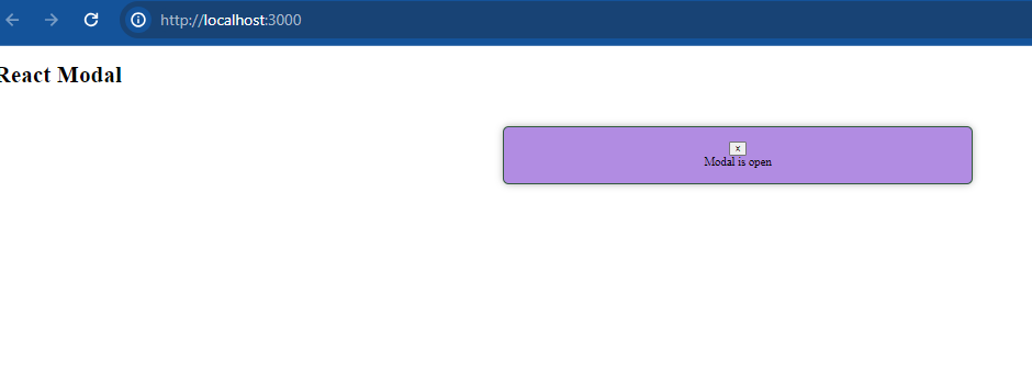
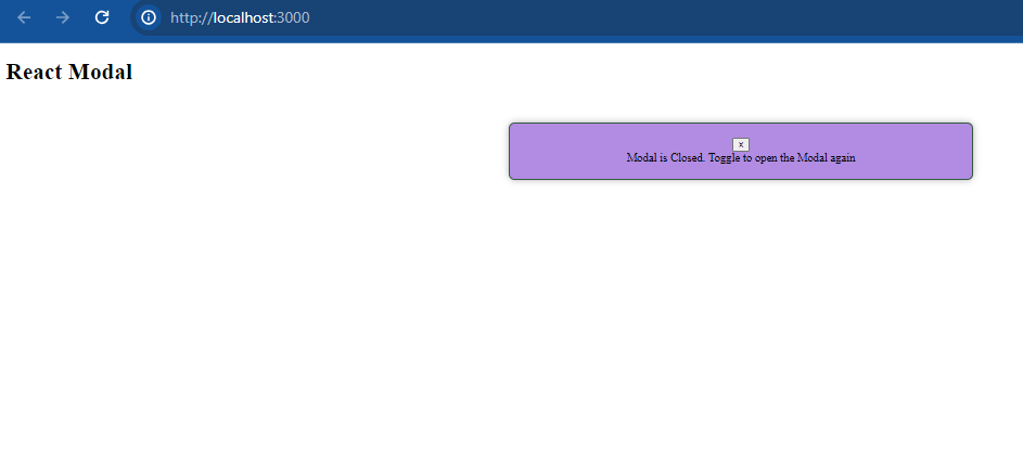
In the above code, the Modal functional component in React employs the useState hook to handle the visibility state (isOpen). It renders a button that toggles the isOpen state, dynamically displaying distinct content based on whether the modal is open or closed. The content alternates between "Modal is open" and "Modal is Closed. Toggle to open the Modal again" messages, updating accordingly upon button click.
Modal Component in App.js
Now that we have our modal component ready, we can update App.js to include it:
// src/App.js
import React from 'react';
import Modal from './Modal';
import './App.css';

function App() {
  return (
    <div className="App">
      <h1>My Modal</h1>
      <Modal />
    </div>
  );
}

export default App;
Styling
Make a new file called App.css in the src folder or edit the existing one to include some basic modal component styling:
/* src/App.css */
.modal {
  border: 1px solid #345a3f;
  padding: 20px;
  background-color: #b18ce2;
  width: 600px;
  margin: 50px auto;
  text-align: center;

}
Start The Development Server
npm start
To view the modal in action, open your browser and go to http://localhost:3000. To see the changes, click the button to toggle the modal.


Conclusion
Finally, to dynamically toggle and display content, you may use CSS styles, conditional rendering, and state management to create a modal in React. Developers may build interactive modal components with flexibility and state control using React's useState hook, conditional logic for visibility management, and CSS for styling. Gaining a grasp of these stages lays the groundwork for incorporating different modal functionalities, which in turn enhance user experiences in projects built using React.
Subscribe to my newsletter
Read articles from Fronted Brief directly inside your inbox. Subscribe to the newsletter, and don't miss out.
Written by

Fronted Brief
Fronted Brief
As a full-stack web developer and technical writer, I bring a unique combination of skills to every project I work on. With experience in both web development and technical writing, I can develop custom solutions that are not only high-performing and user-friendly but also well-documented and easy to maintain. I have expertise in a wide range of programming languages and technologies, including HTML, CSS, JavaScript, React, Node.js, Python, and SQL, as well as technical writing tools and techniques. I am committed to delivering projects on time and within budget while ensuring that the final product meets the unique needs of the client. Let's work together to create something amazing that meets your needs and exceeds your expectations.