What is my linux CPU load?
 Frits Hoogland
I recently had some discussions about understanding a CPU load. My position on understanding CPU load is that the figures that are mostly used, which are CPU percentages and the load 1/5/15 figures, are not enough to get a complete understanding of linux CPU load.
TL;DR
For understanding the 'load' of a system, CPU percentages provide incomplete information. The (unix) load 1/5/15 figures provide even less complete information because the number moves towards reality, and uses multiple load sources (running and uninterruptible state), which add load to different resources.
The utility procstat uses the CPU figures, but expresses them as time, not as percentages, and additionally uses the scheduler statistics to express 'waiting for runqueue' time. This provides a conclusive insight into actual CPU usage, as well as how much time has been spent on waiting to run tasks, providing the actual amount of oversubscription on CPU.
if this dazzles your mind or you want more explanation about what I summarizing above, read on: let me explain this to you.
CPU percentages
CPU percentages are widely used almost everywhere. The reason is probably because these are the original CPU figures that system administrator used 30 years back on Unix systems:
$ sar 1 10
Linux 6.5.0-14-generic (7acced642ee0)     01/08/24     _aarch64_    (5 CPU)

16:32:16        CPU     %user     %nice   %system   %iowait    %steal     %idle
16:32:17        all      0.00      0.00      0.00      0.00      0.00    100.00
16:32:18        all      0.20      0.00      0.00      0.00      0.00     99.80
16:32:19        all      0.20      0.00      0.20      0.00      0.00     99.60
I should point out this what sar on a recent linux system looks like; %steal is linux specific, and %iowait is not always part of sar data, although I know the recent unix versions do had this figure too. All in all, this is easy to use and understand information, and shows information about the usage of CPUs. Very useful.
Or is it? An 100% idle situation is obvious, but what does, for example, 10% user time for a second mean in the sense of CPU load? Yes, I agree it means 90% is still left, and thus there is CPU headroom.
But it's important to realise that the imaginary 10% here means half of a single CPU is used (5 (CPUs) * 0.1 (10%) = 0.5) out of the five. If the 10% was seen a single CPU system, it would mean 10% of that single CPU, and if would be run on an SGI UV-300, which can have 2,304 cpu threads, 10% would mean 230.4 CPUs were in use (extreme, I know).
So, that means that if you know the system it is running on, and thus know the number of CPUs visible to linux, percentages work. If not, it will give you an impression of headroom, but does not tell you how much CPU is used in the absolute sense. If percentages are used in a dashboard which shows virtual machines/pods/etc. with different amounts of CPU, it will be close to impossible to understand the actual resource usage, it can only show the percentage of headroom left, unless you know each system from the top of your head.
A solution for the percentage problem that is stated here, is to express the amount per CPU state as "seconds per second". "seconds per second" means that the total of all the states is 1 second times the number of (visible) CPUs. So in the above case of 5 CPUs, that would be 5.00:
$ procstat -o cpu-all
Timestamp  cpu            usr_s    nice_s     sys_s  iowait_s   steal_s     irq_s    soft_s   guest_s   gnice_s    idle_s sched_r_s sched_w_s
18:05:38   all             0.00      0.00      0.01      0.00      0.00      0.00      0.01      0.00      0.00      5.00      0.01      0.00
18:05:39   all             0.01      0.00      0.00      0.00      0.00      0.00      0.00      0.00      0.00      4.98      0.02      0.00
18:05:40   all             0.00      0.00      0.02      0.00      0.00      0.00      0.00      0.00      0.00      4.98      0.02      0.00
18:05:41   all             0.01      0.00      0.02      0.00      0.00      0.00      0.00      0.00      0.00      4.96      0.03      0.00
If you scroll to the right, you will see "idle_s" being close to 5.00: most of the time of the 5 CPUs is not scheduled, and thus idle. The above overview is created by a tool called `procstat`, which I developed to expose statistics both traditional as well as in more innovative ways, such as showing seconds per second.
But there is another problem with reporting percentages, which also is a problem when reporting CPU usage as time: it has a finite amount it reports on, which means it cannot go beyond 100% or all time per second per visible CPU (CPUs*1 second), while the actual amount of tasks willing to run can be much higher.
Load / load average
Many people will respond that this is where the load figure is for. I would dare to challenge the usage of the load figure for understanding what is going on, on linux.
The essence of me challenging this is to a great extent because the load figure on linux not only includes tasks in running state, but also tasks in uninterruptible state.
Traditionally, the load figure (on Unix operating systems) would include processes running on CPU and processes in the run queue/willing to run. This means that the traditional load figure is a better indicator. Not ideal, but "better".
Tasks in running state
This is where linux is different from the Unix operating systems. Traditionally, at least as I've been taught when using Unix systems like AT&T unix, SCO unix, Solaris, AIX, HPUX and many others, a process that needs to run gets into the CPU run queue, and waits for the scheduler to schedule it into a time slot or "quantum" which will give the process the ability to actually run on CPU.
Linux works pretty much the same, but with an exception: if a task needs to run, it gets set to the running state, not in a queue or getting a designated run queue state. The running state means the scheduler then needs to pick up the task and schedule it on a CPU, so the running state means willing to run, and can be both waiting for runtime or actually running on CPU. If the scheduler does schedule the task on a CPU, the state does not change.
How does the load figure work?
The load figure, on linux, takes the number tasks in R/running and D/uninterruptible state and uses it to calculate the load figure. To perform that calculation, it takes the previous load figure as basis, and uses the current load figure to alter the previous load figure. This alteration is done using a socalled exponentially decaying average where the decay length is set for 1, 5 and 15 minutes. The decay length sets how much influence the current figure has on changing the actual load figure.
This means that the load figure, both on linux and on Unix, where Unix is a "better" load figure, is never the actual load, but instead a figure that sits between a previous calculated figure caused by the past load, and the current load. It can only be the actual load if it the actual load is consistent. The time it needs to be consistent to represent the actual load depends on the difference between the current load and the previous calculated load figure.
So a load figure likely is not the actual, current, activity on a system. And a system with a varying amount of activity, which is extremely common, therefore never will actually never show the actual activity.
So what is the point?
The point is that since Linux kernel 2.6 there is a better way of understanding "load", where load means the running state of processes versus the available CPU. The better way of understanding "load" is by using the linux kernel time accounting of tasks in running state waiting for runtime in the /proc file /proc/schedstat:
$ cat /proc/schedstat
version 15
timestamp 4368614342
cpu0 0 0 0 0 0 0 595892062561 25425684664 8091266
domain0 1f 0 0 0 0 0 0 0 0 0 0 0 0 0 0 0 0 0 0 0 0 0 0 0 0 0 0 0 0 0 0 0 0 0 0 0 0
cpu1 0 0 0 0 0 0 596840467175 20630776500 8012462
domain0 1f 0 0 0 0 0 0 0 0 0 0 0 0 0 0 0 0 0 0 0 0 0 0 0 0 0 0 0 0 0 0 0 0 0 0 0 0
cpu2 0 0 0 0 0 0 593421390075 25706576601 8054939
domain0 1f 0 0 0 0 0 0 0 0 0 0 0 0 0 0 0 0 0 0 0 0 0 0 0 0 0 0 0 0 0 0 0 0 0 0 0 0
cpu3 0 0 0 0 0 0 592709134561 23012546662 8067187
domain0 1f 0 0 0 0 0 0 0 0 0 0 0 0 0 0 0 0 0 0 0 0 0 0 0 0 0 0 0 0 0 0 0 0 0 0 0 0
cpu4 0 0 0 0 0 0 587780921937 18764682075 8080783
domain0 1f 0 0 0 0 0 0 0 0 0 0 0 0 0 0 0 0 0 0 0 0 0 0 0 0 0 0 0 0 0 0 0 0 0 0 0 0
On each 'cpu' line:
the seventh figure is the runtime on cpu
the eighth figure is the waiting for runtime
Both are counters, and both are in nanoseconds.
The ninth figure is the number of quantum scheduled.
This means, like for more statistics in the /proc filesystem, a tools is necessary to gather these figures, add them together and to take the counter values at different points in time and calculate the amount over that time. Essentially to represent these figures just like CPU figures.
An issue is that there are no common, generally used tools, such as sar, that do report these figures, and thus most people (as far as I can see) use 'traditional' statistics, for which this article just summarised why these are inaccurate.
The procstat tool does report the schedstat figures with the sched_r_s (scheduler runtime per second) and sched_w_s (scheduler wait time per second):
$ procstat -o cpu-all
Timestamp  cpu            usr_s    nice_s     sys_s  iowait_s   steal_s     irq_s    soft_s   guest_s   gnice_s    idle_s sched_r_s sched_w_s
18:55:16   all             0.01      0.00      0.00      0.00      0.00      0.00      0.01      0.00      0.00      4.99      0.01      0.00
18:55:17   all             0.01      0.00      0.02      0.00      0.00      0.00      0.00      0.00      0.00      4.96      0.04      0.00
18:55:18   all             0.00      0.00      0.02      0.00      0.00      0.00      0.00      0.00      0.00      4.98      0.02      0.00
18:55:19   all             0.01      0.00      0.00      0.00      0.00      0.00      0.00      0.00      0.00      4.98      0.01      0.00
(scroll to the right, these are the last two columns)
Webserver
The current procstat version does have (experimental) support for starting a small webserver, which works as long as the tool is active, and show statistics that are gathered during the runtime of the tool, which shows a graphical overview of several performance figures. Here is an example of the tool showing CPU usage using the traditional CPU states:
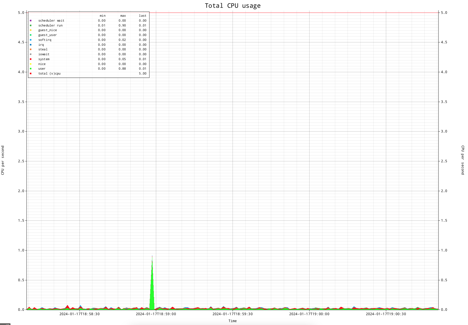
This is my test system. It has 5 virtual CPUs, which you can see in the legend as well as using the red line at "5". But of course this is a very boring overview if the system isn't doing anything. Let me start 4 processes and make them take 100% of CPU for each process, which will each be scheduled on a CPU:
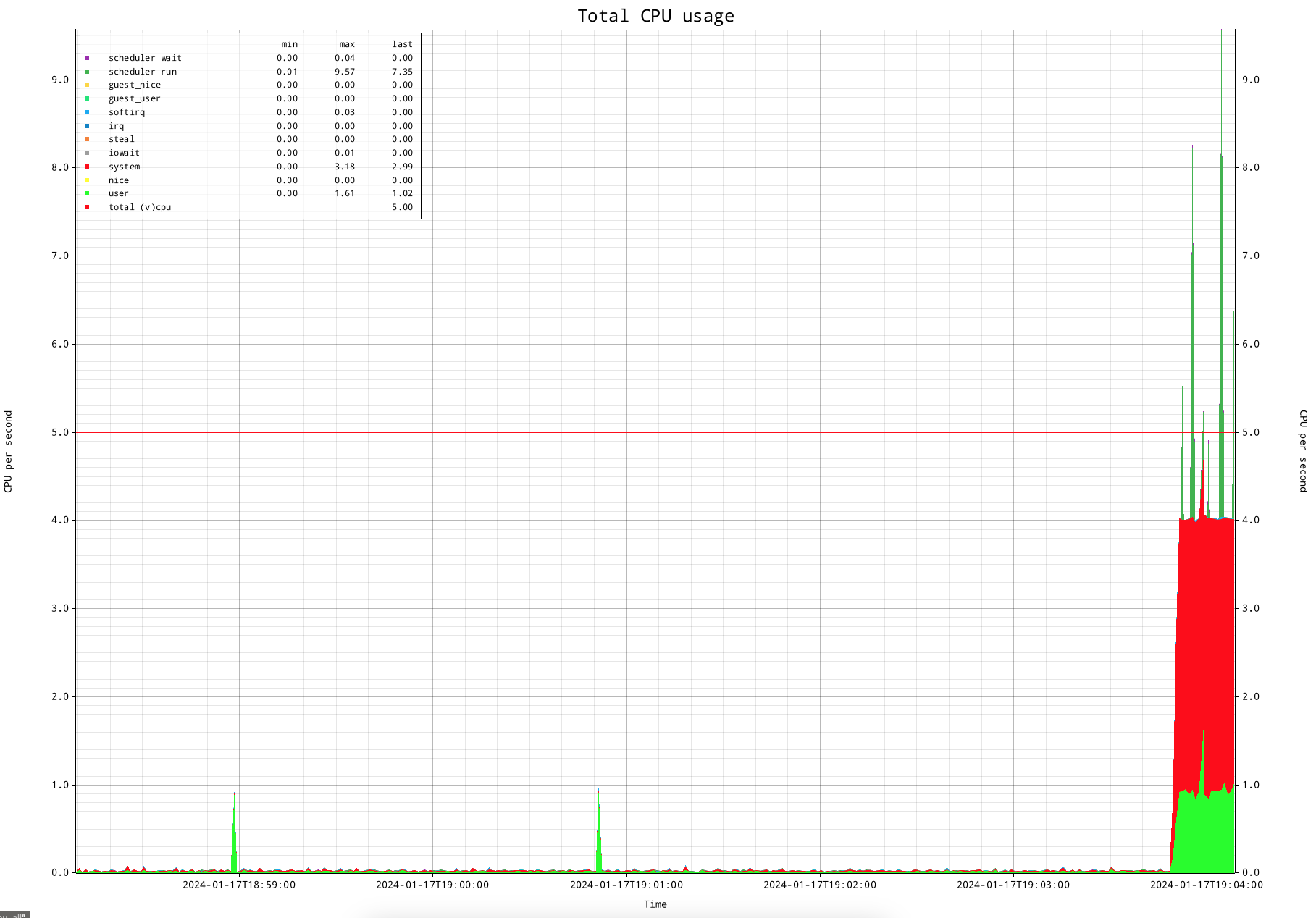
This shows is that the 4 processes do reasonably accurate take the full time of 4 processors. (I am using a very simple trick to occupy a full CPU with a process: yes>/dev/null &).
If you play close attention to the above CPU overview, you see that the runtime is taking a significant amount of system time, which is shown in red. If this would be an actual production system this would be a concern, processing should generally be in user time.
Scheduler runtime statistics
Another thing you might be wondering about are the dark green spikes, which are scheduler runtime statistics. They seem to disagree with the CPU accounting. The reason for this is CPU runtime statistics are administered per defined "clock tick", which is generally 100ms on linux configurations for server use, while the scheduler statistics are administered per scheduler quantum (alias 'timeslice').
Tickless kernel
Modern linux system do have what is commonly referred to as a 'tickless kernel'. This means the scheduler does not have fixed scheduler quantum, but allow a task to run "as long as it needs". Obviously there are limits to that.
First of all, there needs to be enough CPU to allow a task to run for a "longer" period of time: the scheduler in essence will try to give any task that is willing to run a portion of runtime. Only if there are more CPUs than concurrent tasks, it can let a task run for a longer period of time.
Second, if there is enough time, I observe that a task can run up to approximately 4 seconds. Once the task leaves its quantum, it will report its time. I measure the statistics by measuring the counters that indicate the amount of time for a statistic, and subtract two to see the difference over a period of time. The default period of time currently is 1 second. That means that if a task has added it's runtime of 4 seconds to the statistic and measure it as a difference between two measurements over the period of a second, it looks like 4 seconds worth of time happened in a second, which would equal to the runtime of 4 CPUs.
There are different ways to deal with this. The first one is to simply understand this, and take it for granted. That sounds a bit simplistic, but think about when this becomes important, which is once CPU gets under pressure. If that happens, the scheduler will lower the length of the time slots, and this will not be an issue anymore. As second way is to increase the period of time in between measurements. That would make the information less granular, but increasing it to 5 seconds would be long enough to have the large times be smoothed out.
Visualizing scheduler wait time
Now we are getting to the point that this article tries to make: an accurate insight into CPU usage, which allows to see oversubscription very clearly.
Let's create a simplistic CPU oversubscription scenario, where 6 CPU hungry processes are run on my 5 CPU system. These are the "yes" processes again.
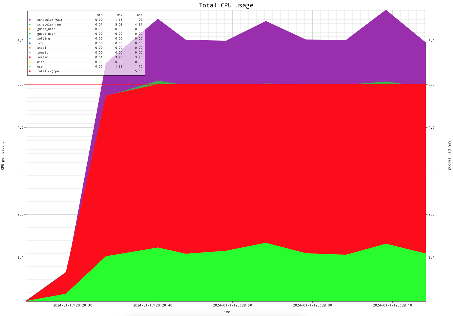
In order to make the graph more smooth and self explanatory, I increased the measurement interval to 5 seconds. This shows that the scheduler waiting for runtime statistic shows almost exactly the oversubscription of CPU of 1 process.
How about the load figure?
A logical question you might ask yourself is: okay; but how does this compare with the load figure?
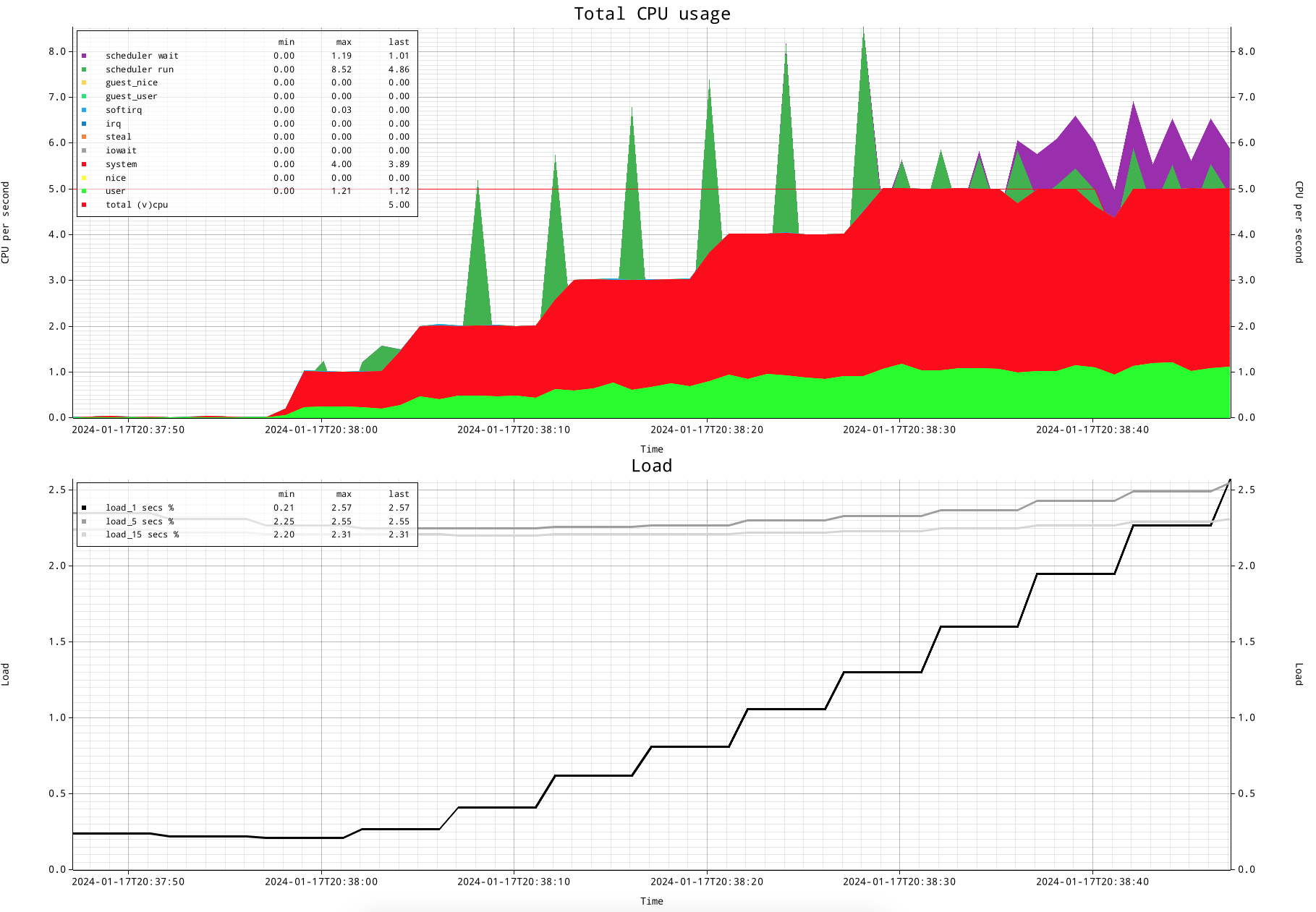
This is how that looks like. The CPU figures and the scheduler figures show exactly what is going one. The load figure shows first of all that a previous load did not lower the 5 and 15 minute load figures. But the 1 minute load figure was lowered, and it started climbing when more CPU was used.
The lines for load figures are: black for the 1 minute load average, medium grey for the 5 minute load average and light grey for the 15 minute load average.
This shows that the load figure does not actually show a lot of detail, and doesn't represent the actual state. And don't forget that the gradual increase here is likely the CPU usage, but also can be a task in uninterruptible state. Uninterruptible state, by definition, does NOT take any CPU: it's a state where a task is off CPU waiting for an event to happen, that likely is disk IO, but can be something different.
PSI: pressure stall information
There is a new kid on the block: PSI; pressure stall information. To address the issue of getting more insight into CPU usage, as well as having a way to let the linux kernel communicate pressure (outside of the scope of this article), the kernel exposes more information about CPU usage.
Let's replay the above scenario, and add PSI information:
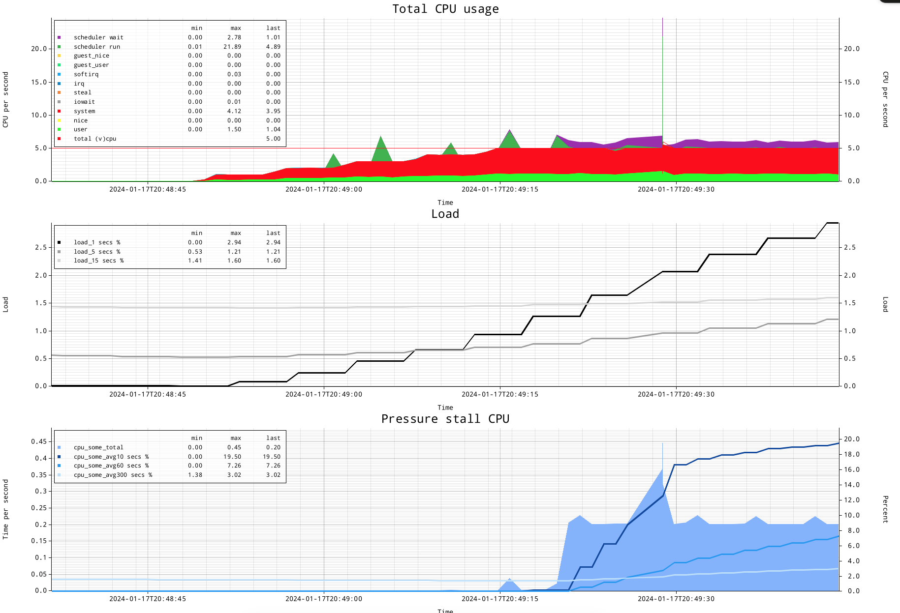
Okay, we see the CPU times and scheduler times, which do show exactly when the 6th process was oversubscribing again.
We also see the load figure reacting to the change in activity.
And there is the pressure stall information...let me explain how I currently visualize this. The left hand Y-axis shows time per second, which is the time measured by this PSI source, CPU. The right hand Y-axis side shows 'percent' for the 10 second, 60 second and 300 second lines (which are coloured dark blue, medium blue, light blue).
The lines somewhat resemble the 1, 5 and 15 minute idea of the load figure, but have different intervals, which are much shorter. You can see how especially the 10 second line quickly reacts to the activity. It goes to 20% in the graph above. But what is 20%?
20% is the amount of resource shortage for CPU. By having 6 active processes and 5 CPUs, the amount of oversubscription is 100*((6/5)-1)=20 percent.
In fact, the amount of time by blue area graph shows pretty much the same: it shows 0.2 seconds per second having no available CPU alias CPU oversubscription.
This means that CPU pressure stall information has a limited amount of pressure it can report on: let me show a graph where I startup 15 active processes, 15 concurrent active processes for 5 CPUs mean a load of 300%, where 100% is serviced by CPU, and the additional 200% is oversubscription.
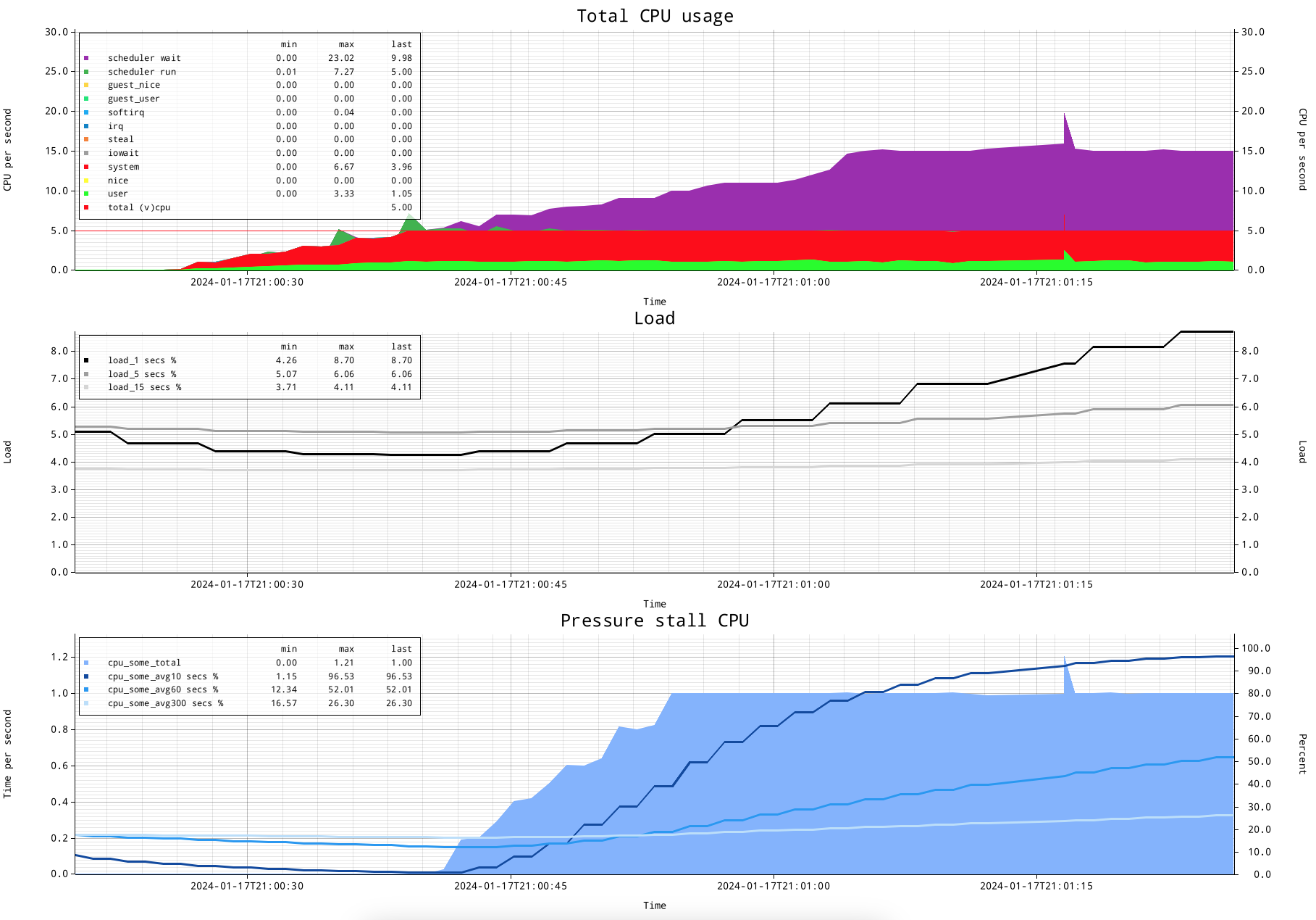
The CPU usage graph shows the CPU usage a in a very detailed way, where the actual oversubscription is clear, and very precisely shows when it started, and will show also when the oversubscription stops.
The load figure...is the load figure. It started changing...
The pressure stall information shows close to 100% for the 10 second line, and shows "1" for the stalled CPU time measured.
This is my current understanding of CPU pressure stall information:
If there are no tasks stalling for getting on CPU, it will not show anything. This means that up to reasonably close to all CPUs busy, there will be no PSI indicated.
Once tasks cannot get scheduled directly, they will add to CPU pressure stall information.
The percentages as well as the time report CPU stall time as an amount of stalling per second. Therefore it will go maximally up to 1 second per second or 100%.
This means PSI, if my understanding is correct, that CPU PSI cannot report more than 100% oversubscription.
Subscribe to my newsletter
Read articles from Frits Hoogland directly inside your inbox. Subscribe to the newsletter, and don't miss out.
Written by
