Code Craft
 Divyani Thota
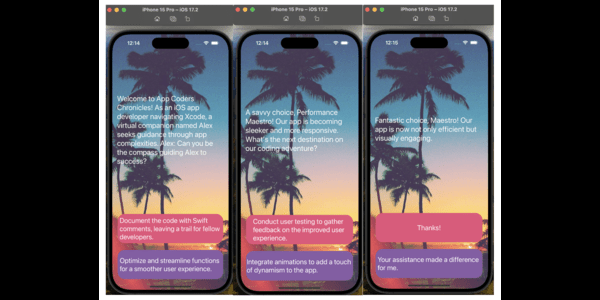
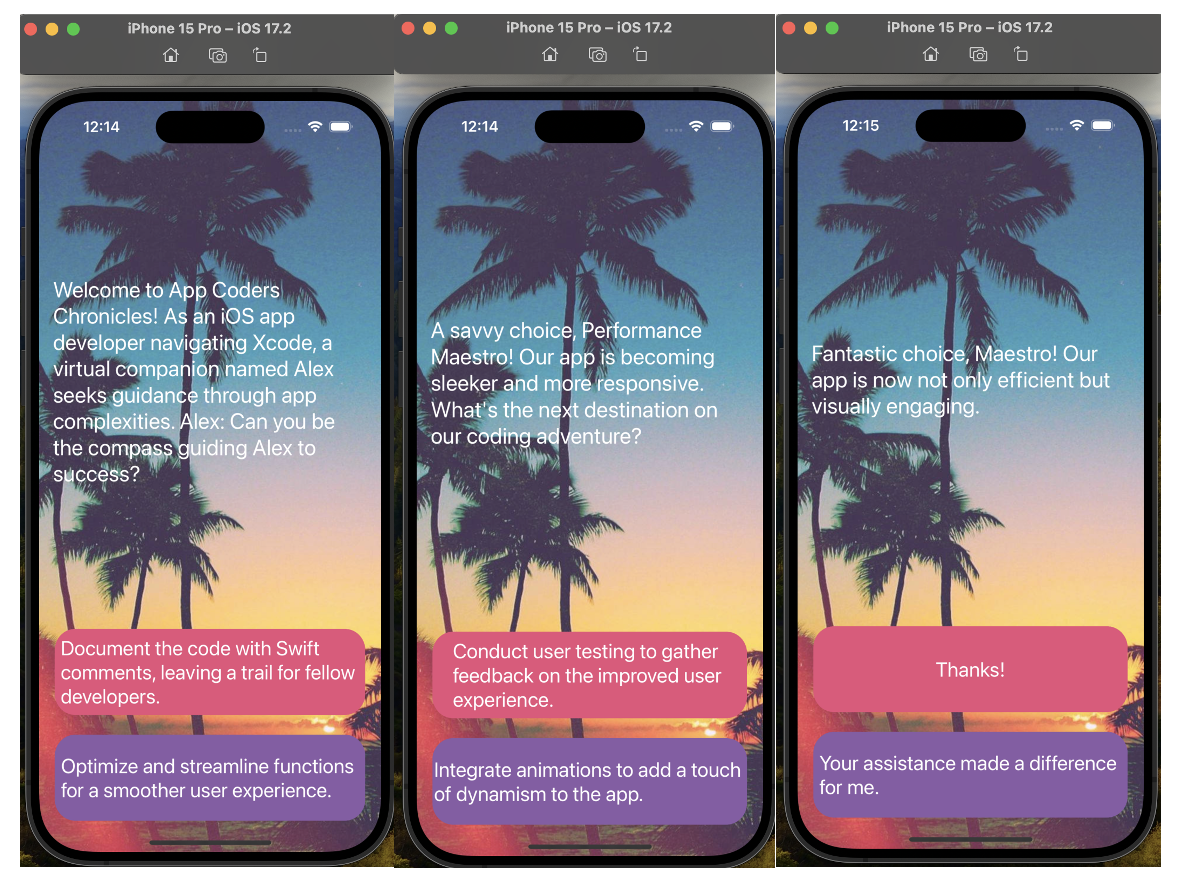
Hello, coding enthusiasts! I'm thrilled to introduce Code Craft, a user-friendly app crafted to initiate the coding journey and pave the way for anyone aspiring to become an app developer. Think of it as a coder's take on the well-known "Life Line" app. In this version, join Alex (an imaginary character) as he navigates the intricacies of app development, and your assistance becomes crucial. Let's embark on this coding journey together!
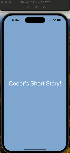
The launch screen is incredibly minimal, featuring only a blue background with the label, "Coder's Short Story," perfectly centered both vertically and horizontally within a container.

In crafting this app, I adopted the Model-View-Controller (MVC) design pattern as the architectural framework. This methodology segregates the components of the app into three distinct entities: the Model, View, and Controller.
The Model encapsulates both the data and the logic that govern the app's functionality. Here, you'll find variables, structures, mutating functions, methods, and properties that collectively define the app's behavior and operations.
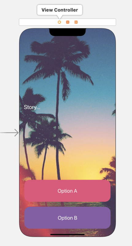
The View is responsible for constructing the user interface, leveraging the user interaction builder. In our scenario, the UI screen depicted below is categorized under the "View" component.

The Controller, represented by the ViewController file, serves as the mediator between the Model and the View. It manages the flow of information, ensuring that data from the Model is appropriately presented through the View, and any user interactions are communicated back to the Model.
Throughout the development process, I utilized core Swift concepts, including variables for storing data, structures to organize code, mutating functions to modify data within structures, methods for defining behavior, and properties for encapsulating characteristics of various elements within the app. This combination of MVC architecture and Swift fundamentals forms the backbone of the app's structure and functionality.
The app's user interface is meticulously crafted using two interactive buttons labeled as "Option A" and "Option B," alongside a text label sourced from the object library—all neatly organized within a stack view. Leveraging the power of Auto Layout, this strategic use of stack views allows for a dynamic adaptation of the user interface to varying device orientations, screen sizes, and changes in available space.
Within this intuitive interface, a text label is employed to display relevant information, and users can seamlessly interact by selecting either of the two options—Option A or Option B—to assist Alex in the development journey.

To enhance the visual appeal, the background image is sourced from Google, and meticulous attention is given to image resolution by generating 1x, 2x, and 3x images, ensuring optimal quality across various devices. This thoughtful design approach not only ensures a user-friendly experience but also contributes to the overall aesthetics of the app.
Ready to embark on your coding journey? Then, start crafting your own success story in the world of coding!
Subscribe to my newsletter
Read articles from Divyani Thota directly inside your inbox. Subscribe to the newsletter, and don't miss out.
Written by
