Screen Choreography
 Divyani Thota
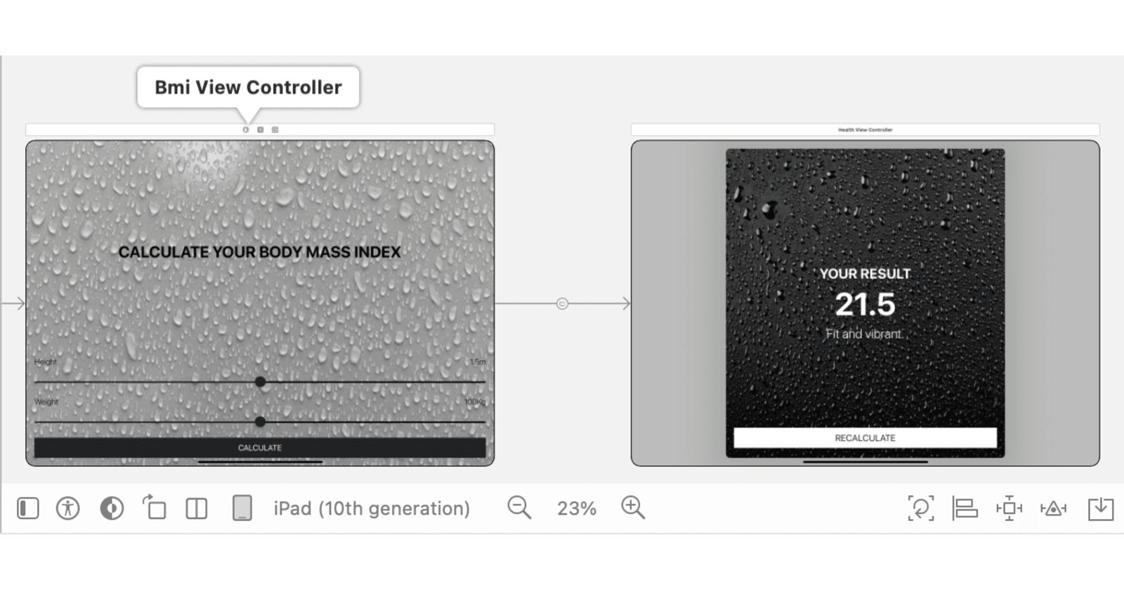
Hey there, I am delighted to share some exciting insights about developing my iOS app, "BMI Tracker." In this blog, we'll delve into the intricacies of making the app work seamlessly on various iOS devices, from iPhones to iPads and ensuring a smooth user experience in both portrait and landscape orientations.
Why does it matter?
Think about it – when you use an app, you want it to feel natural, regardless of whether you're holding your phone upright or sideways, or if you're on an iPhone or an iPad. You shouldn't sense a disorienting shift when transitioning between holding your phone upright or sideways or switching from an iPhone to an iPad.
A seamless experience fosters a sense of familiarity, preventing users from feeling disconnected or disoriented, and ultimately enhances their overall satisfaction with the application.
BMI Breakdown
Here's a sneak peek into what our BMI chart reveals: If the BMI value is below 18.5, it suggests leanness. The sweet spot is between 18.5 and 24.9, which indicates fitness. Beyond 24.9? Well, that's where obesity might be knocking on the door.
Important Disclaimer
Before we go any further, it's crucial to clarify – I'm not a health professional. The BMI values I'm talking about here are specifically applied to develop the app. This blog is not a substitute for professional health advice.
Adaptive Transitions and Different Orientations on Various Devices
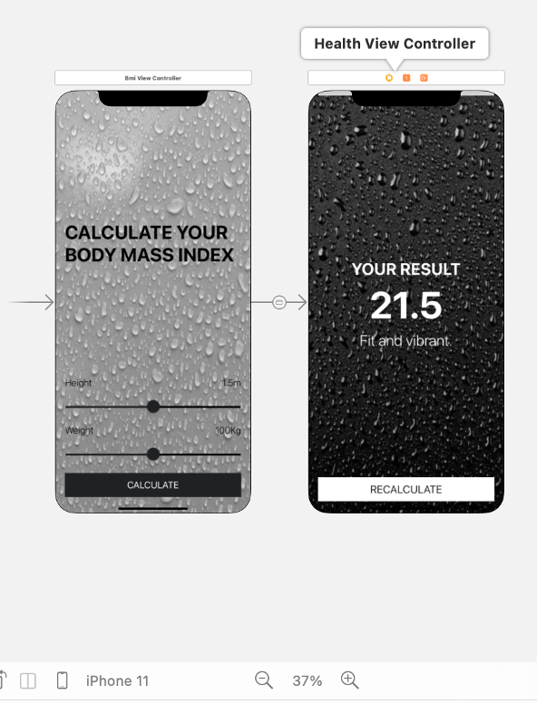
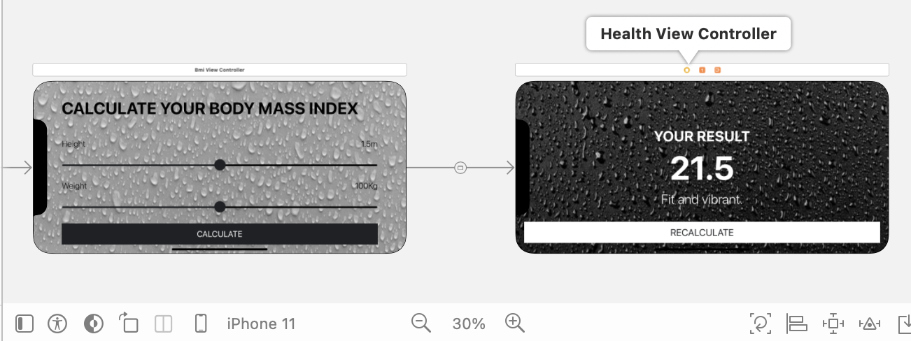
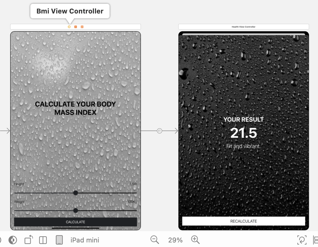
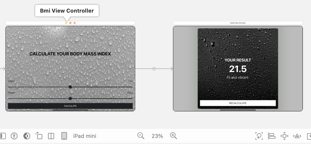
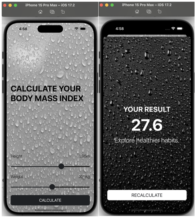
I have implemented two view controllers namely "Bmi View Controller" and "Health View Controller" in my app, each serving a distinct purpose as shown below,
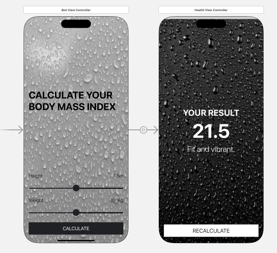
The first view controller welcomes users with the UILabel displaying "CALCULATE YOUR BODY MASS INDEX" and provides UI sliders for selecting height and weight by the users. A button is in place for users to initiate the BMI calculation.
The second view controller displays the calculated BMI value and offers brief advice categorizing the user as fat, fit, or lean.
These view controllers are seamlessly connected using segues. A segue is a transition from one view controller to another view controller in an application. Two essential UIViewController methods are necessary to initiate the segue and facilitate the transition from the first view controller to the second. These methods play a pivotal role in the flow of our app. The methods are,
In the code, both view controllers are defined using class, and optionals are employed to handle potential nil values.
Now, let's talk about making our app adaptive to different devices and orientations. User satisfaction significantly hinges on an app's ability to run smoothly across various devices. To achieve this, we leverage constraints to pin images and elements to specific positions on the view. Whether in portrait or landscape mode, our images dynamically adjust, offering a consistent visual experience.
Utilizing horizontal and vertical alignment constraints allows us to center elements dynamically, ensuring a harmonious layout regardless of device orientation. Also, I have set the content mode of the background image to aspect fill so that it scales the entire bounds of the background image while maintaining its aspect ratio.
To simplify the alignment and pinning process, I've incorporated stack views. These handy components enable us to align and pin the UIButtons, UISlider, and images in smaller portions of the view independently, making our app more resilient to orientation changes. Additionally, it's crucial to mark suitable orientations in the Deployment Info section of the General settings as depicted in the image below,
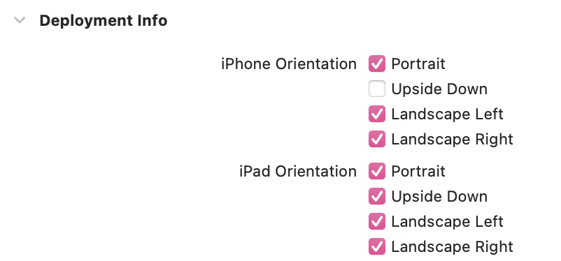
For iPhones and iPads, the same principles apply. Also, make sure to add iPhone and iPad devices to the Supported Destinations in the General settings to ensure that the app is running seamlessly on various devices involved.
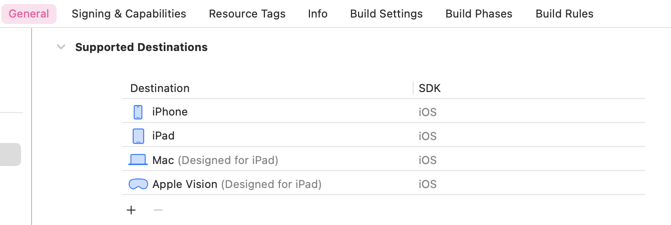
Thorough testing, both on simulators and physical iPhones, is paramount to guaranteeing optimal performance across different orientations and devices.
DIFFERENT ORIENTATIONS (iPhone):
Portrait:
Landscape:
DIFFERENT ORIENTATIONS (iPad):
Portrait:
Landscape:
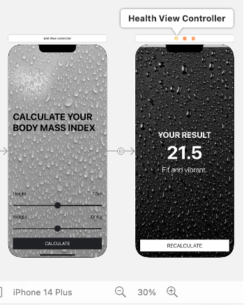
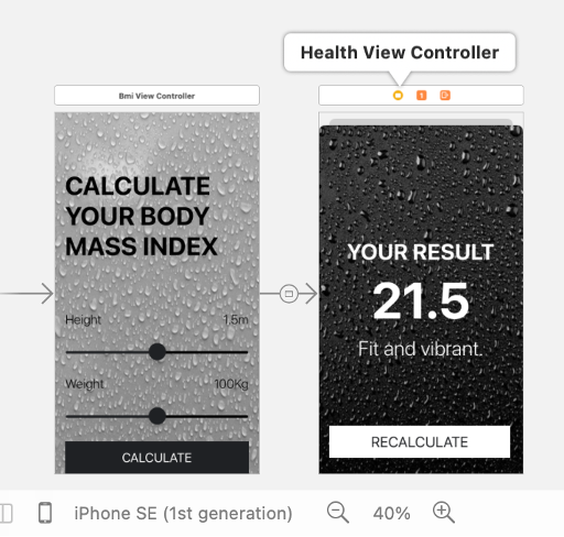
DIFFERENT IPHONE DEVICES:
iPhone 14 Plus
iPhone SE (1st generation)
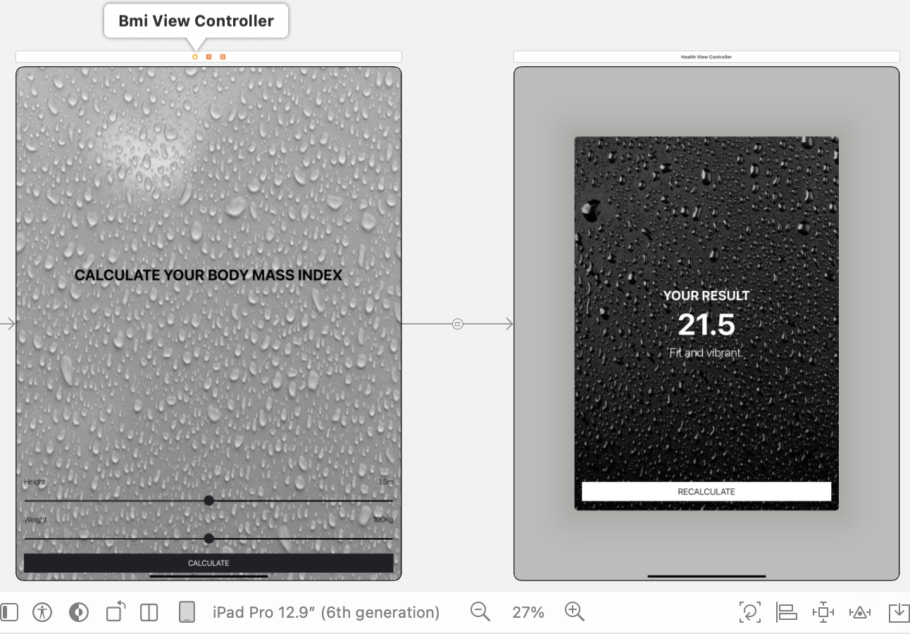
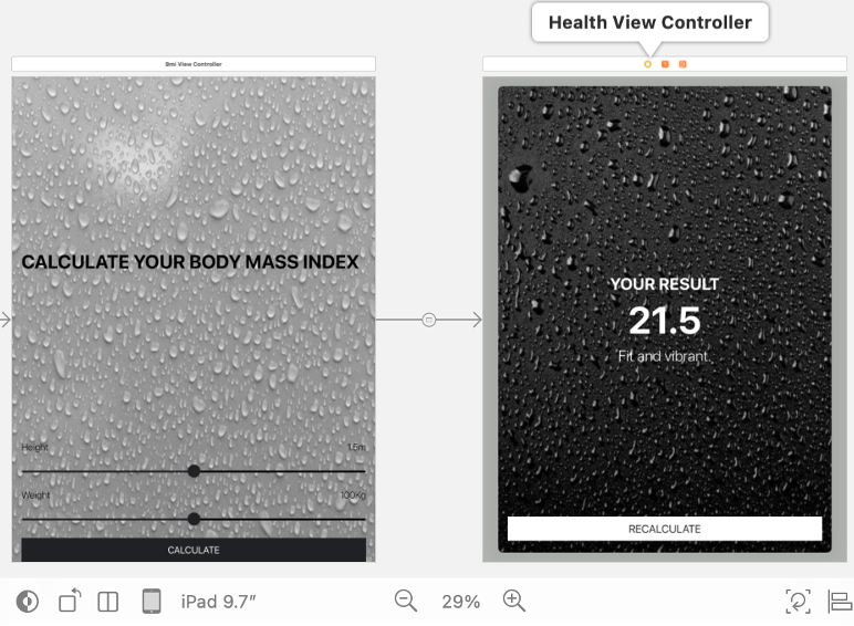
DIFFERENT IPAD DEVICES:
iPad Pro 12.9" (6th generation)
iPad 9.7"
Simulator:
The following link demonstrates the app in action on an actual mobile device.
https://share.vidyard.com/watch/yjECQpYpJoWJb3MfTkqZEg?
As we explore the realm of seamless experiences, let the adaptability of your apps captivate users in the harmonious symphony of technology.
Thank you!
Subscribe to my newsletter
Read articles from Divyani Thota directly inside your inbox. Subscribe to the newsletter, and don't miss out.
Written by


