EasyBank: Empowering Your Financial Journey
 Jeremiah Samuel
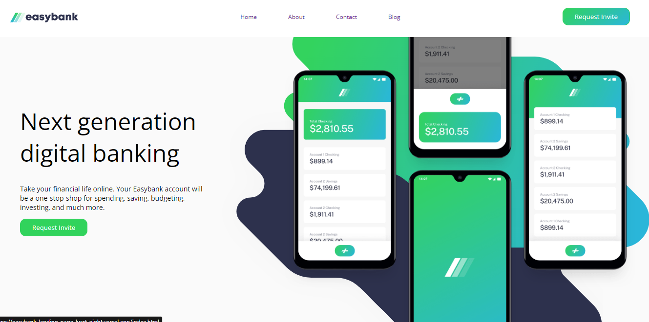
Today’s journal marks the end of the second week and the commencement of the third week of boot camp. No better way to end it than with a walkthrough of a completed project. By the end of week 2, We were tasked with building a landing page for a digital banking solution. This solution would have some key features which are highlighted below
Bank Name: EasyBank
Key Features
Online Banking
The app would have web and mobile applications to offer convenience, allowing users to manage their finances anytime, anywhere. They can also visualize their transactions, account details, and more at their fingertips.
Simple Budgeting
Users can keep control of their spending using a straightforward budgeting tool. Receive timely notifications to ensure you stay within your financial limits.
Fast Onboarding
This solution would facilitate quick and smooth-free onboarding thereby eliminating traditional banking hassles. Users can open an EasyBank account in minutes online, eliminating the need for physical branches and tedious paperwork.
Open API
Experience financial management like never before. Easily manage your savings, investments, pension, and more from a single account, thanks to our open API.
Page Structure
Navigation:
The navigation bar will ensure easy access to all sections of the EasyBank landing page. From the homepage to the blog and contact details, it is structured for a smooth user journey.
Hero Section
This displays what EasyBank represents: “next-generation digital banking that empowers you”.
Blog Section
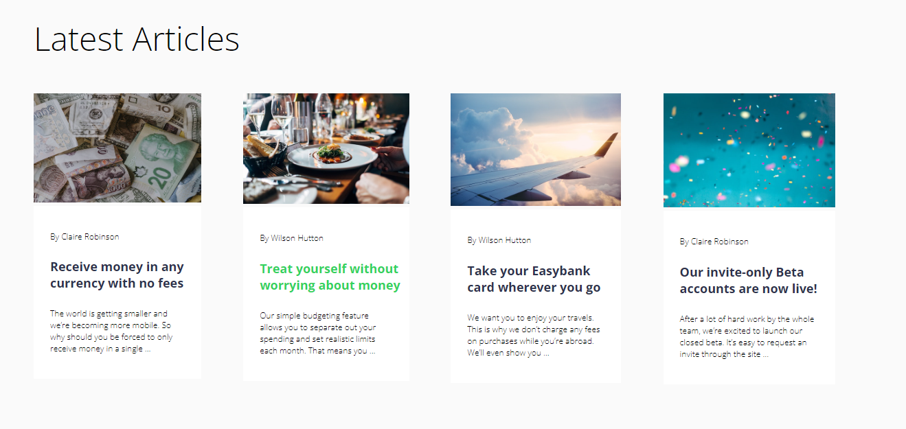
A blog section has been added to provide valuable insights, financial tips, and updates. Discover articles on personal finance, banking best practices, and strategies for financial wellness. The aim is to empower our users with relevant knowledge.
Development Walkthrough
Developing the EasyBank landing page involved a strategic combination of HTML, CSS, and optional JavaScript to create an engaging and responsive user interface.
HTML Structure
This is structured to ensure a seamless user journey for users.
CSS Styling
CSS was used to enhance the visual appeal, maintaining a clean and modern design throughout the page. Responsive design was considered to ensure a consistent experience across web and mobile devices.
You can find the Project Link here and view it. Your feedback would be most appreciated
Subscribe to my newsletter
Read articles from Jeremiah Samuel directly inside your inbox. Subscribe to the newsletter, and don't miss out.
Written by

