Outlier Detection With Python
 Abraham Luna
Data is not perfect, there is always a need to clear and transform a dataset before training a Machine Learning model or simply take insights from the data.
Nulls and wrong data types are not the only problems while cleaning data. Depending of what and where you are collecting data from there may be values that will affect the data distribution and descriptive statistics. These values are often referred as outliers, and the process to identify and clean the outliers is called Outlier Detection.
On this article I will explain five different ways you can tackle outliers in a smart and easy way. It all depends on the case you are working on to pick one of these techniques. These are:
Elliptic Envelope
Interquartile Detection
Isolation Forest
Standard Deviation
Z-Score
Lets review each one using python. Here are all needed libraries and imports we will use throughout this article
import pandas as pd
import numpy as np
import matplotlib.pyplot as plt
import seaborn as sns
from sklearn.covariance import EllipticEnvelope
from sklearn.datasets import make_blobs
from sklearn.ensemble import IsolationForest
Elliptic Envelope
The Elliptic Envelope is a statistical technique that can be used to detect outliers in a normal distributed dataset.
We can use the EllipticEnvelope class from Scikit-Learn and fit our data into it. It first calculates an elliptic depending on the distribution of the data, then values that are not inside the elliptic are identify as outliers.
First, we create a random normal distributed dataset with 500 records
# Create a random dataset with two features
# Normal distributions dataset
X, _ = make_blobs(n_samples=500, n_features=2, centers=1, shuffle=True, random_state=1)
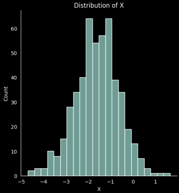
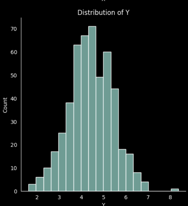
If we plot the data for the two features created we can see the normal distribution
# plot the distribution 'x'
sns.displot(X[:,0]).set(title='Distribution of X', xlabel='X')

# plot the distribution 'y'
sns.displot(X[:,1]).set(title='Distribution of Y', xlabel='Y')

plt.show()
Then define the elliptic envelope model
elpenv = EllipticEnvelope(contamination=0.025, random_state=1)
elpenv

By fitting the data into the model it returns an array with values -1 and 1. -1 means the value on that index is an outlier
# Returns 1 for inliers and -1 for outliers
pred = elpenv.fit_predict(X)
pred
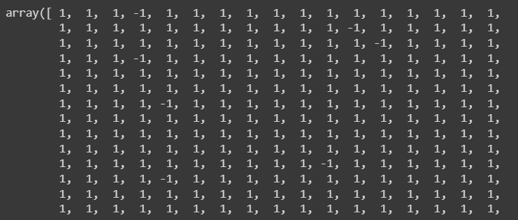
This array does not specify the index on the original dataset. Lets identify them
# Identify the outliers (-1)
outliers_index = np.where(pred==-1)
outliers_values = X[outliers_index]
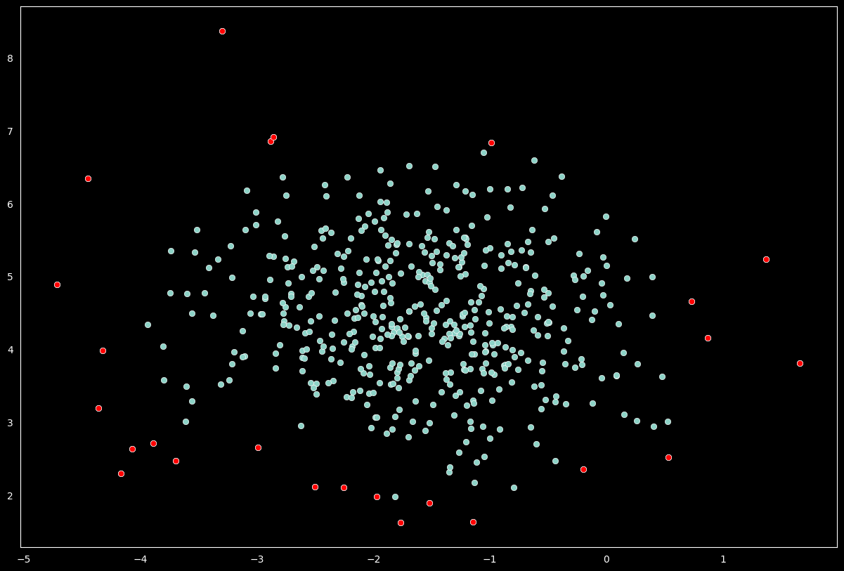
Once the outliers are identified we may want to visually review their values
# Plot the data and mark the outliers
plt.style.use('dark_background')
sns.scatterplot(x=X[:,0], y=X[:,1])
sns.scatterplot(x=outliers_values[:,0],
                y=outliers_values[:,1], color='r')

# plt.title('Outlier Detection - Elliptic Envelope', fontsize=15, pad=15)
plt.show()
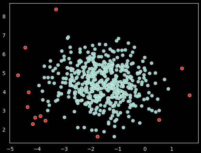
On above plot the red data points are outliers per the elliptic envelope technique.
Interquartile Detection
The Interquartile Range (IQR) is a statistical technique that measures the spread of the middle 50% of values in a dataset by dividing the data into quartiles.
For better use of our random data we can store it on a pandas data frame
# create dataframe with our random values
df = pd.DataFrame(X, columns=['x', 'y'])
df.head()
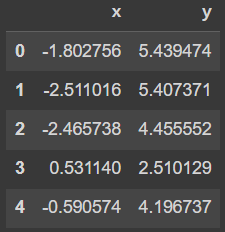
Is necessary to calculate the first and third quartiles. the IQR can then be calculated by subtracting the first quartile to the third quartile
# calculate the first and third quartiles of the data
q1 = df.quantile(0.25)
q3 = df.quantile(0.75)

# calculate the interquartile range (IQR) of the data
IQR = q3 - q1
Now we calculate the lower and and upper limits using the IQR. We will use this limits to identify the outliers.
# calculate the lower and upper bounds for outliers
lower_limit = q1 - 1.5 * IQR
upper_limit = q3 + 1.5 * IQR
print('lower_limit', lower_limit)
print('upper_limit', upper_limit)
These operations will create the lower and upper limit by variables available. In our case there are two variables
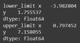
We can access to an specific variable limit
lower_limit[0]

Now that we have the limits defined the next step is to identify those data points that are out of those limits. We can make use of the pandas data frame filtering statements to pass both limits (lower & upper) for all variables (X & Y)
# identify the outliers in the data
outliers = df[(df['x'] < lower_limit[0]) | (df['x'] > upper_limit[0]) | (df['y'] < lower_limit[1]) | (df['y'] > upper_limit[1])]
We can also get the index of each outlier with the following piece of code
# get the indexes of the outliers
outlier_indexes = outliers.index.tolist()
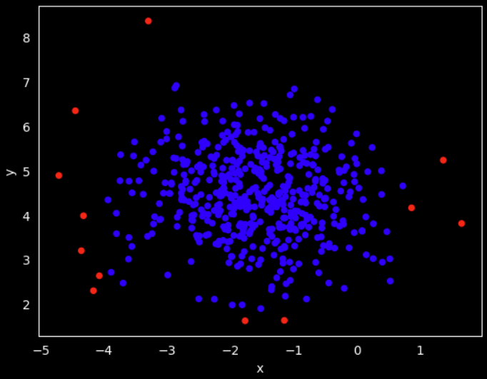
To make it easy to see, lets create a column in the data frame that states red color for those outliers and blue for the values we want to keep
# create a new column 'color' based on the limits
df['color'] = 'blue'
df.loc[outlier_indexes, 'color'] = 'red'
df['color'].unique()

If we plot the data with the identifier color we can now compare to previous outlier detection technique
# Plot the data and mark the outliers
df.plot.scatter(x='x', y='y', c=df['color'])
plt.show()
Isolation Forest
The Isolation Forest is a tree-based anomaly detection algorithm that uses an unsupervised learning approach to identify outliers from a dataset.
Scikit-learn provide the IsolationForest() class to define a model to detect outliers using the Isolation Forest algorithm. Lets create one for our random dataset
iforest = IsolationForest(n_estimators=100, max_samples='auto',
                          contamination=0.05, max_features=1.0,
                          bootstrap=False, n_jobs=-1, random_state=1)

iforest
We pass several parameters values that you can play with to make a better outlier prediction. We will not focus on the specifics but I encourage you to learn more here.
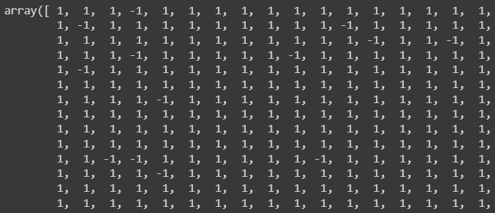
With a Isolation Forest model define we simply fit the data into the model and similar to the Elliptic Envelope technique it returns and array with values -1 and 1, where -1 means outlier
pred = iforest.fit_predict(X)
pred
Identify and save the index of those outliers
# Identify the outliers (-1)
outliers_index = np.where(pred==-1)
outliers_values = X[outliers_index]
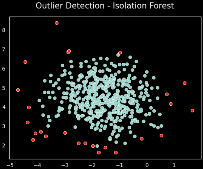
And plot the data with the outliers in red
# Plot the data and mark the outliers
sns.scatterplot(x=X[:,0], y=X[:,1])
sns.scatterplot(x=outliers_values[:,0],
                y=outliers_values[:,1], color='r')

plt.title('Outlier Detection - Isolation Forest', fontsize=15, pad=15)
plt.show()
Standard Deviation
The Standard Deviation is a statistical technique that measures the spread of the dataset values around the mean of the dataset.
The standard deviation is calculated as the square root of the variance of the dataset.
Lets define the lower limit and upper limit for each of the variables in our random dataset. In this case we have to define each limit for individual variables.
# define limits using sigmas, by variable
lower_limit_x = df['x'].mean() - 3*df['x'].std()
upper_limit_x = df['x'].mean() + 3*df['x'].std()

lower_limit_y = df['y'].mean() - 3*df['y'].std()
upper_limit_y = df['y'].mean() + 3*df['y'].std()
print('lower_limit_x : ', lower_limit_x , ' & upper_limit_x : ', upper_limit_x)
print('lower_limit_y : ', lower_limit_y , ' & upper_limit_y : ', upper_limit_y)

As we are using the standard deviation and it is based on the data distribution, it is best to plot each variable and show the limits defined previously
# Plot histograms with the upper and lower limits
# plot the distribution 'x'
fig = sns.displot(data=df, x='x')
fig.set(title='Distribution of X', xlabel='X')
plt.axvline(lower_limit_x, color='magenta')
plt.axvline(upper_limit_x, color='magenta')

# plot the distribution 'y'
fig = sns.displot(data=df, x='y')
fig.set(title='Distribution of Y', xlabel='Y')
plt.axvline(lower_limit_y, color='magenta')
plt.axvline(upper_limit_y, color='magenta')
plt.show()
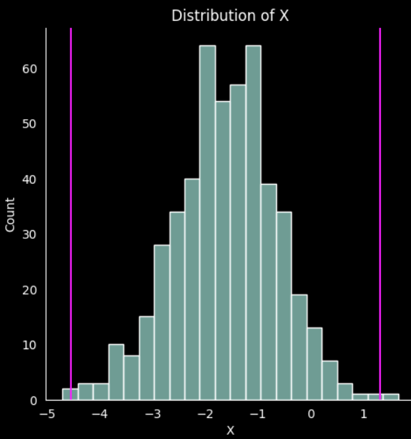
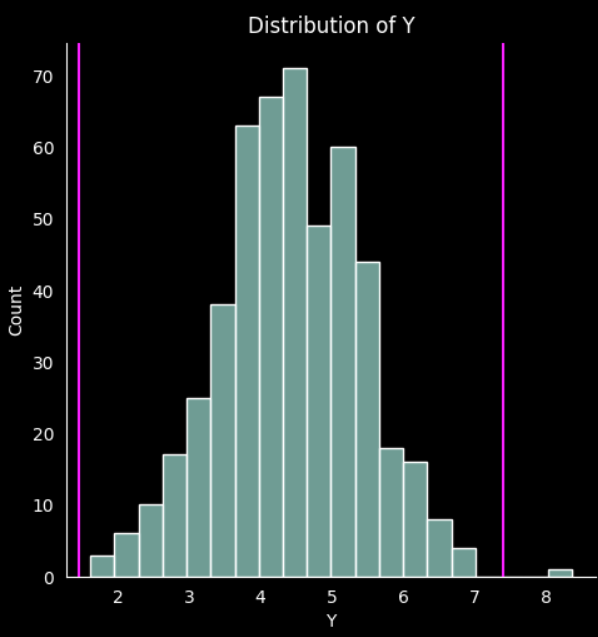
It is easy to visualice the limits, and you can implement the color column used in the previous technique to identify each outlier.
Z-Score
The Z-score is a statistical technique that measures the number of standard deviations that a data point is away from the mean of the dataset.
Similar to the standard deviation technique the Z-score uses the standard deviation. It takes the difference between a data point and the mean of the dataset, divided by the standard deviation of the dataset.
# Calculate the Z-score in a new column
df['z_score_x'] = (df['x'] - df['x'].mean())/df['x'].std()
df['z_score_y'] = (df['y'] - df['y'].mean())/df['y'].std()
df.head()
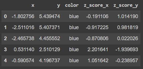
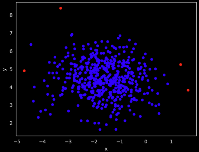
We can also create a color column on this techinque to visually identify the outliers. The difference is that we calculated a z_score for each of the variables, therefore, we need to specify that we want to flag those data points that are out of the range -3 and 3 z_score
# Identify the outlier then assign a color
# identify the outliers in the data
outliers_z = df[(df['z_score_x'] < -3) | (df['z_score_x'] > 3) | (df['z_score_y'] < -3) | (df['z_score_y'] > 3)]

# get the indexes of the outliers
outlier_indexes_z = outliers_z.index.tolist()

# create a new column 'color_z' based on the limits
df['color_z'] = 'blue'
df.loc[outlier_indexes_z, 'color_z'] = 'red'
Then we plot the data with the assigned color
# Plot the data and mark the outliers
df.plot.scatter(x='x', y='y', c=df['color_z'])
plt.show()
Next Steps
There are different ways to detect and remove the outliers. It all depends on how your data is distributed and is also important that you understand the nature of the data, the process it comes from. There are many considerations before picking one technique but you are not limited to just use one!.
I highly recommend you exploring how these techniques compare to each other in a real world example. Here are some ideas to continue practicing
Implement one outlier detection technique on your next Exploratory Data Analysis project (EDA)
Compare a correlation exploration before and after cleaning a dataset from outliers
Are there more techniques to be use?. I'm sure you will find more advanced ways to accomplish this task
Try the same techniques shared here but with different data distributions and more variables
As always, here is the full notebook in my GitHub repo.
Keep on learning !
Subscribe to my newsletter
Read articles from Abraham Luna directly inside your inbox. Subscribe to the newsletter, and don't miss out.
Written by

Abraham Luna
Abraham Luna
I am an Industrial Engineer, enthusiast in Data Science, Machine Learning and programming in general.