Let's talk about Mingle
 José
José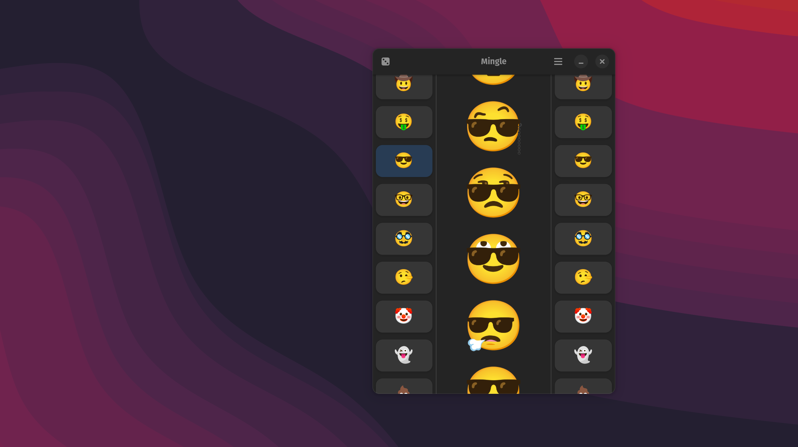
I have spent the past few weeks working on a small personal project, because I do not know when to stop. I think Mingle is mostly feature complete at this point. It lets you play with Google's Emoji Kitchen, which is available on Android's GBoard, on GNOME. It provides a convenient way to find the perfect expression and paste it into any conversation online. It is a GTK4/Libadwaita application written in Vala/Blueprint. I have such a weird fascination with Vala. I have a Java/C# background so the syntax is quite familiar. Blueprint is the future and way more readable then XML. The application is still using a placeholder icon because I am not an artist and my own endeavors into Inkscape have not been too successful. Life has kinda been kicking my butt recently, so working on this app has been a small reprieve from how uncaring and mean existence can be.
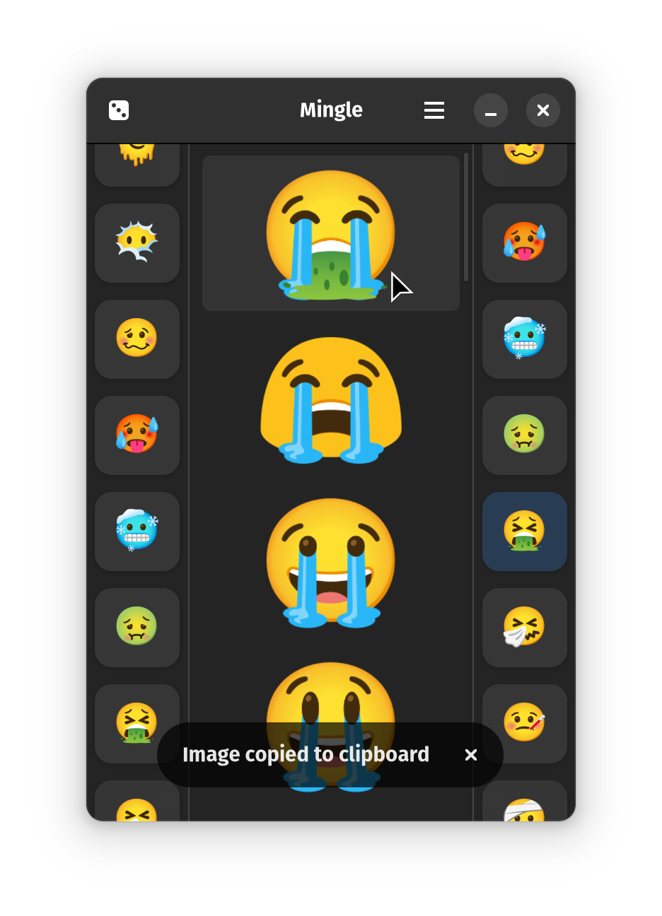
Personal Favorite
Lazy Loading
I started this project under the assumption I would get it running under GNOME Shell Mobile one day. So, I had to implement lazy loading, something I have never done before, if I ever wanted to see this run on a mobile device; Until somewhat recently, when you selected an emoji it would just grab every relevant combination. This was not smart or efficient. Mingle would very quickly use up more memory than my web browser. Google's artists made a lot of emoji art, and loading that many combined emojis and populating a flow box asynchronously at the same time tanked performance. This made my XPS 13, with only 8 gigabytes of memory, scream in agony.
Currently, Mingle is loading combined emojis in batches and fetches more on an edge-overshot signal, so it loads more as your scroll. This works both with a scroll-wheel and touch-input (Thanks XPS). I am not sure if this is the best approach, but it prevents the app from being a stuttering mess. When you select a left and a right emoji we prepend that combination to our center flow box.
Style Switcher
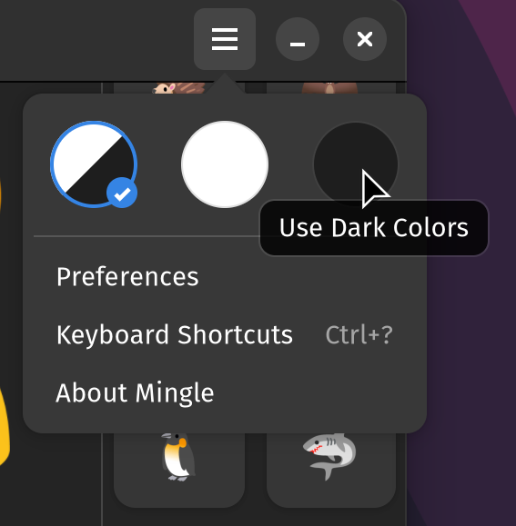
A fairly common pattern I have seen in both GNOME and Elementary apps are these slick color/style selectors. I wanted to implement this pattern, because why not? It looks good and I get to learn how things work. These custom widgets are really just radio buttons that are heavily stylized with CSS. We then just have to add it as a custom child to our primary menu. Here is great example using JavaScript and Blueprint. Blackbox, my terminal of choice, also has a selector written in Vala and XML. These two projects and the beauty of open source software allowed me to create a solution I am happy with. If anybody is reading this and is interested you can check out the repo. I intend to polish things a bit more and then do a first release on Flathub.
Subscribe to my newsletter
Read articles from José directly inside your inbox. Subscribe to the newsletter, and don't miss out.
Written by
