Enhancing User Experience with Flex Cards: Redirect to Record Page on Row Selection
 Harsh Verma
When you're dealing with lots of information in Salesforce, it's crucial to make things easy for users. One cool way to do this is by using Flex Cards – they're like digital cards that can do lots of things. Today, we're going to talk about one awesome trick: making a card that takes you to more details when you click on a row in a table.
Flex Cards in Salesforce are like digital helpers. They can show information in a way that makes sense and is easy to use. Imagine having a card that not only shows data but also lets you quickly jump to more details without any extra clicks.
I am going to show you a simple trick – clicking on a row in a table will take you straight to a page with more information. It's like having a magic button that saves you time and effort. In this hands-on example, I will demonstrate how to redirect from an account record page to a contact record page.
Step 1: Creating a New Flex Card
First, go to your Salesforce account and make a new Flex Card. This card is like a container for your data table, and you'll put it right on the Account record page.
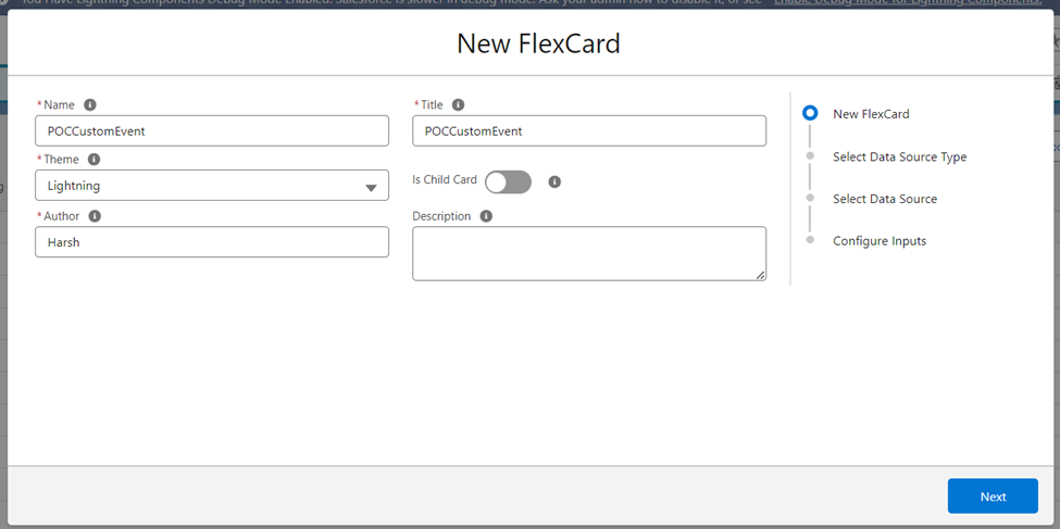
Step 2: Set Up Data Source with a SOQL Query
Choose a SOQL query as the source of your data. This is like telling Salesforce where to get the important information. It ensures that your data table is filled with the right records.
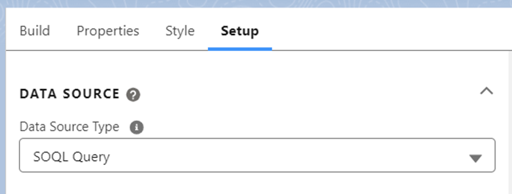
Step 3: Add the Data Table with a Drag-and-Drop
Make your Flex Card look nice by dragging and dropping a data table onto it. This is like building the base to show the information you asked Salesforce to find.

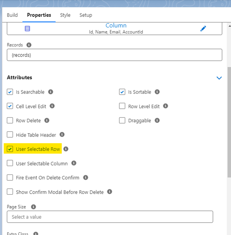
Step 4: Check User Selectable Row Checkbox in Attributes
Make it easy for users to do things by ticking the "User Selectable Row" box in the data table settings. This means users can now click on specific rows, getting ready for the cool redirect feature.
Step 5: Make Things Happen with Event Listeners
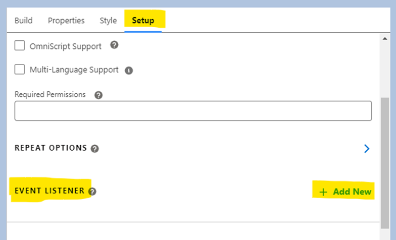
Go into the settings and add a new Event Listener. This is a crucial step that makes sure Salesforce does the right thing when a user picks a row. It's like telling the system, "Hey, something happened – do this!"
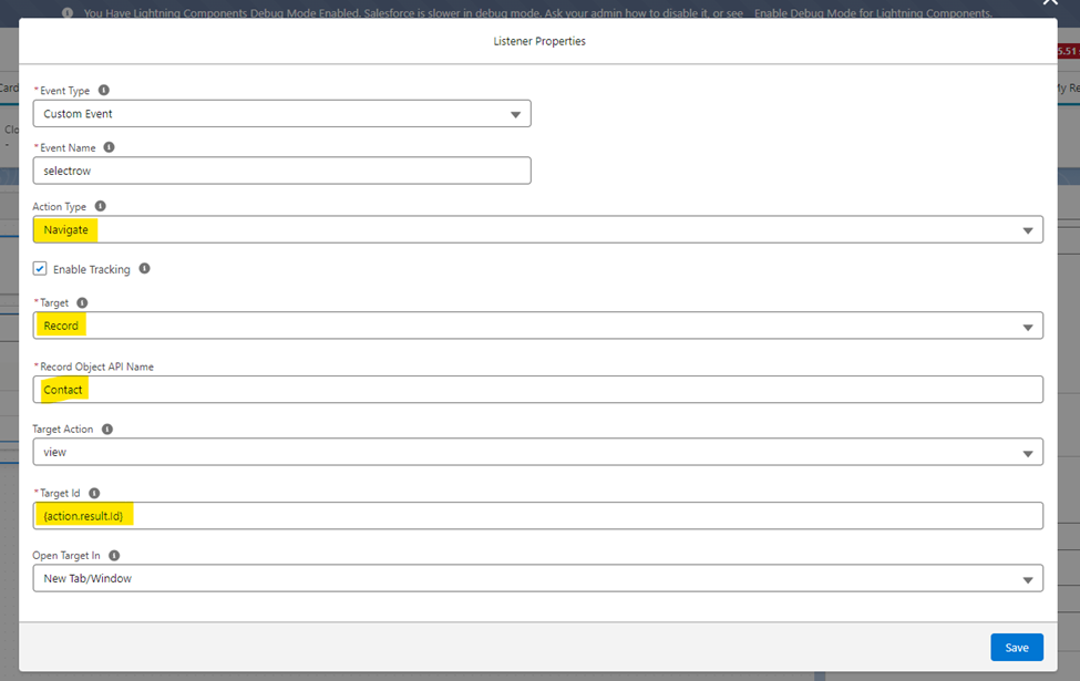
Step 6: Put it on the Page
Stick your Flex Card right onto the Account record page. This is where the action happens, making sure users can easily find and use the new features.
Now, watch what happens! When users click checkboxes in the data table, the Event Listener you set up will magically take them to the right record page.


Conclusion
To sum it up, with these easy steps, you've made your Salesforce experience smoother. The Flex Card and clickable rows now let users quickly find more details, saving time and effort. This simple setup enhances how you navigate and interact with data, making Salesforce more user-friendly.
Subscribe to my newsletter
Read articles from Harsh Verma directly inside your inbox. Subscribe to the newsletter, and don't miss out.
Written by
