Forecasting Model with Exponential Smoothing
 Abraham Luna

This is the first article of a series to present different forecasting models. We will start by using the Exponential Smoothing model provided by statsmodels library.
The dataset is the Alphabet Inc. daily stock prices that can be downloaded from Yahoo Finance. Data ranged from Jan-2020 to Dec-2023.
The target column is Close column. It represents the stock price at the end of the day.
Here are the steps we will follow in each article:
Data Preparation
Decomposing The Data Set
Training The Model
Evaluate The Model
Exponential Smoothing
Exponential Smoothing is a time series forecast method for univariate data. It means that can make forecast predictions for just one variable related to the time series.
One of the advantages of using the Exponential Smoothing is that uses Holt’s Linear Trend Model to learn the trend and seasonality of the data. This is an popular alternative to ARIMA model.
Data Preparation
Make sure to download the csv file from Yahoo Finance and save it in the same directory as your Jupyter notebook.
Lets import all of the needed modules and packages
# Import usefull libraries
import pandas as pd
import numpy as np
import matplotlib.pyplot as plt
import seaborn as sns

from statsmodels.tsa.api import ExponentialSmoothing
from statsmodels.tsa.seasonal import seasonal_decompose
We read the dataset using pandas.
# Collect the dataset
df = pd.read_csv('GOOG.csv')
df.head()

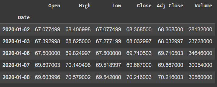
We can observe that the dataset contains more than one column. For further models we will use them for now lets just focus on the Date and Close column.
In case there are nulls on our dataset we replace them, but the downloaded file should be all clean data.
# Check for nulls
df.info()
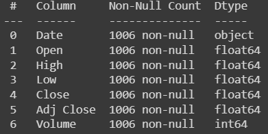
Now that we are sure that all records contains non-null values we can use the Date column as our index.
# Use date column as index
df['Date'] = pd.to_datetime(df['Date'])
df.set_index('Date', inplace=True)

# Remove duplicates based on index, keep first found
df = df[~df.index.duplicated(keep='first')]
df.asfreq('D')
df.sort_index(inplace=True)

df.head()
Decomposing The Data Set
On this section we will reveal the trend, seasonality and residuals. Here is a description of each element:
Trend - represents the increasing or decreasing pattern over time
Seasonality - represents patterns that occur at regular intervals (e.g., daily, weekly, monthly, etc.)
Residuals - represents the noise or the random variation in the data
We can start by plotting the data so we can visually discover the trend and seasonality. We can include some vertical lines to identify each year on the data.
# Plot the data
vlines = ['2021-01-01', '2022-01-01', '2023-01-01']

df.plot(y='Close', figsize=(15,5))

for line in vlines:
  plt.axvline(x=line, color='black', linestyle='--')

plt.show()
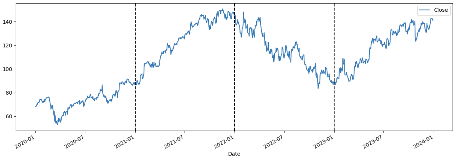
With above plot we can see that expect for 2022, each start of the year the stock prices tend to go up. Also, on and after 2022 there seems to be more variation in between days, in other word we have more noise during this period.
It is required to identify the type of seasonality. There are two main types:
Additive - assumes that changes over time are consistently made by the same amount.
Multiplicative - suggests that the components interact in a multiplicative way. Changes in trend and seasonality are proportional to the level of the time series.
I highly recommend readying this article to learn more.
On this article we will use the seasonal_decompose module from statsmodels to plot each of the component of the time series. It is required to pass the type of seasonality and by the previous plot there is a clear tendency of add to the next values.
# Plot the decompose item
series = df[['Close']].copy()
decompose_result_mult = seasonal_decompose(series, model="additive", period=365)


decompose_result_mult.plot()
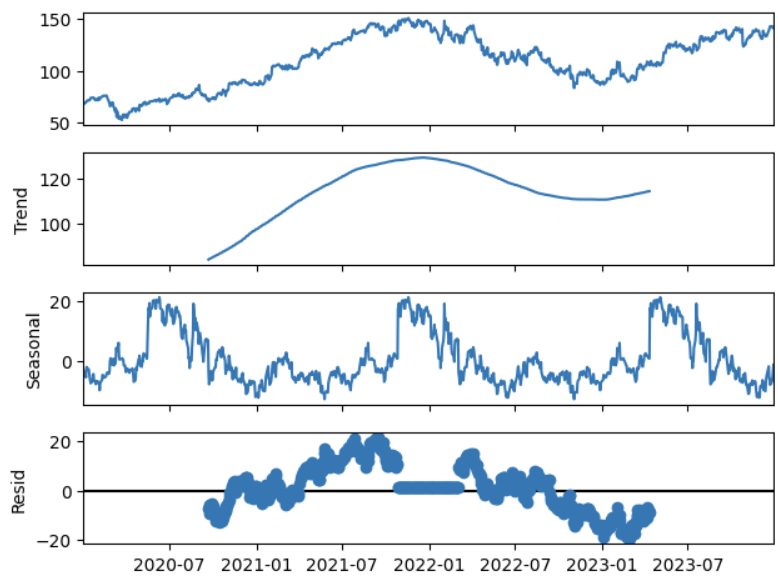
decompose_result_mult.plot() includes the actual data plot, the trend line figure, the seasonal discomposing plot and the residuals plot.
Each of the plot helps us identifying the component of the time series that will be useful for further analysis. Lets train a model.
Training The Model
Starting from defining the future horizon. This contains the future dates we want to predict once the model is trained.
future = pd.date_range('2024-01-01', '2025-01-01', freq='D')
Now we define the Exponential Smoothing model by calling the ExponentialSmoothing() class
# Define the Exponential Smoothing model
model = ExponentialSmoothing(df['Close'],
                                seasonal_periods=365,
                                trend='add',
                                seasonal='add').fit(optimized=1)
We can get the fitted values from the model with mode.fittedvalues. This will return the values the model predict on the training data. Lets create a column to store those values an compare.
# Fit the model
df['fitted_values'] = model.fittedvalues

df.head()

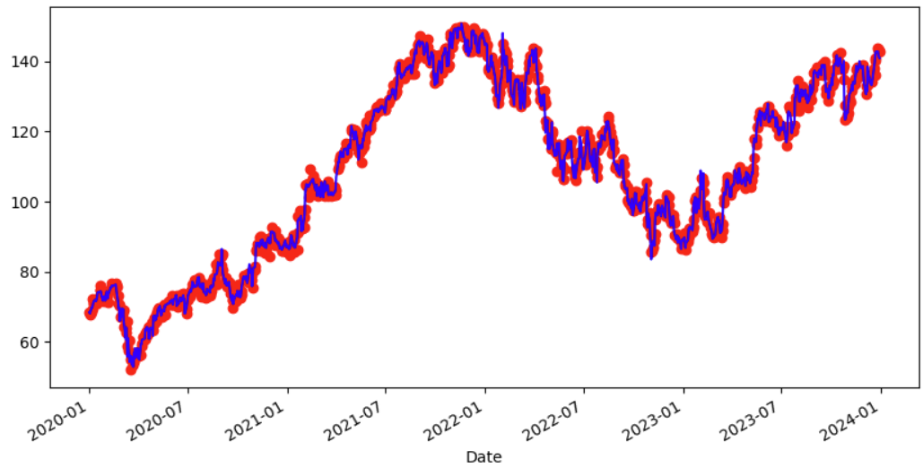
If we plot both values we can compare how good the model is learning from the training data.
# Compare fitted values and actual values

df['fitted_values'].plot(style='o', color='red')
df['Close'].plot(figsize=(10,5), color='blue')
plt.show()
Evaluate The Model
There are many ways to evaluate a model, using metrics but we start with the basic on this notebook, so lets keep it simple with visual inspection. In future article we will improve the evaluation techniques.
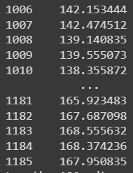
First predict for the forecast horizon which is 180 days.
# Forecast 180 days
pred = model.forecast(180)
pred
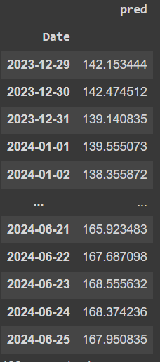
Pandas data frames are really useful to visualize the predictions, so lets create a data frame.
# Concat forecast and fitted values
future = pd.date_range(df.index.max(), df.index.max() + pd.DateOffset(days=179), freq='D')

forecast = pd.DataFrame({'Date': future, 'pred': pred})

# Use date column as index
forecast['Date'] = pd.to_datetime(forecast['Date'])
forecast.set_index('Date', inplace=True)

forecast
Now we plot the predictions
# Plot prediction values

plt.figure(figsize=(20,5))
plt.title('Forecast vs Actuals')
plt.plot(forecast['pred'], '--o', color='red')

plt.show()

If we visually inspect the predicted forecast we can see that the model did it best to understand the trend of the time series.
# Plot both values

plt.figure(figsize=(20,5))
plt.title('Forecast vs Actuals')
plt.plot(forecast['pred'], '--o', color='red')
plt.plot(df['Close'], '-o')

plt.show()

Next Steps
Exponential Smoothing is really good when it comes to univariate time series forecasts as it learns from the trend, seasonality and residuals. This firsts article did not focused on statistical methods to validate the output of the forecast. We will explore more in the next one.
Meanwhile, I highly recommend investigating:
Measures to evaluate forecasting models
What other models can be used for multivariate datasets?
Here is the full notebook for the code.
Enjoy training !!
Subscribe to my newsletter
Read articles from Abraham Luna directly inside your inbox. Subscribe to the newsletter, and don't miss out.
Written by

Abraham Luna
Abraham Luna
I am an Industrial Engineer, enthusiast in Data Science, Machine Learning and programming in general.