A week with the Apple Vision Pro
 Christian Hain (He/Him)
Wow 🤯, what a crazy week in the Apple universe. By now, I'm sure you've seen the videos of people driving while wearing Apple Vision Pro's, or perhaps you've seen memes of people gesticulating wildly in public. All I can say is, "Yikes!"
Before I go any further, allow me to introduce myself. My name is Christian. I'm a software engineer specializing in browser-based development. I've been surfing the net since the "best viewed at 1024x768" message was a standard disclaimer. I learned HTML, Flash, and ActionScript in high school amidst the Web 2.0/"aqua" phase. I sat beside the Mayor of Philadelphia while the media dragged him for waiting in line for the original iPhone. When my roommate would disconnect the WiFi to plug into ethernet, I used the phone as my primary browser for hours at a time. Professionally, I've built desktop websites for Delta with one team while other teams built m.* versions of the same site. I helped CNN with a mobile-first rewrite in the early days of responsive design. And now, at the beginning of spatial computing, I'm excited to see what the next generation of the Web will look like.
My hopes, dreams, and expectations
Tab management
Okay, so I'm a tab-hoarder. And, like... one of the worst. I'll have several tabs open in several windows across several browsers. I use Safari for general browsing, Firefox for development, and Chrome for Gmail, Calendar, and Meet (by the way, Google, can you make your software work on all browsers?). Anyway, when I first heard about the Apple Vision Pro, my first thought was, "Oh! please let me keep my tabs in physical rooms." I want cooking tabs in the kitchen and work tabs in my office. I want to run around the house looking for that website I was looking at the other day. Good news... I kinda can!
One of the coolest features is that I can actually walk through the tab, turn around, and see the backside. Apple even allows me to turn the tab around so it faces me. If I re-open Safari from the App screen, all my browser windows are recalled and stacked together.

This brings me to my "yikes" moment. Even in complete immersion mode, windows don't follow you. So, the videos of people pinching and throwing air as they walk into a store are either staged or faked.
Shared immersion
Whenever I put on the Apple Vision Pro around friends, their first questions are, "What are you doing? What are you looking at?" I don't personally know anybody else who has one, so I can't confirm if this is possible, but I would love to be able to "share" a window with others in my physical space and have us share that experience. If I scroll, you scroll, just like that.
3D web pages/elements
Today, the browser experience is flat and contained within the window. If you're to type on the virtual keyboard, you'll notice that you have to focus your gaze on the keyboard and can no longer see the browser clearly. Imagine if elements of the page, like a comment or review section, were brought closer to that keyboard so you could see what you're doing better. Imagine that with any element. YouTube video in the back, comment section up close and personal.
This would change the way we think about responsive design.
My disappointments
Hover/focus states
The hardest thing about web browsing with the Apple Vision Pro is the lack of hover/focus states. Apple will add its own overlay element on <a /> and <button /> tags, but not other elements like <detail /> or play-head scrubbers. Sometimes, even opening the hamburger menus of websites is a bit difficult. You think you're looking at the hamburger menu, but the device thinks you're looking at the link below.
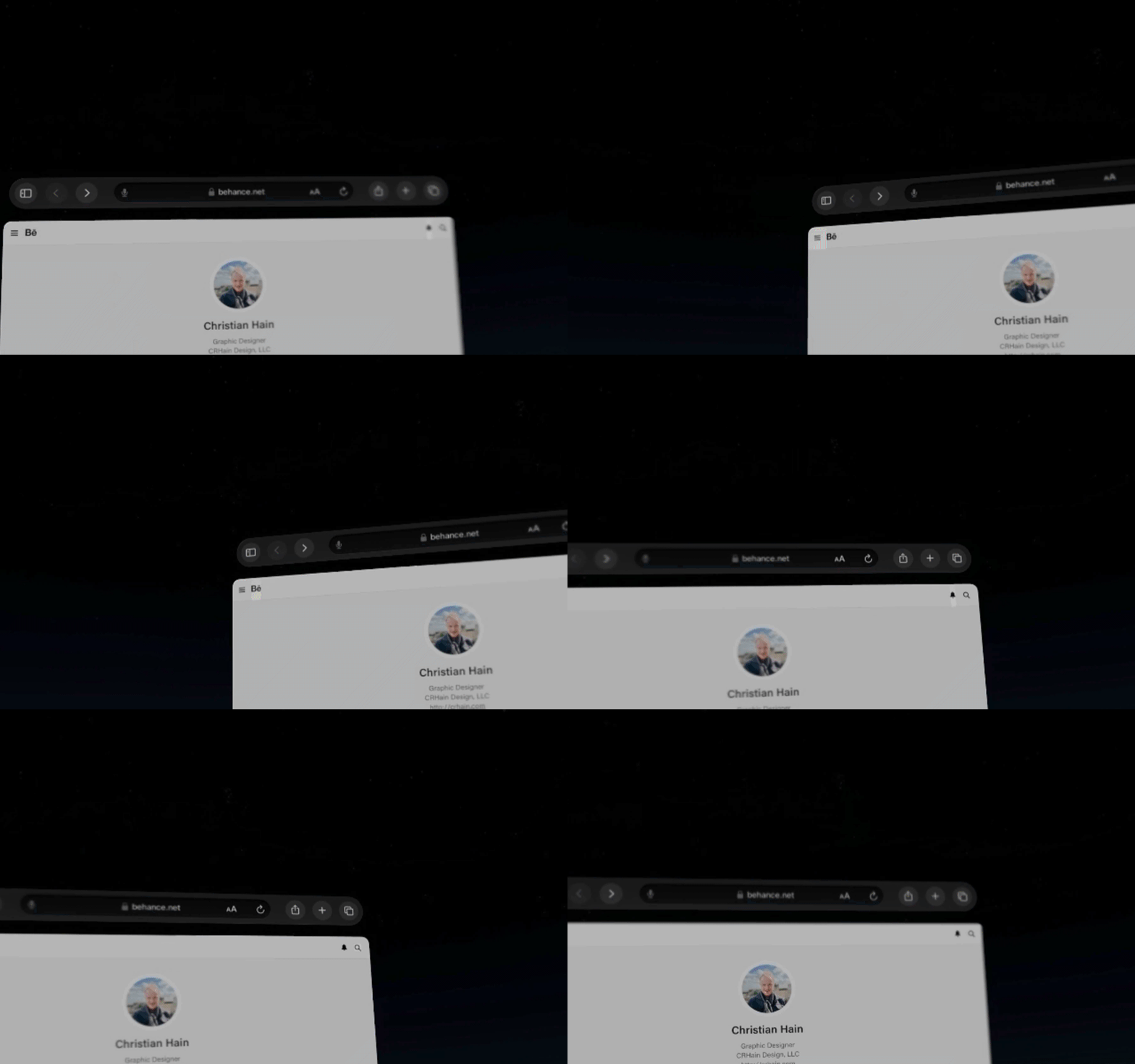
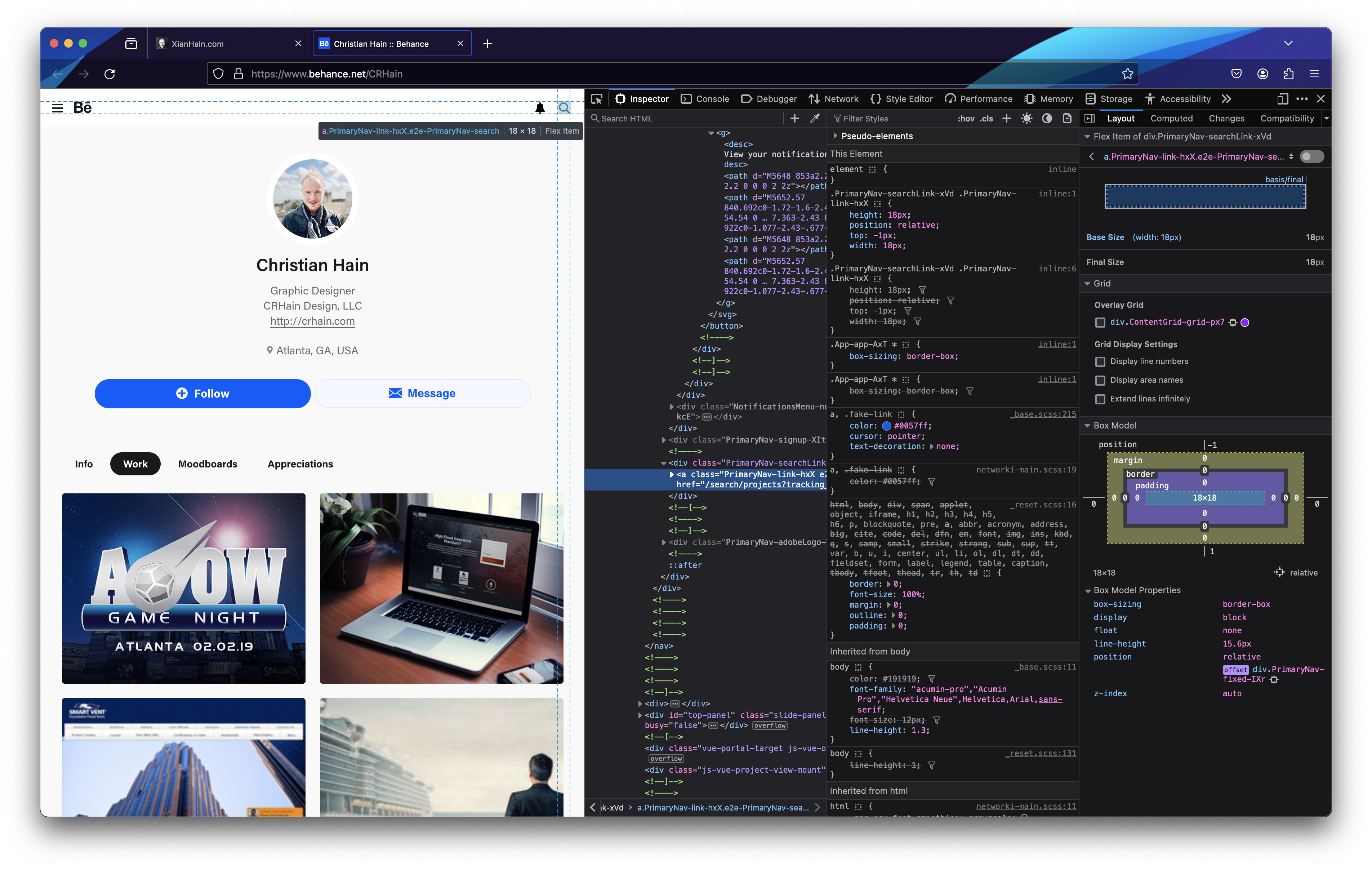
As an industry, we may need to rethink the affordance of interactive elements, especially around iconic links and buttons. Here's an example of Behance's site. Notice how the focus-overlay for elements changes dimensions depending on the icon and how hard it is to see the hover state of the search icon.

The widths vary because the actual button and anchor elements do not consistently include space around the SVG graphic. Regarding the hard-to-see hover state, I'm not sure if this is Apple's fault for not providing a high-contrast indicator, triggering actual hover events, or if Adobe is at fault for not having a bigger tap target or dark mode.

Typing
As mentioned above, typing on the Apple Vision Pro requires your full attention on the keyboard. As a touch-typist capable of 120 words per minute, I've grown accustomed to looking at the insertion point while my fingers drum out my words.
It's incredibly annoying to have to look at each letter individually as I type. Using the microphone is an option, but not necessarily better, especially when typing URLs. Using your hands to type "through" the keyboard doesn't feel great, either. It feels foolish poking the air. Make a mistake, and you may give up and grab your phone before wasting more time.
Other screens
While impressive, looking at the real world through, the Apple Vision Pro has a VHS-like quality. The image is somewhat over-saturated and filled with ISO grain noise. Like the first iPhone, it doesn't have external illumination, so it's practically useless in the dark. I tried to use my phone as an external light source when I noticed I couldn't read anything on the screen; the image was blown out, blurry, and somewhat obscured by the apps I was using. Instead, I had to slide the device up and peek from underneath to find the flashlight app. If Apple could find a way to allow me to use my iPhone as an input device by overlaying a mirror image of either what is or what would be on the phone, I think that would be a huge win.
My takeaways
It's an impressive first-generation device. It will take some time before the general public comes to a consensus on the best design patterns for elements. The Web is already in a weird state of barely-working code that could either be improved or completely ruined by AI-generated code.
Websites en masse won't start optimizing for spatial browsing any time soon, either. There are still sites that aren't optimized for mobile or dark-mode experiences (which, by the way, what is a "mobile" experience anymore?), and some Google services, to this day, still say something along the lines of "best viewed on Chrome." I think it will be up to Apple to figure out how to make the web work on their device, and until then, the best thing we can do as Web Developers is stay semantic and do everything we can to follow HTML specs.
Subscribe to my newsletter
Read articles from Christian Hain (He/Him) directly inside your inbox. Subscribe to the newsletter, and don't miss out.
Written by

Christian Hain (He/Him)
Christian Hain (He/Him)
Internet power-user, creator, and Certified Scrum Developer® engineer. Specializing in browser-based experiences, my goal is to share what I know about making beautiful UI and frictionless UX accessible to everyone.