WebDesign Tutorial - About Material Minimal
 Keep Coding
This is part 20. You can find the part 19, Plan the process, here
About Material Minimal
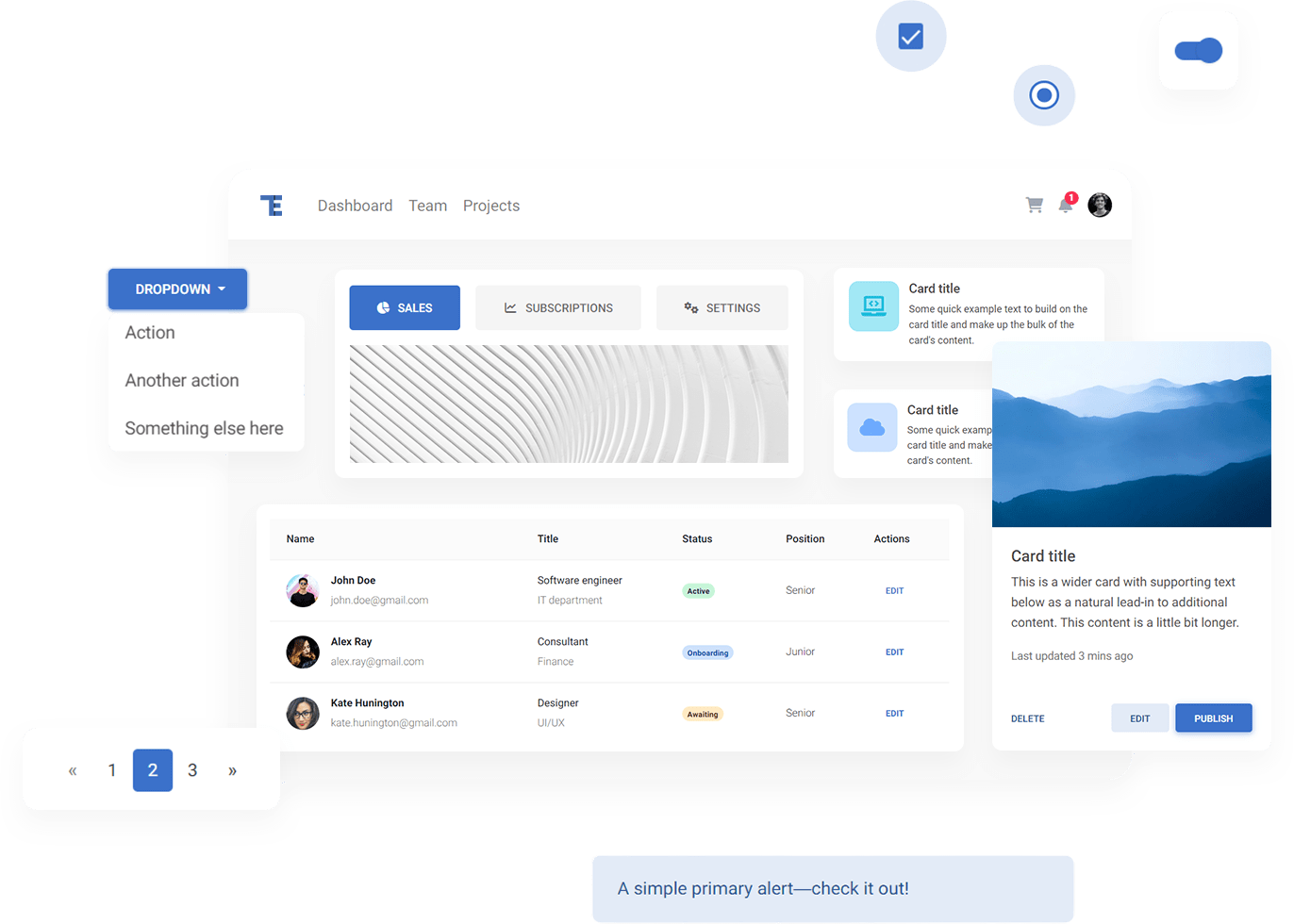
MDBootstrap and Tailwind Elements design system, called Material Minimal, is an improved version of the classic Material Design.
Just for the record:
"A design system is a set of standards to manage design at scale by reducing redundancy while creating a shared language and visual consistency across different pages and channels" ~**Therese Fessenden
Back to Material Minimal:
On the one hand, Material Minimal appreciates and uses the standard created by Google, and on the other hand improves it, giving it lightness, subtlety and elegance.

Material Minimal seeks a golden mean between the naturalness of the real world and the functionality necessary in the digital world.
Elements such as shadows or gradients allow it to get closer to nature (as our real world is full of shadows and gradients), while minimalism is a nod to the user experience and aims to prepare space for the most important actor - content.
This section will help you to learn the details of our Design System and use its full potential to create beautiful and practical user interfaces.
Next part - Classic Material Design (coming soon)
Material Minimal, which is basically Material Design on steroids can be found here on Figma.
Material Design for Bootstrap is a UI Kit, that uses Material Minimal, check it out here.
And TW Elements, our newest child is based on Tailwind CSS. Check it out!
Subscribe to my newsletter
Read articles from Keep Coding directly inside your inbox. Subscribe to the newsletter, and don't miss out.
Written by
