WebDesign Tutorial - Classic Material Design
 Keep Coding
This is part 21. You can find the part 20, About Material Minimal, here.
Classic Material Design
Before we dive into Material Minimal, let's take a look at the classic Material Design created by Google.
According to the official Material Design website:
"Material is the metaphor"
"Material Design is inspired by the physical world and its textures, including how they reflect light and cast shadows. Material surfaces reimagine the mediums of paper and ink."
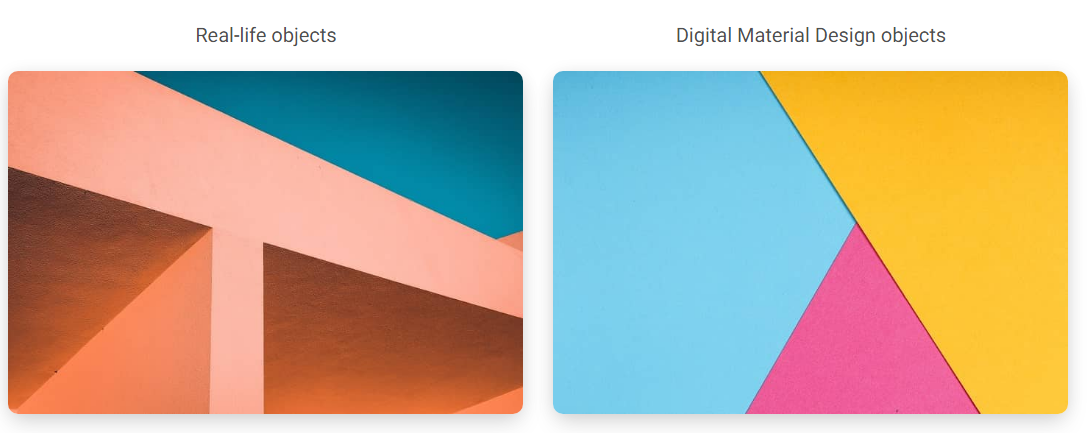
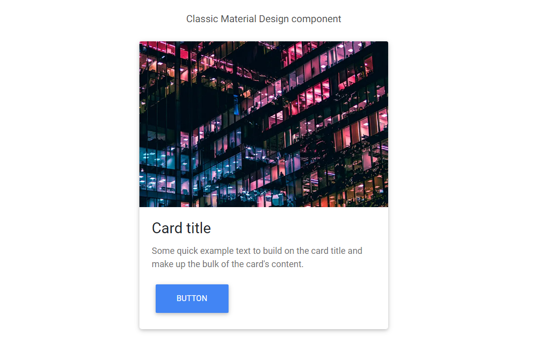
For many years, MDB has tried to follow the Material Design guidelines as closely as possible. However, as time went on, we began to see more and more aspects that could be improved.
Classic Material Design can be heavy, clunky and monotonous. Fortunately, with the release of Material Design 3, Google changed its approach to its guidelines.
"The latest version of Material Design (v.3) includes personalization and accessibility features that put people at the centre"
In other words - use the best in Material Design, but at the same time personalize and adapt it to your needs.
MDB takes full advantage of this principle by creating its own, improved version of Material Design, i.e. Material Minimal.
Next part - Nature inspired Design
Material Minimal, which is basically Material Design on steroids can be found here on Figma.
Material Design for Bootstrap is a UI Kit, that uses Material Minimal, check it out here.
And TW Elements, our newest child is based on Tailwind CSS. Check it out!
Subscribe to my newsletter
Read articles from Keep Coding directly inside your inbox. Subscribe to the newsletter, and don't miss out.
Written by
