WebDesign Tutorial - Nature inspired design
 Keep Coding
This is part 22. You can find the part 21, Classic Material Design, here.
Nature inspired design
As you have learned in previous lessons, both Material Minimal and Material design are inspired by the physical world.
This fascination with nature and the reflection of the physical world in digital interfaces is extremely important.

Contrary to appearances, this is not a form of artistic expression. It is a value that has a strictly pragmatic background.
And the fact that it also carries a beautiful and noble message about nature as a source of knowledge and inspiration is an additional asset.
As it is the foundation of both Material Minimal and Material Design in this lesson I would like us to take a closer look at this issue and understand what it is specifically for.
Get ready for some theory 🧐
A Digital Interface Inspired by the Real World
In the realm of design and technology, few philosophies have captured our imagination as uniquely as Google's Material Design. Unveiled in 2014, Material Design was a significant leap forward in interface design, introducing a novel visual language that merges the principles of good design with the innovation and possibilities of technology and science.
At the heart of this design philosophy is the concept of reality—translating the tactile experience and behaviours of physical objects into digital interfaces.
Material Design is rooted in the physical world, inspired by the study of paper and ink, yet transcending their limitations. This approach is not accidental; it arises from an understanding of human cognition, familiarity, and the natural inclination towards entities and experiences we already comprehend.

It's a theory that posits the user at the center, with the intention to make the digital realm a more intuitive and efficient environment.
Mimicking the Real World
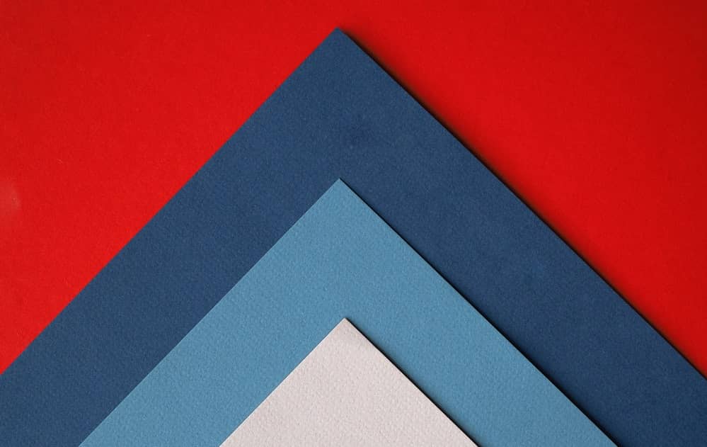
The fundamental principle of Material Design is its attempt to mimic physical properties. Each element in Material Design is inspired by natural materials like paper and fabric, incorporating tangible attributes like weight, texture, and how such materials reflect light or cast shadows.

As a result, the digital landscape appears tactile and familiar to users, invoking instinctual reactions and responses based on real-world experiences.
Consistency and Familiarity
The decision to mirror the natural world in Material Design was not merely about aesthetic preference. It was a response to a psychological principle that humans find comfort in familiarity. Objects and behaviors that mirror those in our daily lives invoke a sense of recognition, reducing cognitive load and making the digital world easier to navigate.

By using metaphors we know from reality, users can understand how to interact with various elements on the screen, reducing friction and accelerating the learning process. This allows users to transfer knowledge and understanding from the real world to the digital one.
Interaction and Motion
Another crucial aspect of Material Design is the concept of meaningful motion. This principle suggests that every movement in the interface should have a purpose and follow real-world physics, like the way a card flips over or how a button depresses when clicked.

These interactive elements, anchored in the laws of nature, contribute to a more intuitive user experience, creating a narrative that connects users with the digital landscape in a seamless manner.
Benefits of Material Design approach
Incorporating real-world elements into the digital experience provides a host of benefits.
First, it reduces the cognitive effort required to understand the interface, fostering a more intuitive user experience. Second, it introduces consistency across different applications and platforms, reducing the learning curve for new applications.
Lastly, it allows designers to focus on what's truly important: creating an effective and efficient platform that prioritizes user needs and enhances usability.
Material Design represents a significant advancement in interface design. By merging the laws of nature and technology, it creates a user-centric design language that is both intuitive and visually appealing.
This innovative approach highlights the importance of drawing from our surroundings to create familiar experiences, ensuring that even as technology continues to evolve, it remains accessible, understandable, and cantered around human experience.

In its fusion of the physical and digital realms, Material Design underlines the argument that we humans prefer things we already know, especially if they occur in nature. As such, it serves as a compelling reminder that the most effective designs are those that speak to our innate understanding and familiarity of the world.
Next part - Core Values
Material Minimal, which is basically Material Design on steroids can be found here on Figma.
Material Design for Bootstrap is a UI Kit, that uses Material Minimal, check it out here.
And TW Elements, our newest child is based on Tailwind CSS. Check it out!
Subscribe to my newsletter
Read articles from Keep Coding directly inside your inbox. Subscribe to the newsletter, and don't miss out.
Written by
