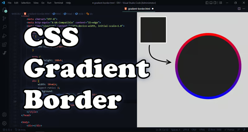
Create a Gradient Border with CSS [Just 2 Lines]
 Gorithm
The Problem with border-color and border-image:
When you try to add a gradient as a property value to the border-color or to the border itself (same) you will see nothing, the border is completely vanished, this happens because CSS border property doesn't allow gradients only allows colors, and if you tried the border-image it will do the same effect but only on rectangles, it won't respect the border-radius if you set the border-radius of the element, so the solution here must do the following:
Make the border color to be any kind of gradient (linear, radial, conic, etc)
respect the shape of the element and its radius
Returning to the Roots of CSS aka the BOX MODEL:
what is the CSS Box Model, will I could tell from experience it's concept that tells us about a BOX that wraps around every HTML element, and it consists of 4 different parts:
Content Box: where is the initial content of the element exist, and the width and height properties applied to it.
Padding Box: Clears an area around the Content Box but still inside the element this is the difference between it and margin-box.
Border Box: the area that wraps around the Padding Box and the Content Box.
Margin Box; Clears an area around the Border Box, so it's outside of the element itself.
Implementing the solution
We will make use of the padding-box and the border-box in creating to gradient backgrounds, first will be treated as the color of the content box so it will be a gradient of the the same color, second gradient will be treated as the color of the border, and this is the fun part of mixing colors, then you must assign the border-width to a certain value like (10px or what) and make sure it's transparent so the second background could be shown otherwise its color will cover our gradient
.element {
    ...
    background:
        linear-gradient(#222, #222),
        linear-gradient(crimson, blueviolet);
    border: 10px solid transparent;
}
Also I made a short tutorial here so you could understand better
Subscribe to my newsletter
Read articles from Gorithm directly inside your inbox. Subscribe to the newsletter, and don't miss out.
Written by
