8 Tailwind CSS Classes I Wish I Found Earlier✈️
 Nishit Bariya
Tailwind CSS has revolutionized the way we build and design web interfaces, offering unparalleled speed, efficiency, and flexibility. Its utility-first approach simplifies the process of creating responsive, maintainable, and scalable designs. However, navigating through its extensive documentation can be overwhelming. In this article, I share eight Tailwind CSS classes that have significantly improved my workflow and design aesthetics, which I wish I had discovered earlier in my journey.
Divide Width
Tailwind CSS offers a set of utilities under the divide-width category, designed to control the border width between child elements within a container. This feature is incredibly useful for creating consistent, visually appealing separations in layouts such as lists, grids, or navigation menus without having to apply border utilities to each individual element.
Add borders between horizontal elements using the divide-x-{width} utilities.

<div class="grid grid-cols-3 divide-x">
  <div>01</div>
  <div>02</div>
  <div>03</div>
</div>
Scroll Snap Type
In modern web design, creating a smooth and controlled scrolling experience can significantly enhance user engagement. Tailwind CSS's scroll snap utilities provide developers with the tools to implement these scroll behaviors easily. The scroll-snap-type utility controls how scroll snap points are enforced within a scroll container, offering a way to guide users through scrolling content with intentional stopping points.
Scroll snapping controls the scroll offset of a scroll container at specific points, typically elements within the container. This behavior is perfect for creating carousels, slideshows, or sections that snap into place as the user scrolls.
To implement scroll snapping in Tailwind CSS, you use the scroll-snap-type utility on the container element, specifying the axis and strictness of the snapping behavior.
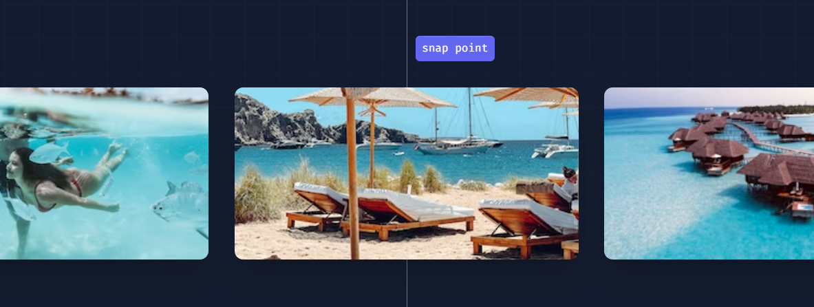
<div class="snap-mandatory snap-x ...">
  <div class="snap-center ...">
    <img src="https://images.unsplash.com/photo-1604999565976-8913ad2ddb7c?ixlib=rb-1.2.1&ixid=MnwxMjA3fDB8MHxwaG90by1wYWdlfHx8fGVufDB8fHx8&auto=format&fit=crop&w=320&h=160&q=80" />
  </div>
  <div class="snap-center ...">
    <img src="https://images.unsplash.com/photo-1540206351-d6465b3ac5c1?ixlib=rb-1.2.1&ixid=MnwxMjA3fDB8MHxwaG90by1wYWdlfHx8fGVufDB8fHx8&auto=format&fit=crop&w=320&h=160&q=80" />
  </div>
  <div class="snap-center ...">
    <img src="https://images.unsplash.com/photo-1622890806166-111d7f6c7c97?ixlib=rb-1.2.1&ixid=MnwxMjA3fDB8MHxwaG90by1wYWdlfHx8fGVufDB8fHx8&auto=format&fit=crop&w=320&h=160&q=80" />
  </div>
  <div class="snap-center ...">
    <img src="https://images.unsplash.com/photo-1590523277543-a94d2e4eb00b?ixlib=rb-1.2.1&ixid=MnwxMjA3fDB8MHxwaG90by1wYWdlfHx8fGVufDB8fHx8&auto=format&fit=crop&w=320&h=160&q=80" />
  </div>
  <div class="snap-center ...">
    <img src="https://images.unsplash.com/photo-1575424909138-46b05e5919ec?ixlib=rb-1.2.1&ixid=MnwxMjA3fDB8MHxwaG90by1wYWdlfHx8fGVufDB8fHx8&auto=format&fit=crop&w=320&h=160&q=80" />
  </div>
  <div class="snap-center ...">
    <img src="https://images.unsplash.com/photo-1559333086-b0a56225a93c?ixlib=rb-1.2.1&ixid=MnwxMjA3fDB8MHxwaG90by1wYWdlfHx8fGVufDB8fHx8&auto=format&fit=crop&w=320&h=160&q=80" />
  </div>
</div>
Real-Life Use Case: Image Carousel
Screen Readers
Screen reader utilities in Tailwind CSS are used to control the visibility of content specifically for screen readers. This includes showing or hiding elements when they are being accessed by users who rely on assistive technologies.
The primary utility for screen readers is sr-only, which visually hides content from the screen but makes it accessible to screen readers. This is particularly useful for providing additional context to interactive elements, like buttons or links, that might not be self-explanatory.
Example:
<nav>
  <ul class="flex">
    <li>
      <a href="/">
        <svg><!-- Icon SVG --></svg>
        <span class="sr-only">Home</span>
      </a>
    </li>
    <!-- More navigation items -->
  </ul>
</nav>
In this example, visually hidden text provides a clear description of each navigation link, enhancing the site's accessibility.
Real-Life Use Case: Accessible Navigation
A common application of screen reader utilities is in creating more accessible navigation menus. Icons alone can be ambiguous, so including off-screen text descriptions ensures that users navigating with a screen reader will understand each navigation element's purpose.
Accent Colors
Creating a consistent and visually appealing user interface often involves customizing form controls to match your brand or design theme. Tailwind CSS addresses this need with its accent-color utilities, which allow developers to specify the accent color of form controls. This customization enhances the visual integration of form elements with the overall design, providing a seamless user experience.
The accent color of a form control is used to highlight elements like the background of a checked checkbox, the thumb of a range slider, or the circle inside a selected radio button. Tailwind CSS's accent-color utilities enable you to easily align these elements with your site's color scheme.
To apply an accent color, Tailwind CSS offers utilities that can be used directly on form controls. These utilities follow the pattern accent-{color}, where {color} is replaced with any of Tailwind's color names (e.g., blue, red, green).

<label>
  <input type="checkbox" checked> Browser default
</label>
<label>
  <input type="checkbox" class="accent-pink-500" checked> Customized
</label>
Real-Life Use Case: Branded Form Elements
Imagine you are designing a form for a brand with a distinctive color scheme. To maintain brand consistency throughout the form, you can utilize the accent-color utilities to customize the form controls. For example, if the brand's primary color is a specific shade of blue, you can apply this color to all checkboxes, radio buttons, and range slides, ensuring that these elements complement the brand's aesthetic.
Blur
The blur utilities in Tailwind CSS allow developers to apply varying degrees of blur effects to any element. These effects can be used to soften backgrounds, create a sense of depth, or focus attention on specific page elements by blurring others.
To apply a blur effect, Tailwind CSS provides the blur utility with predefined levels of intensity. These range from subtle (`blur-sm`) to pronounced (`blur-xl`), offering flexibility to achieve the desired visual effect.

<div class="blur-none ...">
  <!-- ... -->
</div>
<div class="blur-sm ...">
  <!-- ... -->
</div>
<div class="blur-lg ...">
  <!-- ... -->
</div>
<div class="blur-2xl ...">
  <!-- ... -->
</div>
Real-Life Use Case: Frosted Glass Effect
A popular use of blur utilities is to create a frosted glass effect over a background image, allowing content on top of the image to remain readable while providing a stylish, modern look.
Dark Mode
Dark mode is a critical feature in modern web design, offering users a darker color scheme that reduces eye strain and conserves energy on devices with OLED and AMOLED screens. Tailwind CSS supports dark mode out of the box, providing a straightforward way for developers to implement this feature in their web projects.
Tailwind CSS uses a class-based approach to toggle dark mode, allowing developers to define dark mode styles alongside default styles using the dark: prefix. This approach ensures that implementing dark mode is as simple as adding a few classes to your existing styles, making your website adaptable to user's system preferences
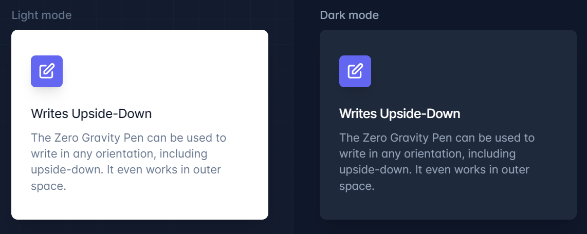
<div class="bg-white dark:bg-slate-800 rounded-lg px-6 py-8 ring-1 ring-slate-900/5 shadow-xl">
  <div>
    <span class="inline-flex items-center justify-center p-2 bg-indigo-500 rounded-md shadow-lg">
      <svg class="h-6 w-6 text-white" xmlns="http://www.w3.org/2000/svg" fill="none" viewBox="0 0 24 24" stroke="currentColor" aria-hidden="true"><!-- ... --></svg>
    </span>
  </div>
  <h3 class="text-slate-900 dark:text-white mt-5 text-base font-medium tracking-tight">Writes Upside-Down</h3>
  <p class="text-slate-500 dark:text-slate-400 mt-2 text-sm">
    The Zero Gravity Pen can be used to write in any orientation, including upside-down. It even works in outer space.
  </p>
</div>
Configuring For Dark Mode Preferences
Tailwind CSS offers two strategies for activating dark mode: media and class.
Media: Uses the CSS
@media (prefers-color-scheme: dark)feature to automatically switch to dark mode based on the user's system settings.Class: Requires manually adding a
darkclass to the root element (usually<html>or<body>) to enable dark mode, allowing for more control over when and how dark mode is applied.
To configure the preferred mode, adjust the darkMode option in your Tailwind CSS configuration file.
Real-Life Use Case: Responsive Dark Mode Toggle
A common feature in web applications is a toggle that allows users to switch between light and dark modes manually. With Tailwind CSS, you can implement this by adding or removing the dark class from the root element in response to user interaction.
Tailwind CSS Plugins
Tailwind CSS is renowned for its utility-first approach to styling, offering a vast array of classes for almost every CSS property. However, its extensibility through official plugins is what truly sets it apart, allowing developers to incorporate more complex components and utilities that go beyond the framework's core features. Official plugins such as Typography, Forms, Aspect Ratio, and Line Clamp add layers of functionality, enabling more intricate designs with minimal effort.
Typography Plugin
The @tailwindcss/typography plugin introduces the prose class, which automatically styles raw HTML content with beautiful typographic defaults. This plugin is ideal for content-heavy websites, such as blogs or documentation, ensuring text is readable, engaging, and visually appealing.
Forms Plugin
The @tailwindcss/forms plugin provides a reset for form elements, creating consistent and modern styles across different browsers. It simplifies the process of styling forms by applying a base style to inputs, checkboxes, radio buttons, and select elements, which can then be easily customized.
Aspect Ratio Plugin
With the @tailwindcss/aspect-ratio plugin, developers can easily manage the aspect ratios of embedded content, such as videos or images. This is crucial for maintaining the integrity of content layouts across different screen sizes.
Line Clamp Plugin
The @tailwindcss/line-clamp plugin offers utilities for truncating text after a specified number of lines, using the CSS line-clamp property. This is especially useful for creating excerpts or limiting the display of lengthy text content.
Space Between
Tailwind CSS's spacing utilities are based on a predefined scale that ranges from 0 (no space) to a maximum value, often up to 96 (24rem). This scale includes a variety of incremental values, enabling developers to apply the exact amount of space needed between elements.
To apply spacing, Tailwind CSS provides margin (`m-`, mt-, mr-, mb-, ml-) and padding (`p-`, pt-, pr-, pb-, pl-) utilities. Each utility accepts values from Tailwind's spacing scale, allowing for detailed control over the layout.

<div class="flex space-x-4 ...">
  <div>01</div>
  <div>02</div>
  <div>03</div>
</div>
Real-Life Use Case: Creating Consistent Gaps
A common use case for spacing utilities is to create consistent gaps between elements, such as in a list or grid layout. Tailwind CSS's space utilities (space-x-, space-y-) allow for horizontal and vertical spacing between child elements, simplifying the process of achieving a balanced design.
Conclusion
Throughout this article, we've explored the myriad of utilities and features that Tailwind CSS offers, from customizing form controls with accent colors to applying blur filters, implementing dark mode, extending functionality with official plugins, and controlling the space between elements. Tailwind CSS's utility-first approach empowers developers to build responsive, aesthetically pleasing, and highly customizable web interfaces with efficiency and ease.
Remember, the examples and utilities discussed in this article only scratch the surface of what's possible with Tailwind CSS. I encourage you to dive deeper into the framework, experiment with its utilities, and discover how it can streamline your workflow and enhance your web projects.
If you find this article helpful, please share it with your friends and colleagues who might also benefit from learning about Tailwind CSS. Follow me for more content and articles on web development, UI/UX design, and the latest trends in technology. Together, let's explore the endless possibilities that Tailwind CSS and modern web development have to offer.
Thank you for reading, and happy coding! 😊
Subscribe to my newsletter
Read articles from Nishit Bariya directly inside your inbox. Subscribe to the newsletter, and don't miss out.
Written by

Nishit Bariya
Nishit Bariya
Building http://Bundled.Design | Nextjs/React developer | React Native | Open for freelance work | Indie Hacker