Create a custom theme layout for your Experience Aura Site
 Salla Tero-Anandamurthy
Experience Cloud offers different kinds of ready-made themes, but sometimes your project needs more customisation or flexibility. In this article I will show you how to create a custom theme layout that you can use on your Aura site.
Let's say you found the ready-made theme Jepson and managed to set it up looking like this.

This is almost what you need, but would like to customise the look and feel of the navigation menu and have the User Profile Menu stacked on top of the page navigation, something like this.

Create a custom theme component
First you need to create an Aura component, that implements the forceCommunity:themeLayout interface. Let's name it customTheme.
<!-- customTheme.cmp -->

<aura:component implements="forceCommunity:themeLayout" access="global">
  <aura:attribute name="slot_profileMenu" type="Aura.Component[]" />
  <aura:attribute name="slot_navigation" type="Aura.Component[]" />
  <aura:attribute name="slot_footer" type="Aura.Component[]" />

  <!-- Header -->
  <div style="background-color: black; z-index: 999;" class="slds-grid slds-gutters">
    <div class="logo-container slds-col slds-size_2-of-12"></div>
    <div class="slds-col slds-size_10-of-12">
        <div class="profile-menu">{!v.slot_profileMenu}</div>
        <div class="navigation-menu">{!v.slot_navigation}</div>
    </div>
  </div>

  <!-- Body -->
  <div>{!v.body}</div>

  <!-- Footer -->
  <div style="background-color: black;" class="slds-size_12-of-12">
    {!v.slot_footer}
  </div>
</aura:component>
To create a content slot in the template that user can drag and drop any component, you need to do two things
Define an attribute with type
Aura.Component[]and give it a name (like slot_navigation)Define a div in the html for this slot (using the same name), like
{!v.slot_navigation}
We have defined four slots
slot_profileMenu
slot_navigation
slot_footer
In addition to these slots, make sure you have a section in the html for the actual page content (body) as well. To do this you add a div that includes the variable {!v.body}. Notice we haven't created a slot for the logo, because we will use another approach for that.
Let's add some margins and alignment for the component.
/* customTheme.css */
.THIS .profile-menu {
    text-align: right;
}

.THIS .navigation-menu {
    margin-bottom: 1rem;
}
In your Experience Builder go to Settings > Theme > Configure > New Theme Layout.
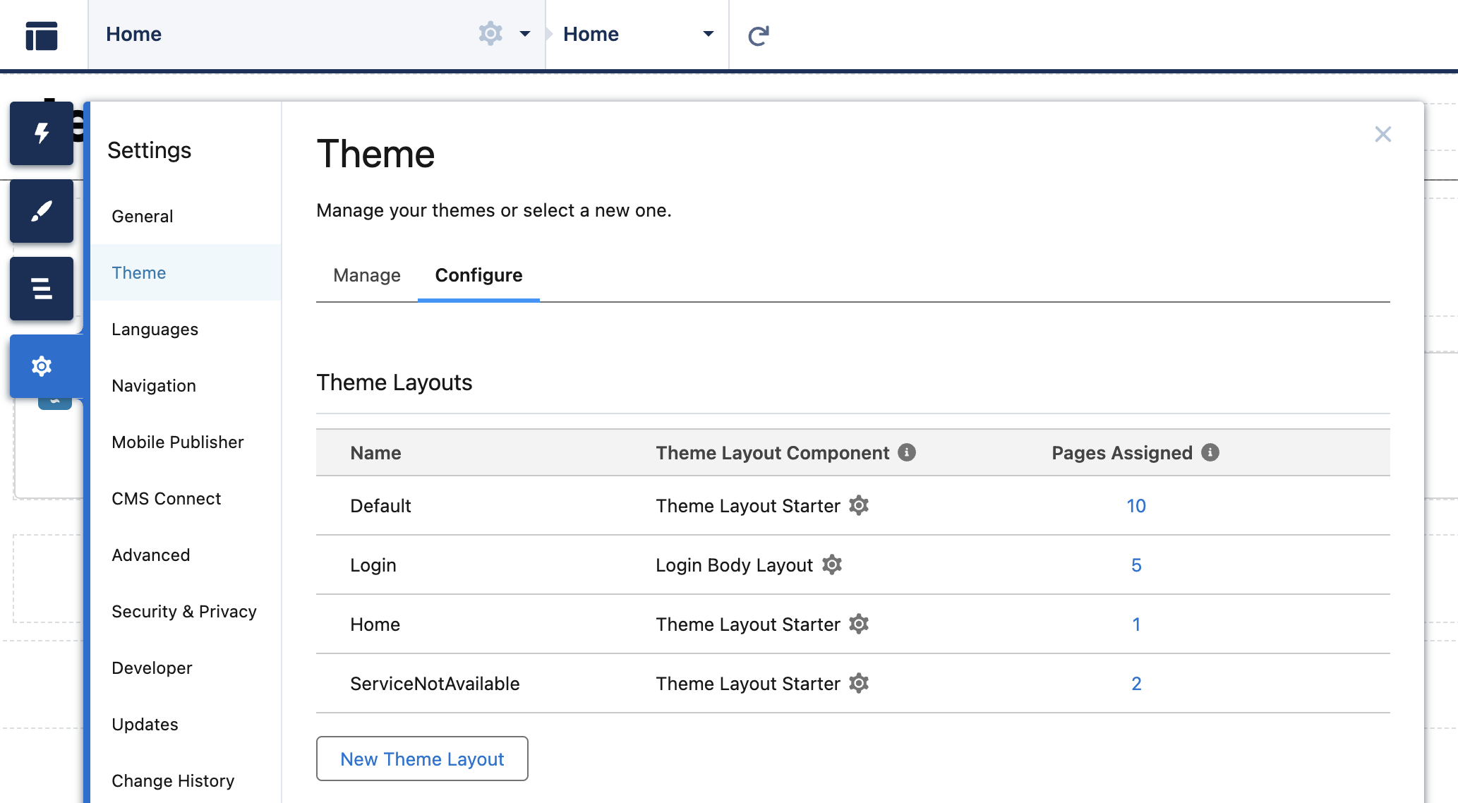
Give the theme layout a name, for example My Theme, and as the Theme Layout Component select the component you just created, customTheme. Click save.
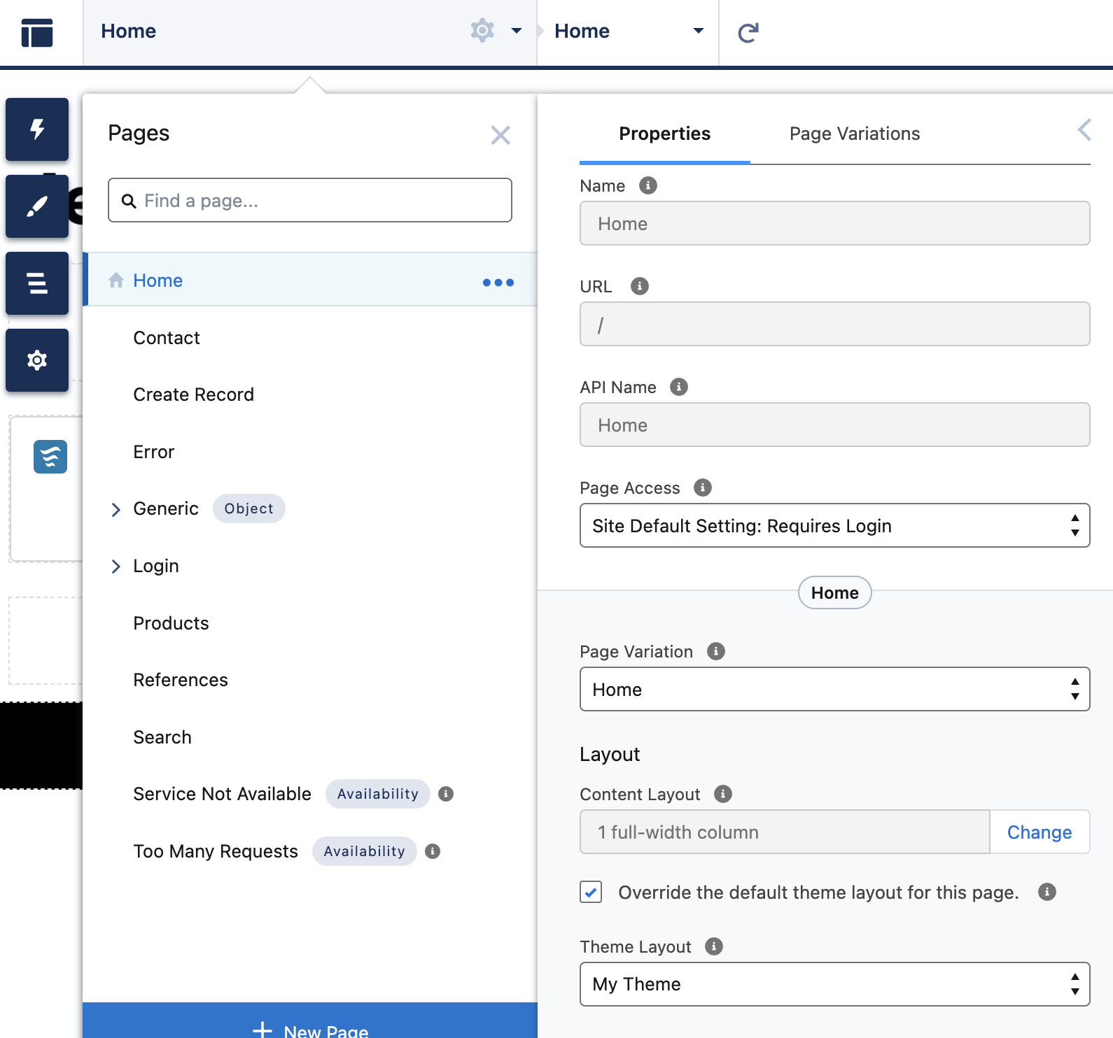
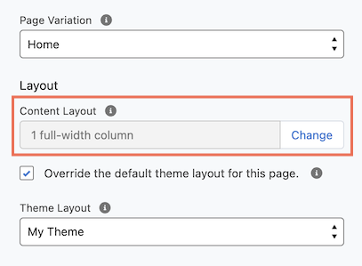
Assign the new theme layout to your Home page. Click the gear icon (Page Properties) and at the bottom of the Properties section check the box Override the default theme layout for this page. Then select My Theme as the Theme Layout.
Now the Home page is using the custom theme layout and shows that you can drag and drop components to the slots defined.
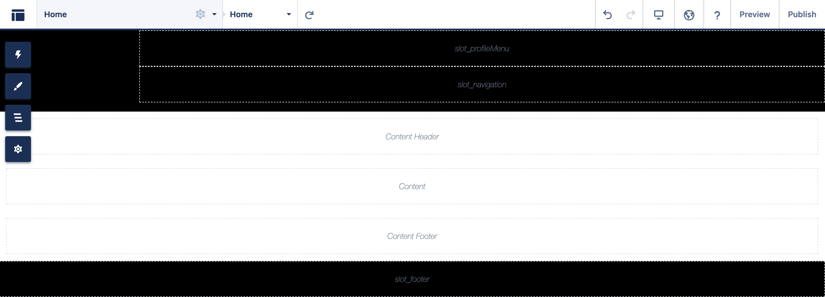
The body variable that you defined in the html of the theme component renders its own slots for the page (Content Header, Content, and Content Footer). These are coming from the Content Layout setting in the page properties. For our Home page we are using a 1 full-width column.
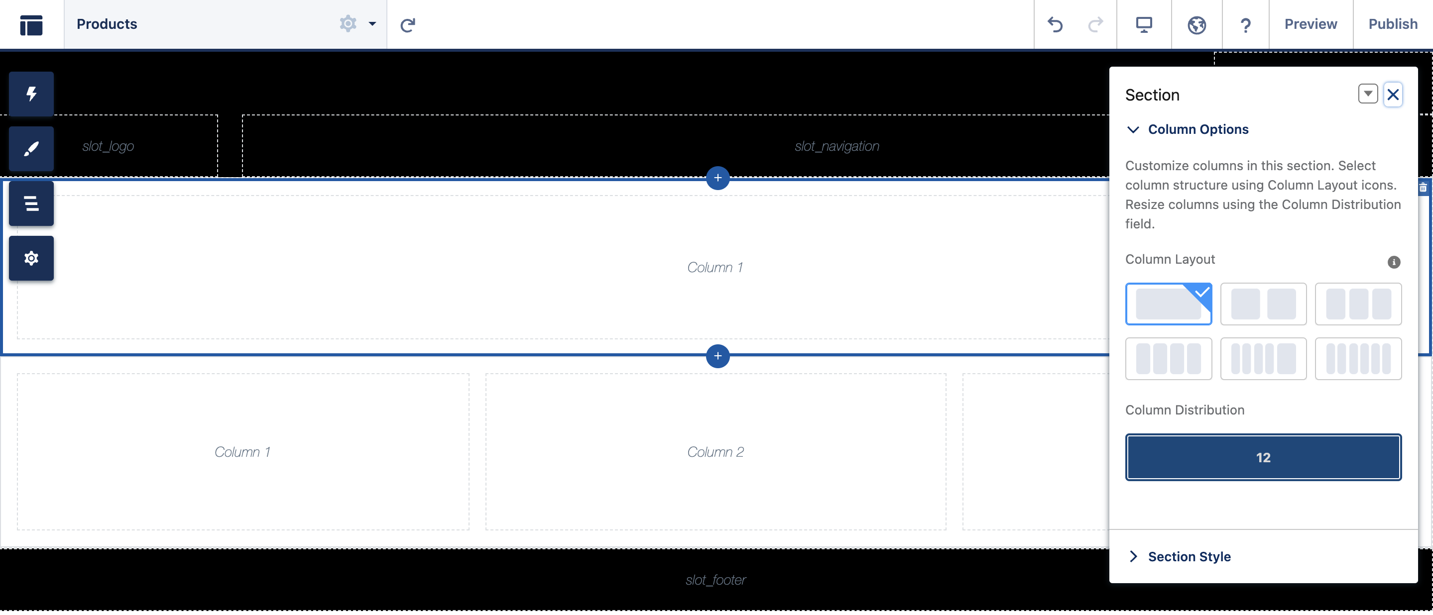
Let's say we have another page called Products, that also uses the My Theme Theme Layout, but as the Content Layout it uses the Flexible Layout. Here the body can be customised by adding columns and adjusting them to your liking with the property editor.
Next, let's create a custom navigation menu component that we can use with our theme layout.
Create a custom navigation component
Let's create an Aura component, that extends the forceCommunity:navigationMenuBase abstract component. Let's name it customNavigationMenuAura and let's give it a label Custom Navigation (Aura) in the design file.
<!-- customNavigationMenuAura.cmp -->
<aura:component extends="forceCommunity:navigationMenuBase" implements="forceCommunity:availableForAllPageTypes" access="global">
    <div class="slds-grid slds-grid_align-end">
        <div class="slds-col slds-var-p-left_small slds-var-p-top_small slds-size_3-of-4 slds-large-size_1-of-5">
        </div>
        <div class="slds-col slds-var-p-top_small slds-var-p-horizontal_large slds-show_large">
            <span>
                <nav role="navigation">
                    <ul onclick="{!c.onClick}" class="slds-list_horizontal slds-has-block-links_space">
                        <aura:iteration items="{!v.menuItems}" var="item">
                            <li
                                key="{!item.id}"
                                class="{!item.active ? 'is-active slds-var-p-horizontal_large' : 'slds-var-p-horizontal_large'}"
                            >
                                <a href="javascript:void(0);" data-menu-item-id="{!item.id}" class="slds-text-link_reset">
                                    {!item.label}
                                </a>
                            </li>
                        </aura:iteration>
                    </ul>
                </nav>
            </span>
        </div>
    </div>
</aura:component>

<!-- customNavigationMenuAura.design -->
<design:component label="Custom Navigation (Aura)">
</design:component>
You can see the specification for the navigationMenuBase component here. The nice thing is this abstract component offers an easy way to access the default navigation menu in your site, so you can maintain it through the builder. When you extend this component, it will automatically populate the menuItems attribute with an array of top-level menu items, which you can just loop through. If you want to have user define the navigation menu to render, you can use the navigationLinkSetId attribute, see the specification for more details.
We have also added implements="forceCommunity:availableForAllPageTypes" to the aura:component tag. Implementing this interface allows us to find this component in the Components collection in the builder and to drag it to our page.
Then for the click handler to do the actual navigating let's add this piece of code to the controller file.
/* customNavigationMenuAuraController.js */
({
    onClick : function(component, event, helper) {
        var id = event.target.dataset.menuItemId;
        if (id) {
            component.getSuper().navigate(id);
         }
    }
 })
As a final touch, let's add some styling to the component.
/* customNavigationMenuAura.css */
.THIS li a {
    color: white;
}
.THIS li:hover {
    background: #333;
    color: white;
}
.THIS li.is-active {
    background-color: #104547;
    pointer-events: none;
}
In your Experience Builder open your Home page and then open the component selector. Find your navigation component and drag it to the correct slot in the theme layout.
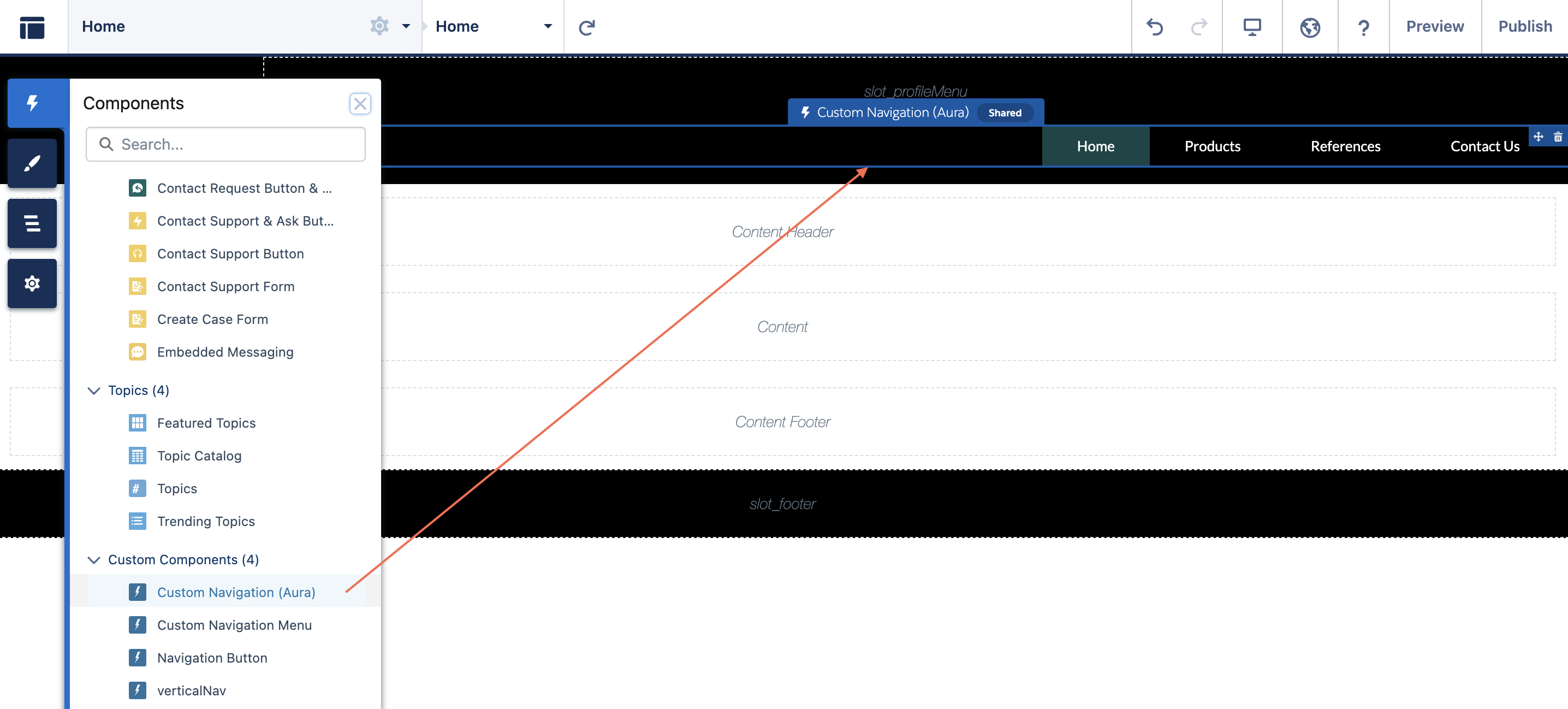
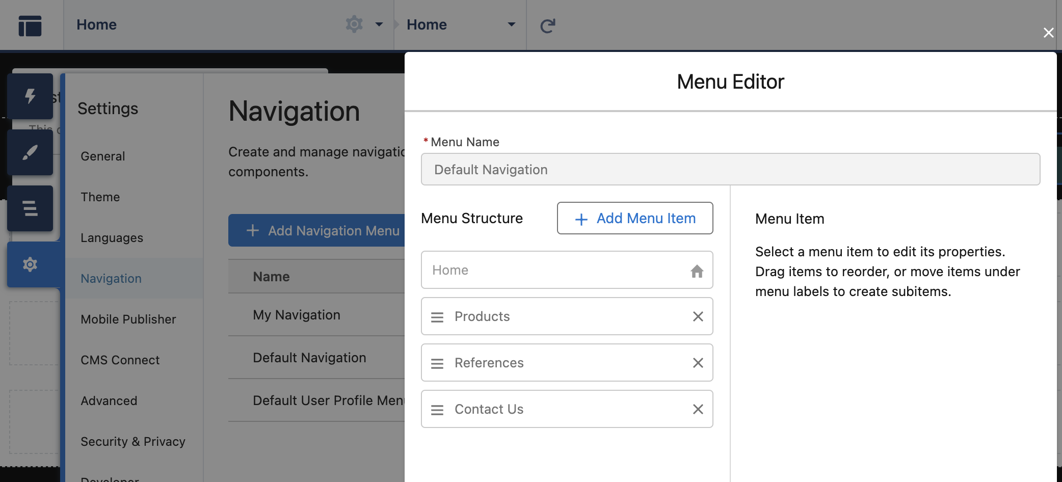
Your custom navigation component is rendering the navigation items from the Default Navigation navigation menu, which is defined in the Settings > Navigation.
Create a custom user profile menu
Let's create another Aura component, that extends the forceCommunity:navigationMenuBase component and implements the same forceCommunity:availableForAllPageTypes interface. Let's name this new component customProfileMenuAura.
<!-- customProfileMenuAura.cmp -->
<aura:component extends="forceCommunity:navigationMenuBase" access="global">
    <aura:attribute name="navigationLinkSetId" type="String" default="Default_User_Profile_Menu1"/>

    <div style="padding-right: 0.8rem;">
        <div class="dropdown slds-var-p-horizontal_large">
            <lightning:icon class="dropbtn" iconName="action:user" size="x-small" alternativeText="My Profile" title="My Profile" />
            <div class="dropdown-content" onclick="{!c.onClick}">
                <aura:iteration items="{!v.menuItems}" var="item">
                    <a key="{!item.id}" href="javascript:void(0);" data-menu-item-id="{!item.id}">{!item.label}</a>
                </aura:iteration>
            </div>
        </div>
    </div>
</aura:component>
To allow the site admin to select which navigation menu to render, we will use the navigationLinkSetId attribute, as described in the specification. As a default value I have used the developer name of my default user profile menu. These developer names are unique across experience sites, so if you have another site in the same org, it might be that the name of your default menu differs from this. To check the name run this query.
Select Id, NetworkId, Network.Name, MasterLabel, DeveloperName
FROM NavigationLinkSet
To offer the navigationLinkSetId attribute as a parameter in Experience Builder, we need to define it in the design file.
<!-- customProfileMenuAura.design -->
<design:component label="Custom Profile Menu (Aura)">
    <design:attribute name="navigationLinkSetId" label="Navigation menu developer name" />
</design:component>
The click handler will be the same as for the navigation component, so you can copy paste that as is.
/* customProfileMenuAuraController.js */
({
    onClick : function(component, event, helper) {
        var id = event.target.dataset.menuItemId;
        if (id) {
            component.getSuper().navigate(id);
         }
    }
 })
Then final touches for the css.
/* customProfileMenuAura.css */
.THIS a {
    color: white;
}

.THIS .dropdown {
    position: relative;
    display: inline-block;
}

.THIS .dropbtn {
    background-color: black;
    cursor: pointer;
    text-align: right;
    padding-left: 1.8rem;
    padding-right: 1.8rem;
}

.THIS .dropdown-content {
    display: none;
    position: absolute;
    left: 0;
    background-color: white;
    width: 100%;
    box-shadow: 0px 8px 16px 0px rgba(0,0,0,0.2);
    z-index: 1;
}

.THIS .dropdown-content a {
    color: black;
    padding: 12px 16px;
    text-decoration: none;
    display: block;
    text-align: center;
}

.THIS .dropdown-content a:hover {
    background-color: #f1f1f1
}

.THIS .dropdown:hover .dropdown-content {
    display: block;
}

.THIS .dropdown:hover, .THIS .dropdown:hover .dropbtn {
    background-color: #333;
}
Now we are ready to take this profile menu into use. In your Experience Builder find the component in the Components collection and drag it to the slot_profileMenu slot. See the menu working in Preview mode.

The last thing we want to add is the logo. As stated earlier, we could use the same approach as with the navigation components, that is creating a slot for the logo and then adding the logo as part of some component, like Rich Text. But there is a better way.
If you look at the Theme menu in the builder, you see there is a way to add your company logo there. We can use this image in our theme layout.
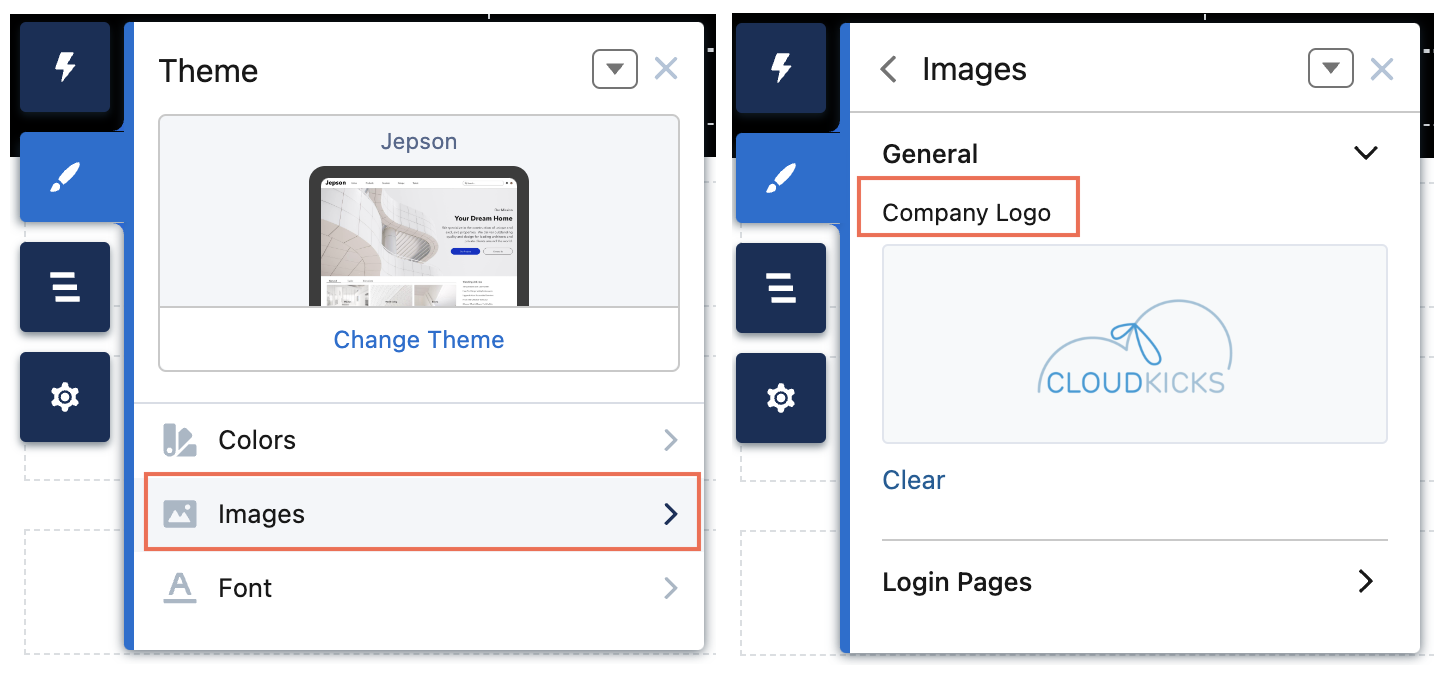
You see in our customTheme component, that we already have a div defined for the logo <div class="logo-container slds-col slds-size_2-of-12"></div>. We can use the theme logo image as background for this div, and we can do it with css. But how do we get to the theme logo, you ask?
Theme logo is controlled by a branding token, and to access it we need to define a tokens bundle in the same namespace. So in the Developer Console, let's create a new Lightning Token. Select File > New > Lightning Tokens. Name it defaultTokens. Something to note: Your first tokens bundle should be named exactly this, defaultTokens. The tokens defined within defaultTokens are automatically accessible in your Lightning components. Tokens defined in any other bundle won’t be accessible in your components unless you import them into the defaultTokens bundle.
<!-- defaultTokens.tokens -->
<aura:tokens extends="forceCommunity:base">
</aura:tokens>
This tokens bundle extends forceCommunity:base, which gives us access to all the tokens exposed by SLDS and the branding values defined in the Theme panel in Experience Builder, including the brandLogoImage token. So we can reference this token with the notation t('url(' + brandLogoImage + ')'). See other Experience site standard tokens here.
/* customTheme.css */

.THIS .profile-menu {
    text-align: right;
}

.THIS .navigation-menu {
    margin-bottom: 1rem;
}

.THIS .logo-container {
    background-image: t('url(' + brandLogoImage  + ')');
    background-position: center;
    background-repeat: no-repeat;
    background-size: contain;
    z-index: 99;
    cursor: pointer;
    position: relative;
    max-width: 100%;
    display: block;
    outline: 0;
}
Now the logo-container div will show the brand logo in the builder.

And there we have it! We have successfully created our own theme layout that we can use instead of the standard ones.
Subscribe to my newsletter
Read articles from Salla Tero-Anandamurthy directly inside your inbox. Subscribe to the newsletter, and don't miss out.
Written by
