Weekly Indie Devlog #1 - CW08, 2024
 Maximilian Keppeler
For several weeks now, I've been seeing many Indie Game Devlogs popping up on YouTube. These devlogs showcase the issues, progress, and achievements that developers encounter. I really enjoy watching them for several reasons: to see other devs face challenges and find solutions, learn from their experiences, and be entertained and encouraged by their passion.
Inspired by these devlogs, I'd like to explore the same concept in a series of articles, focusing on my journey as an Senior Android & Web developer. I've been journaling my daily life for a while now as part of the self-improvement journey, and I'm comfortable expanding on this practice to include technical happenings from my development week.
These "Devlogs" will provide updates on my current and future web and app ideas. If you're interested in any of my apps or the behind-the-scenes process, I invite you to join me on this development journey.
Elcovia
Elcovia is a web project I started in the middle of last year. I've made immense progress from a development perspective, and I'm excited to showcase future work on Elcovia. Elcovia is a marketplace for Notion templates. Notion creators can publish and sell their templates to interested customers.
Check it out here.
SEO Research about slugish product URLs
I'm diving deeper into SEO (Search Engine Optimization) to help my website, Elcovia, rank better in Google search results. To do this, I'm using a Google tool that makes it easier for Google to find and list our pages quickly. I'm also exploring a new idea to create more readable and user-friendly website addresses (URLs) for our templates, which come with product titles in different languages.
I've made our Notion templates on Elcovia available in several languages (which was a big project). This means we can't always predict the language of each product's title. However, the challenge isn't just about managing different languages. We need to ensure that each translated title has its own URL. Plus, we want these URLs to be resilient, so a small typo doesn't lead to a dead end. This approach is not only better for users but also improves our site's SEO, as it's more effective than using random IDs for each template.
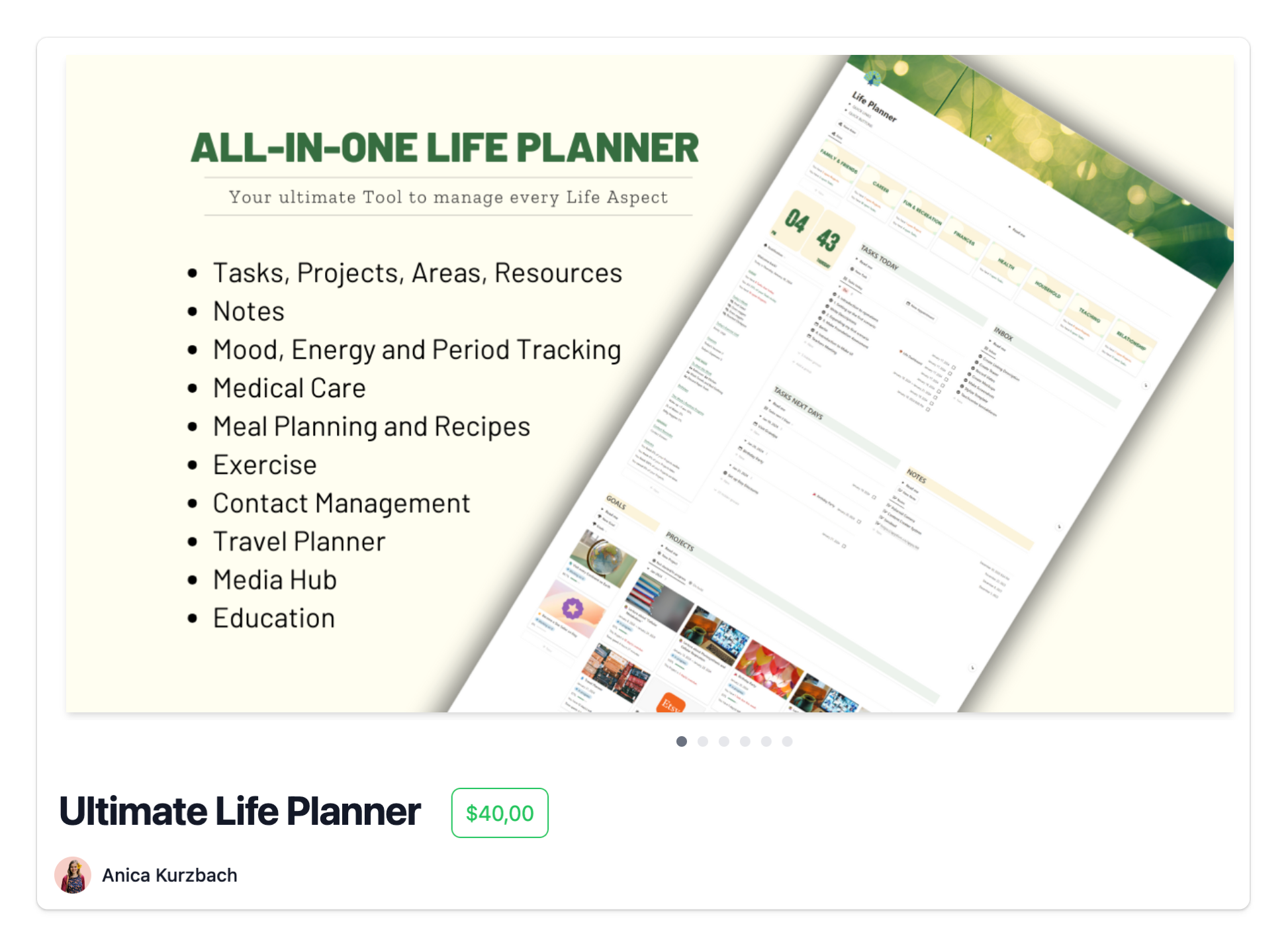
This is the URL for the Notion template "Ultimate Life Planner." Now let's imagine the product is offered in the German language as well ("Ultimativer Lebensplanner").
This URL would open the Notion template in the German language or default back to English or another language in which the product is offered.
However, that's what I want to achieve:
Benefits:
Increased SEO reach, readable and localized URL.
One more URL for each language supported by the Notion template.
Read more about this topic here:
Improve SEO with Google Search Indexing
I discovered a helpful tool from SEO Gets that assists in submitting large numbers of URLs for indexing. I set up the script, ran it, and plan to do so regularly.
Here it is: Google-Indexing-Script
WearSocials
WearSocials is an all-in-one app for QR codes, barcodes, and beyond. Scan anything, create personalized codes, and share information. Read more here.
Google Play Store & Wear-OS Release issue

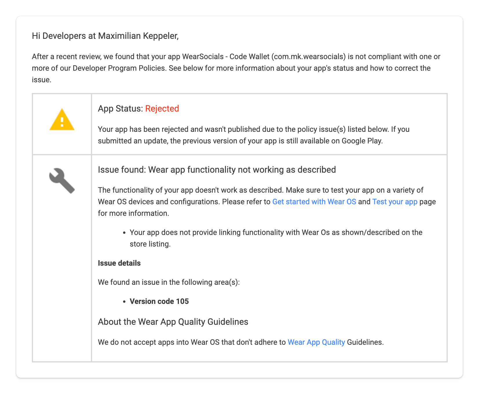
I have been struggling for over 2 weeks now with Google, as none of the recent Wear OS app versions have been accepted. Instead, they were declined with the reason, "Your app does not provide linking functionality with Wear OS as shown/described on the store listing." This is very odd since the description in the app store listing is the same, and the Wear OS app has not changed fundamentally. What has changed is the Phone App. It has changed a lot - the scope of the app expanded as it previously was just meant to scan, store, and display URLs & QR Codes. Now, all the limitations are gone, and the app has become a full-fledged code wallet.
Right now, I'm waiting for another review, hoping it will be accepted this time. As the reason is not very helpful, I have been randomly trying to optimize and rewrite texts in the app store listing, alongside testing the wear and phone app and their compatibility. Wish me luck!
Google Play Review API & SCD Rating Dialog
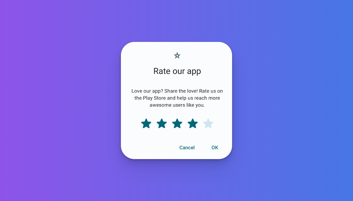
I implemented Google's Play Review API, which is initiated when the user clicks through a custom rating dialog that pops up every month. Through the rating dialog, I track the general app rating and allow some of the users to review the app via the Review API.
It's using https://github.com/maxkeppeler/sheets-compose-dialogs, therefore it only took a few minutes to set up.
Here's an image for representation:

Firebase Firestore & Auth, Login screen (+Twitter)
I removed RoomDB from the WearSocials app in favor of using Firebase Firestore again for syncing across devices, and potentially having a web-app as part of a premium feature one day. I had to add the Login Screen for user authentication. This was completed in less than an hour, but supporting Twitter was a bit more tedious. I had to create a separate Gmail account specifically for WearSocials, a new Twitter account for WearSocials, and pass numerous human verification tests, which I kept failing, in order to finally obtain the API key & secret. However, Twitter is now supported alongside Google. In the future, I might add passwordless email login.

Premium feature
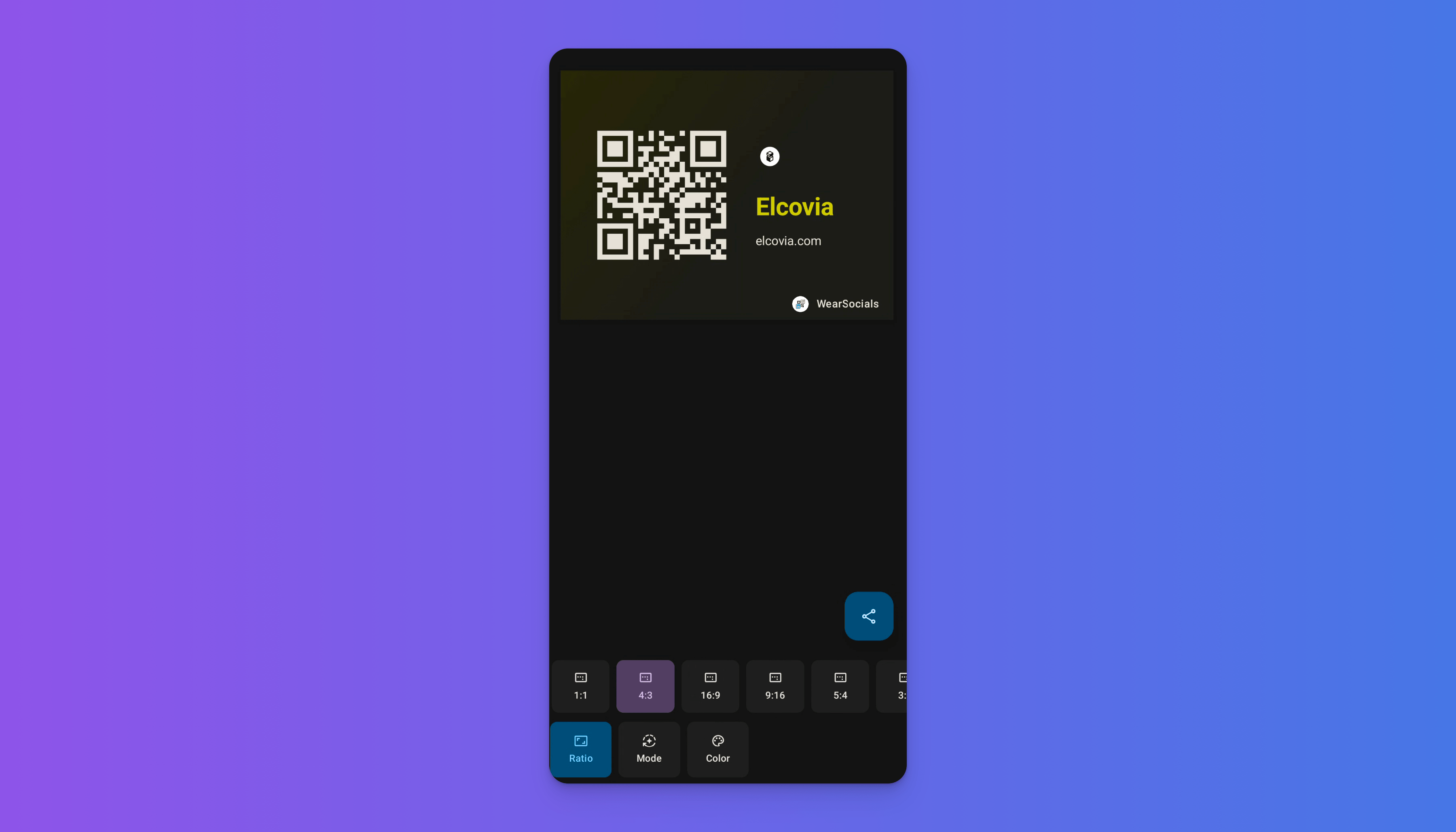
I've started working on the first premium feature for WearSocials. This feature allows users to customize the creation of images for their codes when sharing them with friends or online. It's still very much a work in progress (WIP), but fundamentally, it's already working. Currently, users can choose from a variety of ratios and day/night mode-dependent color schemes. I'm always amazed by how quickly UI can be created with Jetpack Compose. See it in action!

Initially, I began adding custom ColorSchemes, but I eventually discovered the material-color-utilities repository from Google. I used this to dynamically create various dark and light color schemes based on primary seed colors.
Other Improvements
- The Wear-OS app UX has been improved. Users can now click the respective code to view it in full-screen mode, making it easier for others to scan. In this mode, the title, code type, and data type are hidden, leaving only the code visible. This enhancement was made based on user feedback
If you enjoy my Indie Devlog, feel free to sign up.
Subscribe to my newsletter
Read articles from Maximilian Keppeler directly inside your inbox. Subscribe to the newsletter, and don't miss out.
Written by

Maximilian Keppeler
Maximilian Keppeler
Indie Web and Android Dev and Senior Android Dev @ Lufthansa Group ✨ Crafting a portfolio of apps, websites, & Open-Source libraries. 💫
