Media query in CSS
 pranjali
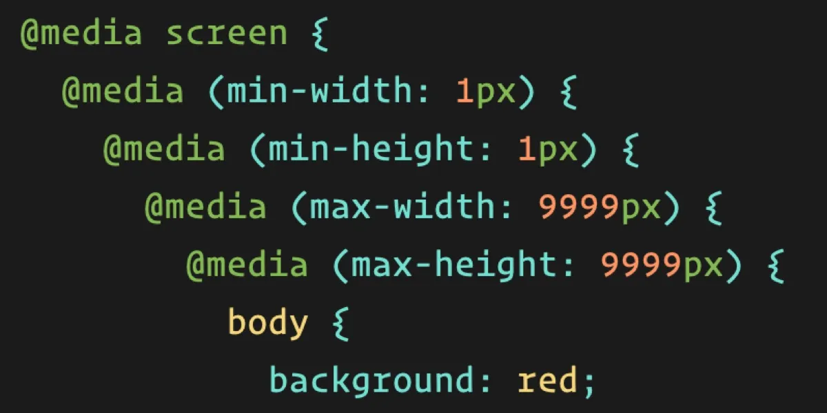
Media queries play a crucial role in responsive web design by enabling developers to create layouts that adapt and respond to the size and capabilities of the device being used to view the website.
Why Media queries important ?
Media queries are important for creating responsive, accessible, and future-proof websites that provide users with a seamless browsing experience across different devices and platforms. They enable developers to build websites that not only look great but also perform well and rank higher in search engine results.
Let's understand types of media queries
common example for all
<!DOCTYPE html>
<html lang="en">
<head>
 <meta charset="UTF-8">
 <meta name="viewport" content="width=device-width, initial-scale=1.0">
 <title>Document</title>
 <style>
  body {
            background-color: red;

        }
.container {
           display:flex;
            flex-direction: column;
           color: white;

 }
 .box
 {
           background-color: #242323;
           height: 50px;
           width: 50px;
           margin: 20px;
           padding: 20px;
 }

 </style>
</head>
<body>
<div class="container">
 <div class="box">box1</div>
 <div class="box">box2</div>
 <div class="box">box3</div>
 <div class="box">box4</div>
</div>
</body>
</html>
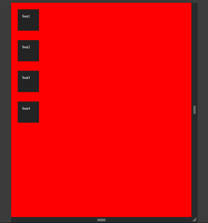
1)Width-based Media Queries:
Width-based media queries are used to adjust the layout and styling of a website based on the width of the viewport. They are commonly used to create responsive designs that adapt to different screen sizes.
@media only screen and (max-width: 455px){
          body{

             background-color: blue;
              }
}
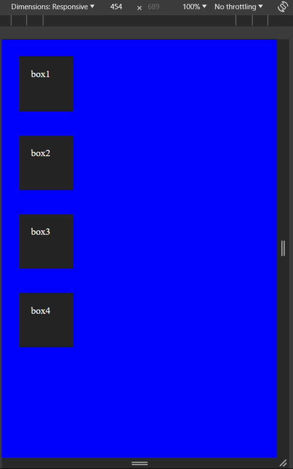
here we can see the moment we hit width less 455px background it turned into blue color.
2)Height-based media queries
Height-based media queries adjust layout and styling based on the height of the viewport. Although less commonly used than width-based queries, they can be valuable in specific scenarios, such as when content organization or visibility depends on vertical space.
@media (min-height: 500px) {
    body{
        background-color:orange ;
}
}
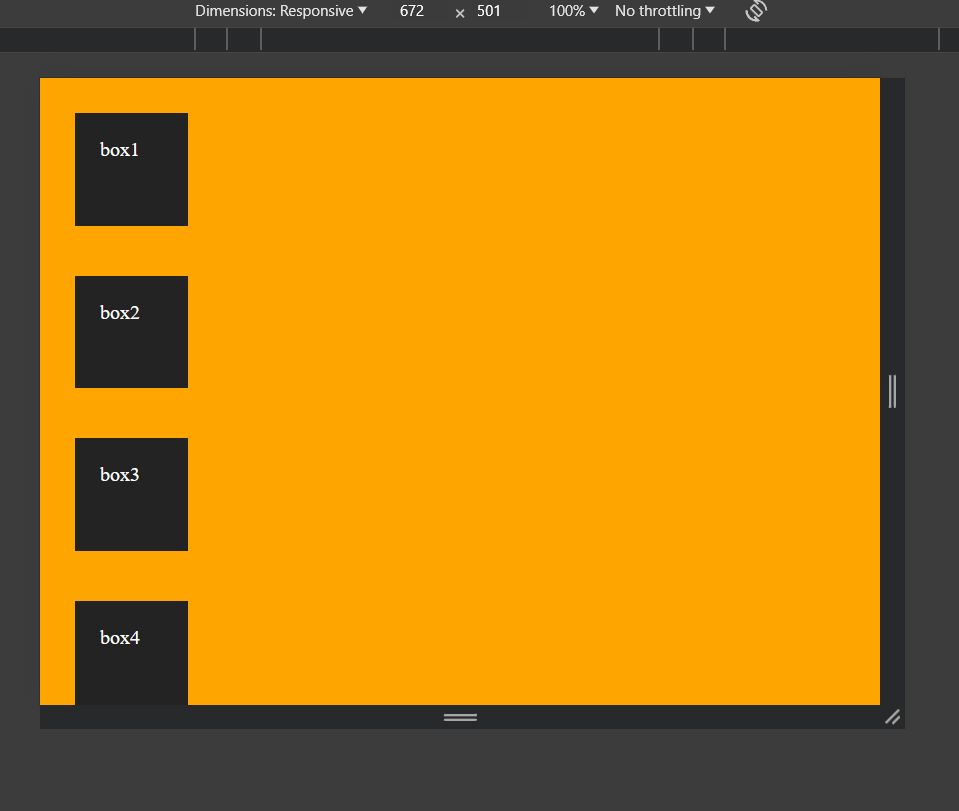
As we set minimum height to 500px so after 500px the background color will be orange.
3)Device Orientation Media Queries:
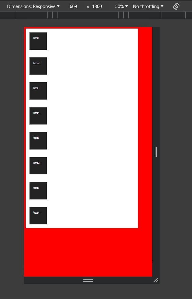
Device orientation media queries allow you to adjust the layout and styling of your website based on whether the device is in portrait or landscape mode. This can be particularly useful for optimizing content presentation and usability.
@media (orientation: portrait) {
    .container {
        width: 90%;
        background-color: #fff;
    }
}
@media (orientation: landscape) {
    .container
    {
     width: 90%;
     background-color: aqua;
    }

}
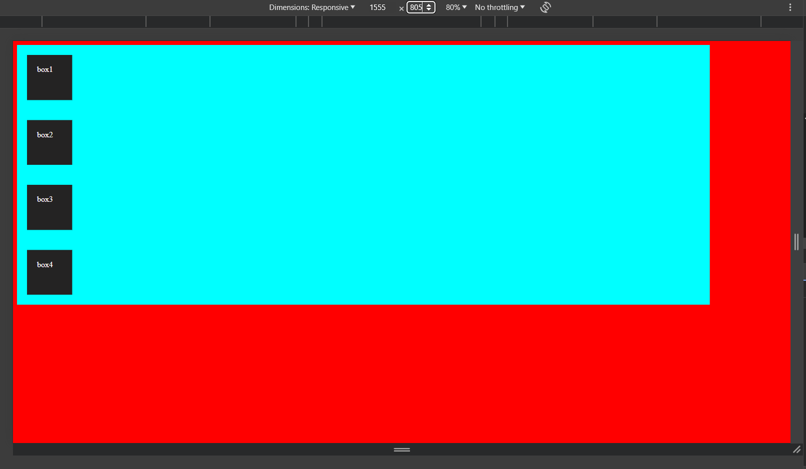
Above both example we can the background is changing according to dimension we mention whether it is portrait landscape.
4)Device Type Media Queries
Device type media queries target specific types of devices, allowing developers to tailor styles or layout based on the device's intended use.
there are four types of device type media queries which are
media screen
media handheld
media tv
media print
This is all about media queries although there so many queries present but we only use media only screen maximum time.
Thank you for taking the time to read this blog! Your interest and engagement are greatly appreciated. If you found this content helpful, insightful, or informative, please feel free to share it with others who might benefit from it.
cheers!!!!
Subscribe to my newsletter
Read articles from pranjali directly inside your inbox. Subscribe to the newsletter, and don't miss out.
Written by
