Creating Content Frame Using Vanilla HTML/CSS
 Mahdi Balali
Abstract
Here, we will explore the use of vanilla HTML and CSS to enhance the visual appeal of web pages without relying on external utilities like Elementor. The focus is on creating diverse content frames, starting with a simple rectangle and progressing to more complex shapes such as domes, ellipses, circles, and frames with convex curved sides using Scalable Vector Graphics (SVG). The paper provides practical examples and code snippets, making it accessible for coding newcomers to improve the visual attractiveness of web pages.
Introduction
Layout and page structure are substantially important for the user experience (UX). While designing and implementing these concepts, different parameters should be considered, including information hierarchy, readability and scannable, navigation and flow, consistency, responsive design, loading speed, accessibility, and visual appeal. The visual presentation of the content frame is crucial for influencing the user's perception and experience on the website. It could be a simple rectangle or any complicated geometry. Here we want to examine few simple methods for coding newbies, to improve the visual attractiveness of web page. Our focus will be on the methods which are not using utilities such as "Elementor" or so. We will only use vanilla HTML-CSS codes.
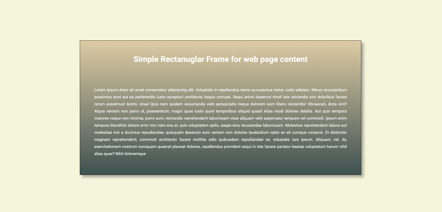
Let’s start from the simplest appearance, A Simple Rectangle. Creating such a simple content frame for web pages, could be generated so Straightforward. The following image shows a very simple instance of this type:
The HTML/CSS code for such a simple frame is provided below:
<!DOCTYPE html>
<html lang="en">
<head>
    <meta charset="UTF-8">
    <meta name="viewport" content="width=device-width, initial-scale=1.0">
    <title>Simple Rect Frame</title>
    <link rel="preconnect" href="https://fonts.googleapis.com">
    <link rel="preconnect" href="https://fonts.gstatic.com" crossorigin>
    <link href="https://fonts.googleapis.com/css2?family=Roboto:ital,wght@0,100;0,300;0,400;0,500;0,700;0,900;1,100;1,300;1,400;1,500;1,700;1,900&display=swap" rel="stylesheet">
    <style>
        .roboto-regular {
            font-family: "Roboto", sans-serif;
            font-weight: 400;
            font-style: normal;
        }

        .roboto-bold {
            font-family: "Roboto", sans-serif;
            font-weight: 700;
            font-style: normal;
        }


        body{
            display: flex;
            flex-direction: column;
            justify-content: center;
            align-items: center;
            border:1px solid black;
            height: 100vh;
            background-color: beige;
        }

        #box-1{
            border:1px solid black;
            width:61.8vw;
            height: 61.8vh;
            line-height: 30px;
            font-size: 17px;
            display: flex;
            flex-direction: column;
            justify-content: center;
            align-items: center;
            box-shadow: 10px 10px 10px rgb(0,0,0,0.3);
            background: linear-gradient(0deg, #3E5151   ,#DECBA4);
            color:white;
        }
        h1{
            margin-top:150px;
        }
        p{
            text-align: justify;
            padding:60px;
            margin-bottom: 100px;

        }
    </style>
</head>
<body>
    <div id="box-1">
        <h1 class="roboto-bold">Simple Rectanuglar Frame for web page content</h1>
        <p class="roboto-regular">
            Lorem ipsum dolor sit amet consectetur adipisicing elit. Voluptate in repellendus nemo accusamus natus, iusto adipisci. Minus accusantium possimus sunt aut ea perferendis iusto excepturi architecto itaque corrupti. Sequi animi deserunt modi iste reiciendis sint doloribus facere rerum possimus! Animi, vitae! Quis nam quidem assumenda velit perspiciatis neque dolorem eum libero reiciendis! Obcaecati, dicta sint? Atque veniam non porro ut, praesentium, magni quae iusto quod temporibus aliquid quasi! Alias modi dolores debitis. Aut quis tempora maiores neque non minima, porro eum, reiciendis reprehenderit laboriosam vitae aliquam velit aspernatur tempore vel commodi. Ipsum enim tempora blanditiis dolore error non nam eos et, quis voluptatem optio, saepe eius recusandae laboriosam. Molestias reprehenderit labore aut molestiae nisi a ducimus repudiandae, quisquam deserunt eum veniam non dolores laudantium optio ex sit cumque corporis. Et distinctio magnam reprehenderit, commodi architecto facere mollitia odio quibusdam repudiandae ex, voluptate iure ipsum. Aliquam, vel. At, exercitationem nostrum numquam quaerat placeat dolores, repellendus provident sequi in iste facere pariatur beatae voluptatum harum nihil alias quas? Nihil doloremque
        </p>
    </div>
</body>
</html>
According to the provided code, the frame shape is predominantly implemented by setting the div element borders. The problem rises when we want to have non-straight sides for the div. Hereafter, you will find different content frames, with curve sides, that are all generated using vanilla HTML and CSS.
Dome Shape Content Frame
To create a content frame, which is like a dome, we can modify the border radius of the two top corners of div element. The following picture illustrates such a dome:
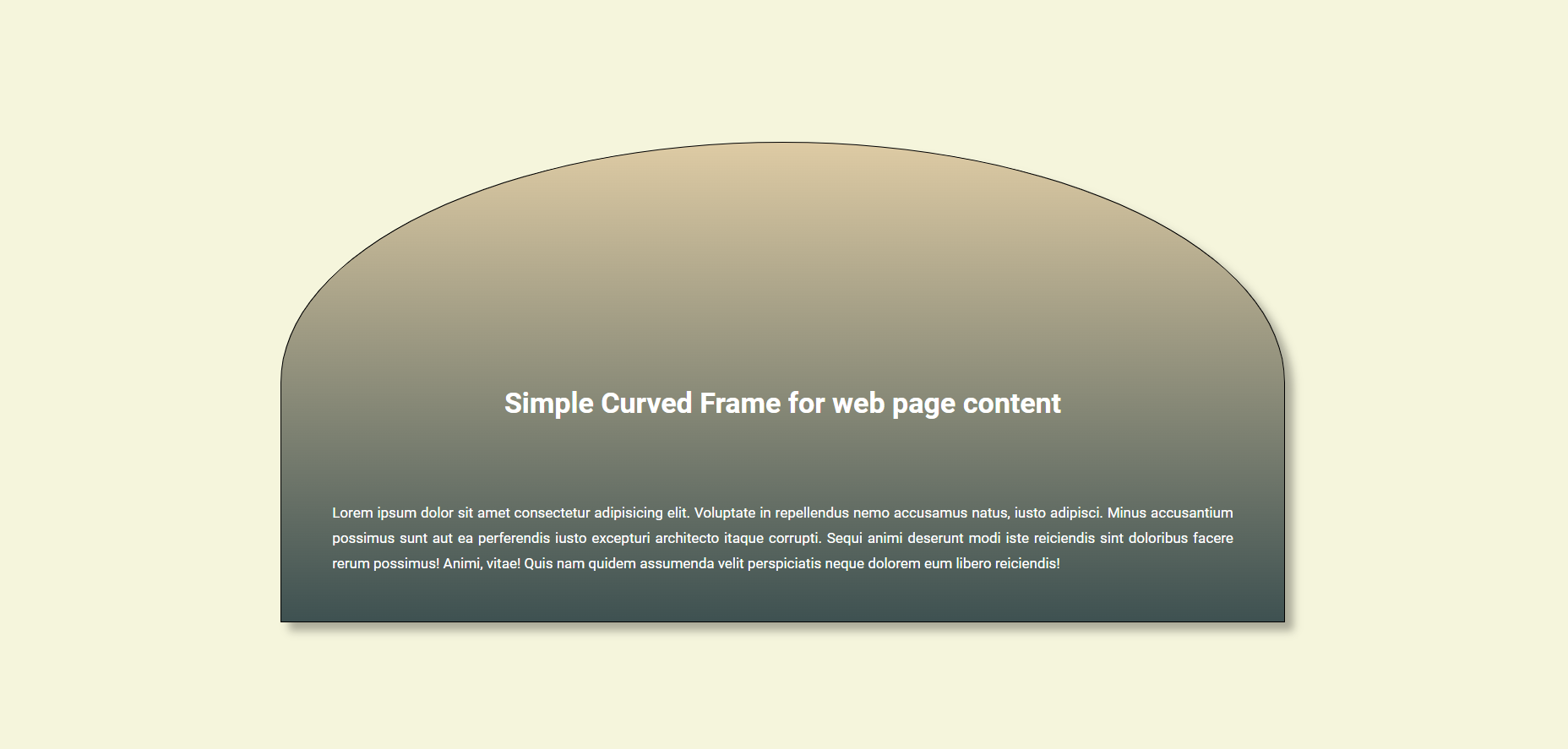
The main code is generally similar to the previously provided version, except CSS code for div element, which is shown below:
        #box-2{
            border:1px solid black;
            border-top-left-radius: 50%;
            border-top-right-radius: 50%;
            width:61.8vw;
            height: 61.8vh;
            line-height: 30px;
            font-size: 17px;
            display: flex;
            flex-direction: column;
            justify-content: center;
            align-items: center;
            box-shadow: 10px 10px 10px rgb(0,0,0,0.3);
            background: linear-gradient(0deg, #3E5151   ,#DECBA4);
            color:white;
        }
As it is clear from the above code, border-top-left-radius and border-top-right-radius are both set to 50%. Setting the div radius to 50% will create an arc with a radius of half length of the div.
Ellipse Shape Content Frame
Creating an ellipse shape content frame is almost the same as the dome shape. Here, we will modify the radius of all four corners of div element. The following figure shows what it would look like:
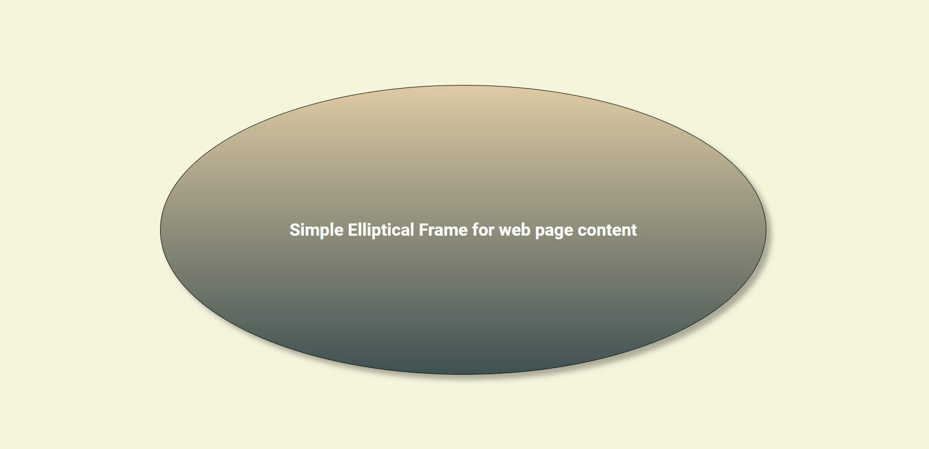
The CSS Style code for the div is as follows:
        #box-3{
            border:1px solid black;
            border-top-left-radius: 50%;
            border-top-right-radius: 50%;
            border-bottom-left-radius: 50%;
            border-bottom-right-radius: 50%;
            width:61.8vw;
            height: 61.8vh;
            line-height: 30px;
            font-size: 17px;
            display: flex;
            flex-direction: column;
            justify-content: center;
            align-items: center;
            box-shadow: 10px 10px 10px rgb(0,0,0,0.3);
            background: linear-gradient(0deg, #3E5151   ,#DECBA4);
            color:white;
        }
Circle Shape Content Frame
If we set both width and height of div element equally, then the code provided for elliptical content frame shape, will generate a circle.
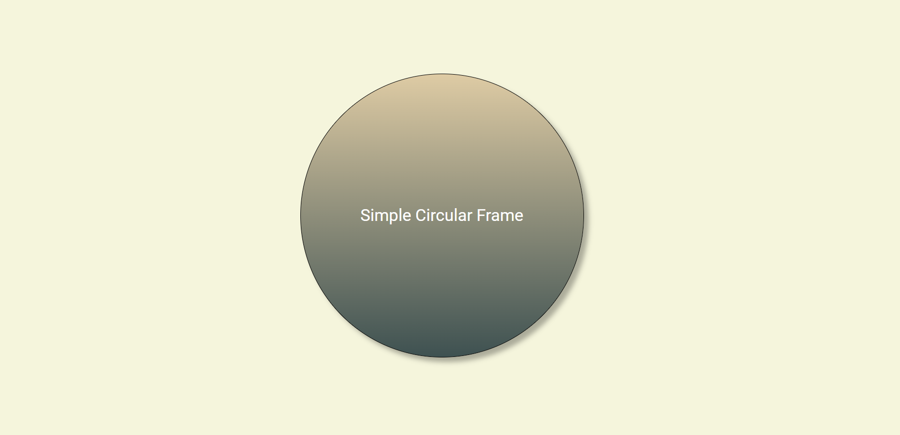
The code is here:
        #box-4{
            border:1px solid black;
            border-top-left-radius: 50%;
            border-top-right-radius: 50%;
            border-bottom-left-radius: 50%;
            border-bottom-right-radius: 50%;
            width:30vw;
            height: 30vw;
            line-height: 30px;
            font-size: 17px;
            display: flex;
            flex-direction: column;
            justify-content: center;
            align-items: center;
            box-shadow: 10px 10px 10px rgb(0,0,0,0.3);
            background: linear-gradient(0deg, #3E5151   ,#DECBA4);
            color:white;
        }
Content Frame with Convex Curved Sides:
This shape of content frame could not be generated by simply modifying borders and their radius or other dimensions. So, we will use the power of SVG. SVG, stands for of Scalable Vector Graphics. That is an XML based vector image format of defining two-dimensional graphics, having support for interactivity and animation. SVG images are defined in vector graphics format and stored in XML text files. These images can be scaled in size without loss of quality. Most of major geometrical shapes could be drawn using SVG functions in HTML. So, we can use those functions to create our shape.
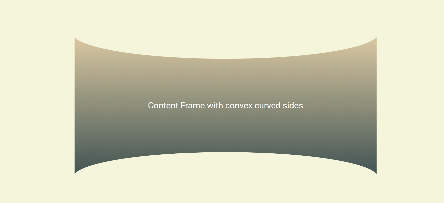
The following code shows how can we create this content frame:
<!DOCTYPE html>
<html lang="en">
<head>
    <meta charset="UTF-8">
    <meta name="viewport" content="width=device-width, initial-scale=1.0">
    <title>Simple Curved Side Frame</title>
    <link rel="preconnect" href="https://fonts.googleapis.com">
    <link rel="preconnect" href="https://fonts.gstatic.com" crossorigin>
    <link href="https://fonts.googleapis.com/css2?family=Roboto:ital,wght@0,100;0,300;0,400;0,500;0,700;0,900;1,100;1,300;1,400;1,500;1,700;1,900&display=swap" rel="stylesheet">
    <style>
        .roboto-regular {
            font-family: "Roboto", sans-serif;
            font-weight: 400;
            font-style: normal;
        }

        .roboto-bold {
            font-family: "Roboto", sans-serif;
            font-weight: 700;
            font-style: normal;
        }


        body{
            display: flex;
            flex-direction: column;
            justify-content: center;
            align-items: center;
            height: 100vh;
            background-color: beige;
        }
        .main{
            position: relative;
            width: 61.8vw;
            height: 61.8vh;
        }
        .container{
            position: absolute;
            top:0;
            left:0;
            width:100%;
            height: 100%;
        }
        #box-5{
            margin:0 auto;
            width:61.8vw;
            height: 61.8vh;
            line-height: 30px;
            font-size: 17px;
            display: flex;
            flex-direction: column;
            justify-content: center;
            align-items: center;
            background: linear-gradient(0deg, #3E5151   ,#DECBA4);
            color:white;
        }
        h1{
            text-align: center;
        }
        p{
            text-align: justify;
            padding:60px;
            margin-bottom: 200px;
        }
        .ellipseup{
            position:absolute;
            left:0;
            top:0;
            z-index: 10;
            width:61.8vw;
            height:100px;
            background-color: transparent;
        }
        .ellipsebottom{
            position:absolute;
            left:0;
            bottom:0;
            z-index: 10;
            width:61.8vw;
            height:100px;
        }
    </style>
</head>
<body>
    <div class="main">
        <svg viewBox="0 0 100 100" fill="beige" class="ellipseup" xmlns="http://www.w3.org/2000/svg">
            <ellipse cx="50" cy="0" rx="600" ry="100" />
        </svg>
        <div class="container">
            <div id="box-5">
                <h1 class="roboto-regular">Content Frame with convex curved sides  </h1>
            </div>
        </div>
        <svg viewBox="0 0 100 100" fill="beige" class="ellipsebottom" xmlns="http://www.w3.org/2000/svg">
            <ellipse cx="50" cy="100" rx="600" ry="100" />
        </svg>
    </div>
</body>
</html>
As it is clear from this code, we have generated two ellipses at top and bottom sides of the div element, and makes them all position absolute regarding their common relative container. The SVG shapes will be shown just inside the viewBox. So, by setting the viewBox window, and the ellipse dimensions, we can make some portion of ellipse be visilble and mask the central div element. The fill color of ellipses is the same as the body background color, so the user may think the top side of the box is a convex curve. The following picture shows the actual arrangement of two ellipses and the main central box.
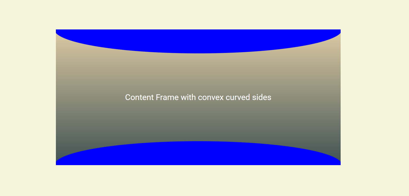
Any combination of ellipses, circles, rectangles, and paths could be used for designing content frames.
Context frame with bottom curved side:
The following picture and code show how you can have a context frame with bottom side, curved.
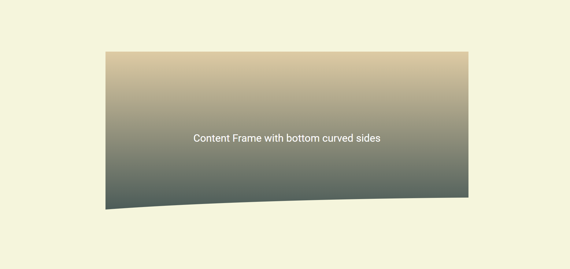
And the code is:
<!DOCTYPE html>
<html lang="en">
<head>
    <meta charset="UTF-8">
    <meta name="viewport" content="width=device-width, initial-scale=1.0">
    <title>Simple Curved Side Frame</title>
    <link rel="preconnect" href="https://fonts.googleapis.com">
    <link rel="preconnect" href="https://fonts.gstatic.com" crossorigin>
    <link href="https://fonts.googleapis.com/css2?family=Roboto:ital,wght@0,100;0,300;0,400;0,500;0,700;0,900;1,100;1,300;1,400;1,500;1,700;1,900&display=swap" rel="stylesheet">
    <style>
        .roboto-regular {
            font-family: "Roboto", sans-serif;
            font-weight: 400;
            font-style: normal;
        }

        .roboto-bold {
            font-family: "Roboto", sans-serif;
            font-weight: 700;
            font-style: normal;
        }


        body{
            display: flex;
            flex-direction: column;
            justify-content: center;
            align-items: center;
            height: 100vh;
            background-color: beige;
        }
        .main{
            position: relative;
            width: 61.8vw;
            height: 61.8vh;
        }
        .container{
            position: absolute;
            top:0;
            left:0;
            width:100%;
            height: 100%;
        }
        #box-5{
            margin:0 auto;
            width:61.8vw;
            height: 61.8vh;
            line-height: 30px;
            font-size: 17px;
            display: flex;
            flex-direction: column;
            justify-content: center;
            align-items: center;
            background: linear-gradient(0deg, #3E5151   ,#DECBA4);
            color:white;
        }
        h1{
            text-align: center;
        }
        p{
            text-align: justify;
            padding:60px;
            margin-bottom: 200px;
        }
        .ellipseup{
            position:absolute;
            left:0;
            top:0;
            z-index: 10;
            width:61.8vw;
            height:100px;
            background-color: transparent;
        }
        .ellipsebottom{
            position:absolute;
            left:0;
            bottom:0;
            z-index: 10;
            width:61.8vw;
            height:100px;
        }
    </style>
</head>
<body>
    <div class="main">
        <div class="container">
            <div id="box-5">
                <h1 class="roboto-regular">Content Frame with bottom curved sides  </h1>
            </div>
        </div>
        <svg viewBox="0 0 100 100" fill="beige" class="ellipsebottom" xmlns="http://www.w3.org/2000/svg">
            <ellipse cx="900" cy="110" rx="1800" ry="100" />
        </svg>
    </div>
</body>
</html>
Codes:
You can clone all of the above codes from here.
Conclusion:
In conclusion, we have demonstrated the creative possibilities and versatility of using vanilla HTML and CSS to design visually appealing content frames for web pages. By exploring various shapes, including domes, ellipses, circles, and convex curved sides using SVG, the paper showcases the flexibility inherent in these fundamental web technologies.
The emphasis on avoiding external utilities and relying solely on basic coding techniques makes these methods accessible to coding newcomers. The provided examples and code snippets serve as practical guides for implementing these visual enhancements. The paper underscores the importance of layout and page structure in influencing user experience, and it empowers designers and developers to take control of the visual aspects of their websites.
As web design continues to evolve, understanding the potential of vanilla HTML and CSS becomes crucial for creating unique and engaging user interfaces. By mastering these techniques, developers can not only improve the aesthetics of their websites but also gain a deeper understanding of the foundational principles that contribute to a positive user experience. In summary, this paper encourages experimentation and creativity within the boundaries of basic web technologies, opening doors for both newcomers and seasoned developers to elevate the visual appeal of their web pages.
Subscribe to my newsletter
Read articles from Mahdi Balali directly inside your inbox. Subscribe to the newsletter, and don't miss out.
Written by
