Navigating Heights: Material Top Tabs and Gorhom Bottom Sheet with React Navigation
 Ahona Das
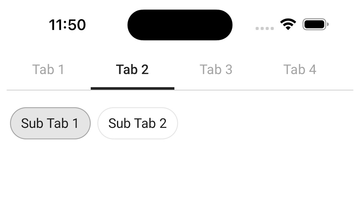
When we build screens in React Native, dealing with many tabs can get tricky, especially when they have sub-tabs, which have lists tied to the chosen tab and sub-tab values. Things get even more confusing if each list item includes a card that, when clicked, opens a modal with the same tabs and sub-tabs. It can be a bit of a puzzle.

The Image Above Shows Sub-tabs in React Native Screens.
But don't worry! Here's a straightforward and easy-to-use solution to keep everything organized.
In this article, we will see how we can achieve complex tab structure with minimal effort. Let’s get started!
Using Material Top Tabs Navigator
Material Top Tabs Navigator is a part of the React Navigation library, a popular navigation solution in the React Native ecosystem. This navigator specifically focuses on creating a tab-based navigation structure with tabs at the top of the screen. It aligns with the Material Design guidelines, providing a modern and aesthetically pleasing navigation experience.
Installation
To implement the tabs, ensure React Navigation is installed in your project. If not, you can install it using the following steps:
npm install @react-navigation/native
 or
yarn add @react-navigation/native
Additionally, you'll need to install the Material Top Tabs Navigator:
npm install @react-navigation/material-top-tabs react-native-tab-view
 or
yarn add @react-navigation/material-top-tabs react-native-tab-view
Then, you need to install react-native-pager-view which is required by the navigator.
npm install react-native-pager-view
 or
yarn add react-native-pager-view
Creating Tab Array
const TabSubTabData = [
  {
    id: 1,
    title: 'Tab 1',
    subTabs: [
      { id: 1, title: 'SubTab 1', parentTab: 'Tab 1', screenName: 'Screen1' },
      { id: 2, title: 'SubTab 2', parentTab: 'Tab 1', screenName: 'Screen2' },
    ],
    screen: 'Screen1',
  },
  {
    id: 2,
    title: 'Tab 2',
    subTabs: [
      { id: 3, title: 'SubTab 1', parentTab: 'Tab 2', screenName: 'Screen3' },
      { id: 4, title: 'SubTab 2', parentTab: 'Tab 2', screenName: 'Screen4' },
    ],
    screen: 'Screen3',
  },
  // Add more objects as needed
]
Each tab in the array has its own array of sub-tabs.
Let’s use this array to create material top tabs in our TabNavigator component.
To use the tab navigator, import it from @react-navigation/material-top-tabs.
import { createMaterialTopTabNavigator } from '@react-navigation/material-top-tabs'

const Tab = createMaterialTopTabNavigator()

export const MyTabs() {
 return (
   <Tab.Navigator>
   {TabSubTabData.map((item, index) => (
              <Tab.Screen
                key={index}
                name={item.screen}
                options={{
                  title: `${item.title}`,
                }}
              >
                {(props) => (
                  <TabBody
                    currentTab={item}
                  />
                )}
              </Tab.Screen>
            ))}
   </Tab.Navigator>
 )
}
The above code sets up a top tab navigator MyTabs using the createMaterialTopTabNavigator function. It dynamically creates tab screens based on the data in the TabSubTabData array, each associated with a common screen component (TabBody) and configured with a title.
Now that we have created our tabs, let’s create our TabBody component. This component will have a list, and each list will show a card with brief information on it.
To enable a detailed view, we'll make these cards pressable, triggering the opening of a modal that mirrors the structure of tabs and sub-tabs.
import { FlashList } from '@shopify/flash-list'

export const TabBody({currentTab}) {

 const [subStatus, setSubstatus]=useState(currentTab.subTabs[0])

 const onPressSubTab = (subTab) => {
  setSubStatus(subTab)
 }

 const onPressCard = (card) => {
 // open the modal with detailed view
 }

 return (
   <>
   {currentTab.subTabs.map((subTab) => (
    <Button
     onPress={() => onPressSubTab(subTab)}
     title={subTab.title} />
   ))}
   <FlashList
     //list fetched from API based on Tab and subTab selection
     data={list}
     renderItem={({item}) => (
     <Pressable onPress={() => onPressCard(item)}>
     // UI to show a card as each item of the list.
     </Pressable>
     )}
   />
   </>
 )
}
Upon modal activation, it should promptly navigate to the tab corresponding to the card's initial position, with the preselected sub-status.
Various methods exist for modal implementation, and we have opted for the BottomSheet from gorhom/bottom-sheet. This choice is attributed to its seamless integration with React Navigation, along with robust keyboard handling capabilities.
Elevating User Experience with Gorhom Bottom Sheet
Gorhom Bottom Sheet is an open-source library for React Native that facilitates the creation of bottom sheets – a user interface element that slides up from the bottom of the screen.
Unlike traditional bottom sheets, Gorhom Bottom Sheet supports multi-level hierarchies. This means you can nest bottom sheets within each other, providing a layered and organized structure for presenting information or actions.
Why Gorhom Bottom Sheet?
Seamless React Navigation Integration: Gorhom Bottom Sheet is designed to seamlessly integrate with React Navigation, allowing for smooth navigation transitions and a consistent user experience. This compatibility is particularly advantageous as it allows our modal to be seamlessly opened from any screen, yielding optimal results.
Multi-Level Bottom Sheets: This library excels in supporting multi-level bottom sheets, empowering developers to create hierarchies for intricate user interfaces. In the context of our modal, this feature becomes especially valuable, enabling the implementation of more complex functionalities. For instance, having distinct buttons that trigger different modals is made feasible, and the ability to nest modals with each other is seamlessly supported by this library.
Installation
npm install @gorhom/bottom-sheet
# or
yarn add @gorhom/bottom-sheet
This library needs these dependencies to be installed in your project before you can use it:
yarn add react-native-reanimated react-native-gesture-handler
Note: React Native Gesture Handler needs extra steps to finalize its installation, please follow their installation instructions. Please make sure to wrap your App with GestureHandlerRootView when you've upgraded to React Native Gesture Handler ^2. React Native Reanimated v2 needs extra steps to finalize its installation, please follow their installation instructions.
Let’s create our modal component.
import BottomSheet from '@gorhom/bottom-sheet'


const DetailSheetTab = createMaterialTopTabNavigator()

export const MyDetailSheet({route, navigation}) {

const TabSubtab = route.params  // to set initial tab & subtab

const bottomSheetRef = useRef<BottomSheet>(null)
const snapPoints = usememo(() => [1, ‘90%’], [])

const handleSheetChanges = useCallback((index: number) => {
 if (index === -1) {
    navigation.goBack()  // close modal
   }
}, [])

const initialRoute = useMemo(() => TabSubTabData.find((tab) => TabSubtab.TabId === tab.id), [TabSubtab])

const subStatus = useMemo(() => initialRoute.find((subtab) => TabSubtab.SubTabId === subtab.id), [initialRoute, TabSubtab])

return (
   <BottomSheet
    ref={bottomSheetRef}
    index={1}
    snapPoints={snapPoints}
    onChange={handleSheetChanges}
   >
   <DetailSheetTab.Navigator
    initialRouteName={initialRoute.screen}>
   {TabSubTabData.map((item, index) => (
              <DetailSheetTab.Screen
                key={index}
                name={item.screen}
                options={{
                  title: `${item.title}`,
                }}
              >
                {(props) => (
                  <DetailedWrapperComponent
                    currentTab={item}
                    subStatus={subStatus}
                  />
                )}
              </DetailSheetTab.Screen>
            ))}
   </DetailSheetTab.Navigator>
   </BottomSheet>
 )
}
Let's break down the key components of the code:
const TabSubtab = route.params: Extracts parameters from the route, which are related to tab and subtab information. We will use this to set the initial route of the navigator and preselect subtab as soon as our modal opens.
initialRoute: Determines the tab that should be focused when modal opens.
subStatus: Determines the subtab that should be preselected when modal opens.
Let’s leverage the most interesting feature of gorhom bottom sheet - react navigation support.
To open the modal, we just need to navigate to it just like we would navigate to any other screen in a stack navigator.
Add below code in the onPressCard function in the TabBody component:
const onPressCard = (card) => {
 navigation.navigate(‘MyDetailSheet’, {
  TabId: card.Status
  SubTabId: card.subStatus
 }
 }
}
Pass the selected tab and subtab as parameters when navigating to MyDetailSheet (modal). These parameters will serve as the initial route and preselected subtab, respectively, when the modal opens.
Redirection from Notification
Implementing our modal in this manner provides an additional benefit – seamless handling of notification redirection. For example, when a notification carries appended tab and sub-tab IDs in its URL, we can effortlessly extract these IDs. Upon navigating to 'MyDetailSheet' (our modal) and passing these extracted IDs as parameters, the bottom sheet will promptly open upon tapping the notification. This ensures proper redirection, with the required tab being focused and the associated sub-tab preselected.
Conclusion
Combining Material Top Tabs and Gorhom Bottom Sheet in a React Navigation setup provides a powerful and flexible navigation experience. Whether you're organizing content with top tabs or introducing interactive bottom sheets, this approach enhances user engagement and creates a modern and dynamic app interface.
This article was written by Sonali Mandal, Software Engineer III, for the GeekyAnts blog.
Subscribe to my newsletter
Read articles from Ahona Das directly inside your inbox. Subscribe to the newsletter, and don't miss out.
Written by
