Creating A Custom Simple Tooltip in React js
 Emmanuel Okocha
Table of content
Scaffolding of vite react project.
Installation of tailwind CSS with vite
Creation of the tooltip component and how to style using tailwind and plain CSS
Implementation of hover effect using useState() Hook and the onMouseEnter and Also onMouseLeave
Why do I prefer to use the onMouseEnter , onMouseLeave and useState instead of the
:hoverpseudo**-class**Bonus
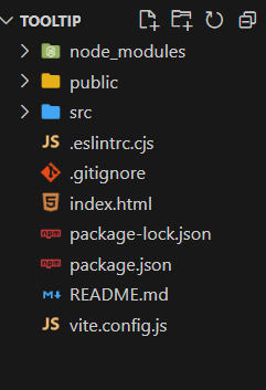
Scaffolding of vite react
I open my rich text editor, vscode, but you can also use any rich text editor you choose.
I opened up my Terminal and then ran
npm create vite@latest Tooltip -- --template react(I did not runnpm run devyet as I will still**install tailwind CSS**)
Installation of tailwind CSS
In the Terminal I ran
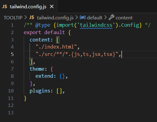
npm install -D tailwindcss postcss autoprefixer. , After which I rannpx tailwindcss init -pthis downloadtailwindcssand its peer dependencies and generatetailwind.config.jsandpostcss.config.jsfiles.In the root dir, I opened the
tailwind.config.jsand Configure your template paths by adding the paths to all of your template files in yourtailwind.config.jsfileexport default { content: [ "./index.html", "./src/**/*.{js,ts,jsx,tsx}", ], theme: { extend: {}, }, plugins: [], }I opened up the
index.cssand added the following@tailwind base; @tailwind components; @tailwind utilities;tailwind directives for each of Tailwind’s layers to your./src/index.cssfile.I then started the building process for the tooltip project by running
npm run dev.
Creation of Tooltip component & styling with tailwind CSS
I opened up my src folder and created a component folder, in the component folder I created a Tooltip.jsx src.

created the following code, A Tooltip functional component that will accept two props which are Children props and the tooltip text props.
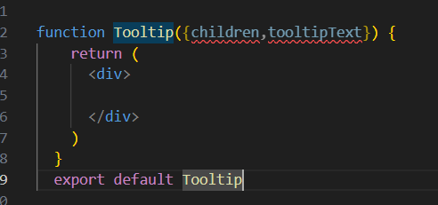
As shown below the div element which is the parent element will be given an attribute of className in which we will use to set the styling for the parent element.
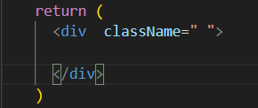
In the className in between the semi-colon " " , I added the following class inside relative and group as shown below.

The
relativeclass allows for anychildElementto be positioned absolutely to the parent, more on that as we progress.While the
group, class when placed on the parent element allows for styling effect on thechildElementmore on that as we progress.
setting up our TooltipText and children props
Inside the parent which is our div with the className of relative and group we pass in the children prop as shown below.

Next, we create a span tag and pass in the tooltipText as shown below.
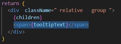
Next, we create an attribute of className and then proceed to give it a styling.
we proceed to give the span the following styling which I will explain each of the classes given.
absolute, Imagine you are on a train and you are a passenger on that train, that is you are bound by that train, so you can say the train is the div with the className ofrelative, sochildElementwith the className ofabsoluteis bounded and relative to the parent that is its position is based on the parent.px-[.1rem]is for setting the inline padding(Horizontal) with a value of .1rem on the span tag.rounded-smis for rounding or curving the edge of the span tag.bg-slate-500for giving a background color of slate.whitespace-nowarp, if there is a given space in the tooltip text this class does not allow the text with a space not to warp.top-[100%]setting the top of the span tag 100% from the top of the parent tag, that is if the top was set to 20% that istop-[20%]from the top of theparentElement. that is there is a 20% space from the top of theparentElementto thechildElementwhich is the span.group-hover:visibleif we remember we gave theparentElementa class ofgroupso anychildElementwith a class ofgroup-hover:visible, when hovering on theparentElementan effect will be placed on thechildElementand the effect we need is to change the visibility ofchildElementtovisible.transition-[visibility]these allow for subtle animation when going from visible to invisible and vice versa.delay-[150ms], Is the time delay before the animation commences, Here we are using 150ms -> 150 milliseconds, you can input any time of your choice it can bedelay-[200ms]ordelay-[1s](s -> seconds).invisiblethis class is used to set the span tag which is thechildElementtoinvisibleand when hovered onparentElementis set thechildElementtovisible.z-[1]it gives the styling of setting the z-order of a positionedchildElement.left-[50%]to position or it a space of 50% coming from the left.
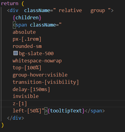
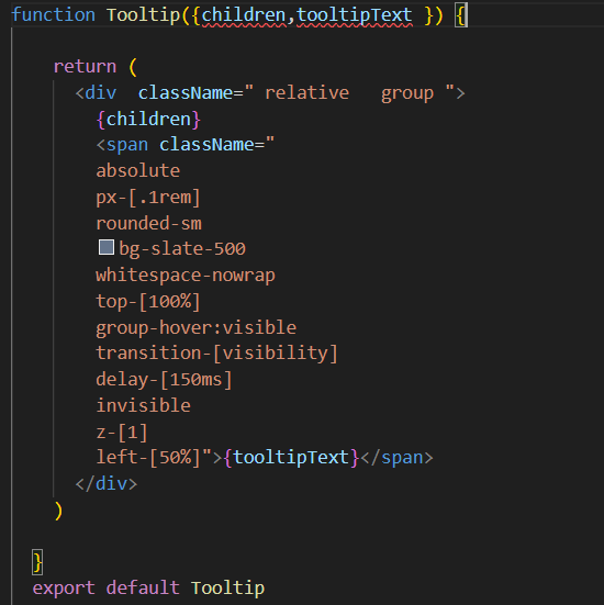
Exporting of the Tooltip component and Importing of the Tooltip component to the App.jsx for rendering.
exporting is done using the export default Tooltip as shown below.
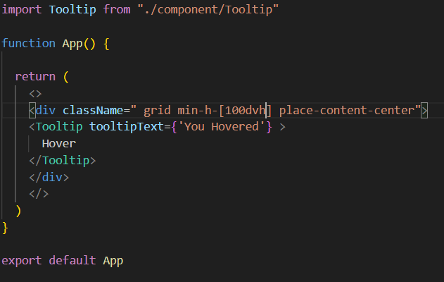
You can then import the tooltip by using import Tooltip from "./component/Tooltip" and warp the component over any element or text of your choice for the sake of this article I wrapped mine around a Hover text and gave the tooltipText={'You Hovered'} you can also replace you Hovered any string of your choice and for the sake of these articles I added a bit of styling for centering as shown below.
The end product of the hover effect using Tailwind CSS
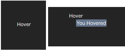
Implementation of tooltip effect using useState() Hook and the onMouseEnter and Also onMouseLeave.
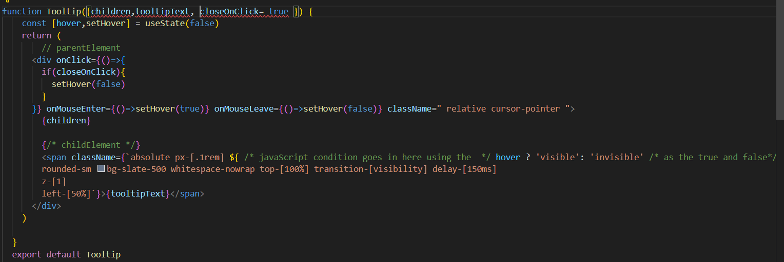
In this part of the implementation of the tooltip component we import useState hook and create a state variable and a setter function , for the sake of this article, I will call the state variable hover and the setter function setHover , so we have const [hover,setHover] = useState() , the initial state is set to the boolean false that is const [hover,setHover] = useState(false) and Also on the parentElement I removed the group and added the cursor-pointer class as well as the group-hover:visible and the previous invisible class from the childElement as they will not be needed in this section and instead of className=" " I will use className = {``} , if you notice we used template literal and bracket these allow us to write JavaScript inside using the ${javaScript is written in here} , so we have this className = {`${javaScript condition goes in here} classes that won`t be affected by our javaScript code `} , let's take a look at what we have done in the image shown below.

After these, I added two types of events the onMouseEnter and onMouseLeave , which changes the state variable to true when the mouse enters the parentElement and it changes the state variable to false when the mouse leaves the parentElement the variable is changed using the setter function setHover() , onMouseLeave={()=>setHover(false)} and onMouseEnter={()=>setHover(true)} , as shown below.

So we then implement the condition which goes like this hover ? 'visible' : 'invisible' that is if hover is true let the childElement have the class of visible else if hover is not true which is false let the childElement have the class invisible as shown below.


This will allow the tooltip to be shown based on the event.
Why do I prefer to use the onMouseEnter , onMouseLeave, and useState instead of the :hover pseudo-class?
Well cause you can add a click event to cause the tooltip to be invisible by adding an onClick event to the parentElement while that implemented with only tailwind CSS can not close based on click as shown below.

Bonus
In this bonus section of the article, a new prop will be added, for the sake of this article I will call the prop closeOnClick and it will accept a boolean and also have an initial value of true this prop will enable us to give a condition inside of the onClick event function that goes like this
onClick={()=>{ if(closeOnClick)
{setHover(false)
}
}}
thank you.
Subscribe to my newsletter
Read articles from Emmanuel Okocha directly inside your inbox. Subscribe to the newsletter, and don't miss out.
Written by

Emmanuel Okocha
Emmanuel Okocha
I'm a web2 developer looking into the web3 space.