🚀 Diagram as Code (DaC)
 Chenwi Ngu
In the rapidly evolving landscape of information technology, the ability to clearly convey intricate architectures and procedures is crucial. The conventional approach of creating diagrams using graphical tools often fall short in providing the adaptability, version control features, and automation possibilities required in today’s dynamic and fast-paced environments. This is where the concept of “Diagram as Code” (DaC) comes into play. In this blog post, we will explore some of the essential tools that enable DaC, making diagram creation a breeze for developers, DevOps and cloud engineers.
What is Diagram as Code?
“Diagram as Code” refers to the practice of saving the blueprint of a diagram image in a text file format. This method can streamline your work process, boost teamwork, and guarantee that your diagrams are always current and precise. It’s becoming a popular way to diagram software architecture, particularly for long-lived high-level documentation.
Diagram as Code in DevOps & Cloud Engineering
In the dynamic world of contemporary DevOps and cloud engineering, Diagram as Code (DaC) enhances the upkeep, scalability, and cooperative efforts surrounding system documentation and architecture. This makes it an indispensable method for the current landscape of software development and infrastructure management.
The Benefits of Diagram as Code
Representing diagrams as code allows tracking of diagram changes in version control systems.
Diagrams have the ability to automatically update in response to alterations in your infrastructure, thereby ensuring their continuous accuracy and relevance.
Diagram as code bridges documentation with system implementation.
Architectural diagrams, which are generated from code, can be distributed across different platforms and can be incorporated in any location or context as needed.
Tools for Diagram as Code
There are several tools available that convert code into architectural diagrams. Some of them are:
Diagrams: A Python library that lets you draw cloud system architectures in code. Designed for rapid prototyping,
Diagramseliminates the need for separate diagramming tools. It supports major providers and stacks like AWS, Azure, GCP, Kubernetes, and more. Whether you’re dealing with on-premise nodes, SaaS services, or major programming frameworks and languages,Diagramshas got you covered.Go Diagrams: It offers the same functionality as
Diagrams, but lets you write in Go, providing a familiar environment for Go enthusiasts.Mermaid: A JavaScript library that enables creating diagrams and visualizations using text. It uses Markdown-style text definitions that feed into a renderer to create complex diagrams. With
Mermaid, you can keep your documentation at pace with development, solving the problem of “doc-rot”.PlantUML: Offers a domain-specific language to generate a wide variety of diagram types. From sequence diagrams and architectural diagrams to network topology and Gantt charts,
PlantUMLcan handle it all. It even supports ASCII art! While it has a bit of a learning curve compared to other tools, its broad features makePlantUMLa flexible and powerful option for embedding diagrams alongside code.ASCII Diagram Editors: These tools allow you to draw diagrams visually or in text and then render them as ASCII art. These tools harness the power and simplicity of plain text, allowing you to easily author text-based diagrams, layouts, flow charts, and more. Some examples of this class of tools include web-based
asciiflowandMonodraw, which is Mac only.Markmap: Creates and visualizes mind maps derived from Markdown documents. It parses Markdown content and extracts its inherent hierarchies to render a mindmap. It’s great for connecting ideas and their relationships defined in writing.
Each tool has its strengths and is suited to different use cases, making this a valuable resource for developers, DevOps and cloud engineers or anyone interested in ‘diagram as code’ tools.
Quick start with Diagrams
We’ll use Python to create architecture diagrams. Being able to codify diagrams is a huge asset, and could potentially save you and your team long hours. To get started all you need is the diagrams library, and to use this diagrams library, you need the following:
Python 3.6 or higher, check your Python version first.
Graphviz to render the diagram, so you need to install Graphviz to use
diagrams. After installing graphviz, install thediagramslibrary.# using pip (pip3) $ pip install diagrams # using pipenv $ pipenv install diagrams # using poetry $ poetry add diagrams
A Custom CI/CD Pipeline
Here’s a quick start example of how to use the diagrams library to create a custom CI/CD pipeline diagram:
#cicd.py

from diagrams import Diagram, Cluster, Custom
from diagrams.onprem.ci import Jenkins
from diagrams.onprem.vcs import Github
from diagrams.onprem.container import Docker
from diagrams.programming.language import Java


with Diagram("CI/CD Pipeline", show=False, graph_attr={"ranksep": "0.7", "nodesep": "0.4"}):

    with Cluster("New Feature - Development", graph_attr={"fontsize": "10"}):
         ticket = Custom("Ticket raised/assigned", "/path/to/jira.png")
         developer = Java("Write/test code")
         github = Github("Developer pushes code")

         ticket >> developer >> github

    with Cluster("Continuous Integration", graph_attr={"fontsize": "10"}):
        jenkins = Jenkins("Jenkins")
        maven_test = Custom("Compile code/Unit test", "/path/to/maven.png")
        sonarqube = Custom("Code Quality Check", "/path/to/sonarqube.png")
        dependency_check = Custom("Vulnerability Scan", "/path/to/dependencycheck.png")
        maven_build = Custom("Build/Package Application", "/path/to/maven.png")

        jenkins >> maven_test >> sonarqube >> dependency_check >> maven_build

    github >> jenkins

    with Cluster("Artifact - Docker Image", graph_attr={"fontsize": "10"}):
         nexus = Custom("Push Artifact", "/path/to/nexus.png")
         docker_build = Docker("Docker build and Tag")
         trivy = Custom("Docker Image Scan", "/path/to/trivy.png")

         nexus >> docker_build >> trivy

    maven_build >> nexus

    with Cluster("Continuous Deployment", graph_attr={"fontsize": "10"}):
         docker_push = Docker("Docker Push")
         kubernetes = Custom("Deploy to Kubernetes",  "/path/to/kubernetes.png")

         docker_push >> kubernetes

    trivy >> docker_push
If you have local images for Maven, Jira, SonarQube, etc you can use the diagrams.Custom class to include them in your diagram. Here’s how you can modify the script:
In this script, replace "/path/to/jira.png" , "/path/to/maven.png" etc, with the actual paths to your local Jira, Maven, SonarQube, and Trivy images. This will use your local images to represent the Jira, Maven, SonarQube, and Trivy stages in your pipeline.
Then, you can run the script using Python:
python cicd.py
This will generate a ci_cd_pipeline.png file in the same directory as your script. You can open this file to view your diagram. You should see a similar diagram like the cover image of this blog post.
Taking a look at the code, we can see that we have a standalone node object, 4 cluster group objects, and connections (>>) represent the flow of the process from one stage to the next. By default direction = "LR" in the Diagram function. This means that the nodes in the diagram are arranged from left to right. We can also import the Edge object to set some attributes (label, color, and style) to the connections between nodes. We’ll explore this in the 3 tier and Kubernetes architecture diagrams.
Let’s create a three-tier diagram on AWS
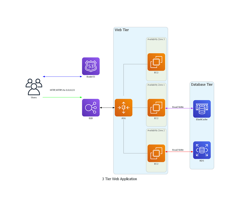
The script below generates a three-tier architecture diagram with Users, Route53, an Elastic Load Balancer (ELB), an AutoScaling group (ASG) with three EC2 instances, and a Database Tier with ElastiCache and RDS. The edges between the nodes represent connections, with color and label attributes to indicate the type of connection. Note comments are provided for readability.
# 3_tier.py

# Import necessary modules from the diagrams library
from diagrams import Cluster, Diagram, Edge
from diagrams.aws.network import Route53, ELB
from diagrams.aws.compute import EC2, AutoScaling
from diagrams.aws.database import RDS, ElastiCache
from diagrams.onprem.client import Users

# Create a new Diagram object
with Diagram("Stateful Web Application", show=False, graph_attr={"splines": "ortho", "fontsize": "20"}):
    # Define nodes for Users, Route53, and ELB
    users = Users("Users")
    route53 = Route53("Route53")
    elb = ELB("ELB")

    # Create a cluster for the Web Tier
    with Cluster("Web Tier", graph_attr={"fontsize": "20"}):

        # Define an cluster Autoscaling group node
        asg = AutoScaling("ASG")
        # Create a separate cluster for each EC2 instance
        with Cluster("Availability Zone 1"):
            ec2_instance1 = EC2("EC2")
        with Cluster("Availability Zone 2"):
            ec2_instance2 = EC2("EC2")
        with Cluster("Availability Zone 3"):
            ec2_instance3 = EC2("EC2")
        # Connect the AutoScaling group to each EC2 instance
        asg - [ec2_instance1, ec2_instance2, ec2_instance3]

    # Create a cluster for the Database Tier
    with Cluster("Database Tier", graph_attr={"fontsize": "20"}):
        # Define nodes for ElastiCache and RDS
        elasticache = ElastiCache("ElastiCache")
        rds = RDS("RDS")


    # Define edges between nodes
    users >> Edge(color="blue")\
    << route53
    users >> Edge(color="green", label="HTTP/HTTPS to 0.0.0.0/0")\
    >> elb >> Edge(color="black") << asg
    ec2_instance1 >> Edge(color="purple", label="Read/Write")\
    << elasticache
    ec2_instance2 >> Edge(color="red", label="Read/Write")\
    << rds
Run the script using Python:
python 3_tier.py
If everything is set up correctly, you should see your three-tier AWS architecture diagram as shown below.

Let’s create a Kubernetes architecture diagram
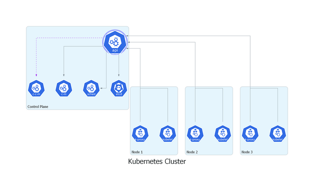
The script provided below generates a Kubernetes architecture diagram with an API Server, ETCD Server, Scheduler, Controller Manager, and Cloud-Controller Manager in the Control Plane, and three Nodes each with a Kubelet and Kube-Proxy. The edges between the nodes represent connections, with each component in the Nodes connected to the API Server, and the API Server connected to ETCD Server, Scheduler, Controller Manager, and Cloud-Controller Manager in the Control Plane as specified.
# k8s.py

# Import necessary modules from the diagrams library
from diagrams import Cluster, Diagram, Edge
from diagrams.k8s.infra import ETCD
from diagrams.k8s.controlplane import APIServer, ControllerManager, CCM, KubeProxy, Kubelet, Scheduler

# Create a new Diagram object
with Diagram("Kubernetes Cluster", show=False, direction="TB", graph_attr={"splines": "ortho", "fontsize": "40"}):
     # Create a cluster for the Control Plane
     with Cluster("Control Plane",  graph_attr={"fontsize": "20"}):
        # Define nodes for the Control Plane
        etcd_server = ETCD("")
        scheduler = Scheduler("")
        api_server = APIServer("")
        controller_manager = ControllerManager("")
        cloud_controller_manager = CCM("")

        # Connect the API Server to ETCD, Scheduler, and Controller Manager
        etcd_server << api_server
        scheduler << api_server
        controller_manager << api_server
        cloud_controller_manager << Edge(color="purple", style="dashed") << api_server

     # Create clusters for each Node
     with Cluster("Node 1",  graph_attr={"fontsize": "20"}):
        # Define nodes for Node 1
        kubelet1 = Kubelet("")
        kube_proxy1 = KubeProxy("")
        # Connect Kubelet and Kube-Proxy to the API Server
        kubelet1 >> api_server
        kube_proxy1 >> api_server

     with Cluster("Node 2",  graph_attr={"fontsize": "20"}):
        # Define nodes for Node 2
        kubelet2 = Kubelet("")
        kube_proxy2 = KubeProxy("")
        # Connect Kubelet and Kube-Proxy to the API Server
        kubelet1 >> api_server
        kube_proxy1 >> api_server

     with Cluster("Node 3",  graph_attr={"fontsize": "20"}):
        # Define nodes for Node 3
        kubelet3 = Kubelet("")
        kube_proxy3 = KubeProxy("")
        # Connect Kubelet and Kube-Proxy to the API Server
        kubelet1 >> api_server
        kube_proxy1 >> api_server
Run the script using Python:
python k8s.py
If you have gotten your hands dirty, you should see a Kubernetes cluster diagram like this:

Conclusion
Diagram as Code is a powerful approach for developers, DevOps/Cloud engineers, and IT professionals to effectively communicate complex architectures and processes. It integrates seamlessly with modern software development practices and toolchains, enhancing collaboration and maintaining up-to-date documentation. So, if you’re a developer, DevOps or cloud engineer, it’s time to embrace Diagram as Code and take your documentation to the next level!
References
To further learn and explore diagram as code, you can refer to these valuable resources:
Keep trying there’s light at the end of the tunnel! 🖐
I look forward to connecting with you on LinkedIn
Subscribe to my newsletter
Read articles from Chenwi Ngu directly inside your inbox. Subscribe to the newsletter, and don't miss out.
Written by

Chenwi Ngu
Chenwi Ngu
Welcome to my digital realm! Cloud DevOps Engineer, specializing in automation, CI/CD, infrastructure as code and leveraging deployment tools such as Docker, Kubernetes, Ansible, Jenkins and ArgoCD. I assist teams in utilizing cloud technologies to engineer efficient software solutions. I’m passionate about continuous learning and sharing knowledge. Follow me for insights on DevOps, cloud technologies, and the intersection of education and tech.