CSS Masks Guide: Solutions to Common Design Challenges
 brian treese
As people who use HTML and CSS to build things for the web, we run into difficult challenges daily. Sometimes things seem so easy but end up being a real pain in the butt. Well, I’m here to help… at least a little bit… well hopefully. In this post I’m going to show you how I’ve solved three pretty common design issues in the past with CSS masks.
First, we’re going to add fade out effects to the top and bottom of a scrolling container.
Then, we’re going add an irregular shape to the edges of a banner.
And after that, we’ll use a mask image to pull off a hexagonal style for a square image.
Now, if that doesn’t get you pumped, I guess I don’t know what will! Alright, let’s go.
CSS mask-image Explained
So, before we get too far ahead of ourselves, we need to understand what we’re doing and how it actually works. We’re going to be using the CSS mask-image property. The rules and syntax for mask-image will probably look a little familiar. They are a lot like the CSS background-image properties.
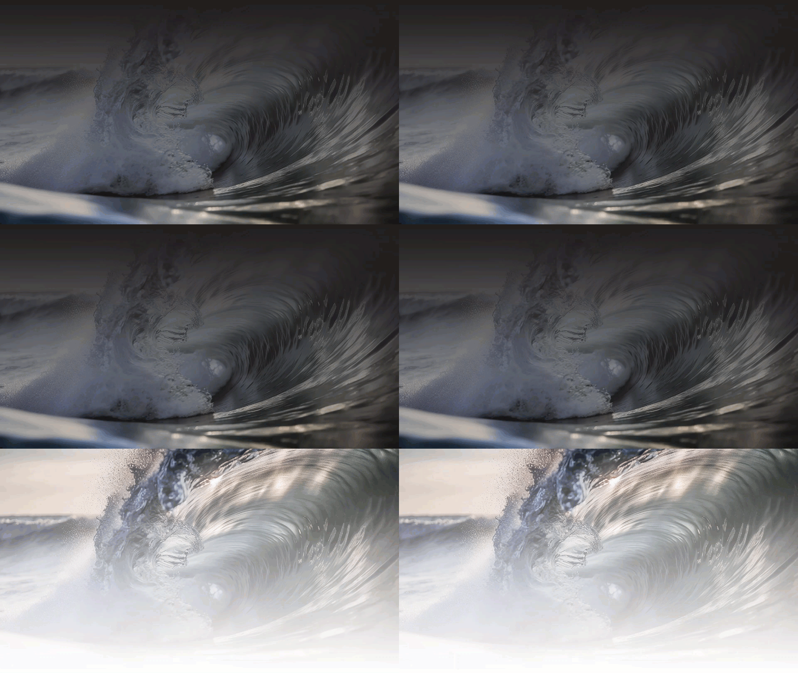
Masks in CSS work by using a combination of opaque and transparent areas. The areas that are completely transparent will mask the things behind them. The areas that are completely opaque will allow the things behind them to be seen.
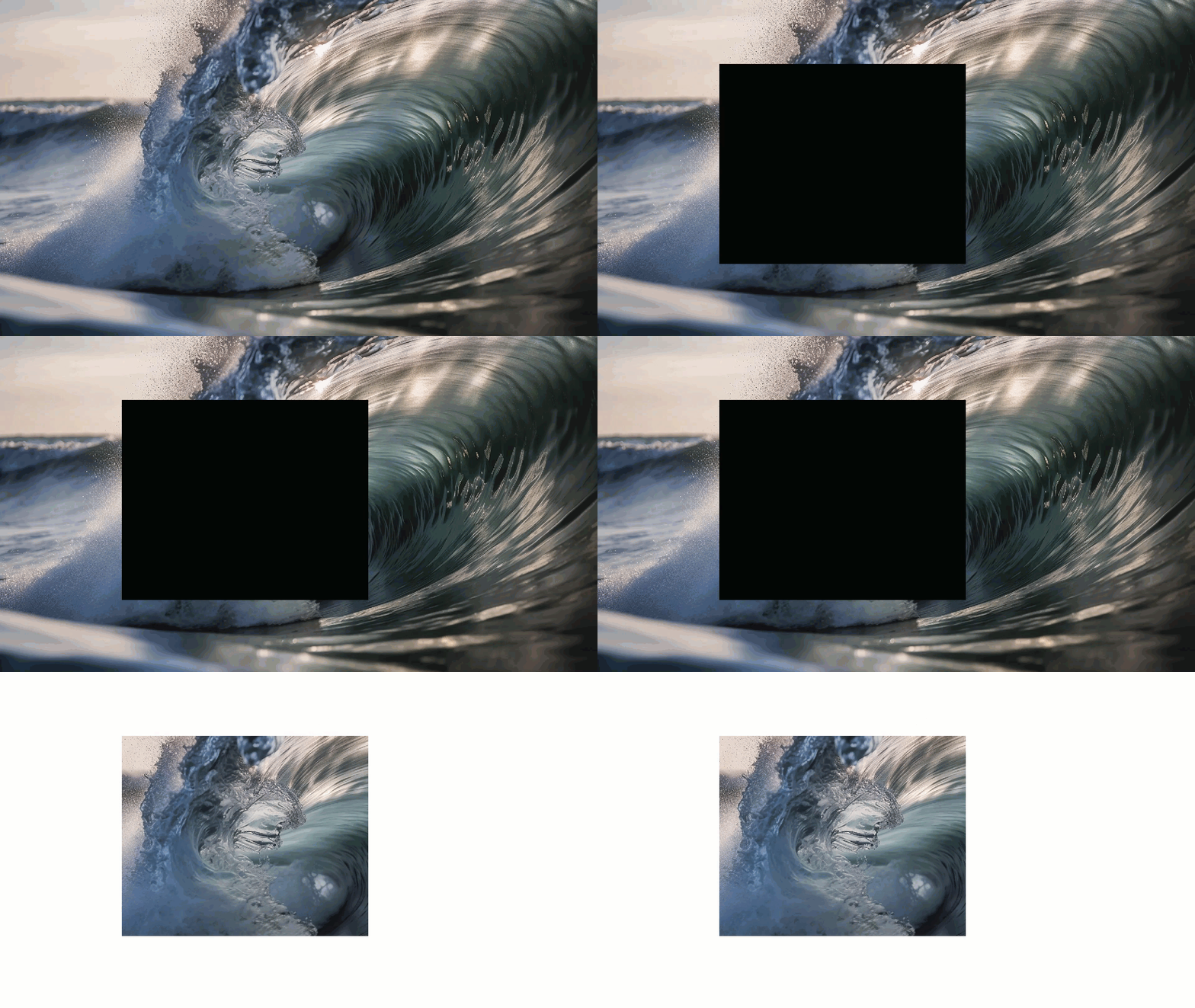
And areas that are partially opaque will allow the things behind them to be partially seen.
Okay so how about an example?
Using CSS mask-image with linear-gradients to Create a Fade Effect for a Scrolling Container
Our goal here is to create a fade out effect at the top and bottom of our scrolling container like what we're seeing here.
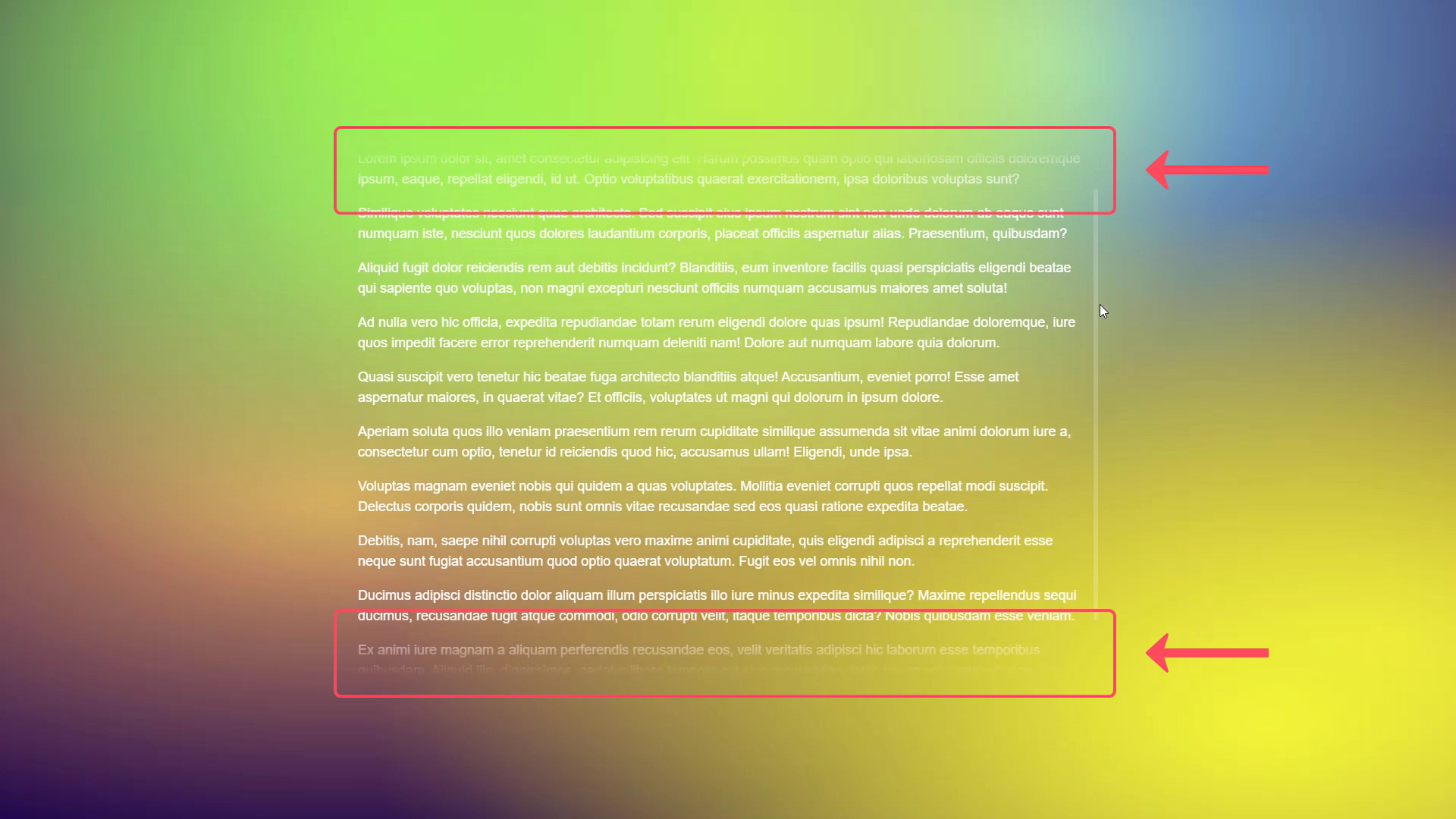
So, based on what we just learned about masks you probably have some ideas about what we need. We need a mask that is an opaque color for most of the container, but that fades to transparent at the top and then again at the bottom.

So, if we think about what we need, we want to place a mask on top of our scrolling container and it's going to fade at the top and bottom. For this, we're going to need to use two linear-gradients with our mask-image property. One gradient will fade from fully opaque black at the top down to the bottom where it'll need to fade to transparent. And then vice versa, at the top it'll fade from fully opaque at the bottom to transparent at the top.
So, let's start with the bottom first. To do this we'll add our mask-image property. And we're going to want to add a linear-gradient. Since we're doing the bottom first, we will make this gradient go "to bottom". Also, we're going to want the fades to be 5em tall so we'll add a custom property for this so that it can be used multiple times.
:root {
    --fadeHeight: 5em;
}

.container {
    mask-image: linear-gradient(to bottom)
}
So, to start we're going to start with fully opaque black and then it's going to be fully opaque black for the height of the entire container until we get down where we want the fade to start. For this we'll use a calculation, and then the final piece is to make it transparent at the bottom.
.container {
    mask-image:
        linear-gradient(
            to bottom,
            black,
            black calc(100% - var(--fadeHeight)),
            transparent
        )
}
Now we can see that we have our fade effect at the bottom.

Now we need to add the top, so we'll add another linear-gradient. This time we're going to start from the bottom and go upward so we'll add "to top", and it will start as fully opaque black.
This gradient will be the opposite of the bottom fade. It will be 100 percent of the height minus the height of the fade, so we'll use a calculation again.
.container {
    mask-image:
        linear-gradient(
            to top,
            black,
            black calc(100% - var(--fadeHeight)),
            transparent
        ),
        linear-gradient(
            to bottom,
            black,
            black calc(100% - var(--fadeHeight)),
            transparent
        )
}
But, at this point, we've actually broken our mask. It's no longer fading at the bottom like we'd expect.
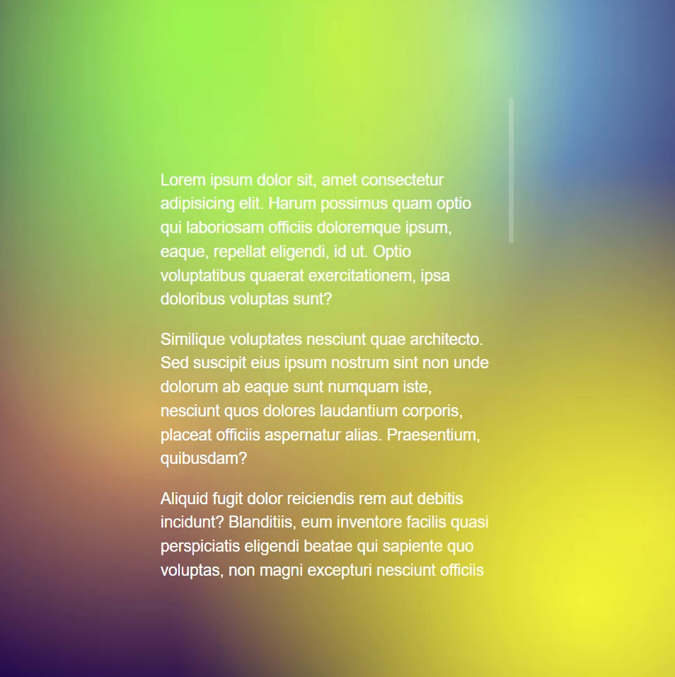
Why is this happening?
Well, if we think about what we did, we just applied two masks that were exactly overlapping each other. And this means that there's now a fully opaque black mask applied to the whole container. What we really need to do, is in both of these linear-gradients, we need to make room for our fades at the top and bottom.
So, on our bottom mask, we need to make it transparent before it becomes black to make room for the fade at the top. It will need it to remain transparent the height of the fade so we can use our --fadeHeight custom property. We also need to do the same to top fade linear-gradient to make room for the fade at the bottom.
.container {
    mask-image:
        linear-gradient(
            to top,
            transparent,
            transparent var(--fadeHeight),
            black,
            black calc(100% - var(--fadeHeight)),
            transparent
        ),
        linear-gradient(
            to bottom,
            transparent,
            transparent var(--fadeHeight),
            black,
            black calc(100% - var(--fadeHeight)),
            transparent
        )
}
Okay so how’d we do?
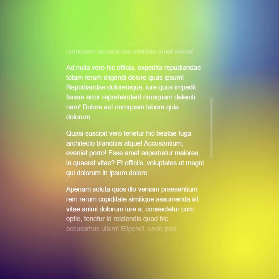
Perfect, fading in both directions now.
One last thing to note here is that I'm actually using Autoprefixer in this Codepen example which automatically handles vendor specific prefixes for me. If I wasn't using Autoprefixer, since I'm using Chrome, I would actually need to use the -webkit prefix on the mask image property for this to work correctly.
-webkit-mask-image
But since I'm using Autoprefixer it makes it so that I don't need to do this. Just one thing to note as you're adding masks in your own projects.
Here's the final working example:
Using an SVG, linear-gradient, and mask-image to Irregular Shaped Edges
Now we're going to move on to another common design concept, containers with an irregular edge of some sort. For this we'll need more than just a linear gradient, we'll also need an SVG. In this example, we're goint to use two SVGs that look like this.
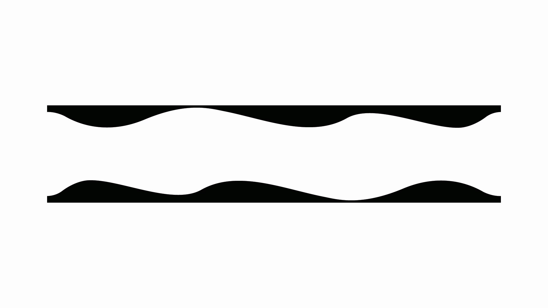
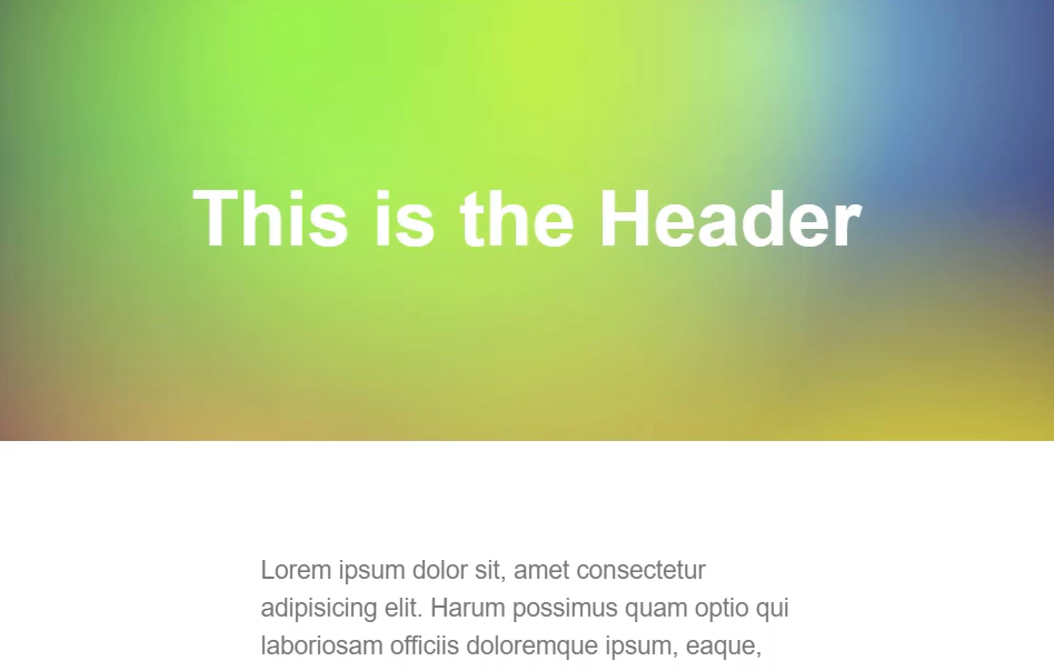
And for this example, We have a header that looks like this:
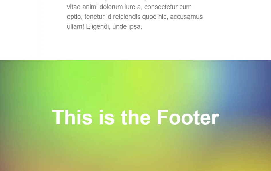
And, we have a footer that looks like this:
Let's start with our header. As we've seen, mask-image is very much like background-image, meaning we can use linear-gradients and we can also use actual images. In this case, we're going to use a combination of an SVG, the url() function, and a linear-gradient to mask everything else.
We'll start with the url() function. In this example, we'll use an encoded SVG which is a lot like a base64 encoded image. You really rarely should to do this type of thing for performance reasons, but for this example it will work just fine within our Codepen Demo.
header {
    mask-image:
        url("data:image/svg+xml,%3Csvg xmlns='http://www.w3.org/2000/svg' viewBox='0 0 1000 ...")
}
The mask-size Property
Okay now we need to add a mask-size for this so that it's the proper size. Just like our previous example, we need a couple of custom properties for this too because we're going to use them over and over a throughout this example.
:root {
    --maskWidth: 62.5em; /* 1000px */
    --maskHeight: 3.125em; /* 50px */
}
Now, just like background-size we have a mask-size property. We'll use our custom properties for this size. For the width, we'll use --maskWidth and for the height we'll use --maskHeight.
header {
    ...
    mask-size: var(--maskWidth) var(--maskHeight);
}
The mask-position Property
Next, we want our image to be positioned on the bottom and in the center, so just like background-position, we have a mask-position property. And, we'll want to use "bottom" and "center" for this position.
header {
    ...
    mask-position: bottom center;
}
The mask-repeat Property
Now we want to make sure that we're not repeating the image along the y-axis and only along the x-axis. So just like background-repeat, we have a mask-repeat property. And, we'll use a value of repeat-x.
header {
    ...
    mask-repeat: repeat-x;
}
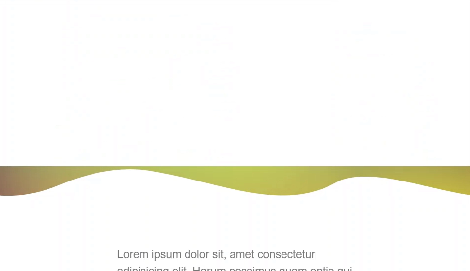
There we go, it's starting to take shape.
So now we need to use our linear-gradient to mask everything above this image out so that we can see our background. We'll start at the top with the value of fully opaque black. Then we'll want it to be black all the way until it meets up with the top of the mask image so again we're going to use a calculation. This calculation will be 100 percent minus the height of our mask. And we'll add a half pixel value to deal with pixel rounding issues that can sometimes occur. This just helps ensure that the gradient will meet up or overlap the SVG by one pixel. Then, at the same calculation, we'll want our mask to be transparent and then transparent again at 100 percent.
header {
    ...
    mask-image:
        ...
        linear-gradient(
            black,
            black calc(100% - var(--maskHeight) + 0.5px),
            transparent calc(100% - var(--maskHeight) + 0.5px),
            transparent
        );
}
Now, the only other piece that we're missing is a mask-size for our linear-gradient. In this case it's going to be 100 percent.
header {
    ...
    mask-size: var(--maskWidth) var(--maskHeight), 100%;
}
This makes it spread out 100 percent of the width and 100 percent of the height of this rectangle.
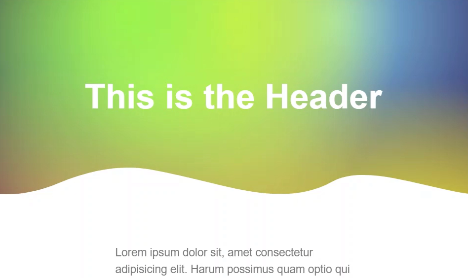
looking pretty good right? Now we can do the same thing to our footer. The only differences are we're using a different image and the gradient value. The image is flipped the opposite direction of our header image, facing upward. And then our gradient starts at transparent the height of the mask-image, and then it goes to black the rest of the way. It's also positioned in the top, center too.
footer {
    mask-image:
        url("data:image/svg+xml,%3Csvg xmlns='http://www.w3.org/2000/svg' ..."),
        linear-gradient(
            transparent 0%,
            transparent var(--maskHeight),
            black var(--maskHeight),
            black 100%
        );
    mask-size: var(--maskWidth) var(--maskHeight), 100%;
    mask-position: top center;
    mask-repeat: repeat-x;
}
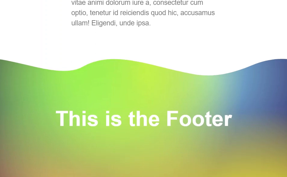
So, this gives us a nice way to apply different effects to boxes. Rather than just an ordinary straight line, we can give them more interesting effects with CSS masks.
Here's the final working example:
Using an SVG and CSS mask-image to Create a Hexagonal Shaped Image
Now, in this last example we're going to mask a square image with a custom shape to provide a more interesting effect. In this case, we'll only need an SVG, no linear gradient. The SVG we're going to use will look like this.
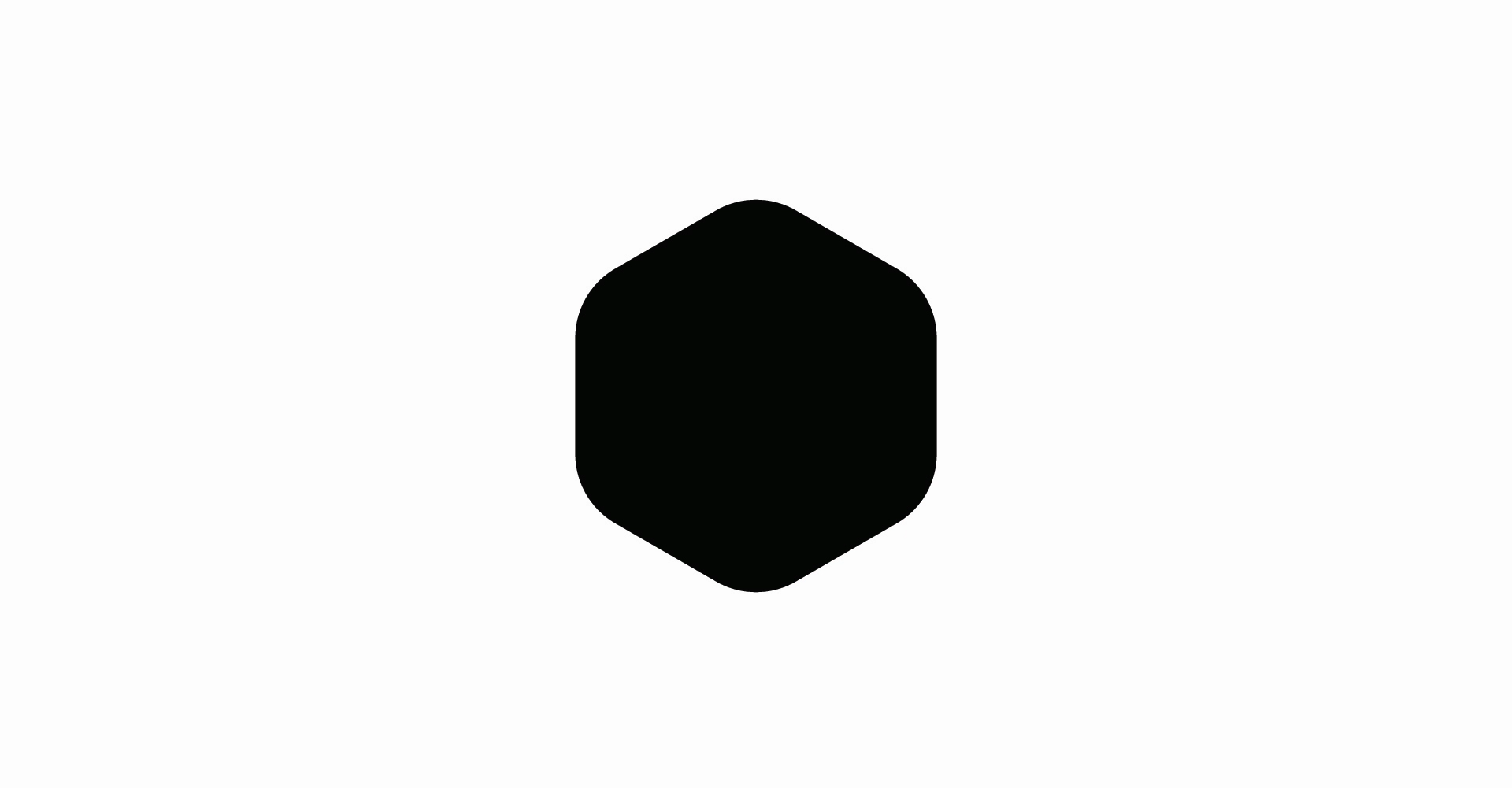
Okay, what's different about this approach is we don't need the linear-gradient. All we need is the mask-image and our url() function. Let's add in our encoded SVG.
img {
    mask-image: url("data:image/svg+xml,%3Csvg xmlns='http://www.w3.org/2000/svg' ...");
}

Okay, not exactly what we want, this mask looks a little funky. What we need to do is set this so that it doesn't repeat with the mask-repeat property. Also, it's a little off center, so we need to center it with the mask-position property.
img {
    ...
    mask-repeat: no-repeat;
    mask-position: center;
}
And there we go. It's that simple.
Here's the final working example:
Conclusion
Just to recap, masks are simply created by using some level of opacity and transparency to create the desired effect. We can use linear and radial gradients to create interesting masking effects without the need for images. We can use combinations of CSS gradients in combination with SVG paths or other images to create boxes with irregular edges. We can also use SVGs that are exactly the shape we want and then create a mask from them.
I hope these examples provide some inspiration for what’s possible when using CSS masks. Your creativity is all that’s holding you back now.
Found This Helpful?
If you found this article helpful and want to show some love, you can always buy me a coffee!
Subscribe to my newsletter
Read articles from brian treese directly inside your inbox. Subscribe to the newsletter, and don't miss out.
Written by
